效果展示
实现思路
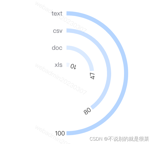
- 使用柱状图系列+设置极坐标绘制弧线
- 使用自定义系列+设置极坐标绘制弧线末尾标签
- 通过自定义柱状图data的item样式,设置热力效果,按数量多少来设置颜色深浅,颜色深浅通过rgba色值中的a设置透明度
- 通过设置angleAxis和radiusAxis属性来设置半圆展示等效果
实现代码(仅options)
let dataList=[
{
item: 'text',
value: 90
},
{
item: 'csv',
value: 100
}
];
let options = {
polar: {
radius: '90%'
},
angleAxis: {
max: dataList.length ? dataList[dataList.length - 1].value * 2 : 0,
startAngle: 90,
boundaryGap: false,
axisTick: {
show: false
},
axisLine: {
show: false
},
splitLine: {
show: false
},
axisLabel: {
show: false
}
},
radiusAxis: {
type: 'category',
axisTick: {
show: false
},
axisLine: {
show: false
},
axisLabel: {
overflow: 'truncate',
interval: 0
},
data: dataList.map((item) => {
return item.name;
})
},
tooltip: {},
series: [
{
type: 'bar',
barWidth: 8,
data: dataList.map((item, index) => {
return {
value: item.value,
itemStyle: {
color: `rgba(66, 150, 253,${index * 0.1 + 0.1})`
}
};
}),
coordinateSystem: 'polar'
},
{
type: 'custom',
coordinateSystem: 'polar',
tooltip: {
show: false
},
renderItem: function (params, api) {
var values = [api.value(0), api.value(1)];
var coord = api.coord(values);
return {
type: 'text',
position: [3 * Math.sin(coord[3]), 3 * Math.cos(coord[3])],
rotation: coord[3] + Math.PI / 2,
origin: [coord[0], coord[1]],
style: {
text: api.value(1),
fill: '#333333',
textAlign: 'right',
textVerticalAlign: 'middle',
x: coord[0],
y: coord[1]
}
};
},
data: dataList.map((item) => {
return {
value: item.value
};
})
}
]
};


 752
752


 被折叠的 条评论
为什么被折叠?
被折叠的 条评论
为什么被折叠?
 到【灌水乐园】发言


