


目录
颜色样式
颜色
八种默认颜色缩写
- b:blue
- g:green
- r:red
- c:cyan
- m:magenta
- y:yellow
- k:black
- w:white
其他颜色表示方法
- 灰色阴影
- html 十六进制
- RGB元组

点形状(注不同点默认使用不同颜色)
- "." point
- "," pixel
- "o" circle
- "v" triangle_down
- "^" triangle_up
- "<" triganle_left
- ">" triganle_right
- "1" tri_down
- "2" tri_up
- "3" tri_left
- "4" tri_right
- "8" octagon
- "s" square
- "p" pentagon
- "*" star
- "h" hexgon1
- "H" hexgon2
- "+" plus
- "x" x
- "D" diamond
- "d" thin_diamond
- "|" yline
- "-" hline

线型
- - 实线
- -- 虚线
- -. 点划线
- : 点线

样式字符串
-可以将颜色,点型,线型写成一个字符串
- xc-- x点青色虚线
- mo: 紫红色圆点点线
- kp- 黑色五边形实线

面向对象画图
三种画图方式简介
- pyplot:经典高层封装,到目前为止,我们所用的都是pyplot
- pylab:将Matplotlib和Numpy合并的模块,模拟Matlab的编程环境
- 面向对象的方式:Matplotlib的精髓,更基础和底层的方式
pyplot模块
import matplotlib.pyplot as plt
import numpy as np

x = np.arange(0,10,1)
y = np.random.randn(len(x))

plt.plot(x,y)
plt.title('pyplot')
plt.show()
pylab模块
from pylab import *

x = arange(0,10,1)
y = randn(len(x))

plot(x,y)

title('pylab')

show()
面向对象的方式
import matplotlib.pyplot as plt
import numpy as np

x = np.arange(0,10,1)
y = np.random.randn(len(x))

fig = plt.figure()    # 创建一个图对象

ax = fig.add_subplot(111)   # 为图对象创建坐标系

ax.plot(x,y)    # 画图

ax.set_title('object oriented')  # 为坐标轴创建名字
三种方式的优劣
- pyplot:简单易用。交互使用时方便,可以根据命令实时作图,但底层定制能力不足
- pylab:完全封装,环境最接近Matlab。不推荐使用
- 面向对象:接近Matplotlib基础和底层的方式,难度稍大,但定制能力强,而且是Matplotlib的精髓
- 总结:实战中推荐,根据需求,综合使用pyplot和面向对象方式,显示导入numpy
子图
面向对象--Matplotlib对象简介
- FigureCanvas 画布
- Figure 图
- Axes 坐标
实践
fig = plt.figure()
- 创建Figure实例
- 可以添加Axes实例
ax = fig.add_subplot(111)
- 返回Axes实例
- 参数一:子图总行数
- 参数二:子图总列数
- 参数三:子图位置
import matplotlib.pyplot as plt
import numpy as np

x = np.arange(0,10,1)
y = np.random.randn(len(x))

fig = plt.figure()
ax = fig.add_subplot(221)    # 两行两列的第一个坐标轴
ax.plot(x,y)                 # 使用坐标轴.plot画图

ax2 =fig.add_subplot(222)    # 两行两列的第二个坐标轴
ax2.plot(x,-y)

ax2 =fig.add_subplot(223)    # 两行两列的第三个坐标轴
ax2.plot(x,y*y)

ax2 =fig.add_subplot(224)    # 两行两列的第四个坐标轴
ax2.plot(x,-y*y)
交互式面向对象画图,也可以显示出相同的结果
import matplotlib.pyplot as plt
import numpy as np

x = np.arange(0,10,1)
y = np.random.randn(len(x))

fig = plt.figure()
ax = fig.add_subplot(221)
plt.plot(x,y)                    # 使用plt.plot画图

ax2 =fig.add_subplot(222)
plt.plot(x,-y)

ax2 =fig.add_subplot(223)
plt.plot(x,y*y)

ax2 =fig.add_subplot(224)
plt.plot(x,-y*y)
网格
生成网格语法
对象/plt.grid(True)   # 生成默认网格
对象/plt.grid(color='r',linestyle=':',linewidth='2')   # 生成设置样式的网格
实例


图例
plt.plot(x,x**2,label="Normal")
plt.legend(loc=1/2/3/4,ncol=3)
# 其中loc为1代表右上,2左上,3左下,4右下,ncol=3表示三列
# 如果loc不指定会默认放在最优位置(不遮挡线段)

设置ncol

设置坐标轴范围
# 查看坐标轴范围
对象/plt.axis()

# 设置坐标轴范围 同时设置x,y
对象/plt.axis([x最小值,x最大值,y最小值,y最大值])

# 设置x坐标轴范围
对象/plt.xlim([x最小值,x最大值])

# 设置y坐标轴范围
对象/plt.ylim([y最小值,y最大值])
坐标轴刻度
调整刻度的段数
plt/对象.locator_params(nbins=20)    # 将x和y轴的段数调整为20

plt/对象.locator_params('y',nbins=20)    # 将y轴的段数调整为20

面向对象的方式调整坐标轴段数

日期作为坐标轴
import matplotlib as mpl   # 多导入一个包

fig = plt.figure()
ax = plt.gca()

# 调整日期样式
date_format = mpl.dates.DateFormatter('%Y-%m-%d')
ax.xaxis.set_major_formatter(date_format)

# 自适应日期互不遮挡
fig.autofmt_xdate()

# 使用plot_date()绘制
plt.plot_date(dates,y,linestyle='-',marker='')


添加坐标轴
plt.twinx()
plt.twiny()
注释
.annotate('this is a note',
            xy=(x1,y1),
            xytext=(x2,y2),
            arrowprops={'frac'=0.5,'facecolor':,headwidth':,'width':})
其中xy代表箭头起始坐标,xytext代表箭头终止坐标及注释开始位置,arrowprops指定箭头如何填充,值为一个字典其中frac代表箭头头部占比,facecolor代表箭头颜色,headwidth代表箭头头部宽度,width代表箭头尾部宽度。

文字

TeX公式
- matplotib自带mathtext引擎,不需要安装TeX系统
- TeX公式$作为开始和结束符,如"$ y=x+z $"

区域填充
- 对曲线下面或者曲线之间的区域进行填充
- fill,fill_between


形状
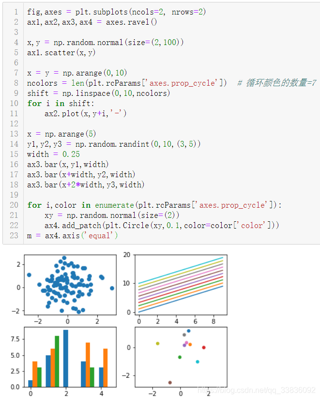
import matplotlib.patches as mpatches(注:不导入这个模块也可,将下述mpatches.Circle等换成plt.Circle也可)
- 生成形状 mpatches.形状
- 添加形状到坐标 add_patch

美化
使用自带样式进行美化
使用样式
![]()

全部样式

其中ggplot,fivethirtypeeight,seaborn比较好看
极坐标
- projection=‘polar’


 576
576


 被折叠的 条评论
为什么被折叠?
被折叠的 条评论
为什么被折叠?
 到【灌水乐园】发言


