


今天开始,就把uni-app前期使用的全部学完了,现在就把以前学习的,做成一案例,中间有未讲的,在进行补充,这里是根据老师视频进行项目案例编写的。
先弄出效果图,然后在根据效果图进行代码的编辑
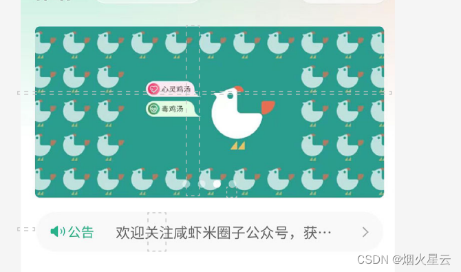
这是今天需要弄出来的效果图,
添加轮播图
在前面学习了轮播图片的功能,这里就使用起来,使用的是swiper,显示图片的是swiper-items,这里记录下
<swiper indicator-dots autoplay circular
		:interval="3000" :duration="1000"
		indicator-color="rgba(255,255,255,0.5)"
		indicator-active-color="#ffffff">
	<swiper-item v-for="(item,index) in picArr" :key="item.id">
	  <image :src="item.src" mode="aspectFill" ></image>
	</swiper-item>
</swiper>
indicator-dots:是否显示面板指示点
autoplay:是否自动切换
circular:是否采用衔接滑动,即播放到末尾后重新回到开头
interval:自动切换时间间隔
duration:滑动动画时长
indicator-color:指示按钮的颜色
indicator-active-color:选中的颜色
这就是轮播图了,但是在运行后,发现样式是不对的,这里得添加下样式
.banner{
		width: 750rpx;
		padding: 30rpx 0; //padding:当是一个值的时候:是周围四边,两个值:第一个是:上下;第二个是左右;当三个值:第一是上。第二个是左右,第三个是下;当是四个值:第一个是上,第二个右,第三个下,第四个左
		swiper{
			width: 750rpx;
			height: 340rpx;
			&-item{
				width: 100%;
				height: 100%;
				padding:0 30rpx;
				image{
					width: 100%;
					height: 100%;
					border-radius: 10rpx;
				}
			}
		}
	}
这就是整个轮播图的样式,这里说明习下,当如果直接使用这个样式,出来的是不正确的,原因是,是用padding是添加了距离边框,但是添加的这个距离边框会把原始布局往外延伸,这里需要设置成内边框,如何设置:这就是css样式的引入了
在根据下添加一个目录,common,创建一个scss的样式,这个样式设置成全局的样式,
view,swiper,swiper-item{
	box-sizing: border-box;
	//定义了 user agent 应该如何计算一个元素的总宽度和总高度
	// content-box
	// 默认值,标准盒子模型。width 与 height 只包括内容的宽和高,不包括边框(border),内边距(padding),外边距(margin)。注意:内边距、边框和外边距都在这个盒子的外部。比如说,.box {width: 350px; border: 10px solid black;} 在浏览器中的渲染的实际宽度将是 370px。
	// 尺寸计算公式:
	// width = 内容的宽度
	// height = 内容的高度
	// 宽度和高度的计算值都不包含内容的边框(border)和内边距(padding)。
	// border-box
	// width 和 height 属性包括内容,内边距和边框,但不包括外边距。这是当文档处于 Quirks 模式 时 Internet Explorer 使用的盒模型。注意,填充和边框将在盒子内 , 例如, .box {width: 350px; border: 10px solid black;} 导致在浏览器中呈现的宽度为 350px 的盒子。内容框不能为负,并且被分配到 0,使得不可能使用 border-box 使元素消失。
	// 尺寸计算公式:
	// width = border + padding + 内容的宽度
	// height = border + padding + 内容的高度
}
然后在app下面引用就可以了。
纵向使用轮播文字
看效果图,有个轮播的公告,这也是使用swiper进行设计的,
<view class="notice">
   <view class="letf">
	<uni-icons type="sound-filled" size="20" color="#309877"></uni-icons>
	<text class="text">公告</text>
  </view>
  <view class="center">
	<swiper vertical circular autoplay interval="1500" duration="300">
		<swiper-item v-for="item in 4">
			内容文字内容文字内容文字内容文字内容文字
		</swiper-item>
	</swiper>
  </view>
  <view class="rigth">
	<uni-icons type="right" size="16" color="#333"></uni-icons>
  </view>
</view>
这就是公告的布局,但是使用这个后,发现所有的组件是纵向显示的,和模版是不相同的,修改下样式:
.notice{
		width: 690rpx;
		height: 80rpx;
		line-height: 80rpx;
		background: #f9f9f9;
		margin: 0 auto;
		border-radius: 80rpx;
		display: flex;
		.letf{
			width: 140rpx;
			display: flex;
			justify-content: center;
			align-items: center;
			.text{
				font-weight: 600; //指定了字体的粗细程度, 详细查看:https://developer.mozilla.org/zh-CN/docs/Web/CSS/font-weight
				font-size: 28rpx;
				color:#309877 ;
			}
		}
		.center{
			flex: 1;
			swiper{
				height: 100%;
				&-item{
					height: 100%;
					font-size: 30rpx;
					color: #666;
					overflow: hidden; //设置了元素溢出时所需的行为——即当元素的内容太大而无法适应它的区块格式化上下文时。
					white-space: nowrap; //用于设置如何处理元素内的空白字符,nowrap是不让换行显示
					text-overflow: ellipsis;// 用于确定如何提示用户存在隐藏的溢出内容 ellipsis:超出文本部分使用省略号
				}
			}
		}
		.rigth{
			width: 70rpx;
			display: flex;
			justify-content: center;
			align-items: center;
		}
	}
如果要修改view显示的方式,只要设置了display: flex;,就可以了,
&-item:这是父组件是swiper,子组件是swiper-item,这里的简化方式就可以使用这种写法
这样就是各个布局的代码和样式,下面是全部代码
<template>
	<view class="homeLayout">
		<view class="banner">
			<swiper indicator-dots autoplay circular :interval="3000" :duration="1000"
			indicator-color="rgba(255,255,255,0.5)" indicator-active-color="#ffffff">
				<swiper-item v-for="(item,index) in picArr" :key="item.id">
					<image :src="item.src" mode="aspectFill" ></image>
				</swiper-item>
			</swiper>
		</view>
		<view class="notice">
			<view class="letf">
				<uni-icons type="sound-filled" size="20" color="#309877"></uni-icons>
				<text class="text">公告</text>
			</view>
			<view class="center">
				<swiper vertical circular autoplay interval="1500" duration="300">
					<swiper-item v-for="item in 4">
						内容文字内容文字内容文字内容文字内容文字
					</swiper-item>
				</swiper>
			</view>
			<view class="rigth">
				<uni-icons type="right" size="16" color="#333"></uni-icons>
			</view>
		</view>
	</view>
</template>

<script setup>
import { ref } from 'vue';
	const picArr=ref([{id:1,src:"../../common/images/banner1.jpg"},
					  {id:2,src:"../../common/images/banner2.jpg"},
					  {id:3,src:"../../common/images/banner3.jpg"}])


</script>

<style lang="scss" scoped>
.homeLayout{
	.banner{
		width: 750rpx;
		padding: 30rpx 0; //padding:当是一个值的时候:是周围四边,两个值:第一个是:上下;第二个是左右;当三个值:第一是上。第二个是左右,第三个是下;当是四个值:第一个是上,第二个右,第三个下,第四个左
		swiper{
			width: 750rpx;
			height: 340rpx;
			&-item{
				width: 100%;
				height: 100%;
				padding:0 30rpx;
				image{
					width: 100%;
					height: 100%;
					border-radius: 10rpx;
				}
			}
		}
	}
	.notice{
		width: 690rpx;
		height: 80rpx;
		line-height: 80rpx;
		background: #f9f9f9;
		margin: 0 auto;
		border-radius: 80rpx;
		display: flex;
		.letf{
			width: 140rpx;
			display: flex;
			justify-content: center;
			align-items: center;
			.text{
				font-weight: 600; //指定了字体的粗细程度, 详细查看:https://developer.mozilla.org/zh-CN/docs/Web/CSS/font-weight
				font-size: 28rpx;
				color:#309877 ;
			}
		}
		.center{
			flex: 1;
			swiper{
				height: 100%;
				&-item{
					height: 100%;
					font-size: 30rpx;
					color: #666;
					overflow: hidden; //设置了元素溢出时所需的行为——即当元素的内容太大而无法适应它的区块格式化上下文时。
					white-space: nowrap; //用于设置如何处理元素内的空白字符,nowrap是不让换行显示
					text-overflow: ellipsis;// 用于确定如何提示用户存在隐藏的溢出内容 ellipsis:超出文本部分使用省略号
				}
			}
		}
		.rigth{
			width: 70rpx;
			display: flex;
			justify-content: center;
			align-items: center;
		}
	}
}

</style>
这就是全部的轮播图和轮播文字!
有不对的地方欢迎大家提问,我是小白,大家共同学习!


 1081
1081


 被折叠的 条评论
为什么被折叠?
被折叠的 条评论
为什么被折叠?
 到【灌水乐园】发言


