


昨天学习了使用轮播显示图片和文字,轮播方式纵向和横向。今天使用扩展组件和scroll-view显示图片,使用scroll-view的grid方式、插槽slot、自定义组件、磨砂背景定位布局做专题组件
这就是需要做成的效果,下面将一步一步的完成。
首先,这里的每日推荐和专题精选都是相同的组件,这里使用自定义组件进行,
第一步:在项目根目录创建文件夹,components文件夹,创建组件,
看这个布局,是文字不同,后面的显示不同,这里使用slot
<template>
	<view class="common-title">
		<view class="name">
			<slot name="name"></slot>
		</view>
		<view class="custom">
			<slot name="custom"></slot>
		</view>
	</view>
</template>

<script setup>

</script>

<style lang="scss" scoped>
	.common-title{
		display: flex;
		justify-content: space-between;//这是让两端对齐
		align-items: center;
		padding: 0 30rpx;
		.name{
			font-size: 40rpx
		}
	}

</style>
这里就是用slot了,定义一个slot的名称,在父组件中直接传参就能显示不同的效果
<common-title>
	<template v-slot:name>每日推荐</template>
		<template #custom>
	 		<view class="date">
				<uni-icons type="calendar" size="18" color="#309877"></uni-icons>
			<view class="text">
				<uni-dateformat :date="Date.now()" format="dd日"></uni-dateformat>
			</view>
			</view>
	</template>
</common-title>
<view class="content">
	<scroll-view scroll-x>
		<view class="box" v-for="item in 8">
			<image src="../../common/images/preview_small.webp" mode="aspectFill"></image>
		</view>
	</scroll-view>
</view>
这就是拓展组件和插槽的使用,这里也使用了扩展组件,顺便复习下,扩展组件的使用:找到需要的组件,点击下载导入,使用的时候,只用引入需要的组件名称,就可以使用了,至于组件的属性,查看文档有详细说明。
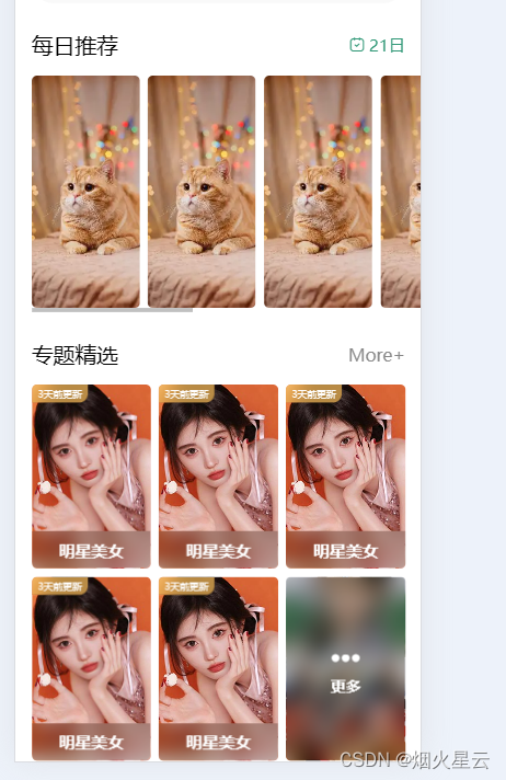
以上是每日推荐模块,但是出来后显示的布局方式是纵向显示的,这里需要修改样式,让横向显示,
.select {
			margin-top: 50rpx;
			.content {
				width: 720rpx;
				margin-left: 30rpx;
				margin-top: 30rpx;

				scroll-view {
					white-space: nowrap;

					.box {
						width: 200rpx;
						height: 430rpx;
						display: inline-block;
						margin-right: 15rpx;

						image {
							width: 100%;
							height: 100%;
							border-radius: 10rpx;
						}
					}

					.box:last-child {
						margin-right: 30rpx;
					}
				}
			}

			.date {
				color: #309877;
				display: flex;
				align-items: center;

				.text {
					margin-left: 5rpx;
				}
			}
		}
这就把每日推荐这个模块的全部显示出来了。
下来是要做专题精选,这里文字模块,使用的和每日推荐使用的是相同的布局,直接使用同样的组件就好。下面的图片显示,使用的是scroll-view的grid方式,因为布局后面,还有个模糊的更多,点击图片进入的是图片详情,点击更多进入的是其他页面,两个显示的不同,点击后进入的方式也不同,这里就用到grid了,
<view class="theme">
			<common-title>
				<template v-slot:name>专题精选</template>
				<template #custom>
					<navigator url="" class="more">More+</navigator>
				</template>
			</common-title>
			<view class="content">
				<theme-item v-for="item in 5"></theme-item>
				<theme-item :isMore="true"></theme-item>
			</view>
		</view>
<!-- style -->
.theme{
			margin: 50rpx 0;
			.more{
				font-size: 32rpx;
				color: #888;
			}
			.content{
				margin-top: 30rpx;
				padding: 0 30rpx;
				display: grid;
				gap: 15rpx;//属性是用来设置网格行与列之间的间隙,该属性是 row-gap 和 column-gap 的简写形式
				grid-template-columns: repeat(3,1fr);
				//display:grid 是转为网格布局,这个是必须的
				// grid-template-columns:1fr | px 这是将网格分为几列,1fr是自适配单位,可以当成栅格,这里也可以是用repeat(3,1fr),是平分成三列,然后自适应宽度,这里看自己需求需要分成几列
				//grid-template-columns: repeat(auto-fill, minmax(255px, 1fr)); 这种写法可以用来做响应式布局,auto-fill主轴上指定的宽度或者重复次数是最大可能的正整数,minmax最小值255px、最大值1fr代表剩余空间的比例。注意:实现这种响应式布局,一定要注意父容器不能使用固定宽度,可以将父容器改为如:80%,这样就能根据屏幕的宽度,自动展示一行展示几个了。
				// gap:30px 这是网格四周的间隔
				// 注意:这三个属性是给父容器添加的,子元素,可以不用设置宽度,也不用设置margin间距即可完成如下布局。
				// grid-row和grid-column可以控制某个元素占领几份
				// 以grid-row行为例,从第几列开始 / 第几列+想占几个;
				// grid-row: 1/3;
				// grid-column: 1/3;
			}
		}
上面是设置grid显示的不同的样式,是不是看的云里雾里的,没事,老师有专门的课程,grid网格布局,比flex方便太多了,介绍几种常用的grid布局属性,这里有详细的解释和案例,
磨砂背景定位布局,在列表中,图片上特定区域,有文字和磨砂背景的,这里也是使用自定义组件的方式
<template>
	<view class="theme-item">
		<navigator url="" class="box" v-if="!isMore">
			<image class="pic" src="../../common/images/classify1.jpg" mode="aspectFill"></image>
			<view class="mack">明星美女</view>
			<view class="tabMack">3天前更新</view>
		</navigator>

		<navigator url="" class="box more" v-else>
			<image class="pic" src="../../common/images/more.jpg" mode="aspectFill"></image>
			<view class="mack">
				<uni-icons type="more-filled" size="34" color="#fff"></uni-icons>
				<text class="text">更多</text>
			</view>
		</navigator>
	</view>
</template>

<script setup>
defineProps({
	isMore:{
		type:Boolean,
		default:false
	}
})
</script>

<style lang="scss" scoped>
	.theme-item {
		.box {
			height: 340rpx;
			border-radius: 10rpx;
			overflow: hidden;
			position: relative;

			.pic {
				width: 100%;
				height: 100%;
			}

			.mack {
				width: 100%;
				height: 70rpx;
				position: absolute;
				bottom: 0;
				left: 0;
				font-size: 30rpx;
				background: rgba(0, 0, 0, 0.2);
				color: #fff;
				display: flex;
				align-items: center;
				justify-content: center;
				backdrop-filter: blur(20rpx);
				font-weight: 600;
			}

			.tabMack {
				position: absolute; //指定一个元素在文档中的定位方式
				left: 0;
				top: 0;
				background: rgba(250, 190, 90, 0.7);
				backdrop-filter: blur(20rpx); //backdrop-filter CSS 属性可以让你为一个元素后面区域添加图形效果(如模糊或颜色偏移)
				font-size: 22rpx;
				color: #fff;
				padding: 6rpx 14rpx;
				border-radius: 0 0 20rpx 0;
				transform: scale(0.8); //属性允许你旋转,缩放,倾斜或平移给定元素。这是通过修改 CSS 视觉格式化模型的坐标空间来实现的。
				transform-origin: left top; //更改一个元素变形的原点
			}
		}

		.box.more{
			.mack{
				width: 100%;
				height: 100%;
				flex-direction: column;
			}
			.text{
				font-size: 28rpx;
			}
		}
	}
</style>
下面是整页的详细代码
<template>
	<view class="homeLayout">
		<view class="banner">
			<swiper indicator-dots autoplay circular :interval="3000" :duration="1000"
				indicator-color="rgba(255,255,255,0.5)" indicator-active-color="#ffffff">
				<swiper-item v-for="(item,index) in picArr" :key="item.id">
					<image :src="item.src" mode="aspectFill"></image>
				</swiper-item>
			</swiper>
		</view>
		<view class="notice">
			<view class="letf">
				<uni-icons type="sound-filled" size="20" color="#309877"></uni-icons>
				<text class="text">公告</text>
			</view>
			<view class="center">
				<swiper vertical circular autoplay interval="1500" duration="300">
					<swiper-item v-for="item in 4">
						内容文字内容文字内容文字内容文字内容文字
					</swiper-item>
				</swiper>
			</view>
			<view class="rigth">
				<uni-icons type="right" size="16" color="#333"></uni-icons>
			</view>
		</view>
		<view class="select">
			<common-title>
				<template v-slot:name>每日推荐</template>
				<template #custom>
					<view class="date">
						<uni-icons type="calendar" size="18" color="#309877"></uni-icons>
						<view class="text">
							<uni-dateformat :date="Date.now()" format="dd日"></uni-dateformat>
						</view>
					</view>
				</template>
			</common-title>
			<view class="content">
				<scroll-view scroll-x>
					<view class="box" v-for="item in 8">
						<image src="../../common/images/preview_small.webp" mode="aspectFill"></image>
					</view>
				</scroll-view>
			</view>
		</view>
		<view class="theme">
			<common-title>
				<template v-slot:name>专题精选</template>
				<template #custom>
					<navigator url="" class="more">More+</navigator>
				</template>
			</common-title>
			<view class="content">
				<theme-item v-for="item in 5"></theme-item>
				<theme-item :isMore="true"></theme-item>
			</view>
		</view>
	</view>
</template>

<script setup>
	import {
		ref
	} from 'vue';
	const picArr = ref([{
			id: 1,
			src: "../common/images/banner1.jpg"
		},
		{
			id: 2,
			src: "../../common/images/banner2.jpg"
		},
		{
			id: 3,
			src: "../../common/images/banner3.jpg"
		}
	])
</script>

<style lang="scss" scoped>
	.homeLayout {
		.banner {
			width: 750rpx;
			padding: 30rpx 0; //padding:当是一个值的时候:是周围四边,两个值:第一个是:上下;第二个是左右;当三个值:第一是上。第二个是左右,第三个是下;当是四个值:第一个是上,第二个右,第三个下,第四个左
			swiper {
				width: 750rpx;
				height: 340rpx;
				&-item {
					width: 100%;
					height: 100%;
					padding: 0 30rpx;
					image {
						width: 100%;
						height: 100%;
						border-radius: 10rpx;
					}
				}
			}
		}

		.notice {
			width: 690rpx;
			height: 80rpx;
			line-height: 80rpx;
			background: #f9f9f9;
			margin: 0 auto;
			border-radius: 80rpx;
			display: flex;

			.letf {
				width: 140rpx;
				display: flex;
				justify-content: center;
				align-items: center;

				.text {
					font-weight: 600; //指定了字体的粗细程度, 详细查看:https://developer.mozilla.org/zh-CN/docs/Web/CSS/font-weight
					font-size: 28rpx;
					color: #309877;
				}
			}

			.center {
				flex: 1;

				swiper {
					height: 100%;

					&-item {
						height: 100%;
						font-size: 30rpx;
						color: #666;
						overflow: hidden; //设置了元素溢出时所需的行为——即当元素的内容太大而无法适应它的区块格式化上下文时。
						white-space: nowrap; //用于设置如何处理元素内的空白字符,nowrap是不让换行显示
						text-overflow: ellipsis; // 用于确定如何提示用户存在隐藏的溢出内容 ellipsis:超出文本部分使用省略号
					}
				}
			}

			.rigth {
				width: 70rpx;
				display: flex;
				justify-content: center;
				align-items: center;
			}
		}

		.select {
			margin-top: 50rpx;
			.content {
				width: 720rpx;
				margin-left: 30rpx;
				margin-top: 30rpx;

				scroll-view {
					white-space: nowrap;

					.box {
						width: 200rpx;
						height: 430rpx;
						display: inline-block;
						margin-right: 15rpx;

						image {
							width: 100%;
							height: 100%;
							border-radius: 10rpx;
						}
					}

					.box:last-child {
						margin-right: 30rpx;
					}
				}
			}

			.date {
				color: #309877;
				display: flex;
				align-items: center;

				.text {
					margin-left: 5rpx;
				}
			}
		}
		.theme{
			margin: 50rpx 0;
			.more{
				font-size: 32rpx;
				color: #888;
			}
			.content{
				margin-top: 30rpx;
				padding: 0 30rpx;
				display: grid;
				gap: 15rpx;//属性是用来设置网格行与列之间的间隙,该属性是 row-gap 和 column-gap 的简写形式
				grid-template-columns: repeat(3,1fr);
				//display:grid 是转为网格布局,这个是必须的
				// grid-template-columns:1fr | px 这是将网格分为几列,1fr是自适配单位,可以当成栅格,这里也可以是用repeat(3,1fr),是平分成三列,然后自适应宽度,这里看自己需求需要分成几列
				//grid-template-columns: repeat(auto-fill, minmax(255px, 1fr)); 这种写法可以用来做响应式布局,auto-fill主轴上指定的宽度或者重复次数是最大可能的正整数,minmax最小值255px、最大值1fr代表剩余空间的比例。注意:实现这种响应式布局,一定要注意父容器不能使用固定宽度,可以将父容器改为如:80%,这样就能根据屏幕的宽度,自动展示一行展示几个了。
				// gap:30px 这是网格四周的间隔
				// 注意:这三个属性是给父容器添加的,子元素,可以不用设置宽度,也不用设置margin间距即可完成如下布局。
				// grid-row和grid-column可以控制某个元素占领几份
				// 以grid-row行为例,从第几列开始 / 第几列+想占几个;
				// grid-row: 1/3;
				// grid-column: 1/3;
			}
		}
	}
</style>
这里提下,如果图片放在common下,这个是在打包的时候,只有用到的才会打包,没有用到的是不打包的,我这里在弄轮播图的时候,就使用的是common下的图片了,把这些图片放在数组中,然后在页面上使用,在H5的时候,是没问题的,因此就没多看,今天在小程序中,轮播图片不显示,原因是没有在小程序中找到,试了各种办法,还是不行,但把图片地址直接引用common下的图片,又可以了,这不清楚原因,这里记录下,后期知道了在补充。
为什么要专门说下这个,从这里看出,各个平台存在差异化,目前是以微信小程序为主的,所以在做完一个小功能后,还是要在小程序中查看下是不是可以使用,不然到后期出现问题更改起来会很繁琐的。
加油,学无止境!


 581
581


 被折叠的 条评论
为什么被折叠?
被折叠的 条评论
为什么被折叠?
 到【灌水乐园】发言


