uniapp-tabBar中间凸起按钮

前言:以下是使用的是原生方法,兼容会比绘制按钮的好,不用写更多代码去让图标固定到tabBar位置。官网有提到“中间按钮 仅在 list 项为偶数时有效”,这需要注意,另外在中间按钮的图标有的凸出的部分的图标有个描边的边框之类的,这点在当前uniapp版本已经自动适应了,在之前的开发版本是不会自适应的。比如在安卓上面能够自适应凸出部分的描边可以刚刚好跟tabBar水平对齐,但是在苹果上面是不会的。


下面我们讲下怎么实现。。。。


(以下图片效果是在苹果手机基座运行的)
不带描边的中间按钮图标效果:
在这里插入图片描述
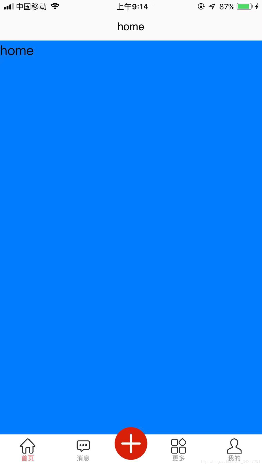
PS:这里可以看到中间按钮可以正常凸出来,图片除了有无描边的区别,还有一个问题就是图片中的白色“+”号那个区域可以看到背景,这个修改图片背景就可以覆盖掉。

带描边的中间按钮图标效果:
在这里插入图片描述
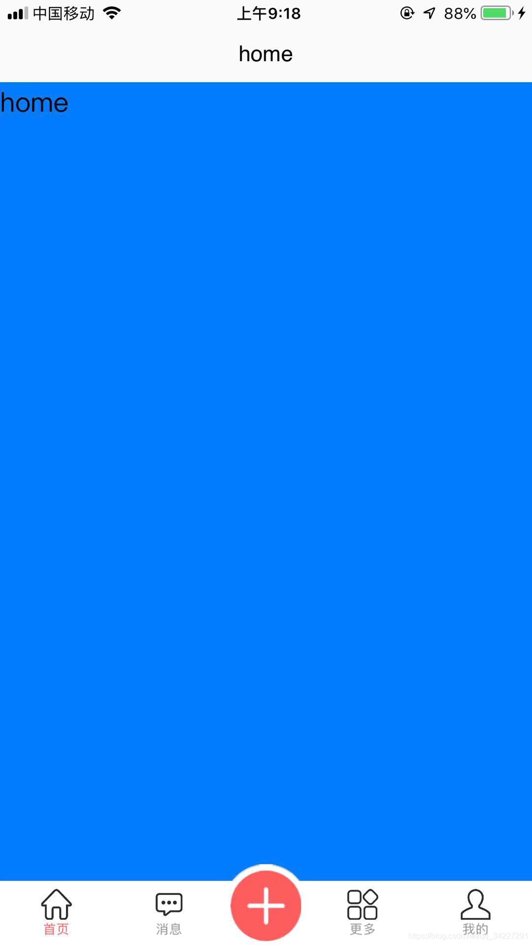
PS:这个图片有的白色背景,可以覆盖下面的,效果看起来比上面的会好很多。此外,凸出部分还有一点很细的灰色描边可以自适应到水平对齐。


  • 在以下两个文件中写代码就可以实现了
    1:页面效果实现,也是显示tabBar;
    2:点击中间按钮事件,也就是点击中间按钮触发一个点击事件

实现tabBar部分代码,在pages.json文件写

PS:midButton就是中间按钮 仅在 list 项为偶数时有效

{
	"pages": [ //pages数组中第一项表示应用启动页,参考:https://uniapp.dcloud.io/collocation/pages
		{
			"path": "pages/home/home",
			"style": {
				"navigationBarTitleText": "home"
			}
		}, {
			"path": "pages/news/news",
			"style": {
				"navigationBarTitleText": "news"
			}
		}, {
			"path": "pages/more/more",
			"style": {
				"navigationBarTitleText": "more"
			}
		}, {
			"path": "pages/mine/mine",
			"style": {
				"navigationBarTitleText": "mine"
			}
		}
	],
	"globalStyle": {
		"navigationBarTextStyle": "black",
		"navigationBarTitleText": "uni-app",
		"navigationBarBackgroundColor": "#F8F8F8",
		"backgroundColor": "#F8F8F8"
	},
	"tabBar": {
		"color": "#8f8f8f",
		"selectedColor": "#FD5C5C",
		"borderStyle": "white",
		"backgroundColor": "#ffffff",
		"list": [{
				"pagePath": "pages/home/home",
				"text": "首页",
				"iconPath": "static/tabBar/shouye.png",
				"selectedIconPath": "static/tabbar/tabbar_home_select.png"
			},
			{
				"pagePath": "pages/news/news",
				"text": "消息",
				"iconPath": "static/tabBar/xiaoxi.png",
				"selectedIconPath": "static/tabbar/tabbar_play_select.png"
			},
			{
				"pagePath": "pages/more/more",
				"text": "更多",
				"iconPath": "static/tabBar/gengduo.png",
				"selectedIconPath": "static/tabbar/tabbar_money_select.png"
			},
			{
				"pagePath": "pages/mine/mine",
				"text": "我的",
				"iconPath": "static/tabBar/wode.png",
				"selectedIconPath": "static/tabbar/tabbar_personal_select.png"
			}
		],
		"midButton": {
			"width": "63px",
			"height": "63px",
			"iconPath": "static/tabBar/plus.png",
			"iconWidth": "55px"
			// "backgroundImage":"static/images/tabbar/plus.png"
		}
	}
}

中间按钮点击事件
PS:在项目根目录下的App.vue文件写
在这里插入图片描述

在uni-app中实现TabBar中间凸起的方法如下: 1. 在 `pages.json` 文件中配置 `custom-tab-bar` 为自定义的 TabBar 组件: ```json { "tabBar": { "custom": true, "color": "#999", "selectedColor": "#007aff", "backgroundColor": "#fff", "list": [ { "pagePath": "pages/index/index", "text": "首页", "iconPath": "static/tabbar/home.png", "selectedIconPath": "static/tabbar/home-active.png" }, { "pagePath": "pages/mine/mine", "text": "我的", "iconPath": "static/tabbar/mine.png", "selectedIconPath": "static/tabbar/mine-active.png" }, { "pagePath": "pages/release/release", "text": "", "iconPath": "static/tabbar/release.png", "selectedIconPath": "static/tabbar/release-active.png" }, { "pagePath": "pages/message/message", "text": "消息", "iconPath": "static/tabbar/message.png", "selectedIconPath": "static/tabbar/message-active.png" }, { "pagePath": "pages/order/order", "text": "订单", "iconPath": "static/tabbar/order.png", "selectedIconPath": "static/tabbar/order-active.png" } ] } } ``` 2. 在 TabBar 组件中添加中间凸起按钮,例如: ```html <template> <view class="custom-tab-bar"> <view class="custom-tab-bar-item" v-for="(item, index) in list" :key="index" @click="switchTab(index)"> <view class="icon"> <image :src="index === current ? item.selectedIconPath : item.iconPath"></image> </view> <view class="text" :class="{ 'text-active': index === current }">{{ item.text }}</view> </view> <view class="custom-tab-bar-center" @click="goReleasePage"> <image src="static/tabbar/release.png"></image> </view> </view> </template> ``` 3. 在 TabBar 组件的样式文件中设置中间凸起按钮样式,例如: ```css .custom-tab-bar { display: flex; flex-direction: row; justify-content: space-between; align-items: center; position: fixed; bottom: 0; left: 0; right: 0; height: 98rpx; box-shadow: 0 -1px 3px rgba(0, 0, 0, 0.1); background-color: #fff; } .custom-tab-bar-item { flex: 1; display: flex; flex-direction: column; justify-content: center; align-items: center; } .custom-tab-bar-item .icon { width: 40rpx; height: 40rpx; } .custom-tab-bar-item .icon image { width: 100%; height: 100%; } .custom-tab-bar-item .text { font-size: 22rpx; color: #999; margin-top: 4rpx; } .custom-tab-bar-item .text-active { color: #007aff; } .custom-tab-bar-center { position: absolute; top: -30rpx; left: 50%; transform: translateX(-50%); width: 80rpx; height: 80rpx; border-radius: 50%; box-shadow: 0 2px 10px rgba(0, 0, 0, 0.1); background-color: #007aff; display: flex; justify-content: center; align-items: center; } .custom-tab-bar-center image { width: 60rpx; height: 60rpx; } ``` 这样,就可以在 uni-app 中实现 TabBar 中间凸起的效果了。
评论 12
添加红包

请填写红包祝福语或标题

红包个数最小为10个

红包金额最低5元

当前余额3.43前往充值 >
需支付:10.00
成就一亿技术人!
领取后你会自动成为博主和红包主的粉丝 规则
hope_wisdom
发出的红包
实付
使用余额支付
点击重新获取
扫码支付
钱包余额 0

抵扣说明:

1.余额是钱包充值的虚拟货币,按照1:1的比例进行支付金额的抵扣。
2.余额无法直接购买下载,可以购买VIP、付费专栏及课程。

余额充值