


之前的布局容器是一个整体的框架,layout里面的布局(比如header)其实就是el-row和el-col的组合。(局部布局会更多的使用el-row和el-col)
基础布局
使用单一分栏创建基础的栅格布局。

通过 row 和 col 组件,并通过 col 组件的 span 属性我们就可以自由地组合布局。

这种最简单,外面有一层row,说明四个col都在一行里面,也就是四列都在一行里面。用了这个组件之后就很容易对浏览器的块去进行一个分割,在每个块里面去填入你想要放的东西。
这里使用到的最多属性其实也就是 span。
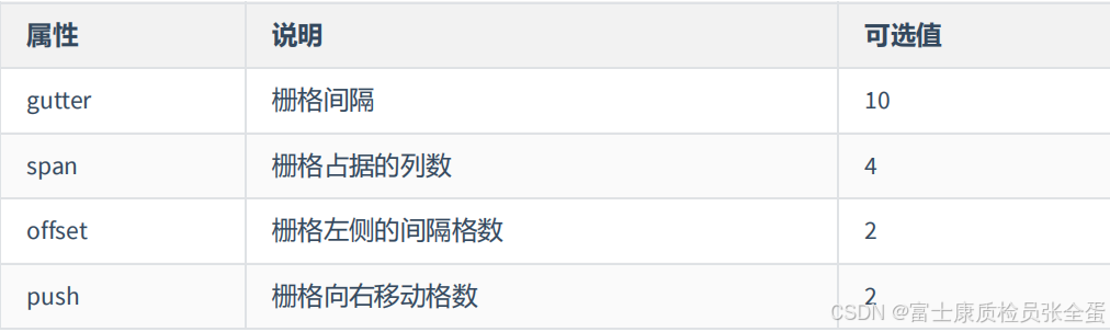
分栏间隔
分栏之间存在间隔。

Row 组件 提供
gutter属性来指定每一栏之间的间隔,默认间隔为 0。
<template>
<el-row :gutter="20">
<el-col :span="6"><div class="grid-content bg-purple"></div></el-col>
<el-col :span="6"><div class="grid-content bg-purple"></div></el-col>
<el-col :span="6"><div class="grid-content bg-purple"></div></el-col>
<el-col :span="6"><div class="grid-content bg-purple"></div></el-col>
</el-row>
</template>
<style>
.el-row {
margin-bottom: 20px;
&:last-child {
margin-bottom: 0;
}
}
.el-col {
border-radius: 4px;
}
.bg-purple-dark {
background: #99a9bf;
}
.bg-purple {
background: #d3dce6;
}
.bg-purple-light {
background: #e5e9f2;
}
.grid-content {
border-radius: 4px;
min-height: 36px;
}
.row-bg {
padding: 10px 0;
background-color: #f9fafc;
}
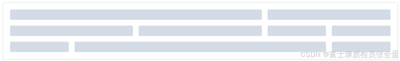
</style>混合布局
通过基础的 1/24 分栏任意扩展组合形成较为复杂的混合布局。
<template>
<el-row :gutter="20">
  <el-col :span="16"><div class="grid-content bg-purple"></div></el-col>
  <el-col :span="8"><div class="grid-content bg-purple"></div></el-col>
</el-row>

<el-row :gutter="20">
  <el-col :span="8"><div class="grid-content bg-purple"></div></el-col>
  <el-col :span="8"><div class="grid-content bg-purple"></div></el-col>
  <el-col :span="4"><div class="grid-content bg-purple"></div></el-col>
  <el-col :span="4"><div class="grid-content bg-purple"></div></el-col>
</el-row>

<el-row :gutter="20">
  <el-col :span="4"><div class="grid-content bg-purple"></div></el-col>
  <el-col :span="16"><div class="grid-content bg-purple"></div></el-col>
  <el-col :span="4"><div class="grid-content bg-purple"></div></el-col>
</el-row>
</template>

<style>
  .el-row {
    margin-bottom: 20px;
    &:last-child {
      margin-bottom: 0;
    }
  }
  .el-col {
    border-radius: 4px;
  }
  .bg-purple-dark {
    background: #99a9bf;
  }
  .bg-purple {
    background: #d3dce6;
  }
  .bg-purple-light {
    background: #e5e9f2;
  }
  .grid-content {
    border-radius: 4px;
    min-height: 36px;
  }
  .row-bg {
    padding: 10px 0;
    background-color: #f9fafc;
  }
</style>
局部布局 [el-row]
el-row是控制一行一行的,el-col是控制一列一列的,span其实它会将整个浏览器作为24个格栅。如果每个都是6那么就排满了。

外面有一层,其实是一个row,外面有一层row,其实是一行,这四个col(也就是四列)都在一行里面。
每一列有个参数6,它会将整个浏览器的宽度作为24个格栅。如果大于24就排满了,就会另起一行。
一个格栅是24个格子,:span="6"其实就是控制格栅占用的几个格子。gutter="20" 每个col之间的间距,间距为x px像素。

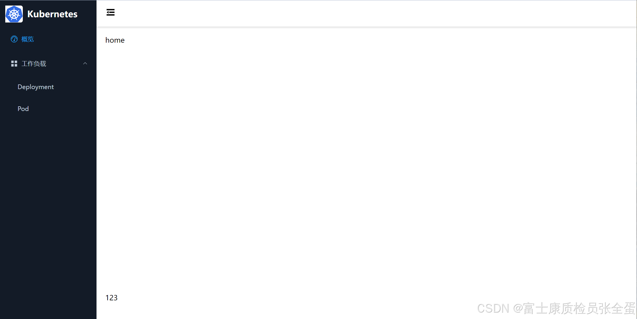
        <el-header style="flex:1">
              <el-row>
                <el-col :span="24" style="background-color: yellow;">123</el-col>
              </el-row>
              <el-row :gutter="35">
                <el-col :span="6" style="background-color: red;">123</el-col>
                <el-col :span="6" style="background-color: green;">123</el-col>
                <el-col :span="6" style="background-color: blue;">123</el-col>
                <el-col :span="6" style="background-color: burlywood;">123</el-col>
              </el-row>
        </el-header>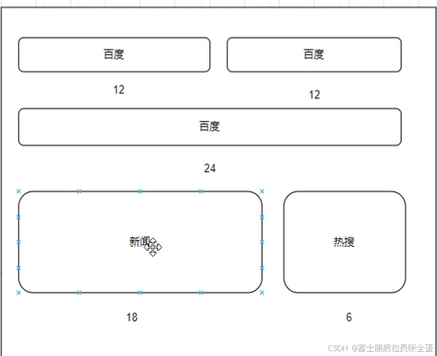
如果超过24了,那么就另外启动一行来摆放。
        <el-header style="flex:1">
              <el-row>
                <el-col :span="24" style="background-color: yellow;">123</el-col>
              </el-row>
              <el-row :gutter="15">
                <el-col :span="6" ><div style="background-color: red;">123</div></el-col>
                <el-col :span="16"><div style="background-color: green;">123</div></el-col>
                <el-col :span="1"><div style="background-color: blue;">123</div></el-col>
                <el-col :span="1"><div style="background-color: burlywood;">123</div></el-col>
              </el-row>
        </el-header>
offset是左侧的间隔格数
        <el-header style="flex:1">
              <el-row>
                <el-col :span="24" style="background-color: yellow;">123</el-col>
              </el-row>
              <el-row :gutter="15">
                <el-col :offset="1" :span="6" ><div style="background-color: red;">123</div></el-col>
                <el-col :span="16"><div style="background-color: green;">123</div></el-col>
                <el-col :span="1"><div style="background-color: blue;">123</div></el-col>
                <el-col :span="1"><div style="background-color: burlywood;">123</div></el-col>
              </el-row>
        </el-header>
下面el-col里面放置图标按钮,这里一个方法是控制它的折叠的。这里没有使用button去实现,而是使用了div去实现,div里面放了一个图标去实现类似按钮的东西。不是纯使用按钮去实现的,这样也是可以的。
很灵活,想怎么组合就可以怎么组合。这里还需要使用css去将其处理一下。
               <el-header  class="header">
                   <el-row :gutter="20">
                      <el-col :span="1">
                         <!--折叠按钮 根据isCollapse来设置是否可以展开和折叠-->
                         <div class="header-collapse" @click="onCollapse">
                             <el-icon><component :is="isCollapse ? 'expand':'fold'"/>   </el-icon>
                         </div>

                      </el-col>
                   </el-row>
              </el-header>


<script>
//这里添加了一个属性routers,要去获取路由规则
import { useRouter } from 'vue-router';
   export default({
      data() {
         return {
            logo: require('../assets/k8s.png'),
            asideWidth: '220px',
            isCollapse: false,
            routers: []
         }
      },
      methods:{
         onCollapse(){
            if(this.isCollapse) {
            //如果为true,已经折叠了,那么就需要展开
             this.asideWidth = '220px'
             this.isCollapse = false
         }else {
              this.asideWidth = '64px'
              this.isCollapse = true
         }
      }
    },
      mounted() {
          //获取router中的所有路由规则
          this.routers = useRouter().options.routes
          console.log(this.routers)
         }
   })
</script>
图标的大小也是front-size来调整的


 扫一扫
扫一扫


 1345
1345

 被折叠的 条评论
为什么被折叠?
被折叠的 条评论
为什么被折叠?
 到【灌水乐园】发言


