


需求:
瀑布流, 图片大小统一不变, 描述长度根据内容确定, 不超过三行.
分两列,那边矮,下个元素就放那边
如图所示:

1. 给item设置top,和left
由于我的项目做了 amfe-flexible适配所以使用rem
完整 template
<template>
<div class="HomePage">
<van-list
:immediate-check="false"
v-model="loading"
:finished="finished"
finished-text="没有更多了"
@load="onLoad"
>
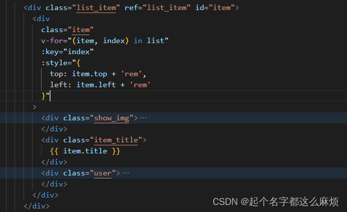
<div class="list_item" ref="list_item" id="item">
<div
class="item"
v-for="(item, index) in list"
:key="index"
:style="{
top: item.top + 'rem',
left: item.left + 'rem'
}"
>
<div class="show_img">
<img
v-if="item.type == 'images'"
:src="item.image"
alt="展示图片"
/>
<img
v-else-if="item.type == 'video'"
class=""
:src="item.videoSrc.poster"
alt=""
@click="toVideoPage(index)"
/>
<div class="is_vide" v-if="item.type == 'video'">
<span class="iconfont icon-bofang"></span>
</div>
</div>
<div class="item_title">
{{ item.title }}
</div>
<div class="user">
<div class="user_msg">
<div class="user_img">
<img :src="item.touXiang" alt="头像" />
</div>
<span>{{ item.userName }}</span>
</div>
<div class="count" @click.stop="amountOfConsent(index)">
<van-icon name="like-o" v-if="item.agreeWithState == 0" />
<van-icon name="like" color="#FF2442" v-else />
<span>{{ item.agreeWith | filterAmountOfConsent }}</span>
</div>
</div>
</div>
</div>
</van-list>
</div>
</template>2. 容器也子元素子绝父相
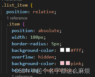
这里的item宽度我直接写死了180
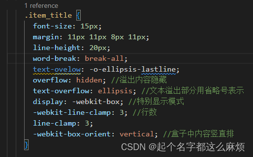
3.描述部分,设置最多三行
完整 css
<style lang="less" scoped>
.HomePage {
  background-color: #fafafa;
}

.list_item {
  position: relative;
  .item {
    position: absolute;
    width: 180px;
    border-radius: 5px;
    background-color: #fff;
    overflow: hidden;
    background-color: pink;
    box-sizing: content-box;
    .show_img {
      height: 240px;
      position: relative;
      img {
        width: 100%;
        height: 100%;
      }

      .is_vide {
        position: absolute;
        top: 12px;
        right: 12px;
        width: 20px;
        height: 20px;
        background-color: rgba(0, 0, 0, 0.5);
        border-radius: 15px;
        display: flex;
        align-items: center;
        justify-content: center;

        .iconfont {
          color: #fff;
          font-size: 12px;
          transform: scale(0.7);
        }
      }
    }

    .item_title {
      font-size: 15px;
      margin: 11px 11px 8px 11px;
      line-height: 20px;
      word-break: break-all;
      text-ovelow: -o-ellipsis-lastline;
      overflow: hidden; //溢出内容隐藏
      text-overflow: ellipsis; //文本溢出部分用省略号表示
      display: -webkit-box; //特别显示模式
      -webkit-line-clamp: 3; //行数
      line-clamp: 3;
      -webkit-box-orient: vertical; //盒子中内容竖直排
    }

    .user {
      padding: 0 8px;
      padding-bottom: 12px;
      display: flex;
      align-items: center;
      justify-content: space-between;

      .user_msg {
        display: flex;
        align-items: center;
        .user_img {
          width: 20px;
          height: 20px;
          border-radius: 10px;
          overflow: hidden;

          img {
            width: 100%;
            height: 100%;
            display: block;
          }
        }

        & > span {
          color: #999;
          font-size: 12px;
          margin-left: 6px;
          width: 85px;
          white-space: nowrap; // 强制一行显示
          overflow: hidden; // 超出隐藏
          text-overflow: ellipsis; // 省略号
        }
      }

      .count {
        color: #999;
        font-size: 12px;

        & > span {
          margin-left: 3px;
        }
      }
    }
  }
}
</style>
4, js部分
data() {
return {
list: [],
loading: false,
finished: false,
designDrawing: 37.5, //设计图
waterfallWidth: 180, // 每个盒子的宽度
waterfallCol: 2, // 瀑布流的列数
waterfallLeft: 5, // 每个盒子的右padding
waterfallBottom: 8, // 每个盒子的下padding
waterfallDeviationHeight: [], // 存放列的高度
};
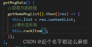
},获取数据后调用核心函数
核心函数讲解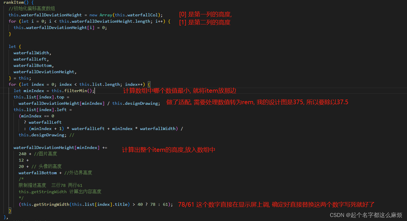
完整 rankItem()
rankItem() {
      //初始化偏移高度数组
      this.waterfallDeviationHeight = new Array(this.waterfallCol);
      for (let i = 0; i < this.waterfallDeviationHeight.length; i++) {
        this.waterfallDeviationHeight[i] = 0;
      }

      let {
        waterfallWidth,
        waterfallLeft,
        waterfallBottom,
        waterfallDeviationHeight,
      } = this;
      for (let index = 0; index < this.list.length; index++) {
        let minIndex = this.filterMin();
        this.list[index].top =
          waterfallDeviationHeight[minIndex] / this.designDrawing;
        this.list[index].left =
          (minIndex == 0
            ? waterfallLeft
            : (minIndex + 1) * waterfallLeft + minIndex * waterfallWidth) /
          this.designDrawing; //

        waterfallDeviationHeight[minIndex] +=
          240 + //图片高度
          12 +
          20 + // 头像的高度
          waterfallBottom + //外边界高度
          /*
          限制描述高度  三行78 两行61
          this.getStringWidth 计算出内容高度
          */
          (this.getStringWidth(this.list[index].title) > 40 ? 78 : 61);
      }
    },
完整 filterMin()
 filterMin() {
      const min = Math.min.apply(null, this.waterfallDeviationHeight);
      return this.waterfallDeviationHeight.indexOf(min);
    },
完整 getStringWidth()
字体的高宽不等于字节, 所以只能通过offsetHeight获取文字高度
getStringWidth(val) {
      console.log(this.waterfallWidth);
      let divWidth = this.waterfallWidth - 22;

      let div = document.createElement("div");
      div.innerHTML = val;
      div.style.width = divWidth + "px";
      div.style =
        `
        font-size: 15px;
        line-height: 20px;
        overflow: hidden; //溢出内容隐藏
        text-overflow: ellipsis; //文本溢出部分用省略号表示
        display: -webkit-box; //特别显示模式
        -webkit-line-clamp: 3; //行数
        line-clamp: 3;
        -webkit-box-orient: vertical; //盒子中内容竖直排
      `;
      div.setAttribute("class", "fontSize");
      document.getElementsByTagName("body")[0].appendChild(div);
      let fontSizeDiv = document.getElementsByClassName("fontSize")[0];
      let fontSizeDivHeight = fontSizeDiv.offsetHeight;
      document.getElementsByTagName("body")[0].removeChild(fontSizeDiv);

      return fontSizeDivHeight;
    },


 扫一扫
扫一扫


 3828
3828

 被折叠的 条评论
为什么被折叠?
被折叠的 条评论
为什么被折叠?
 到【灌水乐园】发言


