


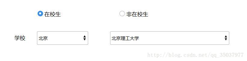
实现上述效果的代码,如下
...
<div class=radio>
    <input type="radio" name="deo" id="deo1">
    <label for="deo1"></label>
    <input type="radio" name="deo" id="deo2">
    <label for="deo2"></label>
</div>
...
.radio input {
display: none;/*取消默认样式*/
}
.radio input+label { /*紧接input出现的label,要有相同父元素*/
display: inline-block;
position: relative;
border-radius: 50%;
border: 1px #aaa solid;
width: 14px; /*外圈圆高度、宽度*/
height: 14px;
}
.radio input+label::after { /*伪元素制作内部的圆*/
content: " ";
border-radius: 50%;
position: absolute;/*居中方法*/
top: 50%;
left: 50%;
width: 6px; /*中心圆的宽度、高度*/
height: 6px;
margin-top: -3px;
margin-left: -3px;
}
.radio input:checked+label {
background-color: blue;/*选中后外圈圆颜色*/
border-color: blue;
}
.radio input:checked+label::after {
background-color: white;/*选中radio中心圆的颜色*/
} <select>
<option value="1">1</option>
<option value="2">2</option>
<option value="2">3</option>
<select> select::-ms-expand { display: none; }/*IE,将默认的select选择框样式清除*/
select {
/*将默认的select选择框样式清除*/
appearance: none;
-moz-appearance: none;
-webkit-appearance: none;
background: url("自定义图片.xxx") no-repeat scroll right center transparent;
background-size: 18px 26px;
}


 1151
1151

 被折叠的 条评论
为什么被折叠?
被折叠的 条评论
为什么被折叠?
 到【灌水乐园】发言


