


目录
1、效果展示
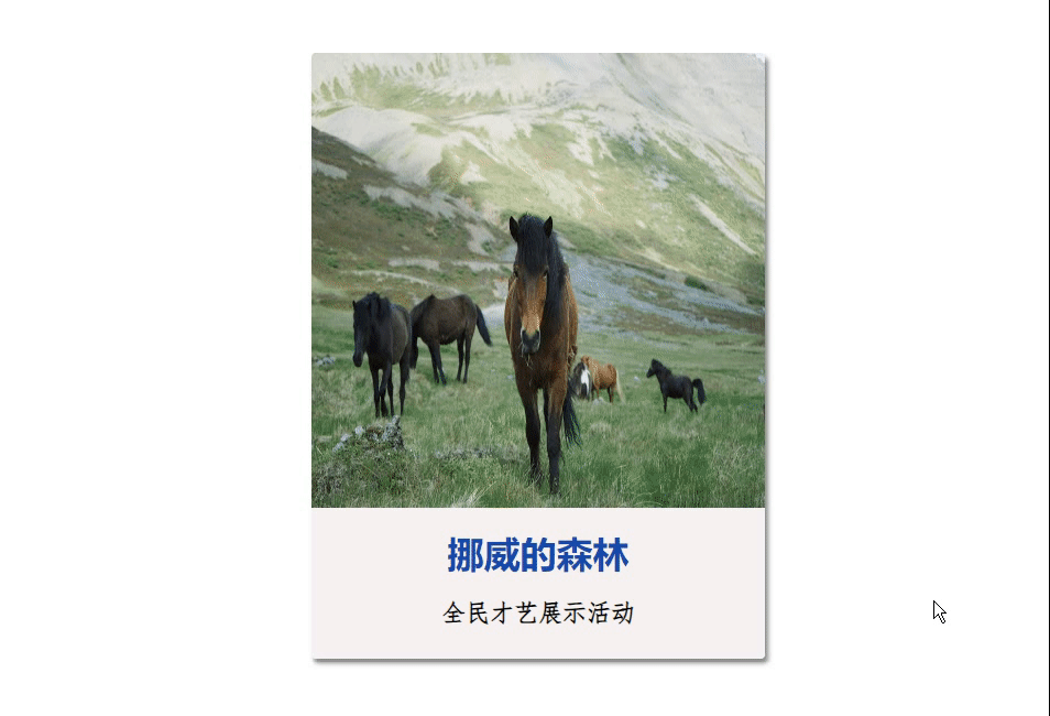
前端样式展示时,有时候会以鼠标悬停,上浮展示信息,如下图效果。
2、源码
<template>
  <div class="div1">
    <div class="img1">
      <img src="https://fuss10.elemecdn.com/1/34/19aa98b1fcb2781c4fba33d850549jpeg.jpeg">
    </div>
    <div class="div2">
      <h2>挪威的森林</h2>
      <p style="padding-bottom: 20px;">全民才艺展示活动</p>
      <p>
        让我将你心儿摘下,试着将它慢慢溶化,看我在你心中是否仍完美无瑕;
        是否依然为我丝丝牵挂、依然爱我无法自拔、心中是否有我未曾到过的地方啊!
        那里湖面总是澄清;那里空气充满宁静;雪白明月照在大,藏着你不愿提起的回忆。
        你说真心总是可以从头;真爱总是可以长久;为何你的眼神还有孤独时的落寞。
      </p>
    </div>
  </div>
</template>

<style scoped>
  *{
    margin: 0;
    padding: 0;
    box-sizing: border-box;
  }
  body{
    height: 100vh;
    display: flex;
    justify-content: center;
    align-items: center;
    background-image: radial-gradient(rgb(241, 238, 238),black);
  }
  .div1{
    position: relative;
    width: 300px;
    height: 400px;
    border-radius: 3px;
    background-color: #fff;
    box-shadow: 2px 3px 3px rgb(139, 138, 138);
    overflow: hidden;
    cursor: pointer;
    transition: all 0.3s;  /*过渡效果,阴影在0.3s内慢慢变化*/
    margin-left: 35%;
    margin-top: 100px;
  }
  .div1:hover{
    box-shadow: 2px 3px 10px rgb(36, 35, 35);  /*鼠标经过后盒子阴影变化。*/
  }
  .img1{
    position: absolute;
    top: 0;
    left: 0;
    width: 100%;
    height: 300px;
    overflow: hidden;

  }
  .img1 img{
    width: 100%;
    height: 100%;
    transition: all 0.5s;
  }
  .div1:hover .img1 img{
    transform: scale(1.2); /*图片变大为1.2倍*/
    filter: blur(1px);     /*图片变模糊*/
  }
  .div2{
    position: absolute;
    bottom: -200px;
    width: 100%;
    height: 300px;

    background-color: rgb(247, 242, 242);
    transition: 0.5s;
  }
  .div1:hover .div2{
    bottom: 0px;
  }
  .div2 h2{
    color: rgb(21, 74, 172);
    line-height: 60px;
    text-align: center;

  }
  .div2 p{
    padding: 0 30px;
    font-family: 'fangsong';
    font-size: 16px;
    font-weight: bold;
    line-height: 20px;
    text-align: center;
  }
</style>
<script>
  export default {
    data() {
      return {
      };
    },
    methods: {

    },
  };
</script>
思路:
1、定义最外层div盒子: <div class="div1">
2、里面 放两个盒子: <div class="img1"> 、 <div class="div2">; 一个存放图片,一个存放文本。
3、最外层div样式处理
.div1{}
4、图片样式处理
.img1{}
5、文本盒子样式处理
.div2 {
position: absolute;
bottom: -200px;
width: 100%;
height: 300px;
background-color: rgb(247, 242, 242);
transition: 0.5s;
}
.kapian:hover .wenben{
bottom: 0px;
}
:hover鼠标经过后文本框绝对定位的bottom发生改变,使得呈现文本框向上展开的效果。
6、文本文字样式
.div2 h2{
  color: rgb(21, 74, 172);
  line-height: 60px;
  text-align: center;

}
.div2 p{
  padding: 0 30px;
  font-family: 'fangsong';
  font-size: 16px;
  font-weight: bold;
  line-height: 20px;
  text-align: center;
}


 452
452

 被折叠的 条评论
为什么被折叠?
被折叠的 条评论
为什么被折叠?
 到【灌水乐园】发言


