


Python 画相关性图
import pandas as pd
import numpy as np
from colormaps import parula
from matplotlib.ticker import FormatStrFormatter
import matplotlib.pyplot as plt
import seaborn as sns
plt.rcParams['font.family']='Times New Roman'# 设置字体族,中文为SimSun,英文为Times New Roman
plt.rcParams['font.weight'] = 580
# 这里可以优化,本人比较懒
city1_PM25 = pd.read_excel(r"deo/CITY1.xls", nrows=2, sheet_name='CO2')
city2_PM25 = pd.read_excel(r"deo/CITY2.xls", nrows=2, sheet_name='CO2')
city3_PM25 = pd.read_excel(r"deo/CITY3.xls", nrows=2, sheet_name='CO2')
city4_PM25 = pd.read_excel(r"deo/CITY4.xls", nrows=2, sheet_name='CO2')
city5_PM25 = pd.read_excel(r"deo/CITY5.xls", nrows=2, sheet_name='CO2')
city6_PM25 = pd.read_excel(r"deo/CITY6.xls", nrows=2, sheet_name='CO2')
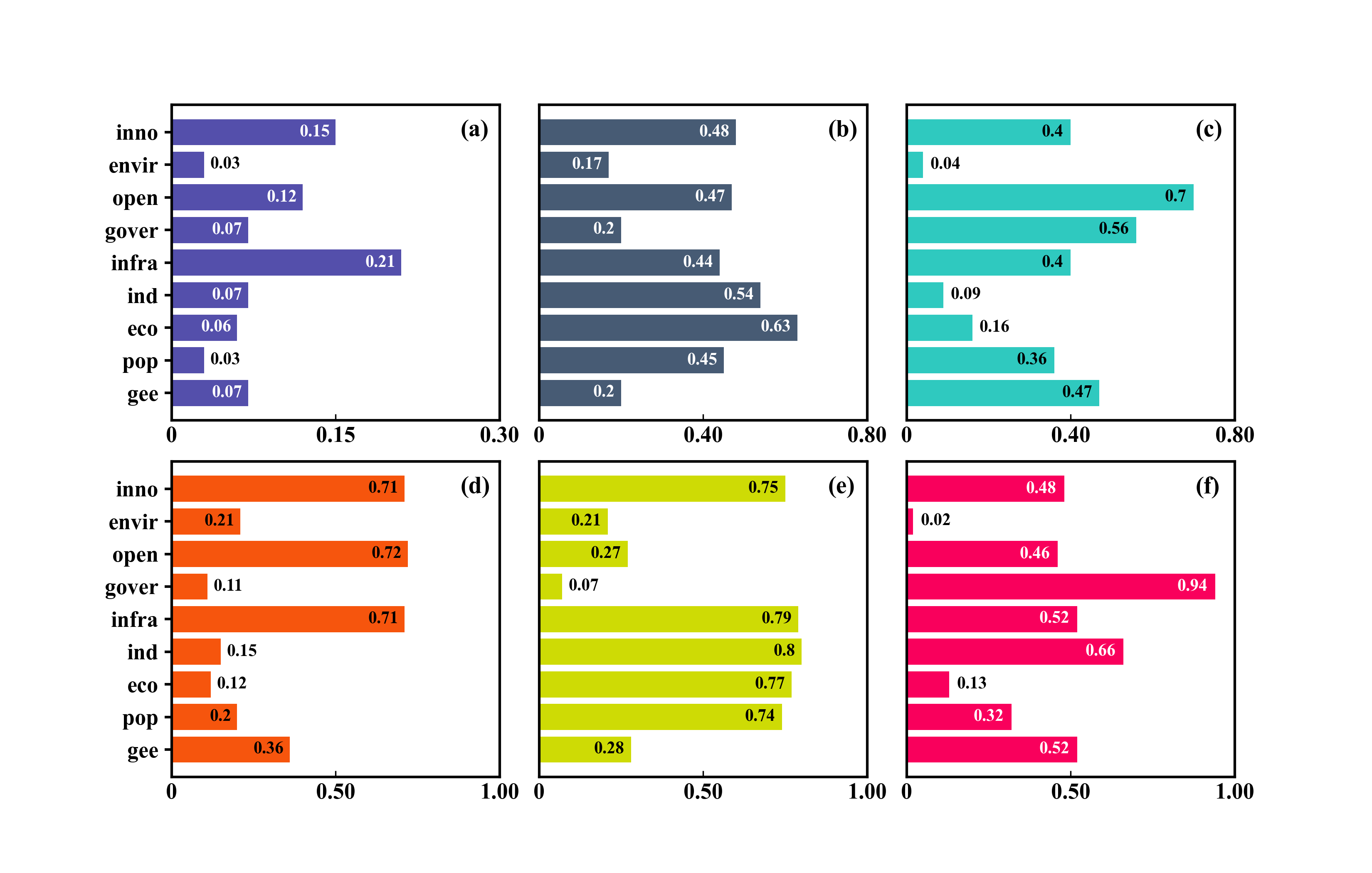
fig,axes = plt.subplots(2,3,figsize=(11,7),dpi=300,facecolor="w")
data = [city1_PM25, city2_PM25, city3_PM25, city4_PM25, city5_PM25, city6_PM25]
colors = ['#544FAB', '#475B74', '#2FC9BF', '#F6550D', '#CEDB05', '#F9005C',]
labels = ['(a)', '(b)', '(c)', '(d)', '(e)', '(f)', ]
# 设置子图边框样式和颜色
for i, ax in enumerate(axes.flatten()):
ax.tick_params(axis="x", which="major",labelsize=13,direction="in")
ax.text(0.88,0.9,labels[i],fontsize=14,transform=ax.transAxes)
ax.spines[['top','right','bottom','left']].set_visible(True)
ax.spines[['top','right','bottom','left']].set_linewidth(1.5)
ax.barh(data[i].columns,data[i].iloc[0,:],height=0.8, align="center", color=colors[i])
if (i in [1,2,4,5]):
ax.tick_params(axis="y", which="major",labelsize=13,width=1.5, length=0,)
ax.set_yticklabels('')
else: # 只有第一列显示Y轴标签
ax.tick_params(axis="y", which="major",labelsize=13,width=1.5, length=4,)
# 在每个条形内部添加值的文本标签
Threshold = data[i].iloc[0,:].max() * 0.25 #定义一个阈值,小于这个数的,数值显示在柱子外面
for j, value in enumerate(data[i].iloc[0,:]):
if value < Threshold: # 标签在外
ax.text(value + Threshold*0.1, j, str(value), ha='left', va='center',fontsize=10)
else: # 标签在里
if i in [0,1,5]:
ax.text(value - Threshold*0.1, j, str(value), ha='right', va='center', color='white', fontsize=10)
else:
ax.text(value - Threshold*0.1, j, str(value), ha='right', va='center', fontsize=10)
axes[0,0].set_xticks([0.00,0.15,0.30])
axes[0,0].set_xticklabels(['0','0.15','0.30'])
axes[0,1].set_xticks([0.00,0.40,0.80])
axes[0,1].set_xticklabels(['0','0.40','0.80'])
axes[0,2].set_xticks([0.00,0.40,0.80])
axes[0,2].set_xticklabels(['0','0.40','0.80'])
axes[1,0].set_xticks([0.00,0.50,1.00])
axes[1,0].set_xticklabels(['0','0.50','1.00'])
axes[1,1].set_xticks([0.00,0.50,1.00])
axes[1,1].set_xticklabels(['0','0.50','1.00'])
axes[1,2].set_xticks([0.00,0.50,1.00])
axes[1,2].set_xticklabels(['0','0.50','1.00'])
# 设置子图间距
plt.subplots_adjust(hspace=0.13, wspace=0.12)
# plt.tight_layout()
fig.savefig('相关性图.png')


 被折叠的 条评论
为什么被折叠?
被折叠的 条评论
为什么被折叠?
 到【灌水乐园】发言


