


大家都知道设置CheckBox的选中以及未选中效果可以使用selector,这种方式比较简单也比较传统这里不做讨论。我最近在做项目的时候使用的是Appcompatcheckbox,这个控件是一个兼容控件,在support-V7包中
android.support.v7.widget.AppCompatCheckBox,主要是可以实现Material风格的效果,即使在Android5.0以下的系统也可以。
设置方法如下:
先定义Checkbox的style,在style.xml文件中
<style name="MyCheckBox" parent="Theme.AppCompat.Light">
    <item name="colorControlNormal">@color/green</item>
    <item name="colorControlActivated">@color/gray</item>
</style>- 1
- 2
- 3
- 4
colorControlActivated表示选中时的颜色,colorControlNormal是未选中的颜色
然后在布局文件中,对控件设置主题
<android.support.v7.widget.AppCompatCheckBox
                android:id="@+id/preview_checkbox"
                android:layout_width="wrap_content"
                android:layout_height="wrap_content"
                android:theme="@style/MyCheckBox"
android:text="选择"/>- 1
- 2
- 3
- 4
- 5
- 6
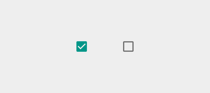
下面是效果,但是图是我盗的
但是真实使用的时候也许你会遇到一些问题,比如下面是我的布局,我禁止了Checkbox的点击事件,并且将它设置为enable=false,使用外层的布局的点击事件控制里面checkbox的选中与取消选中。这时候我发现怎么都变不成绿色,在网上查了很久我发现了下最下面的一张图,一切都恍然大悟。disable状态时选中也是灰色。
<RelativeLayout
        android:id="@+id/checkbox_layout"
        android:layout_width="wrap_content"
        android:layout_toRightOf="@id/checkbox1"
        android:layout_height="wrap_content">

        <android.support.v7.widget.AppCompatCheckBox
            android:id="@+id/checkbox2"
            android:layout_width="wrap_content"
            android:layout_height="wrap_content"
            android:layout_marginRight="20dp"
            android:enabled="false"
            android:clickable="false"
            android:theme="@style/MyCheckBox"
            android:text="CheckBox"/>
    </RelativeLayout>

转自:https://blog.csdn.net/dreamsever/article/details/52253426


 1057
1057


 被折叠的 条评论
为什么被折叠?
被折叠的 条评论
为什么被折叠?
 到【灌水乐园】发言


