移实战动端开发之viewport
今天是久违了的六一,尽管我们都已经长大,可是博主还想说一句。。六一快乐!,今天博主带来的分享是移动端开发之viewport实战!楼主主要模仿了QQ刚进去时候的手机端页面,,为了提高大家的阅读兴趣,我们先来贴下效果把!
1、效果如下:
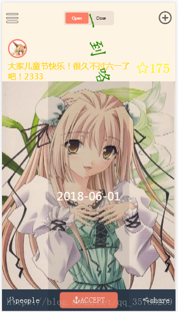
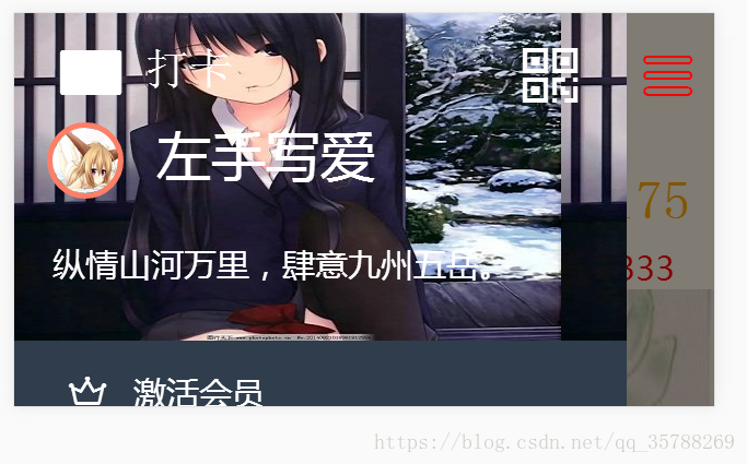
首先,我们刚进去的效果是这样的,标题“六一到咯!”旋转一周之后停下,最后显示为红色,从进入开始,头像下边的文字以及星星都是七彩不间断闪烁的!
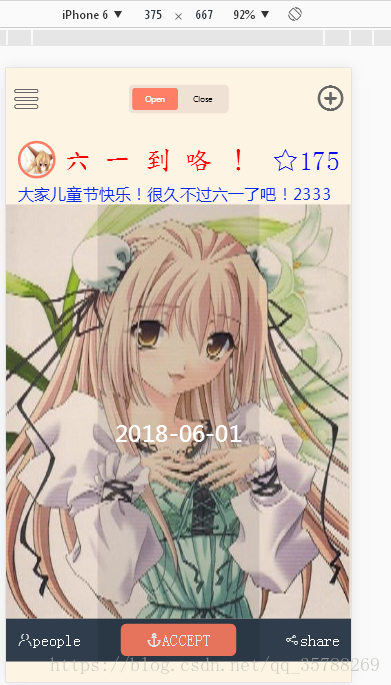
2、标题旋转后为红色,截图如下;
3、点击左上角的菜单符号,会刷出另外一个界面,类似与QQ的!效果如下图所示!
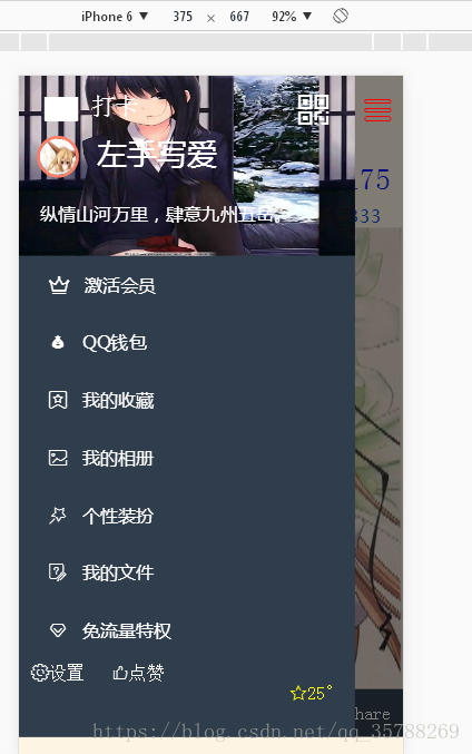
4、这个页面右下角的星星还有温度也是七彩闪烁的!
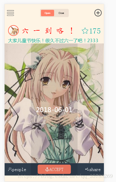
5、点击页面的右上角的菜单符号,页面又会回到刚开始进入的样子,但是要刷新标题才会有动画,因为博主设定了动画的次数为1次!效果如下图:
好咯,这就是博主这次的分享的效果,喜欢的朋友可以复制下面的代码。自己观看下!
楼主上一篇博文贴的是rem布局,,对于viewport来说,,博主觉得还是很方便的,,至少比rem方便!总体来说,viewport
方式开发主要就是解决各种设备的兼容性问题!显然,它可以兼容目前市场的主流设备!大家在做作品时候可以自行选择适合的方法!
对!viewport重要之处就在于如何使得代码适应不同的设备呢?通俗的来说,他是通过scale这个属性来实现等比例缩放的!
即为用移动端设备屏幕的宽度 除以页面自身的宽度,从而得到一个比例!这样,页面所有的东西都按照那个比例进行缩放!从而,就实现了不同设备上的适应问题!
对于设备适应问题,博主这里采用的是JS来实现的!代码如下:
window.
mobileUtil = (
function(
win,
doc) {
var
UA =
navigator.
userAgent,
isAndroid =
/android
|
adr/
gi.
test(
UA),
isIos =
/iphone
|
ipod
|
ipad/
gi.
test(
UA) && !
isAndroid,
// 据说某些国产机的UA会同时包含 android iphone 字符
isMobile =
isAndroid ||
isIos;
// 粗略的判断
return {
isAndroid:
isAndroid,
isIos:
isIos,
isMobile:
isMobile,
isNewsApp:
/NewsApp
\/
[
\d
\.
]
+
/
gi.
test(
UA),
isWeixin:
/MicroMessenger/
gi.
test(
UA),
isQQ:
/QQ
\/
\d/
gi.
test(
UA),
isYixin:
/YiXin/
gi.
test(
UA),
isWeibo:
/Weibo/
gi.
test(
UA),
isTXWeibo:
/T
(?:
X
|
encent
)
MicroBlog/
gi.
test(
UA),
tapEvent:
isMobile ?
'tap' :
'click',
/**
* 缩放页面
*/
fixScreen
:
function() {
var
metaEl =
doc.
querySelector(
'meta[name="viewport"]'),
metaCtt =
metaEl ?
metaEl.
content :
'',
matchScale =
metaCtt.
match(
/initial
\-
scale=
([
\d
\.
]
+
)
/),
matchWidth =
metaCtt.
match(
/width=
([^
,\s
]
+
)
/);
if ( !
metaEl ) {
// REM
var
docEl =
doc.
documentElement,
maxwidth =
docEl.
dataset.
mw ||
750,
// 每 dpr 最大页面宽度
dpr =
isIos ?
Math.
min(
win.
devicePixelRatio,
3) :
1,
scale =
1 /
dpr,
tid;
docEl.
removeAttribute(
'data-mw');
docEl.
dataset.
dpr =
dpr;
metaEl =
doc.
createElement(
'meta');
metaEl.
name =
'viewport';
metaEl.
content =
fillScale(
scale);
docEl.
firstElementChild.
appendChild(
metaEl);
var
refreshRem =
function() {
var
width =
docEl.
getBoundingClientRect().
width;
if (
width /
dpr >
maxwidth) {
width =
maxwidth *
dpr;
}
var
rem =
width /
16;
docEl.
style.
fontSize =
rem +
'px';
};
win.
addEventListener(
'resize',
function() {
clearTimeout(
tid);
tid =
setTimeout(
refreshRem,
300);
},
false);
win.
addEventListener(
'pageshow',
function(
e) {
if (
e.
persisted) {
clearTimeout(
tid);
tid =
setTimeout(
refreshRem,
300);
}
},
false);
refreshRem();
}
else
if (
isMobile && !
matchScale && (
matchWidth &&
matchWidth[
1] !=
'device-width' ) ) {
// 定宽
var
width =
parseInt(
matchWidth[
1]),
iw =
win.
innerWidth ||
width,
ow =
win.
outerWidth ||
iw,
sw =
win.
screen.
width ||
iw,
saw =
win.
screen.
availWidth ||
iw,
ih =
win.
innerHeight ||
width,
oh =
win.
outerHeight ||
ih,
ish =
win.
screen.
height ||
ih,
sah =
win.
screen.
availHeight ||
ih,
w =
Math.
min(
iw,
ow,
sw,
saw,
ih,
oh,
ish,
sah),
scale =
w /
width;
if (
scale <
1 ) {
metaEl.
content =
metaCtt +
',' +
fillScale(
scale);
}
}
function
fillScale(
scale) {
return
'initial-scale=' +
scale +
',maximum-scale=' +
scale +
',minimum-scale=' +
scale +
',user-scalable=no';
}
},
/**
* 转href参数成键值对
*
@param
href
{string} 指定的href,默认为当前页href
*
@returns
{object}
键值对
*/
getSearch
:
function(
href) {
href =
href ||
win.
location.
search;
var
data = {},
reg =
new
RegExp(
"([^?=&]+)(=([^&]*))?",
"g" );
href &&
href.
replace(
reg,
function(
$0,
$1,
$2,
$3 ){
data[
$1 ] =
$3;
});
return
data;
}
};
})(
window,
document);
// 默认直接适配页面
mobileUtil.
fixScreen();
代码中有部分注释,,博主简单的分析下这里,就是检测移动端设备的种类,是安卓还是苹果?是不是移动端?获取屏幕的宽度,计算出比例,求出scale数值,按照比例配置页面!大体上就是这样子,详细部分可自行了解!
写到这里,相信大家都等不及代码了把!嗯。博主的代码依然是四部分!HTML CSS 移动端设备兼容JS 其他常用设置
第一部分:HTML部分:
<!DOCTYPE html
>
<
html
lang=
"en"
>
<
head
>
<
meta
charset=
"UTF-8"
>
<
meta
name=
"viewport"
content=
"width=device-width, initial-scale=1.0"
>
<
meta
http-equiv=
"X-UA-Compatible"
content=
"ie=edge"
>
<
title
>Document
</
title
>
<
link
rel=
"stylesheet"
type=
"text/css"
href=
"font./iconfont.css"
>
<
link
rel=
"stylesheet"
href=
"style/reset.css"
type=
"text/css"
>
<
link
rel=
"stylesheet"
href=
"style/common.css"
type=
"text/css"
>
<
meta
id=
"viewport"
name=
"viewport"
content=
"width=640"
>
<
script
src=
"mobile-util.js"
>
<
/
script
>
<
script
>
<
/
script
>
</
head
>
<
body
>
<
div
class=
"box "
id=
"box"
>
<
div
class=
"page"
>
<
header
class=
"clearfix"
>
<
a
href=
"javascript:;"
id=
"menu"
class=
"menu
fl iconfont icon-iconset0193"
></
a
>
<
span
class=
"header_item"
>
<
a
href=
"#"
class=
"active"
>Open
</
a
>
<
a
href=
"#"
>Close
</
a
>
</
span
>
<
a
href=
"javascript:;"
class=
"add fr
iconfont icon-tianjia2"
></
a
>
</
header
>
</
div
>
<
div
class=
"item"
>
<
div
class=
"item_hd"
>
<
div
class=
"item_tit"
clearfix
>
<
div
class=
"user_img"
>
<
img
src=
"img/11.jpg"
alt=
""
>
</
div
>
<
h3
>六 一 到 咯 !
</
h3
>
<
span
class=
"iconfont icon-star save"
>175
</
span
>
</
div
>
<
p
class=
"info_text"
>大家儿童节快乐!很久不过六一了吧!2333
</
p
>
</
div
>
<
div
class=
"item_bd"
>
<
div
class=
"ibd_img"
>
<
img
src=
"img/6.jpg"
alt=
""
>
<
div
class=
"ibd_time"
><
i
></
i
><
span
>2018-06-01
</
span
></
div
>
<
div
class=
"btns clearfix"
>
<
span
class=
"people fl iconfont icon-yonghu"
>people
</
span
>
<
span
class=
"share fr iconfont icon-fenxiang "
>share
</
span
>
<
a
href=
""
class=
"btn_mao iconfont icon-mao "
>ACCEPT
</
a
>
</
div
>
</
div
>
</
div
>
</
div
>
<
div
class=
"mask"
>
<
div
class=
"leftNav"
>
<
a
href=
"javascript:;"
id=
"menu2"
class=
"menu
fl iconfont icon-iconset0193"
></
a
>
<
div
class=
"top1"
>
<
div
class=
"item_tit1"
clearfix
>
<
span
class=
"daka fl iconfont icon-daqiaqi"
><
i
>打卡
</
i
></
span
>
<
span
class=
"erweima fr iconfont icon-erweima- "
></
span
>
<
div
class=
"user_img"
><
span
class=
"text1"
>左手写爱
</
span
>
<
img
src=
"img/11.jpg"
alt=
""
>
<
div
class=
"text2"
>
<
p
>纵情山河万里,肆意九州五岳。
</
p
>
</
div
>
</
div
>
</
div
>
</
div
>
<
div
class=
"item3"
>
<
ul
>
<
li
><
a
href=
""
class=
"huiyuan iconfont icon-huiyuan"
></
a
>激活会员
</
li
>
<
li
><
a
href=
""
class=
"qianbao iconfont icon-qianbao"
></
a
>QQ钱包
</
li
>
<
li
><
a
href=
""
class=
"zhuangban iconfont icon-wodeshoucang1 "
></
a
>我的收藏
</
li
>
<
li
><
a
href=
""
class=
"shoucang iconfont icon-pic "
></
a
>我的相册
</
li
>
<
li
><
a
href=
""
class=
"xiangce iconfont icon-grab "
></
a
>个性装扮
</
li
>
<
li
><
a
href=
""
class=
"wenjian iconfont icon-survey "
></
a
>我的文件
</
li
>
<
li
><
a
href=
""
class=
"tequan iconfont icon-tequan "
></
a
>免流量特权
</
li
>
</
ul
>
</
div
>
<
div
class=
"bottoml clearfix"
>
<
span
><
a
href=
""
class=
"shezhi iconfont icon-set"
>设置
</
a
></
span
>
<
span
><
a
href=
""
class=
"dianzan iconfont icon-dianzan3"
>点赞
</
a
></
span
>
<
span
><
a
href=
""
class=
"wendu iconfont icon-star"
><
span
id=
"star"
>25°
</
span
></
a
></
span
>
</
div
>
</
div
>
</
div
>
<
script
>
var
oMe =
document.
getElementById(
'menu');
var
oMe2 =
document.
getElementById(
'menu2');
var
oBox =
document.
getElementById(
'box');
oMe.
onclick =
function(){
oBox.
className =
'box open';
}
oMe2.
onclick =
function(){
oBox.
className =
'box';
}
<
/
script
>
</
body
>
</
html
>
第二部分:CSS部分:common.css:
body{
background-color:
#FEF4E4;
}
.box{
width:
640px;
margin:
0
auto;
position:
relative;
}
header{
padding:
31px
11px
10px;
text-align:
center;
}
.menu,.add{
width:
53px;
height:
53px;
font-size:
50px;
color:
#666;
text-align:
center;
line-height:
53px;
}
.header_item{
display:
inline-block;
padding:
6px;
border-radius:
8px;
background-color:
#EFE1D3;
}
.header_item a{
display:
inline-block;
height:
41px;
line-height:
41px;
padding:
0
24px;
color:
black;
border-radius:
6px;
}
.header_item .active{
color:
white;
background-color:
#FF7F66;
}
.item_hd{
padding:
41px
22px
0;
}
.user_img{
width:
60px;
height:
60px;
border:
solid
5px
#FF7F66;
border-radius:
50%;
float:
left;
margin-right:
15px;
}
.user_img img{
width:
100%;
height:
100%;
border-radius:
50%;
}
.item_tit h3{
float:
left;
font-size:
50px;
line-height:
70px;
color:
red;
font-family:
'DFKai-SB';
/*transition: .5s .2s;*/
}
.item_tit h3{
animation:change
10s;
animation-delay:
0.5s;
animation-iteration-count:
1;
}
@keyframes
change {
0%{
transform:
rotate(
0deg);
font-size:
60px;
color:
orange;}
25%{
transform:
rotate(
90deg);
font-size:
70px;
color:
green;}
50%{
transform:
rotate(
180deg);
font-size:
80px;
color:
yellow;}
75%{
transform:
rotate(
270deg);
font-size:
60px;
color:
purple;}
100%{
transform:
rotate(
360deg);
font-size:
50px;
color:
blue;}
}
@keyframes
move {
0%{
color:
orange;}
15%{
color:
yellow; }
30%{
color:
green;}
45%{
color:
lightseagreen;}
60%{
color:
blue;}
75%{
color:
purple;}
100%{
color:
red;}
}
.icon-star{
font-size:
50px;
line-height:
70px;
float:
right;
animation:
move
10s ;
animation-delay:
1s;
animation-iteration-count:
infinite;
}
.icon-star:before{
margin-left:
8px;
}
.info_text{
margin-top:
80px;
font-size:
30px;
line-height:
38px;
animation:
move
10s ;
animation-delay:
1.5s;
animation-iteration-count:
infinite;
}
.ibd_img{
position:
relative;
}
.ibd_img img{
width:
100%;
}
.ibd_time {
width:
300px;
position:
absolute;
font-size:
300%;
left:
50%;
top:
0;
height:
100%;
background-color:
rgba(
0,
0,
0,
.1);
color:
#FFF;
margin-left:
-150px;
text-align:
center;
}
.ibd_time i{
display:
inline-block;
height:
100%;
vertical-align:
middle;
}
.ibd_time span{
vertical-align:
middle;
}
.btns{
height:
80px;
background-color:
#2F3D4C;
padding:
0
20px;
}
.btn_mao{
width:
214px;
height:
60px;
margin:
10px
auto;
display:
block;
background-color:
#FF7F66;
border-radius:
10px;
color:
#fff;
font-size:
30px;
line-height:
60px;
text-align:
center;
}
.people,.share{
color:
#fff;
font-size:
30px;
line-height:
80px;
}
.leftNav{
position:
absolute;
left:
0;
top:
0;
width:
560px;
height:
100%;
background-color:
rgb(
12,
12,
39);
}
.mask{
position:
absolute;
left:
0;
top:
0;
width:
100%;
height:
100%;
display:
none;
transition:
.35s
.1s;
background-color:
rgba(
0,
0,
0,
.5)
}
.page{
transition:
.35s
.1s;}
.leftNav{
position:
absolute;
left:
0;
top:
0;
width:
560px;
transform:
translateX(
-100%);
height:
100%;
background-color:
#2F3D4C;
transition:
.35s
.1s;
}
.leftNav .menu{
position:
absolute;
right:
-64px;
top:
31px;
color:
red;
display:
none;
}
.open .mask,.open .leftNav .menu{
display:
block;
}
.open .page{
transform:
translateX(
-560px);
}
.open .leftNav{
transform:
translateX(
0);
}
.top1{
width:
560px;
background-image:
url(
../img/5.jpg);
height:
300px;
position:
relative;
}
.item_tit1{
top:
100px;
left:
30px;
position:
absolute;
}
.text1{
color:
white;
font-size:
50px;
position:
absolute;
width:
300px;
left:
100px;
line-height:
50px;
}
.daka{
position:
absolute;
font-size:
100px;
color:
white;
margin-top:
-120px;
left:
-10px;
}
.daka i{
font-size:
40px;
position:
absolute;
color:
white;
top:
40px;
width:
100px;
}
.erweima{
font-size:
50px;
position:
absolute;
color:
white;
right:
-400px;
bottom:
75px;
}
.text2{
margin-top:
50px;
color:
#FFF;
font-size:
30px;
width:
500px;
line-height:
30px;
}
.item3 a,li{
font-size:
30px;
color:
white;
padding:
25px;
}
.bottoml a{
color:
white;
font-size:
30px;
padding:
20px;
}
移动端设备兼容问题mobile-util.js
上边已经贴了一次,,为了大家更好的阅读,,在来一次把。如下:
window.
mobileUtil = (
function(
win,
doc) {
var
UA =
navigator.
userAgent,
isAndroid =
/android
|
adr/
gi.
test(
UA),
isIos =
/iphone
|
ipod
|
ipad/
gi.
test(
UA) && !
isAndroid,
// 据说某些国产机的UA会同时包含 android iphone 字符
isMobile =
isAndroid ||
isIos;
// 粗略的判断
return {
isAndroid:
isAndroid,
isIos:
isIos,
isMobile:
isMobile,
isNewsApp:
/NewsApp
\/
[
\d
\.
]
+
/
gi.
test(
UA),
isWeixin:
/MicroMessenger/
gi.
test(
UA),
isQQ:
/QQ
\/
\d/
gi.
test(
UA),
isYixin:
/YiXin/
gi.
test(
UA),
isWeibo:
/Weibo/
gi.
test(
UA),
isTXWeibo:
/T
(?:
X
|
encent
)
MicroBlog/
gi.
test(
UA),
tapEvent:
isMobile ?
'tap' :
'click',
/**
* 缩放页面
*/
fixScreen
:
function() {
var
metaEl =
doc.
querySelector(
'meta[name="viewport"]'),
metaCtt =
metaEl ?
metaEl.
content :
'',
matchScale =
metaCtt.
match(
/initial
\-
scale=
([
\d
\.
]
+
)
/),
matchWidth =
metaCtt.
match(
/width=
([^
,\s
]
+
)
/);
if ( !
metaEl ) {
// REM
var
docEl =
doc.
documentElement,
maxwidth =
docEl.
dataset.
mw ||
750,
// 每 dpr 最大页面宽度
dpr =
isIos ?
Math.
min(
win.
devicePixelRatio,
3) :
1,
scale =
1 /
dpr,
tid;
docEl.
removeAttribute(
'data-mw');
docEl.
dataset.
dpr =
dpr;
metaEl =
doc.
createElement(
'meta');
metaEl.
name =
'viewport';
metaEl.
content =
fillScale(
scale);
docEl.
firstElementChild.
appendChild(
metaEl);
var
refreshRem =
function() {
var
width =
docEl.
getBoundingClientRect().
width;
if (
width /
dpr >
maxwidth) {
width =
maxwidth *
dpr;
}
var
rem =
width /
16;
docEl.
style.
fontSize =
rem +
'px';
};
win.
addEventListener(
'resize',
function() {
clearTimeout(
tid);
tid =
setTimeout(
refreshRem,
300);
},
false);
win.
addEventListener(
'pageshow',
function(
e) {
if (
e.
persisted) {
clearTimeout(
tid);
tid =
setTimeout(
refreshRem,
300);
}
},
false);
refreshRem();
}
else
if (
isMobile && !
matchScale && (
matchWidth &&
matchWidth[
1] !=
'device-width' ) ) {
// 定宽
var
width =
parseInt(
matchWidth[
1]),
iw =
win.
innerWidth ||
width,
ow =
win.
outerWidth ||
iw,
sw =
win.
screen.
width ||
iw,
saw =
win.
screen.
availWidth ||
iw,
ih =
win.
innerHeight ||
width,
oh =
win.
outerHeight ||
ih,
ish =
win.
screen.
height ||
ih,
sah =
win.
screen.
availHeight ||
ih,
w =
Math.
min(
iw,
ow,
sw,
saw,
ih,
oh,
ish,
sah),
scale =
w /
width;
if (
scale <
1 ) {
metaEl.
content =
metaCtt +
',' +
fillScale(
scale);
}
}
function
fillScale(
scale) {
return
'initial-scale=' +
scale +
',maximum-scale=' +
scale +
',minimum-scale=' +
scale +
',user-scalable=no';
}
},
/**
* 转href参数成键值对
*
@param
href
{string} 指定的href,默认为当前页href
*
@returns
{object}
键值对
*/
getSearch
:
function(
href) {
href =
href ||
win.
location.
search;
var
data = {},
reg =
new
RegExp(
"([^?=&]+)(=([^&]*))?",
"g" );
href &&
href.
replace(
reg,
function(
$0,
$1,
$2,
$3 ){
data[
$1 ] =
$3;
});
return
data;
}
};
})(
window,
document);
// 默认直接适配页面
mobileUtil.
fixScreen();
最后,一些常用的设置,,比如清楚浮动,字体设置,颜色等等!
reset.css:
@charset
"UTF-8";
html {
font-family:
sans-serif;
-ms-text-size-adjust:
100%;
-webkit-text-size-adjust:
100%;
overflow-y:
scroll;
-webkit-overflow-scrolling:
touch; }
body {
margin:
0;
font-size:
14px;
line-height:
1.5;
color:
#333;
background-color:
#fff; }
a {
background:
transparent;
text-decoration:
none;
color:
#08c; }
a:active,a:hover {
outline:
0; }
a:hover {
color:
#006699; }
img {
border:
none;
vertical-align:
middle;
-ms-interpolation-mode: bicubic; }
button,input,optgroup,select,textarea {
color:
inherit;
font:
inherit;
margin:
0; }
button,select {
text-transform:
none; }
button,html input[
type=
"button"
],input[
type=
"reset"
],input[
type=
"submit"
] {
-webkit-appearance: button;
cursor:
pointer; *
overflow:
visible; }
button[
disabled
],html input[
disabled
] {
cursor:
default; }
button::-moz-focus-inner,input::-moz-focus-inner {
border:
0;
padding:
0; }
input {
line-height:
normal; }
input[
type=
"checkbox"
],
input[
type=
"radio"
] {
box-sizing:
border-box;
padding:
0; *
height:
13px; *
width:
13px; }
input[
type=
"number"
]::-webkit-inner-spin-button,
input[
type=
"number"
]::-webkit-outer-spin-button {
height:
auto; }
input[
type=
"search"
] {
-webkit-appearance: textfield;
box-sizing:
content-box; }
input[
type=
"search"
]::-webkit-search-cancel-button,
input[
type=
"search"
]::-webkit-search-decoration {
-webkit-appearance:
none; }
input {
margin:
0;
padding:
0;
border:
none;
background-color:
transparent;
outline:
none; }
textarea {
overflow:
auto;
resize:
vertical;
resize:
none; }
table {
border-collapse:
collapse;
border-spacing:
0; }
td,th {
padding:
0; }
html,button,input,select,textarea {
font-family:
"Microsoft Yahei",
"微软雅黑",
"SimSun",
"宋体",
"Verdana",
"Arial"; }
h1,h2,h3,h4,h5,h6,p,figure,form,blockquote {
margin:
0; }
ul,ol,dl,dd {
margin:
0;
padding:
0; }
ul,ol {
list-style:
none
outside
none; }
h1,h2,h3 {
line-height:
2;
font-weight:
normal; }
h1 {
font-size:
21px; }
h2 {
font-size:
18px; }
h3 {
font-size:
16px; }
h4 {
font-size:
14px; }
h5,h6 {
font-size:
12px;
text-transform:
uppercase; }
input:-moz-placeholder,textarea:-moz-placeholder {
color:
#ccc; }
input::-moz-placeholder,textarea::-moz-placeholder {
color:
#ccc; }
input:-ms-input-placeholder,textarea:-ms-input-placeholder {
color:
#ccc; }
input::-webkit-input-placeholder,textarea::-webkit-input-placeholder {
color:
#ccc; }
a { blr: expression(this.onFocus=this.
blur())}
a {
outline:
none; }
em,i {
font-style:
normal; }
.clearfix:before,.clearfix:after {
content:
"";
display:
table; }
.clearfix:after {
clear:
both; }
.clearfix { *
zoom:
1; }
.fl {
float:
left; }
.fr {
float:
right; }
下面我们再来看下在不同设备的效果是不是会变化呢?
截图如下:
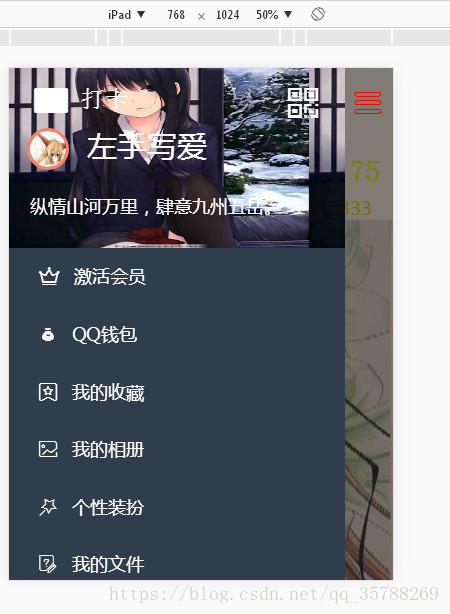
ipad没问题!
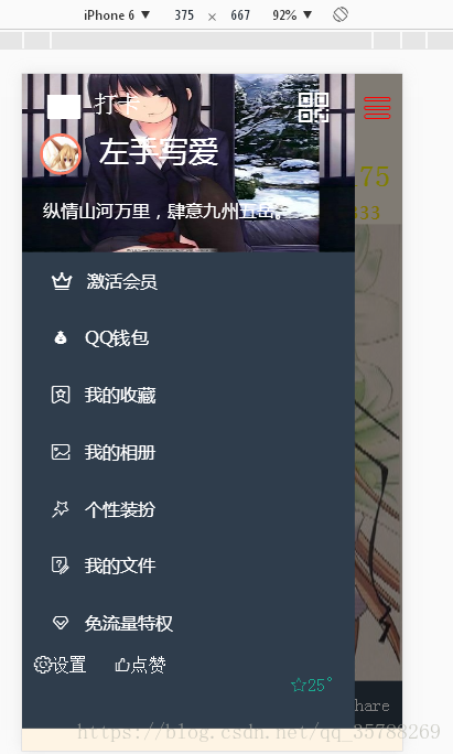
iphone6没问题!
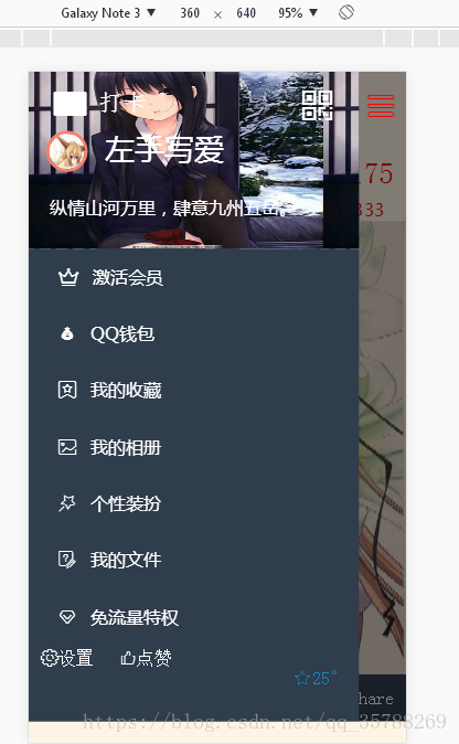
note3没问题!
note5横屏没问题,,需要下拉看完整的!
好了!今天的分享就到这里了,喜欢的老铁点一波关注!


 1785
1785


 被折叠的 条评论
为什么被折叠?
被折叠的 条评论
为什么被折叠?
 到【灌水乐园】发言


