


一.实现三角形
思路:利用border元素是由三角形实现的原理,设置想要的三角形图形,其他三角形设置为透明色即可。
1.首先得到四个三角形:
      .arrow{
            height:0;
            width:0;
            border-width:50px 50px ;
            border-style:solid;
            border-color: red blue yellow pink ;
            display:inline-block;
        }
效果如图: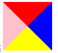
2.然后将其他三角形设置为透明色
      .arrow{
            height:0;
            width:0;
            border-width:50px 50px ;
            border-style:solid;
            border-color: transparent transparent yellow;;
            display:inline-block;
        }
效果如图: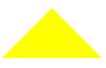
二.用CSS border元素实现三角箭头
思路:先绘制两个三角形,然后通过定位重叠,将其中一个的三角形设置为白色,即得三角箭头。
<!DOCTYPE html>
<html lang="en">
<head>
    <meta charset="UTF-8">
    <meta name="viewport" content="width=device-width, initial-scale=1.0">
    <title>triangle</title>
</head>
<body>
    <style type="text/css">
        .Word{
            position:relative;
            display:inline-block;
        }

        .arrow-before, .arrow-after{
            height:0;
            width:0;
            border-width:0 10px 20px;
            border-style:solid;
            border-color:transparent transparent red transparent ;
            position:absolute;
            display:inline-block;
        }

        .arrow-after{
            border-bottom-color:white;
            top:5px;
            left:64px;
        }
    </style>

    <div class="Word"> 文字描述
        <div class="arrow-before"></div>
        <div class="arrow-after"></div>
    </div>
</body>
</html>
效果如图:
其他各种形式的三角形类似可以实现。


 2722
2722


 被折叠的 条评论
为什么被折叠?
被折叠的 条评论
为什么被折叠?
 到【灌水乐园】发言


