


CSS3的内容包括:1.选中器2.盒模型3.背景和边框4.文字特效5.2D/3D转换6.动画7.多列布局8.用户界面
1.CSS3的边框
CSS3增加了圆角边框和阴影框
a.圆角边框
border-radius:圆角的px
b.阴影框
box-shadow: 阴影相对与原来位置的右移量 阴影相对与原来位置的下移量 阴影的边界模糊位置 颜色
c.边界图片
2.CSS3背景
background-image:url(image1),url(image2)等等
图片的定位根据url出现顺序从上到下依此出现。
这边是该属性的地址:http://www.daqianduan.com/3302.html
background-clip:规定背景的绘制区域 可选项 border-box 背景被裁剪到边框盒 padding-box 背景被裁剪到内边距框 content-box 背景被裁剪到内容框
background-origin:规定背景图片的定位区域 可选项 padding-box border-box content
background-size:规定图片的尺寸
3.文本效果
text-shadow 文本阴影跟box-shadow差不多
word-wrap:break-word 自动换行
4.2D/3D转换
对元素进行移动、缩放、转动、拉长火拉伸
a.对元素进行移动,根据当前位置移动
transform:translate(100px, 100px)第一个是距离left第二个是距离top的位置参数
<!DOCTYPE html>
<html>
<head>
<style>
div
{
margin:30px;
width:200px;
height:100px;
background-color:yellow;

transform:translate(100px,100px);
-ms-transform:translate(100px,100px);
-webkit-transform:translate(100px,100px);
-o-transform:translate(100px,100px);
-moz-transform:translate(100px,100px);
}
</style>
</head>
<body>

<div></div>

</body>
</html>
b.图片的旋转
transform:rotate(旋转角度deg)相对于div的中心旋转
实战1:做出一个照片墙
rotateX()3D旋转沿X轴
rotateY()3D旋转沿Y轴
rotateZ()3D旋转沿Z轴
<!DOCTYPE html>
<html>
<head>
<style>
div
{
    position:absolute;
    left:-100px;
    top:-150px;

}
.image1
{
    height:400px;
    width:400px;
}
.image2
{
    height:200px;
    width:200px;
}
.image3
{
    height:100px;
    width:100px;
}
.image4
{
    height:100px;
    width:100px;
}
.box1
{
    width:400px;
    padding-bottom:50px;
    box-shadow:0px 10px 5px #aaaaaa;
    transform:translate(0px,0px);
    transform:rotate(45deg);
}
.box2
{
    position:absolute;
    top:300px;
    left:0px;
    width:200px;
    padding-bottom:25px;
    box-shadow:0px 5px 2px #aaaaaa;
    transform:rotate(-15deg);

}
.box
{
    width:100px;
    padding-botton:12px;
    box-shadow:0px 3px 1px #aaaaaa;
}
.box3
{
    position:absolute;
    top:500px;
    left:0px;
    transform:rotate(45deg);
}
.box4
{
    position:absolute;
    top:600px;
    left:0px;
    transform:rotate(-15deg);
}
</style>
</head>
<body>

<div class="box1"><img class="image1" src="image/meinv1.png.jpg"></img></div>
<div class="box2"><img class="image2" src="image/meinv2.jpg"></img></div>
<div class="box box3"><img class="image3" src="image/meinv3.jpg"></img></div>
<div class="box box4"><img class="image4" src="image/meinv4.jpg"></img></div>

</body>
</html>
效果展示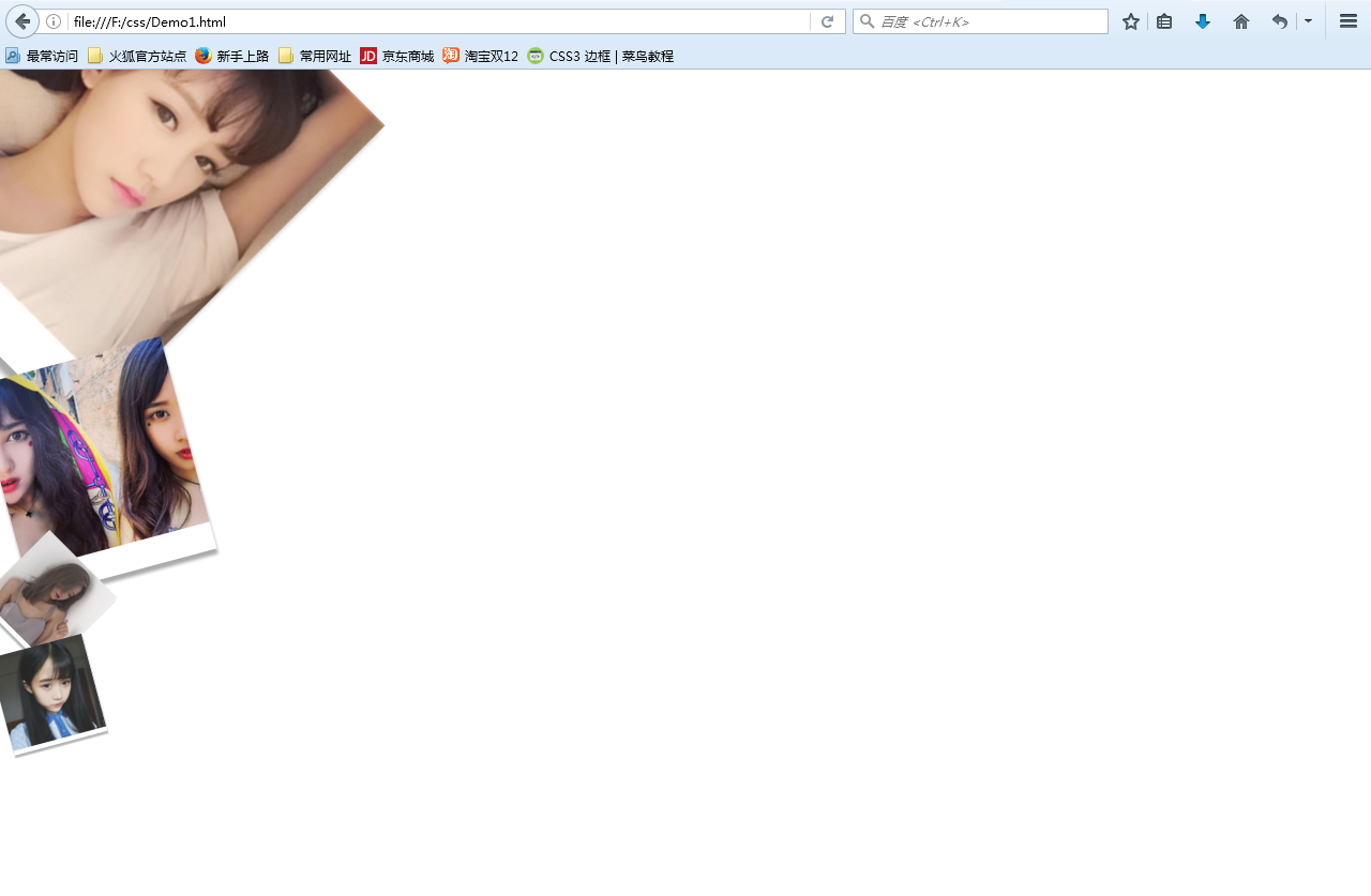
c.图片的拉伸和压缩
scaleX()x轴方向的缩放比例
scaleY()y轴方向的压缩比例
d.图片的倾斜旋转
skew
5.CSS3的过渡
transform:需过渡的属性 时间,需过渡的第二个属性 时间…
这个好像是做动画的,有时间在看看


 被折叠的 条评论
为什么被折叠?
被折叠的 条评论
为什么被折叠?
 到【灌水乐园】发言


