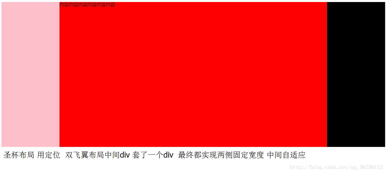
div css 圣杯布局与双飞翼布局

div css 圣杯布局

<html>
<head>
    <style>
        body{
            min-width:600px;
            }
        .main{
                height:500px;
                padding:0 200px 0 200px;
            }
        .midle {
        width:100%;
        height:500px;
        background-color:red;
        }
        .left{
            width:200px;
            height:500px;
            background-color:pink;
            margin-left:-100%;
            position:relative;
            left:-200px;
            }

        .right{
        width:200px;
        height:500px;
        background-color:black;
        margin-left:-200px;
        position:relative;
        right:-200px;
        }
        .fl{
            float:left;
            }
    </style>
</head> 


<body>
    <div class="main">
        <div class="midle fl">内容内容内容内容内容内容</div>
        <div class="left fl"></div>     
        <div class="right fl"></div>

    </div>
</body> 
</html>

div css 双飞翼布局

<html>
<head>
    <style>
        body{
            min-width:600px;
            }
        .main{
                height:500px;
            }
        .midle {
        width:100%;
        height:500px;
        background-color:red;
        }
        .left{
            width:200px;
            height:500px;
            background-color:pink;
            margin-left:-100%;
            }

        .right{
        width:200px;
        height:500px;
        background-color:black;
        margin-left:-200px;
        }
        .fl{
            float:left;
            }
        .inner{
            margin:0 200px;
            }
    </style>
</head> 


<body>
    <div class="main">
        <div class="midle fl">
            <div class="inner"> 
                内容内容内容内容内容内容
            </div>          
        </div>
        <div class="left fl"></div>     
        <div class="right fl"></div>

    </div>
</body> 
</html>

这里写图片描述

CSS圣杯布局双飞翼布局都是三栏布局,其中主要内容区域在最中间,左右两侧是侧边栏。它们的目的是为了解决传统三栏布局固定中间宽度,侧边栏无法等高的问题。 CSS圣杯布局的实现: HTML结构如下: ``` <div class="container"> <div class="main">主要内容</div> <div class="left">左侧边栏</div> <div class="right">右侧边栏</div> </div> ``` CSS样式如下: ``` .container { display: table; width: 100%; table-layout: fixed; border-spacing: 0; } .main { display: table-cell; width: 100%; background-color: #fff; } .left { display: table-cell; width: 200px; background-color: #ccc; position: relative; left: -200px; margin-left: -100%; } .right { display: table-cell; width: 200px; background-color: #ccc; position: relative; right: -200px; margin-right: -100%; } ``` 实现原理:通过将容器设置为table,主要内容区域和侧边栏都设置为table-cell,实现三栏等高。通过设置负的margin和left/right来实现侧边栏的位置偏移。 双飞翼布局的实现: HTML结构如下: ``` <div class="container"> <div class="main">主要内容</div> </div> <div class="left">左侧边栏</div> <div class="right">右侧边栏</div> ``` CSS样式如下: ``` .container { padding-left: 200px; padding-right: 200px; } .main { float: left; width: 100%; background-color: #fff; } .left { float: left; width: 200px; margin-left: -100%; background-color: #ccc; } .right { float: left; width: 200px; margin-left: -200px; background-color: #ccc; } ``` 实现原理:通过设置主要内容区域的宽度为100%,再通过padding将左右两侧的宽度撑开。通过设置负的margin和left来实现侧边栏的位置偏移。
评论
添加红包

请填写红包祝福语或标题

红包个数最小为10个

红包金额最低5元

当前余额3.43前往充值 >
需支付:10.00
成就一亿技术人!
领取后你会自动成为博主和红包主的粉丝 规则
hope_wisdom
发出的红包
实付
使用余额支付
点击重新获取
扫码支付
钱包余额 0

抵扣说明:

1.余额是钱包充值的虚拟货币,按照1:1的比例进行支付金额的抵扣。
2.余额无法直接购买下载,可以购买VIP、付费专栏及课程。

余额充值