


 本文介绍了如何使用JavaScript和CSS两种方法创建16:9比例的盒子。JS实现通过获取元素宽度计算高度,CSS实现则利用百分比属性优雅地达成目标。在CSS方法中,需注意子元素的绝对定位来调整高度计算方式。
前言
整理了下用js和css两种方式实现16比9盒子的方法。
1. js方式实现
实现思路:在页面加载完成后操作dom获取最外层元素的宽度,设置高度为9/16*宽度。
<html>

<head>
  <style>
    #scale {
      overflow: hidden
    }
  </style>

</head>

<body>
  <div id="scale">
    <div id="item" style="background-color: azure; width: 100px; height: 100px;">
      123
      123
      123
      123
      123123
      123123 123123 123123 123123
    </div>
  </div>

</body>
<script>
  window.onload = () => {
    let box = document.getElementById("scale");
    let topItem = box.childNodes[1];
    if (topItem) {
      box.style.width = topItem.offsetWidth
      box.style.height = 9 / 16 * topItem.offsetWidth
    }

  }

</script>

</html>
2. css方式实现
用js实现起来比较方便和直观,但是,没有css实现起来优雅和方便维护。
实现思路:利用css各个属性百分比的含义,依据父元素的宽度来设置其余元素的宽高。(css常见元素的百分比对应关系)
<html>

<head>
  <style>
    /* 父元素设置width为百分之20因为在当前元素height没法通过设置css来获取width信息,所以转而用padding-bottom来设置 */

    #scale {
      overflow: hidden;
      position: relative;
      width: 20%;
      height: 0px;
      padding-bottom: 10%;

    }

    /* 设置高度和宽度为父元素的百分之一百使得内部宽度和高度与父元素一致,因为父元素的height为0准确的说是content的height为0 所以得用绝对定位改变下height的计算方式, 绝对定位下元素脱离文档流参考的是 */
    #item {
      position: absolute;

      width: 100%;
      height: 100%;
      background-color: azure;

    }
  </style>

</head>

<body>
  <div id="scale">
    <div id="item">
      123
      123
      123
      123
      123123
      123123 123123 123123 123123
    </div>
  </div>

</body>
<script>
</script>

</html>
Note: 这里因为子元素的height按照标准盒子的计算方式用的是父元素的content区域的高度,而此时父元素content的height是0px。 所以要使用绝对定位改变计算高度的方式。在使用绝对定位后元素脱离文档流,获取父元素的高度计算方式类似IE盒子 获取的是父元素的 content+padding 的高度。
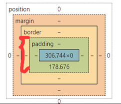
Chrome中父元素盒子高度的截图
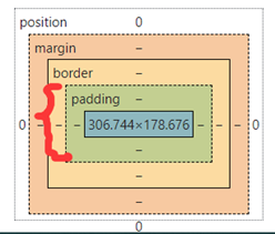
Chrome中子元素元素盒子高度的截图


 扫一扫
扫一扫


 6063
6063

 被折叠的 条评论
为什么被折叠?
被折叠的 条评论
为什么被折叠?
 到【灌水乐园】发言


