


这是程序员表白系列中的100款网站表白之一,旨在让任何人都能使用并创建自己的表白网站给心爱的人看。 此波共有100个表白网站,可以任意修改和使用,很多人会希望向心爱的男孩女孩告白,生性腼腆的人即使那个TA站在眼前都不敢向前表白。说不出口的话就用网页告诉TA吧~制作一个表白网页告诉TA你的心意,演示如下。
一、网页介绍
1 网页简介:基于 HTML+CSS+JavaScript 制作七夕情人节表白网页、生日祝福、七夕告白、 求婚、浪漫爱情3D相册、炫酷代码 ,快来制作一款高端的表白网页送(他/她)浪漫的告白,制作修改简单,可自行更换背景音乐,文字和图片即可使用
2.网页编辑:任意HTML编辑软件(如:Dreamweaver、HBuilder、Vscode 、Sublime 、Webstorm、Text 、Notepad++ 等任意html编辑软件进行运行及修改编辑等操作)。
一、网页效果
二、代码展示
1.HTML代码
代码如下(示例):以下仅展示部分代码供参考~
<!DOCTYPE html>
<html>
<head>
<title>小型婚礼</title>
<meta http-equiv="Content-Type" content="text/html;charset=utf-8" />
<link rel="stylesheet" href="css/reset.css" />
<link rel="stylesheet" href="css/index.css" />
<script type="text/javascript" src="js/jquery-1.10.2.js"></script>
<script type="text/javascript" src="js/jquery-ui-1.10.2.custom.js"></script>
<script type="text/javascript" src="js/index.js"></script>
</head>
<body style="background:FF9999">
<!--[if ie 6]>
<style type="text/css">
.mask {position: absolute; height: 800px;}
.pop-box {_position: absolute;}
</style>
<![endif]-->
<div class="box">
<audio src="http://weixinlisheng.jd-app.com/mp3/jiehun.mp3" loop="loop" hidden="hidden" autoplay="autoplay" controls="controls">Newly married happiness.</audio>
<!-- 场景一 -->
<div class="first-box">
<div class="first-horn">
<img src="images/first_horn.jpg" />
</div>
<div class="first-txt">
<div class="txt1"><img src="images/first_txt1.jpg" /></div>
<div class="txt2"><img src="images/first_txt2.jpg" /></div>
</div>
</div>
<!-- 场景二 -->
<div class="second-box">
<div class="second-people">
<img src="images/second_people.jpg" />
</div>
<div class="second-txt">
<img src="images/second_txt.jpg" />
</div>
</div>
<!-- 场景三 -->
<div class="three-box">
<div class="three-img">
<img src="images/three_img.jpg" />
</div>
</div>
<!-- 场景四 -->
<div class="fore-box">
<div class="fore-img">
<img src="images/fore_img.jpg" />
</div>
</div>
<!-- 场景五 -->
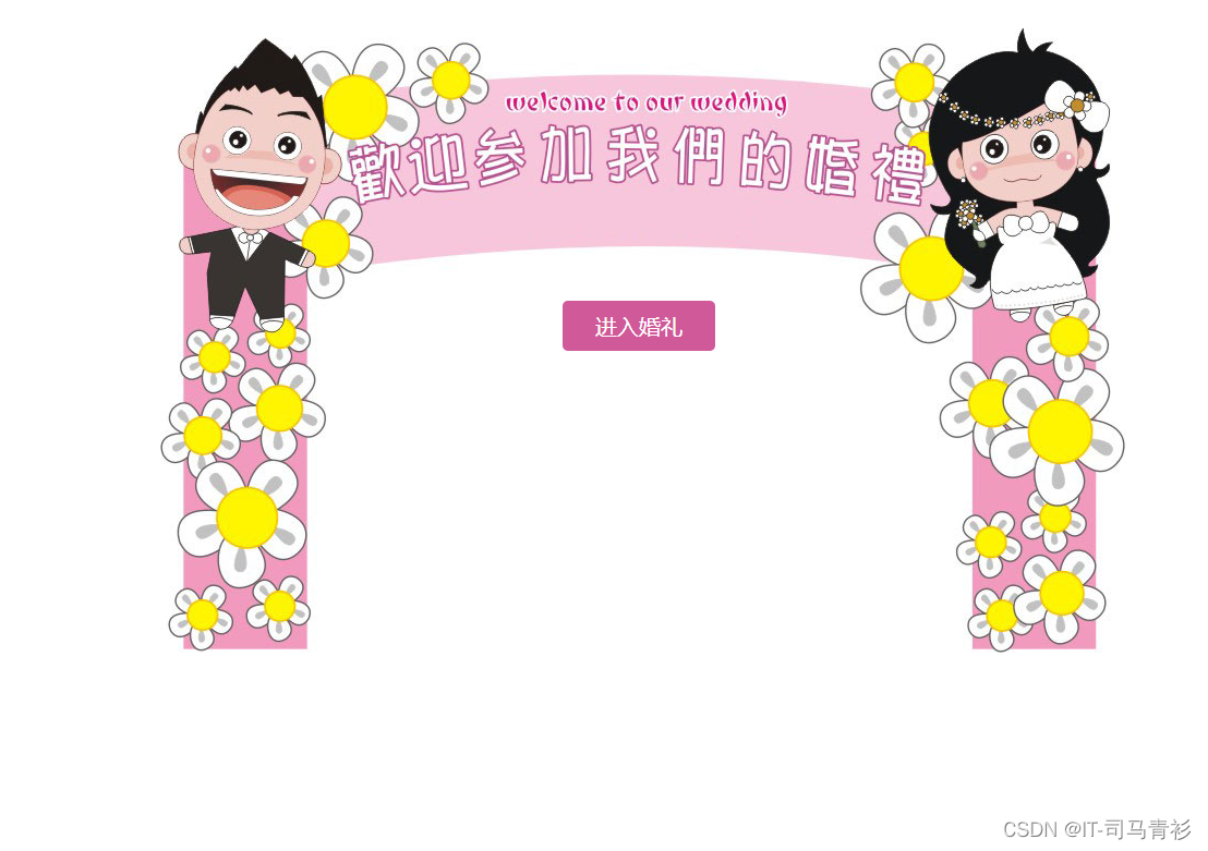
<div class="five-box">
<div class="five-img">
<img src="images/five_img.jpg" />
<div class="u-enter">进入婚礼</div>
</div>
</div>
<!-- 场景六 -->
<div class="six-box">
<div></div>
<div></div>
<div></div>
<div></div>
<div></div>
<div></div>
<div></div>
<div></div>
<div></div>
<div></div>
<div></div>
<div></div>
<div></div>
<div></div>
<div></div>
<div></div>
</div>
<!-- 场景七 -->
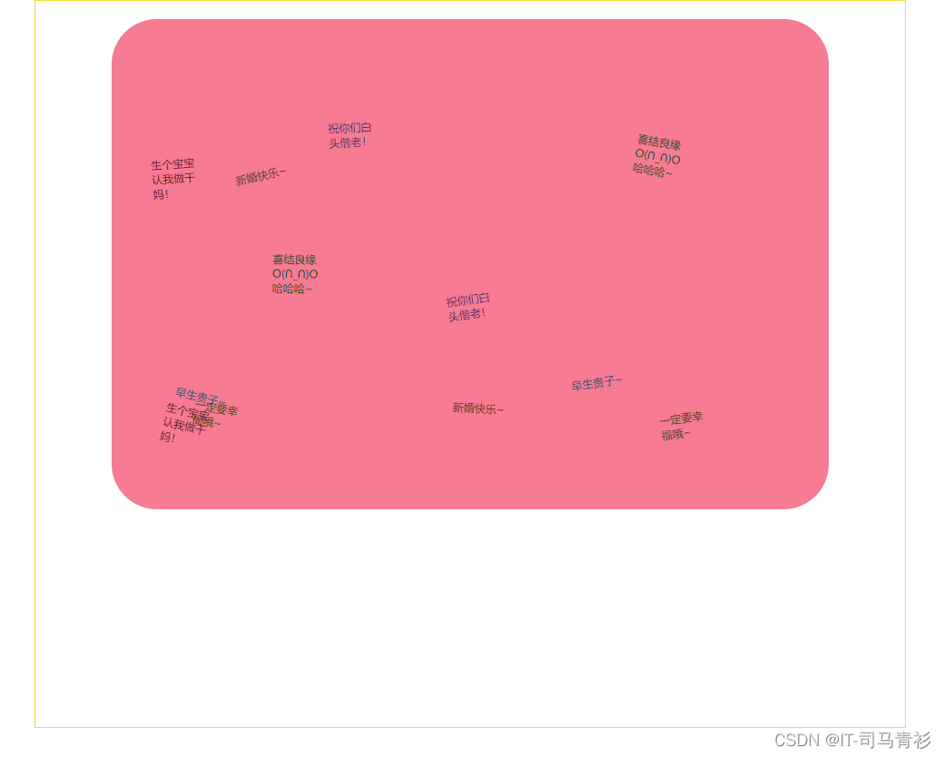
<div class="seven-box">
<div class="clickMe">点我送祝福</div>
<div class="seven-content">
<div class="note-a1"></div>
<div class="note-a2"></div>
<div class="note-a3"></div>
<div class="note-a4"></div>
<div class="note-a5"></div>
<div class="note-a6"></div>
<div class="note-a7"></div>
<div class="note-a8"></div>
<div class="note-a9"></div>
<div class="note-a10"></div>
<div class="note-a11"></div>
<div class="note-a12"></div>
<div class="note-1">一定要幸福哦~</div>
<div class="note-2">祝你们白头偕老!</div>
<div class="note-3">早生贵子~</div>
<div class="note-4">新婚快乐~</div>
<div class="note-5">生个宝宝认我做干妈!</div>
<div class="note-6">喜结良缘O(∩_∩)O哈哈哈~</div>
<div class="note-1">一定要幸福哦~</div>
<div class="note-2">祝你们白头偕老!</div>
<div class="note-3">早生贵子~</div>
<div class="note-4">新婚快乐~</div>
<div class="note-5">生个宝宝认我做干妈!</div>
<div class="note-6">喜结良缘O(∩_∩)O哈哈哈~</div>
</div>
</div>
</div>
<!-- 遮罩层 -->
<div class="mask"></div>
<div class="pop-box">
<h1>送上祝福语</h1>
<textarea id="write">写上您的祝福吧~</textarea>
<div class="u-sure" id="uSure">确定</div>
</div>
</body>
</html>
2.CSS代码
.box {
    position: relative;
    width: 960px;
    height: 810px;
    margin: 10px auto;
    overflow: hidden;
}

.second-box,
.five-box,
.six-box,
.seven-box {
    display: none;
}

/* 场景一css */

.first-horn {
    position: absolute;
    top: 30px;
    left: -422px;
}

.first-txt {
    position: absolute;
    top: 60px;
    display: none;
}

.first-txt .txt1 {
    width: 65px;
    height: 78px;
    overflow: hidden;
}

.first-txt .txt2 {
    width: 0;
    height: 78px;
    overflow: hidden;
}

/* 场景二 */

.second-people {
    position: absolute;
    left: -286px;
}

.second-txt {
    position: absolute;
    left: 0;
    top: 383px;
    display: none;
}

/* 场景三 */

.three-img {
    position: absolute;
    left: -554px;
}

/* 场景四 */

.fore-img {
    position: absolute;
    top: -518px;
    left: 40px;
}

/* 场景五 */

.five-img {
    position: absolute;
    top: 50px;
    left: 38px;
    width: 885px;
    height: 573px;
}

.five-img img {
    transform: scale(0.4);
}

.five-img .u-enter {
    position: absolute;
    left: 50%;
    top: 250px;
    margin-left: -73px;
    padding: 10px 30px;
    border-radius: 5px;
    background: #D05999;
    font-size: 20px;
    color: white;
    cursor: pointer;
}

/* 场景六 */

.six-box {
    position: relative;
    width: 960px;
    height: 800px;
    overflow: hidden;
}

.six-box div {
    position: absolute;
    width: 100px;
    height: 100px;
    background: url("../images/six_center_img.jpg") no-repeat;
}

/* 场景七 */

.seven-box {
    position: relative;
    width: 958px;
    height: 800px;
    background: url("../images/seven_bg.jpg") no-repeat top center;
    border: 1px solid #F4D938;
    overflow: hidden;
}

.clickMe {
    position: absolute;
    left: 0;
    bottom: 0;
    width: 229px;
    height: 233px;
    cursor: pointer;
    text-indent: -99999px;
    background: url("../images/clickMe.jpg") no-repeat;
    z-index: 9999;
}

.seven-content {
    position: relative;
    width: 790px;
    height: 540px;
    margin: 20px auto;
    background: #f67b93;
    border-radius: 50px;
}

.seven-content div {
    position: absolute;
    width: 57px;
    height: 52px;
    padding: 15px 5px 5px 10px;
    background: url("../images/note.png") no-repeat;
    overflow: hidden;
    cursor: pointer;
    z-index: 99;
}

.seven-content div.note-a1 {
    background-position: 0 0;
}

.seven-content div.note-a2 {
    background-position: -110px 0;
}

.seven-content div.note-a3 {
    background-position: -220px 0;
}

.seven-content div.note-a4 {
    background-position: -327px 0;
}

.seven-content div.note-a5 {
    background-position: 0 -150px;
}

.seven-content div.note-a6 {
    background-position: -110px -150px;
}

.seven-content div.note-a7 {
    background-position: -220px -150px;
}

.seven-content div.note-a8 {
    background-position: -327px -150px;
}

.seven-content div.note-a9 {
    background-position: 0 -296px;
}

.seven-content div.note-a10 {
    background-position: -110px -296px;
}

.seven-content div.note-a11 {
    background-position: -220px -296px;
}

.seven-content div.note-a12 {
    background-position: -327px -296px;
}

.seven-content div.note-1 {
    background-position: -1px -440px;
    color: #494000;
}

.seven-content div.note-2 {
    background-position: -110px -440px;
    color: #561e67;
}

.seven-content div.note-3 {
    background-position: -220px -440px;
    color: #07516f;
}

.seven-content div.note-4 {
    background-position: -329px -440px;
    color: #652f09;
}

.seven-content div.note-5 {
    background-position: 0 -550px;
    color: #6b0f13;
}

.seven-content div.note-6 {
    background-position: -110px -550px;
    color: #034914;
}

/* 遮罩层 */

.mask {
    position: fixed;
    top: 0;
    left: 0;
    width: 100%;
    height: 100%;
    background: white;
    opacity: 0.4;
    filter: Alpha(opacity=40);
    z-index: 9999;
    display: none;
}

.pop-box {
    position: fixed;
    top: -300px;
    left: 50%;
    margin-left: -250px;
    margin-top: -150px;
    width: 500px;
    height: 300px;
    padding: 10px;
    background: #c52947;
    border-radius: 10px;
    z-index: 99999;
}

.pop-box h1 {
    font-size: 30px;
    text-align: center;
    color: white;
    margin: 5px 0 10px;
}

.pop-box textarea {
    display: block;
    width: 440px;
    height: 140px;
    padding: 10px;
    margin: 20px auto;
    resize: none;
    font-size: 16px;
    border-radius: 5px;
    background: white;
    color: #691323;
    _margin-left: 270px;
}

.pop-box .u-sure {
    margin: auto;
    width: 100px;
    padding: 8px 0;
    background: #780a1f;
    border-radius: 3px;
    text-align: center;
    font-size: 18px;
    color: white;
    font-weight: bold;
    cursor: pointer;
}
三、精彩专栏
看到这里了就 【点赞,关注,收藏】 三连 支持下吧,你的支持是我创作的动力。


 3847
3847


 被折叠的 条评论
为什么被折叠?
被折叠的 条评论
为什么被折叠?
 到【灌水乐园】发言


