


作为前端开发人员来讲,页面布局是最重要的一步,而布局的传统解决方案,大多基于盒模型,依赖 display属性 + position属性 + float属性等等。对于某些特殊布局就非常不方便,比如,垂直居中就不是那么容易的实现;
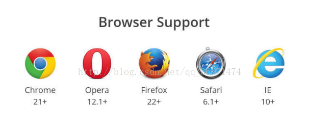
W3C在2009年提出了一种新的布局方案—-Flex布局,可以简便、完整、响应式地实现各种页面布局。目前,大多数主流浏览器已经完全支持它,看下图:
一、Flex布局是干嘛的呢?
Flex(Flexible Box),也就是”弹性布局”,它可以很灵活地实现垂直居中、多列布局等自适应问题。而任何一个容器都可以指定为Flex布局。
需要注意的是:Webkit内核的浏览器,必须加上-webkit前缀。.box{ display:flex; }
温馨提示!.box{ display: -webkit-flex; /* Safari */ display: flex; }
设为Flex布局以后,子元素的float、clear和vertical-align属性将失效。
二、详解Flex
① 术语详解:
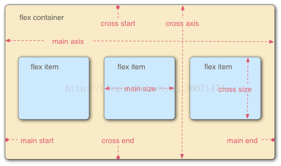
采用Flex布局的元素,称为Flex容器(flex container),简称”容器”。它的所有子元素自动成为容器成员,称为Flex项目(flex item),简称”项目”。
容器默认存在两根轴:水平的主轴(main axis)和垂直的交叉轴(cross axis)。主轴的开始位置(与边框的交叉点)叫做main start,结束位置叫做main end;交叉轴的开始位置叫做cross start,结束位置叫做cross end。项目默认沿主轴列。单个项目占据的主轴空间叫做main size,占据的交叉轴空间叫做cross size。(如下图所示)
② 容器的属性:
✦ flex-direction属性
它决定了项目的排列方向;
取值:
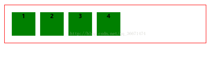
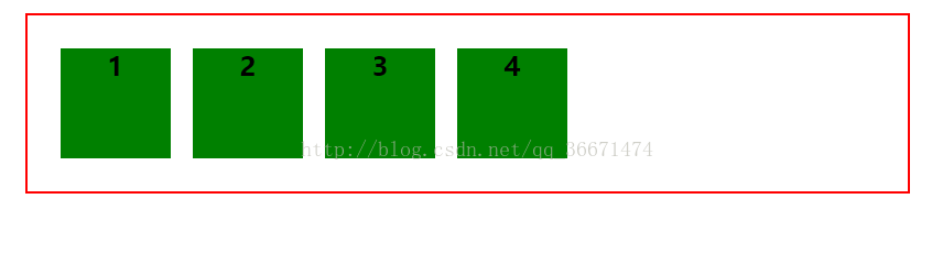
❀ flex-direction:row(默认值),主轴为水平方向,起点在左端;
效果为:<!DOCTYPE html> <html lang="en"> <head> <meta charset="UTF-8"> <title>flex</title> <style> .container{ display: flex; display:-webkit-flex; flex-direction: row; border:2px solid red; padding:20px; margin:20px; } .item{ background: green; width: 100px; height: 100px; margin: 10px; font-size: 24px; text-align:center; font-weight: bold; } </style> </head> <body> <div class="container"> <div class="item">1</div> <div class="item">2</div> <div class="item">3</div> <div class="item">4</div> </div> </body> </html>
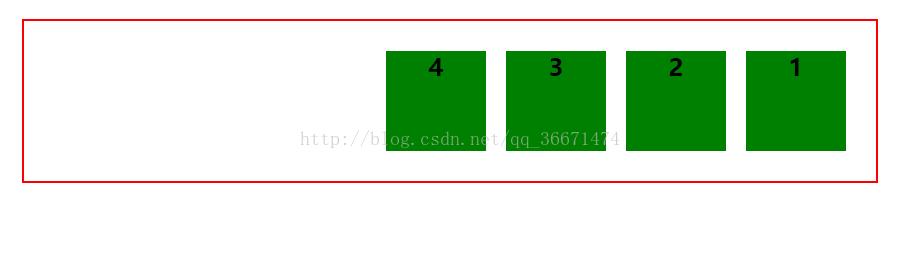
❀ flex-direction:row-reverse,主轴为水平方向,起点在右端;
效果为:.container{ display: flex; display:-webkit-flex; flex-direction: row-reverse; border:2px solid red; padding:20px; margin:20px; } .item{ background: green; width: 100px; height: 100px; margin: 10px; font-size: 24px; text-align:center; font-weight: bold; }
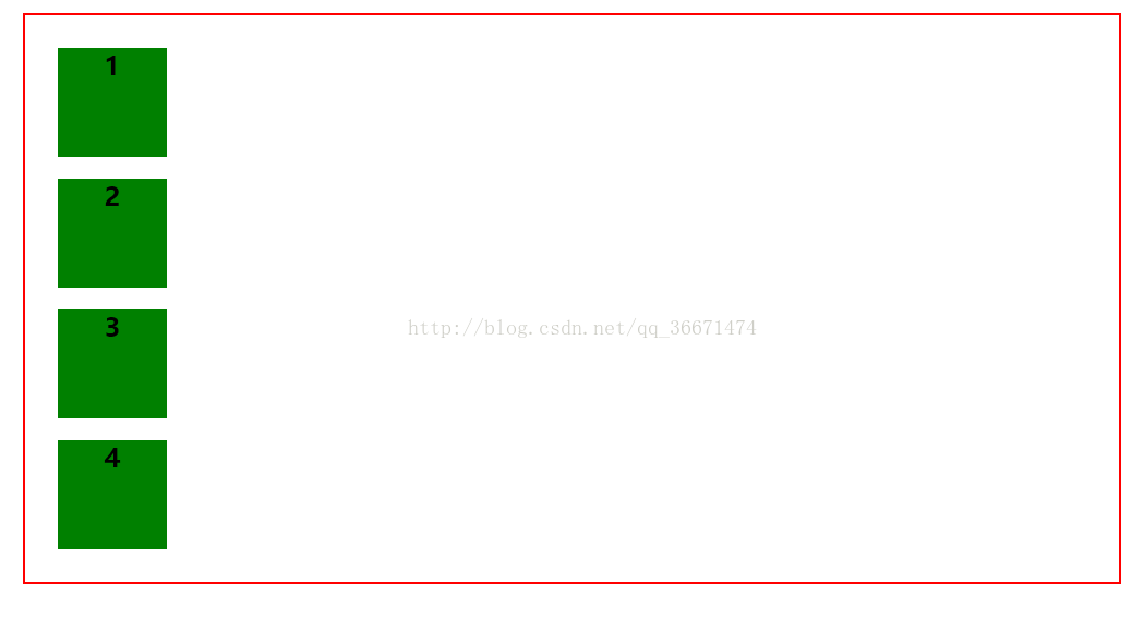
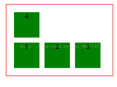
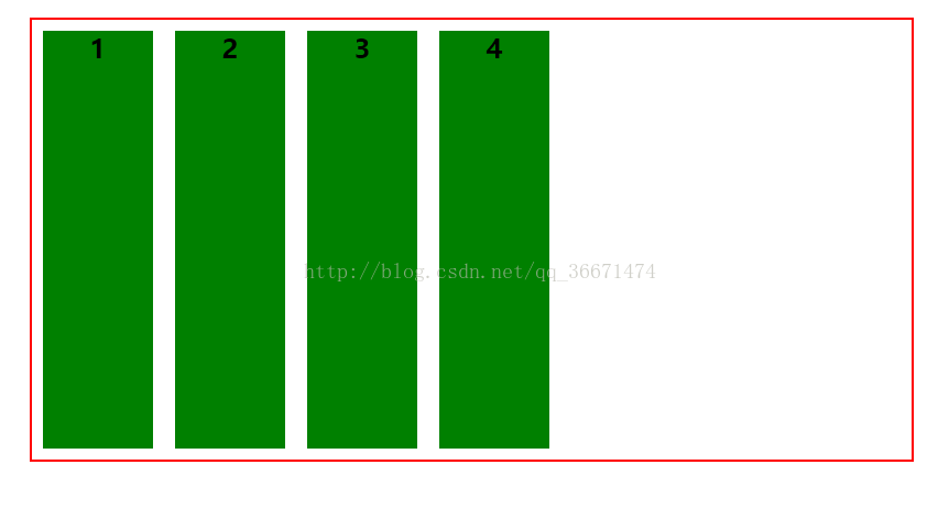
❀ flex-direction:column,主轴为垂直方向,起点在上;
效果为:.container{ display: flex; display:-webkit-flex; flex-direction:column; border:2px solid red; padding:20px; margin:20px; } .item{ background: green; width: 100px; height: 100px; margin: 10px; font-size: 24px; text-align:center; font-weight: bold; }
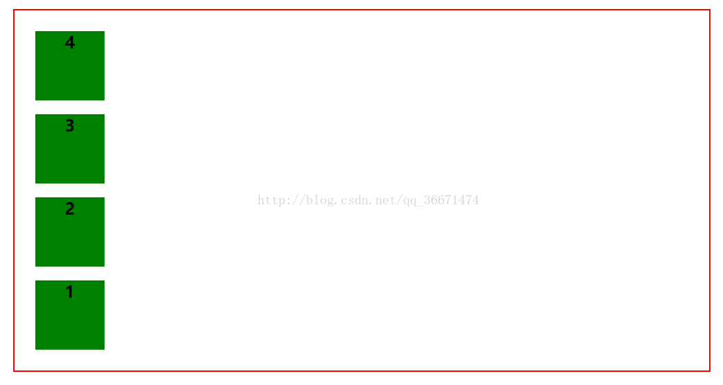
❀ flex-direction:column-reverse,主轴为垂直方向,起点在下;
效果为:.container{ display: flex; display:-webkit-flex; flex-direction:column-reverse; border:2px solid red; padding:20px; margin:20px; } .item{ background: green; width: 100px; height: 100px; margin: 10px; font-size: 24px; text-align:center; font-weight: bold; }
✦ flex-wrap属性:
默认情况下,项目都排在一条线(又称”轴线”)上。flex-wrap属性定义了,如果一条轴线排不下,该如何换行?
取值:
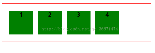
❀ flex-wrap:nowrap(默认),不换行;
 .container{
            display: flex;
            display:-webkit-flex;
            flex-wrap:nowrap;
            border:2px solid red;
            padding:20px;
            margin:20px;
        }
        .item{
            background: green;
            width: 100px;
            height: 100px;
            margin: 10px;
            font-size: 24px;
            text-align:center;
            font-weight: bold;
        }


效果为:
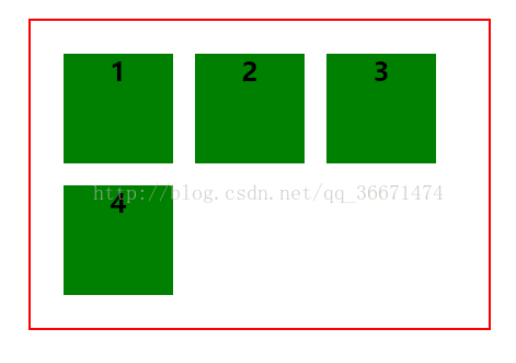
❀ flex-wrap:wrap,换行,第一行在上;
效果为:.container{ display: flex; display:-webkit-flex; flex-wrap:wrap; border:2px solid red; padding:20px; margin:20px; } .item{ background: green; width: 100px; height: 100px; margin: 10px; font-size: 24px; text-align:center; font-weight: bold; }
❀ flex-wrap:wrap-reverse(换行,第一行在下方);
.container{
            display: flex;
            display:-webkit-flex;
            flex-wrap:wrap-reverse;
            border:2px solid red;
            padding:20px;
            margin:20px;
        }
        .item{
            background: green;
            width: 100px;
            height: 100px;
            margin: 10px;
            font-size: 24px;
            text-align:center;
            font-weight: bold;
        }
效果为:
✦ flex-flow属性
flex-flow属性是flex-direction属性和flex-wrap属性的简写形式,默认值为row nowrap。
.box {
     flex-flow: row nowrap;
}
✦ justify-content属性
justify-content属性定义了项目在主轴上的对齐方式。
取值:
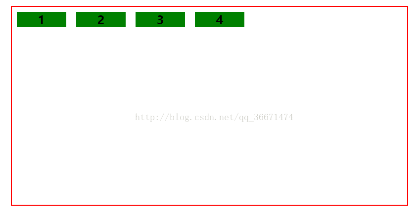
❀ justify-content:flex-start(默认值),左对齐
效果为:.container{ display: flex; display:-webkit-flex; justify-content:flex-start; border:2px solid red; padding:20px; margin:20px; } .item{ background: green; width: 100px; height: 100px; margin: 10px; font-size: 24px; text-align:center; font-weight: bold; }
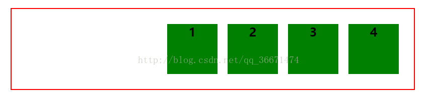
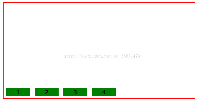
❀ justify-content:flex-end,右对齐
.container{
            display: flex;
            display:-webkit-flex;
            justify-content:flex-end;
            border:2px solid red;
            padding:20px;
            margin:20px;
        }
        .item{
            background: green;
            width: 100px;
            height: 100px;
            margin: 10px;
            font-size: 24px;
            text-align:center;
            font-weight: bold;
        }
效果为:
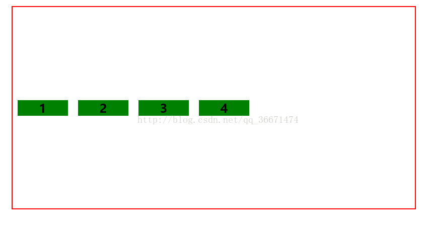
❀ justify-content:center 居中
效果为:.container{ display: flex; display:-webkit-flex; justify-content:center; border:2px solid red; padding:20px; margin:20px; } .item{ background: green; width: 100px; height: 100px; margin: 10px; font-size: 24px; text-align:center; font-weight: bold; }

❀ justify-content:space-between 两端对齐,项目之间的间隔相等;
效果为:.container{ display: flex; display:-webkit-flex; justify-content:space-between; border:2px solid red; padding:20px; margin:20px; } .item{ background: green; width: 100px; height: 100px; margin: 10px; font-size: 24px; text-align:center; font-weight: bold; }
❀ justify-content:space-around 每个项目两侧的间隔相等。所以,项目之间的间隔比项目与边框的间隔大一倍
效果为:.container{ display: flex; display:-webkit-flex; justify-content:space-around; border:2px solid red; margin:20px; } .item{ background: green; width: 100px; height: 100px; margin: 10px; font-size: 24px; text-align:center; font-weight: bold; }
✦ align-items属性

定义项目在交叉轴上如何对齐?如果flex-direction:row或者row-reverse,那么交叉轴就是y轴,反之为x轴;
具体的对齐方式与交叉轴的方向有关,下面假设交叉轴从上到下。
取值:
❀ align-items:stretch (默认值)如果项目未设置高度或设为auto,将占满整个容器的高度
效果为:.container{ display: flex; display:-webkit-flex; flex-direction: row; align-items: stretch; border:2px solid red; height:400px; margin:20px; } .item{ background: green; width: 100px; margin: 10px; font-size: 24px; text-align:center; font-weight: bold; }
❀ align-items:flex-start 交叉轴的起点对齐
.container{
            display: flex;
            display:-webkit-flex;
            flex-direction: row;
            align-items: flex-start;
            border:2px solid red;
            height:400px;
            margin:20px;
        }
        .item{
            background: green;
            width: 100px;
            margin: 10px;
            font-size: 24px;
            text-align:center;
            font-weight: bold;
        }
效果为:
❀ align-items:flex-end 交叉轴的终点对齐
.container{
            display: flex;
            display:-webkit-flex;
            flex-direction: row;
            align-items: flex-end;
            border:2px solid red;
            height:400px;
            margin:20px;
        }
        .item{
            background: green;
            width: 100px;
            margin: 10px;
            font-size: 24px;
            text-align:center;
            font-weight: bold;
        }
效果为:
❀ align-items:center 交叉轴的中心对齐
效果为:.container{ display: flex; display:-webkit-flex; flex-direction: row; align-items: center; border:2px solid red; height:400px; margin:20px; } .item{ background: green; width: 100px; margin: 10px; font-size: 24px; text-align:center; font-weight: bold; }
❀ align-items:baseline 项目的第一行文字的基线对齐
.container{
            display: flex;
            display:-webkit-flex;
            flex-direction: row;
            align-items: baseline;
            border:2px solid red;
            height:400px;
            margin:20px;
        }
        .item{
            background: green;
            width: 100px;
            margin: 10px;
            font-size: 24px;
            text-align:center;
            font-weight: bold;
        }
效果为:
✦ align-content属性
定义了多根轴线的对齐方式。如果项目只有一根轴线,该属性不起作用
取值:
align-content:flex-start 与交叉轴的起点对齐
align-content:flex-end 与交叉轴的终点对齐
align-content:center 与交叉轴的中心对齐
align-content:space-between 与交叉轴两端对齐,轴线之间的间隔平均分布
align-content:space-around 每根轴线两侧间隔相等,所以轴线之间的间隔比轴线与边框间的间隔大一倍
③ 项目的属性
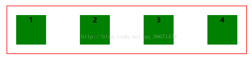
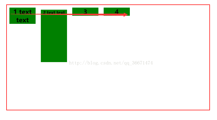
✦ order属性
定义项目的排列顺序。数值越小,排列越靠前,默认为0
效果为:<!DOCTYPE html> <html lang="en"> <head> <meta charset="UTF-8"> <title>flex</title> <style> .container{ display: flex; display:-webkit-flex; flex-direction: row; border:2px solid red; height:400px; margin:20px; } .item{ background: green; width: 100px; margin: 10px; font-size: 24px; text-align:center; font-weight: bold; } .two{font-size:16px;height:200px;order: -2} .three{order:9} </style> </head> <body> <div class="container"> <div class="item">1</div> <div class="item two">2</div> <div class="item three">3</div> <div class="item">4</div> </div> </body> </html>
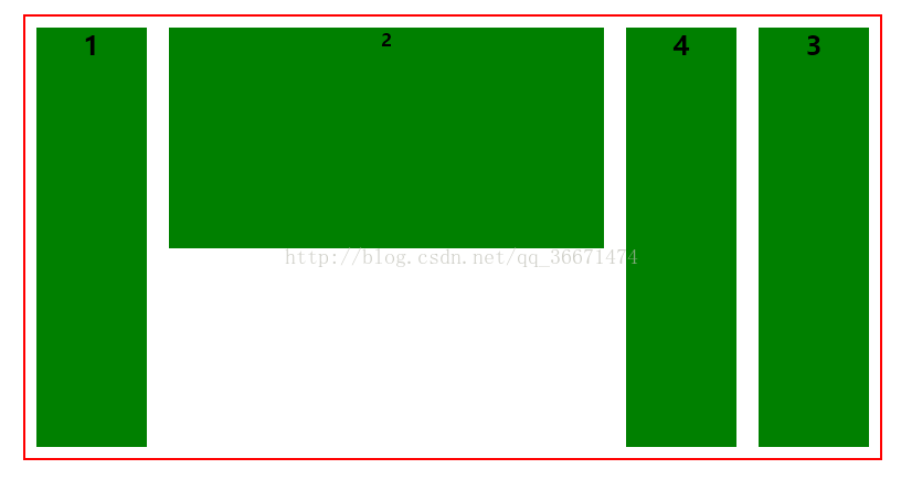
✦ flex-grow属性
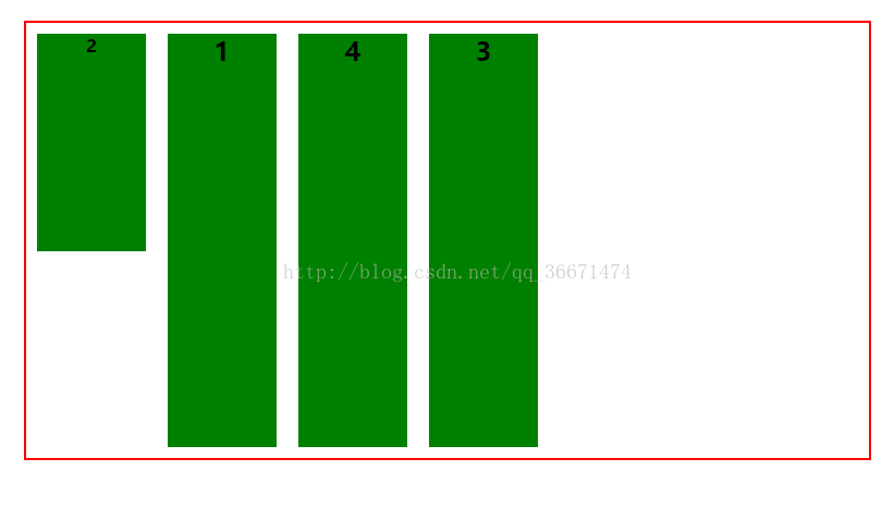
定义项目的放大比例,默认为0,值越大,放大的比例越大
效果为:<!DOCTYPE html> <html lang="en"> <head> <meta charset="UTF-8"> <title>flex</title> <style> .container{ display: flex; display:-webkit-flex; flex-direction: row; border:2px solid red; height:400px; margin:20px; } .item{ background: green; width: 100px; margin: 10px; font-size: 24px; text-align:center; font-weight: bold; } .two{font-size:16px;height:200px;flex-grow: 3} .three{order:9} </style> </head> <body> <div class="container"> <div class="item">1</div> <div class="item two">2</div> <div class="item three">3</div> <div class="item">4</div> </div> </body> </html>
✦ flex-shrink属性
项目的缩小比例,默认为1,值越大,缩小的比列越小
✦ flex-basis属性
定义了在分配多余空间之前,项目占据的主轴空间(main size)。浏览器根据这个属性,计算主轴是否有多余空间。它的默认值为auto,即项目的本来大小。
flex-basis:200px ,如果项目有多余的空间,设置为200px。那么会放大到200的宽度;
✦ flex属性
flex属性是flex-grow, flex-shrink 和 flex-basis的简写,默认值为0 1 auto。后两个属性可选。
✦ align-self属性
align-self属性允许单个项目有与其他项目不一样的对齐方式,可覆盖align-items属性。默认值为auto,表示继承父元素的align-items属性,如果没有父元素,则等同于stretch。


 扫一扫
扫一扫
 1043
1043

 被折叠的 条评论
为什么被折叠?
被折叠的 条评论
为什么被折叠?
 到【灌水乐园】发言


