


本片博客意在练习使用css3的新增特性实现一些炫酷的特效
特效如图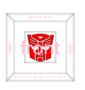
代码如下
<!doctype html>
<html lang="en">
	<head>
		<meta charset="UTF-8">
		<meta name="Generator" content="EditPlus®">
		<meta name="Author" content="ydj">
		<meta name="Keywords" content="">
		<meta name="Description" content="">
		<title>盒子旋转打开</title>
		<style type="text/css">
			*{margin:0;padding:0;}
			ul,ol{list-style:none;}
			a{text-decoration:none;}
			img{border:0;}
			body{
				background-color:#fff;
				perspective:800px;
			}
			.stage{
				position:relative;
				width:200px;
				height:200px;
				margin:400px auto;
				transform-style:preserve-3d;
				transform:rotateY(0deg);
				transition:2s;
			}
			.stage>.face{
				position:absolute;
				width:200px;
				height:200px;
				box-shadow:0 0 15px #999 inset;
				font-size:50px;
				line-height:200px;
				text-align:center;
				color:pink;
			}
			.stage>.front{

				transform:translateZ(100px);
			}
			.stage>.rear{
				transform:rotateY(180deg) translateZ(100px);
			}
			.stage>.left{
				transform:rotateY(-90deg) translateZ(100px);
			}
			.stage>.right{
				transform:rotateY(90deg) translateZ(100px);
			}
			.stage>.top{
				transform-origin:top center;
				/* 基点改变了,下面的语句就不好使了 */
				/* transform:rotateX(90deg) translateZ(100px); */
				transform: translateZ(-100px) rotateX(90deg);
				transition:2s;
			}
			.stage>.bottom{
				transform:rotateX(-90deg) translateZ(100px);
			}
			.stage:hover{
				transform:rotateY(360deg);

			}
			.stage:hover >.top{
				transform: translateZ(-100px) rotateX(180deg);

			}
			.small{
				position:absolute;
				left:50%;
				top:50%;
				width:100px;
				height:100px;
				margin-left:-50px;
				margin-top:-50px;
				transform-style:preserve-3d;
				transition:2s;
			}
			.small>.face{
				position:absolute;
				width:100px;
				height:100px;
				box-shadow:0 0 15px #999 inset;
				font-size:50px;
				line-height:100px;
				text-align:center;
				color:pink;
			}
			.small>.front{
				background:url("images/1.jpg") no-repeat center;
				transform:translateZ(50px);
			}
			.small>.rear{
				background:url("images/2.jpg") no-repeat center;
				transform:rotateY(180deg) translateZ(50px);
			}
			.small>.left{
				background:url("images/3.jpg") no-repeat center;
				transform:rotateY(-90deg) translateZ(50px);
			}
			.small>.right{
				background:url("images/4.jpg") no-repeat center;
				transform:rotateY(90deg) translateZ(50px);
			}
			.small>.top{
				background:url("images/5.jpg") no-repeat center;
				transform:rotateX(90deg) translateZ(50px);

			}
			.small>.bottom{
				background:url("images/6.jpg") no-repeat center;
				transform:rotateX(-90deg) translateZ(50px);
			}
			.stage:hover .small{
				transform: translateY(-400px) rotateY(360deg);
			}
		</style>
	</head>
	<body>
		<div class="stage">
			<div class="face front">front</div>
			<div class="face rear">rear</div>
			<div class="face left">left</div>
			<div class="face right">right</div>
			<div class="face top">top</div>
			<div class="face bottom">bottom</div>
			<div class="small">
				<div class="face front"></div>
				<div class="face rear"></div>
				<div class="face left"></div>
				<div class="face right"></div>
				<div class="face top"></div>
				<div class="face bottom"></div>
				</div>
		</div>
	</body>
</html>


 扫一扫
扫一扫


 984
984

 被折叠的 条评论
为什么被折叠?
被折叠的 条评论
为什么被折叠?
 到【灌水乐园】发言


