


1. 动画CSS边框
当我们想使我们的项目更可见时,该怎么办?
来给它做个动画!
我们可以对我们的边框进行动画化处理,甚至在不改变元素大小的情况下也可以进行动画化处理,非常简单。
要做到这一点,我们只需要为动画创建一个自定义的关键帧(keyframe),并在元素的CSS代码中的动画(animation)参数中使用它。
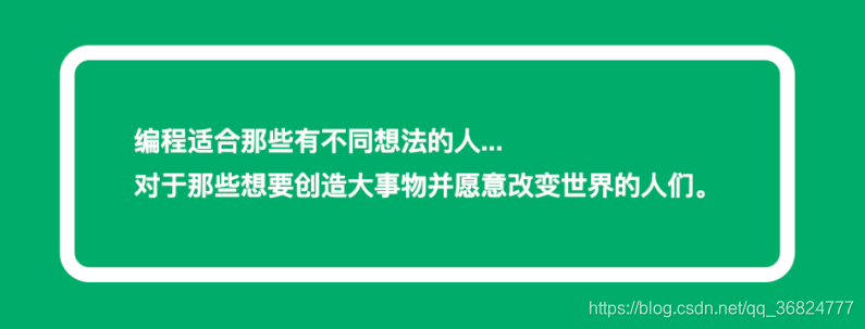
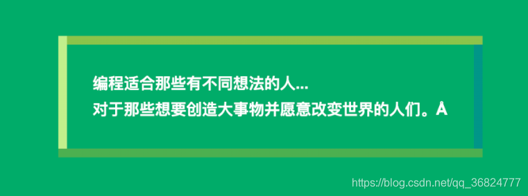
让我们看一个例子,HTML如下
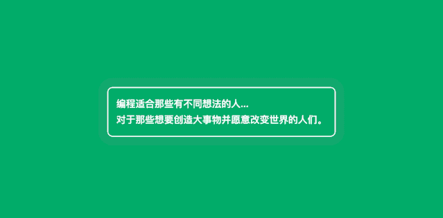
<div id="box">
编程适合那些有不同想法的人... <br/>
对于那些想要创造大事物并愿意改变世界的人们。
div>
编写CSS和动画
@keyframes animated-border {
0% {
box-shadow: 0000rgba(255,255,255,0.4);
}
100% {
box-shadow: 00020pxrgba(255,255,255,0);
}
}
#box {
animation: animated-border 1.5s infinite;
font-family: Arial;
font-size: 18px;
line-height: 30px;
font-weight: bold;
color: white;
border: 2px solid;
border-radius: 10px;
padding: 15px;
}
效果如下
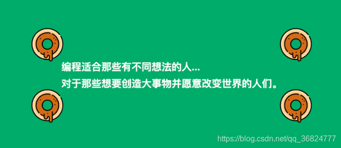
2. CSS图像边框
你是否曾经想象过你的元素周围有甜甜圈?
现在,你无需过多的编码即可通过纯CSS添加它们。
为此,你需要在元素的CSS代码中使用 border-image 属性。
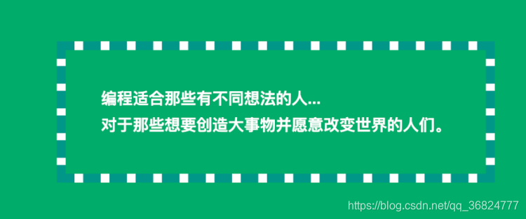
让我们看一个例子,还是之前的HTML
<div id="box">
编程适合那些有不同想法的人... <br/>
对于那些想要创造大事物并愿意改变世界的人们。
div>
编写CSS
#box {
font-family: Arial;
font-size: 18px;
line-height: 30px;
font-weight: bold;
color: white;
border: 40px solid transparent;
border-image: url(https://image.flaticon.com/icons/svg/648/648787.svg);
border-image-slice: 100%;
border-image-width: 60px;
padding: 15px;
}
效果如下
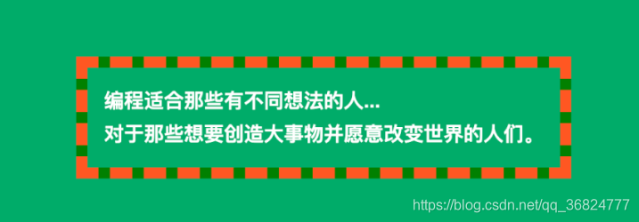
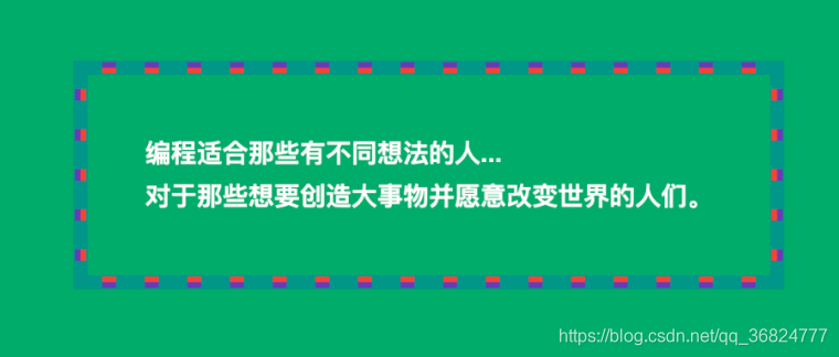
3.蛇式CSS边框
如果我们需要双色超可视边框怎么办?
我们可以穿上蛇的衣服,想怎么着色就怎么着色。
#box {
font-family: Arial;
font-size: 18px;
line-height: 30px;
font-weight: bold;
color: white;
padding: 15px;
border: 10px dashed #FF5722;
background:
linear-gradient(to top, green, 10px, transparent 10px),
linear-gradient(to right, green, 10px, transparent 10px),
linear-gradient(to bottom, green, 10px, transparent 10px),
linear-gradient(to left, green, 10px, transparent 10px);
background-origin: border-box;
}
效果如下
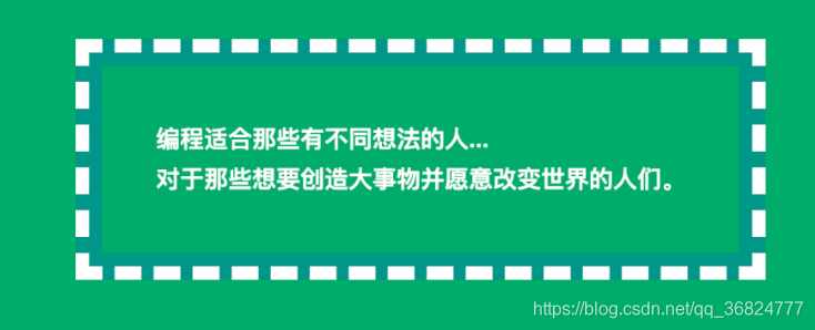
4.阶梯样式CSS边框
你是否曾经尝试在div周围添加3d样式边框?
在我们的元素中添加一些多色深度是非常容易的,我们只需要在CSS中添加一些方块阴影就可以了。
让我们测试一下我们的例子!
#box {
font-family: Arial;
font-size: 18px;
line-height: 30px;
font-weight: bold;
color: white;
padding: 40px;
box-shadow:
inset #0096880005px,
inset #059c8e0001px,
inset #0cab9c00010px,
inset #1fbdae00011px,
inset #8ce9ff00016px,
inset #48e4d600017px,
inset #e5f9f700021px,
inset #bfecf700022px
}
效果
5.只有阴影CSS边框
有时我们需要在现成的设计中添加边框,但添加更多像素会有些问题,它可能改变元素的位置。
现在,我们可以使用围绕元素的框阴影作为边框,看一下代码。
#box {
font-family: Arial;
font-size: 18px;
line-height: 30px;
font-weight: bold;
color: white;
padding: 40px;
border-radius: 10px;
box-shadow: 00010px white;
}
效果
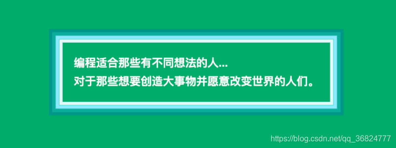
6.带阴影和轮廓的CSS边框
我们可以通过几种方式达到与蛇式类似的效果。接下来,其中之一是在元素CSS中混合 box-shadow 和 outline 属性。
让我们来看看。
#box {
font-family: Arial;
font-size: 18px;
line-height: 30px;
font-weight: bold;
color: white;
padding: 40px;
box-shadow: 00010px white;
outline: dashed 10px#009688;
}
效果
7.少量阴影和轮廓
我们甚至可以在边框中创建一些颜色和元素。
为此,我们需要混合阴影和轮廓,如下面的示例所示。
让我们尝试一下。
#box {
font-family: Arial;
font-size: 18px;
line-height: 30px;
font-weight: bold;
color: white;
padding: 40px;
box-shadow:
0001px#009688,
0005px#F44336,
0009px#673AB7,
00010px#009688;
outline: dashed 10px#009688;
}
效果
8.带有阴影的双CSS边框
我们也可以混合一些 box-shadow 和 outline 的边框。
这将创建一个漂亮的带尖刺的线条效果,如下例所示。
让我们检查一下代码!
#box {
font-family: Arial;
font-size: 18px;
line-height: 30px;
font-weight: bold;
color: white;
padding: 40px;
box-shadow: 00010px#009688;
border: 10px solid #009688;
outline: dashed 10px white;
}
效果
9.多色CSS边框
如果我们想给边框加上比前面的示例更多的颜色怎么办?
我们甚至可以将元素的每一面都设置为不同的颜色。
为此,我们将需要一些带有渐变的自定义背景。
看下面的例子。
#box {
font-family: Arial;
font-size: 18px;
line-height: 30px;
font-weight: bold;
color: white;
padding: 40px;
background:
linear-gradient(to top, #4caf50, #4caf50 10px, transparent 10px),
linear-gradient(to right, #c1ef8c, #c1ef8c 10px, transparent 10px),
linear-gradient(to bottom, #8bc34a, #8bc34a 10px, transparent 10px),
linear-gradient(to left, #009688, #00968810px, transparent 10px);
background-origin: border-box;
}


 扫一扫
扫一扫


 352
352

 被折叠的 条评论
为什么被折叠?
被折叠的 条评论
为什么被折叠?
 到【灌水乐园】发言


