微信小程序-自定义模态窗口
<button bindtap="showDialogBtn">自定义弹窗</button>
<!--弹窗-->
<view class="modal-hide" bindtap="hideModal" catchtouchmove="preventTouchMove" wx:if="{{showModal}}"></view>
<view class="modal-dialog" wx:if="{{showModal}}">
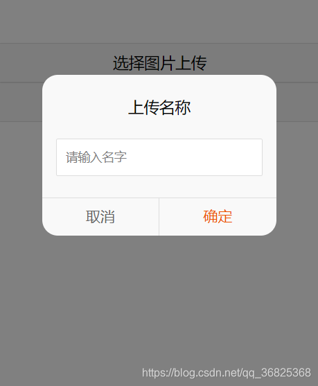
<view class="modal-title">上传名称</view>
<view class="modal-content">
<view class="modal-input">
<input placeholder-class="input-holder" type="number" maxlength="10" bindinput="inputChange" class="input" placeholder="请输入名字"></input>
</view>
</view>
<view class="modal-footer">
<view class="btn-cancel" bindtap="onCancel" data-status="cancel">取消</view>
<view class="btn-confirm" bindtap="onConfirm" data-status="confirm">确定</view>
</view>
</view>
.modal-hide {
  width: 100%;
  height: 100%;
  position: fixed;
  top: 0;
  left: 0;
  background: #000;
  opacity: 0.5;
  overflow: hidden;
  z-index: 9000;
  color: #fff;
}

.modal-dialog {
  width: 540rpx;
  overflow: hidden;
  position: fixed;
  top: 50%;
  left: 0;
  z-index: 9999;
  background: #f9f9f9;
  margin: -180rpx 105rpx;
  border-radius: 36rpx;
}

.modal-title {
  padding-top: 50rpx;
  font-size: 36rpx;
  color: #030303;
  text-align: center;
}

.modal-content {
  padding: 50rpx 32rpx;
}

.modal-input {
  display: flex;
  background: #fff;
  border: 2rpx solid #ddd;
  border-radius: 4rpx;
  font-size: 28rpx;
}

.input {
  width: 100%;
  height: 82rpx;
  font-size: 28rpx;
  line-height: 28rpx;
  padding: 0 20rpx;
  box-sizing: border-box;
  color: #333;
}

input-holder {
  color: #666;
  font-size: 28rpx;
}

.modal-footer {
  display: flex;
  flex-direction: row;
  height: 86rpx;
  border-top: 1px solid #dedede;
  font-size: 34rpx;
  line-height: 86rpx;
}

.btn-cancel {
  width: 50%;
  color: #666;
  text-align: center;
  border-right: 1px solid #dedede;
}

.btn-confirm {
  width: 50%;
  color: #ec5300;
  text-align: center;
}
Page({
    data: {
      showModal: false,
    },
    onLoad: function () {
    },
    showDialogBtn: function() {
      this.setData({
        showModal: true
      })
    },
    preventTouchMove: function () {
    },

    hideModal: function () {
      this.setData({
        showModal: false
      });
    },

    onCancel: function () {
      this.hideModal();
    },

    onConfirm: function () {
      this.hideModal();
    }
})


 1528
1528


 被折叠的 条评论
为什么被折叠?
被折叠的 条评论
为什么被折叠?
 到【灌水乐园】发言


