


实现让子盒子在父盒子内水平垂直居中的方式有很多:
1.定位(有两种)
a.把top和left写为固定值
b. margin设置auto
2.位移(常用)
3.给父盒子设置padding
4.给子盒子设置margin
下面我们用代码来展示一下:
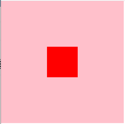
第一种:定位之把把top和left写为固定值
<!DOCTYPE html>
<html lang="en">
<head>
    <meta charset="UTF-8">
    <meta http-equiv="X-UA-Compatible" content="IE=edge">
    <meta name="viewport" content="width=device-width, initial-scale=1.0">
    <title>Document</title>
    <style>
        * {
            margin: 0;
            padding: 0;
            box-sizing: border-box;
        }
        .father {
            width: 400px;
            height: 400px;
            background-color: pink;
            position: relative;
        }

        .son {
            width: 100px;
            height: 100px;
            background-color: red;
            position: absolute;
            top: 150px;
            left: 150px;
        }

    </style>
</head>
<body>
    <div class="father">
        <div class="son"></div>
    </div>
</body>
</html>
第二种:定位之把margin设置auto
<!DOCTYPE html>
<html lang="en">
<head>
    <meta charset="UTF-8">
    <meta http-equiv="X-UA-Compatible" content="IE=edge">
    <meta name="viewport" content="width=device-width, initial-scale=1.0">
    <title>Document</title>
    <style>
        * {
            margin: 0;
            padding: 0;
            box-sizing: border-box;
        }
        .father {
            width: 400px;
            height: 400px;
            background-color: pink;
            position: relative;
        }

        .son {
            width: 100px;
            height: 100px;
            background-color: red;
            position: absolute;
            top: 0;
            bottom: 0;
            left: 0;
            right: 0;
            margin: auto;
        }


    </style>
</head>
<body>
    <div class="father">
        <div class="son"></div>
    </div>
</body>
</html>
第三种:设置位移
<!DOCTYPE html>
<html lang="en">
<head>
    <meta charset="UTF-8">
    <meta http-equiv="X-UA-Compatible" content="IE=edge">
    <meta name="viewport" content="width=device-width, initial-scale=1.0">
    <title>Document</title>
    <style>
        * {
            margin: 0;
            padding: 0;
            box-sizing: border-box;
        }
        .father {
            width: 400px;
            height: 400px;
            background-color: pink;
            position: relative;
        }

        .son {
            width: 100px;
            height: 100px;
            background-color: red;
            position: absolute;
            top: 50%;
            left: 50%;
            transform: translate(-50%, -50%);
        }


    </style>
</head>
<body>
    <div class="father">
        <div class="son"></div>
    </div>
</body>
</html>
第四种:给父盒子设置padding
<!DOCTYPE html>
<html lang="en">
<head>
    <meta charset="UTF-8">
    <meta http-equiv="X-UA-Compatible" content="IE=edge">
    <meta name="viewport" content="width=device-width, initial-scale=1.0">
    <title>Document</title>
    <style>
        * {
            margin: 0;
            padding: 0;
            box-sizing: border-box;
        }
        .father {
            width: 400px;
            height: 400px;
            background-color: pink;
            padding: 150px;
        }

        .son {
            width: 100px;
            height: 100px;
            background-color: red;


        }


    </style>
</head>
<body>
    <div class="father">
        <div class="son"></div>
    </div>
</body>
</html>
第五种:给子盒子设置margin
<!DOCTYPE html>
<html lang="en">
<head>
    <meta charset="UTF-8">
    <meta http-equiv="X-UA-Compatible" content="IE=edge">
    <meta name="viewport" content="width=device-width, initial-scale=1.0">
    <title>Document</title>
    <style>
        * {
            margin: 0;
            padding: 0;
            box-sizing: border-box;
        }
        .father {
            width: 400px;
            height: 400px;
            background-color: pink;
            /*
            嵌套的盒子中,子盒子的margin-top会产生塌陷,
            给父盒子设置overflow:hidden;可以解决这个问题
            */
            overflow: hidden;
        }

        .son {
            width: 100px;
            height: 100px;
            background-color: red;
            margin: 150px auto;
        }


    </style>
</head>
<body>
    <div class="father">
        <div class="son"></div>
    </div>
</body>
</html>


 1418
1418


 被折叠的 条评论
为什么被折叠?
被折叠的 条评论
为什么被折叠?
 到【灌水乐园】发言


