


本文的示例是来自《深入解析CSS》
效果展示
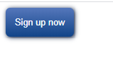
按钮的html
<button class="button"></button>
按钮的样式
.button {
	padding: 1em;
    border: 0;
    border-radius: 0.5em;
    font-size: 0.8rem;
    color: white;
    background-image: linear-gradient(to bottom, #57b, #148);
    box-shadow: 0.1em 0.1em 0.5em #124;
}
.button:active {
	box-shadow: inset 0 0 0.5em #124, inset 0 0.5em 1em rgba(0,0,0,0.4);
}
注意事项
由于谷歌会自己给button的focus的状态加上轮廓线,所以你可以将轮廓线outline设为none。
.button:focus {
    outline: none;
}
属性剖析
这里面主要涉及到渐变和阴影的效果,主要讲解这两个属性。
-
线性渐变
语法:background-image: linear-gradient(direction, color-stop1, color-stop2, …);
direction: 方向,可以指定角度,比如45deg。也可直接写to right,就是从左到右。
2、box-shadow
可设置任意数量的阴影,用逗号分隔。
可设置的值:
阴影的X轴偏移量、Y轴偏移量、模糊半径、扩散半径和颜色。
插页(阴影向内) | x偏移量 | y偏移量 | 模糊半径|扩散半径| 阴影颜色
在该示例中,active的状态下,就设置了两个阴影。都是阴影向内。


 360
360


 被折叠的 条评论
为什么被折叠?
被折叠的 条评论
为什么被折叠?
 到【灌水乐园】发言


