


优点
- 增加开发维护效率:少打很多字符,也不用跳来跳去或者分屏去修改样式
- 复用性强,缩小项目体积
- 降低命名负担
- 不用担心更改影响到其他地方:只是更改了某个东西的class名,而不是更改class里的属性
引擎介绍
Unocss: Guide
用Vite安装和配置步骤:UnoCSS Vite Plugin
互动性文档:https://unocss.dev/interactive/(查询默认预设中的东西)
最好安装一个VS Code插件 :UnoCSS(用来提醒并验证class)
开发服务器开启了之后,也可以直接查看生成的css: localhost:5173/__unocss
Vite配置示例
main.ts里需要引入css
// main.ts
import 'virtual:uno.css'
vite配置文件中
// vite.config.ts
import UnoCSS from 'unocss/vite'
import { defineConfig } from 'vite'

export default defineConfig({
  plugins: [
    UnoCSS({
        configFile: '../uno.config.ts'
      }),
  ],
})
新建一个uno配置文件(可以把rules/variants/shortcuts之类的直接放在里面,我这里是单独把自定义的配置分出了一个文件)
// uno.config.ts
import { defineConfig, presetUno, presetAttributify } from 'unocss'
import { myPreset } from './css-preset'
import presetRemToPx from '@unocss/preset-rem-to-px'

export default defineConfig({
  presets: [
    myPreset,
    presetUno(),
    presetAttributify(),
    presetRemToPx({ baseFontSize: 4 })
  ],
  // ...其他配置项
})
自定义方案的文件:
// css-preset.ts
import type { Preset } from 'unocss'

export const myPreset: Preset = {
  name: 'my-preset',
  rules: [
    [/^fs-(\d+)$/, ([, num]) => ({ 'font-size': `${num}px` })],
    [/^lh-(\d+)$/, ([, num]) => ({ 'line-height': `${num}px` })],
    [/^letter-([0-9.]+)$/, ([, num]) => ({ 'letter-spacing': `${num}em` })]
  ],
  variants: [
    // hover:xxx (已经存在于Uno预设中)
    (matcher) => {
      if (!matcher.startsWith('hover:')) {
        return matcher
      }
      return {
        matcher: matcher.slice(6),
        selector: s => `${s}:hover`
      }
    }
  ],
  shortcuts: {
    'button': 'select-none cursor-pointer text-center bg-blue c-white b-rd-2'
  }
}
Uno预设示例
更多的看这里: https://unocss.dev/interactive/
此处我用了rem to px的预设,所以后面不加单位的数字的话会直接被转化为px(如果不用这个预设,就需要用m-100px之类的)
margin
4项相同数值:m-100 等同于 margin: 100px
2项相同数值: mx-100 my-200 等同于 margin: 200px 100px
单项: mt-100 mr-200 mb-300 ml-400 等同于 margin: 100px 200px 300px 400px
负数: -mt-100或者mt--100
padding
和margin类似,使用p开头
text-align
text-center, text-start, text-end...
width/height
w-600, h-100...
min-w-100, max-w-100...
color
c-blue, c-cyan...
c-blue-400, c-sky-500...
更多预设颜色看https://unocss.dev/interactive/?s=guide:Colors
z-index
z-1, z-2, z-3...
border
4边: b-()...
2边:b-x-(), b-y-()...
单边:b-l-(), b-t-()...
宽度: b-3, b-x-3, b-l-3...
样式: b-dotted, b-dashed, b-solid, b-none...
颜色: b-black, b-blue...
position
absolute, relative, fixed...
important
在前面加上!
!h-600, !pt-15...
其他预设
文档:Uno preset
推荐:
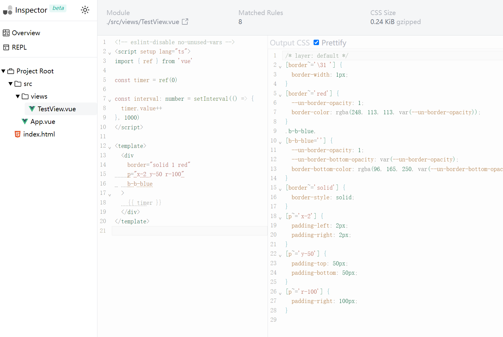
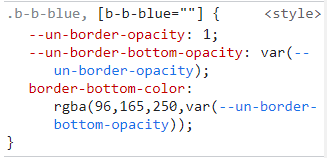
1. Attributify: 可以分类,并且甚至能省去写class的功夫.. (下图)
2. Rem to px: 数字后面不加单位默认转为px。如果把baseFontSize设置为4后,不加单位的数字就等于px数值(原先默认为rem)
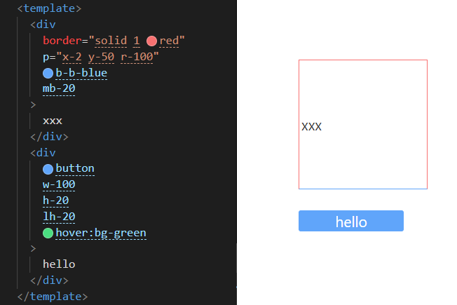
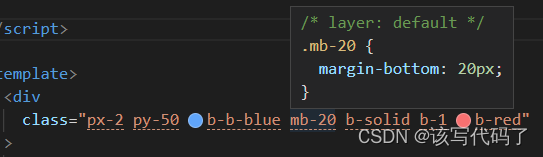
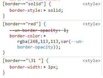
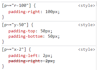
拿上面的div来分析,开发者工具中是这样的:
一些配置项
Rules
写自定义规则,比如:
rules: [
    [/^fs-(\d+)$/, ([, num]) => ({ 'font-size': `${num}px` })],
    [/^lh-(\d+)$/, ([, num]) => ({ 'line-height': `${num}px` })],
    [/^letter-([0-9.]+)$/, ([, num]) => ({ 'letter-spacing': `${num}em` })]
  ]
Variants
可以设置:hover这样的样式(hover已经在默认预设里了)
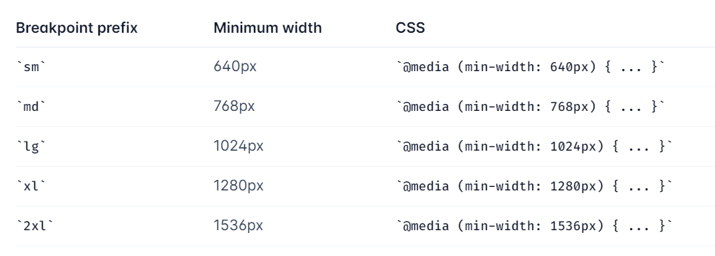
也可以用sm:xxx, lg:xxx之类的设置不同media做不同尺寸的适配
(大概是这样的,截图来自Tailwind文档)
Shortcuts
用来设置需要重复利用,并且有多种样式的class
shortcuts: {
    'button': 'select-none cursor-pointer text-center bg-blue c-white b-rd-2'
  }
Theme
可以给生成的class上再加上一道选项。相当于在theme里存储一套方案,然后在rules里面可以匹配到theme,再进行判定(看官网文档例子)
比较有用的例子,可以覆盖默认的media尺寸:
(只有这个例子是完全覆盖,而不是改写,官网文档特意提了这点)
theme: {
  // ...
  breakpoints: {
    sm: '320px',
    md: '640px',
  },
}
Layer
设置优先级,并排序
SafeList/ BlockList
预加载/不加载某些class


 扫一扫
扫一扫


 908
908

 被折叠的 条评论
为什么被折叠?
被折叠的 条评论
为什么被折叠?
 到【灌水乐园】发言


