


在Axure原型中使用Echarts
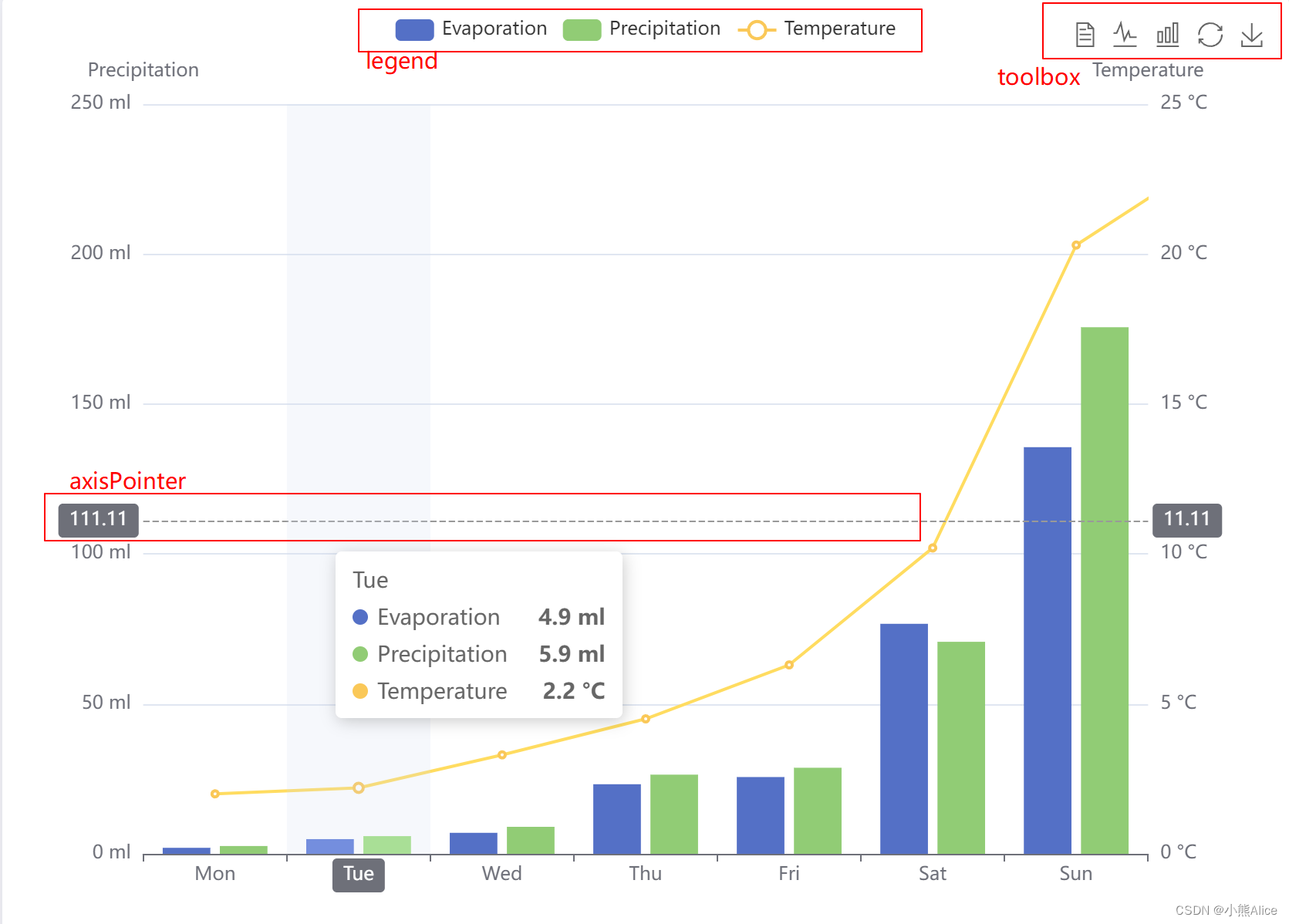
1、双y轴柱状+折线图
【代码解读】
option = {
  tooltip: {
    // 展示xAxis和yAxis
    trigger: 'axis',
    axisPointer: {
      // 鼠标位置的Y轴值横线,颜色
      type: 'cross',
      crossStyle: {
        color: '#999'
      }
    }
  },
  //右上角操作区
  toolbox: {
    feature: {
      // 数据表格
      dataView: { show: true, readOnly: false },
      // 柱状与折线切换
      magicType: { show: true, type: ['line', 'bar'] },
      //数据还原
      restore: { show: true },
      //保存为图片
      saveAsImage: { show: true }
    }
  },
  legend: {
    data: ['Evaporation', 'Precipitation', 'Temperature']
  },
  // X轴
  xAxis: [
    {
      type: 'category',
      data: ['Mon', 'Tue', 'Wed', 'Thu', 'Fri', 'Sat', 'Sun'],
      axisPointer: {
        type: 'shadow'
      }
    }
  ],
  // Y轴
  yAxis: [
    {
      type: 'value',
      name: 'Precipitation',
      min: 0,
      max: 250,
      interval: 50,
      axisLabel: {
        formatter: '{value} ml'
      }
    },
    {
      type: 'value',
      name: 'Temperature',
      min: 0,
      max: 25,
      interval: 5,
      axisLabel: {
        formatter: '{value} °C'
      }
    }
  ],
  //三组数据
  series: [
    //Evaporation数据形式及单位,
    {
      name: 'Evaporation',
      type: 'bar',
      // 对应顶部的tooltip>trigger: 'axis'
      tooltip: {
        valueFormatter: function (value) {
          return value + ' ml';
        }
      },
      data: [
        2.0, 4.9, 7.0, 23.2, 25.6, 76.7, 135.6, 162.2, 32.6, 20.0, 6.4, 3.3
      ]
    },
       //Precipitation数据形式及单位,
    {
      name: 'Precipitation',
      type: 'bar',
      tooltip: {
        valueFormatter: function (value) {
          return value + ' ml';
        }
      },
      data: [
        2.6, 5.9, 9.0, 26.4, 28.7, 70.7, 175.6, 182.2, 48.7, 18.8, 6.0, 2.3
      ]
    },
     //Temperature数据形式及单位,
    {
      name: 'Temperature',
      type: 'line',
      yAxisIndex: 1,
      tooltip: {
        valueFormatter: function (value) {
          return value + ' °C';
        }
      },
      data: [2.0, 2.2, 3.3, 4.5, 6.3, 10.2, 20.3, 23.4, 23.0, 16.5, 12.0, 6.2]
    }
  ]
};
【生成图片】
2、zedoox缩放
【代码解读】
let base = +new Date(1968, 9, 3);
let oneDay = 24 * 3600 * 1000;
let date = [];
let data = [Math.random() * 300];
//循环生成日期
for (let i = 1; i < 20000; i++) {
  var now = new Date((base += oneDay));
  date.push([now.getFullYear(), now.getMonth() + 1, now.getDate()].join('/'));
  //插入随机数据
  data.push(Math.round((Math.random() - 0.5) * 20 + data[i - 1]));
}
option = {
  //提示框:坐标轴数值
  tooltip: {
    trigger: 'axis',
    position: function (pt) {
      return [pt[0], '10%'];
    }
  },
  //主标题
  title: {
    left: 'center',//标题位置
    text: 'Large Area Chart'//标题内容
  },
  //右上角操作区
  toolbox: {
    feature: {
      //右上角操作区:缩放操作
      dataZoom: {
        yAxisIndex: 'none'
      },
      //右上角操作区:还原
      restore: {},
      //右上角操作区:保存为图片
      saveAsImage: {}
    }
  },
  xAxis: {
    type: 'category',
    boundaryGap: false,
    data: date //横坐标数据:日期
  },
  yAxis: {
    type: 'value',
    boundaryGap: [0, '10%']
  },
  //缩放配置
  dataZoom: [
    {
      type: 'inside',
      start: 0,
      end: 10
    },
    //底部缩放条,没有这个就不显示缩放条,任然有缩放功能
    {
      start: 0,
      end: 10
    },

  ],
  // series配置
  series: [
    {
      name: 'Fake Data',
      type: 'line',
      symbol: 'none',
      sampling: 'lttb',
      itemStyle: {//线段样式设置
        color: 'rgb(255, 70, 131)'//line线段颜色
      },
      //折线区域配置
      areaStyle: {//渐变
      /*
 1、使用颜色渐变生成器echarts.graphic.LinearGradient
2、前边四个参数配置颜色渐变的起止位置:按照顺序依次为:右 下 左 上 四个方向的起止位置,1 代表着渐变
3、第五个参数是一个数组,数组里边给渐变的起止点的颜色,offset:0代表渐变0方向的颜色; offset:1代表渐变1方向的颜色
      */
        color: new echarts.graphic.LinearGradient(0, 0, 0, 1, [ //从上至下渐变
          {
            offset: 0,
            color: 'rgb(225, 1, 2)'  //红
          },
          {
            offset: 0.3,
            color: 'rgb(247, 223, 31)' //黄
          },
          {
            offset: 1,
            color: 'rgb(5,194,151)' //绿
          },

        ])
      },
      data: data
    }
  ]
};
【生成图列】
3、面积图,渐变LinearGradient
(1)线性渐变,通过new echarts.graphic.LinearGradient(a,b,c,d,data)函数配置线性渐变
a,b,c,d:取值0|1,代表右下左上线性渐变的方向;
比如:a=1,b=0,c=0,d=0代表颜色从左至右渐变;data表示线性渐变的配置数组。其中每个对象包含两个属性offset:表示该颜色在图块中起始的位置,color表示渐变颜色。
(2)径向渐变,通过new echarts.graphic.LinearGradient(x,y,r,ata)函数配置径向渐变
x:渐变起始颜色在图形中的x轴坐标;
y:渐变起始颜色在图形中的y轴坐标;
r:代表渐变半径;
data:渐变配置数组。
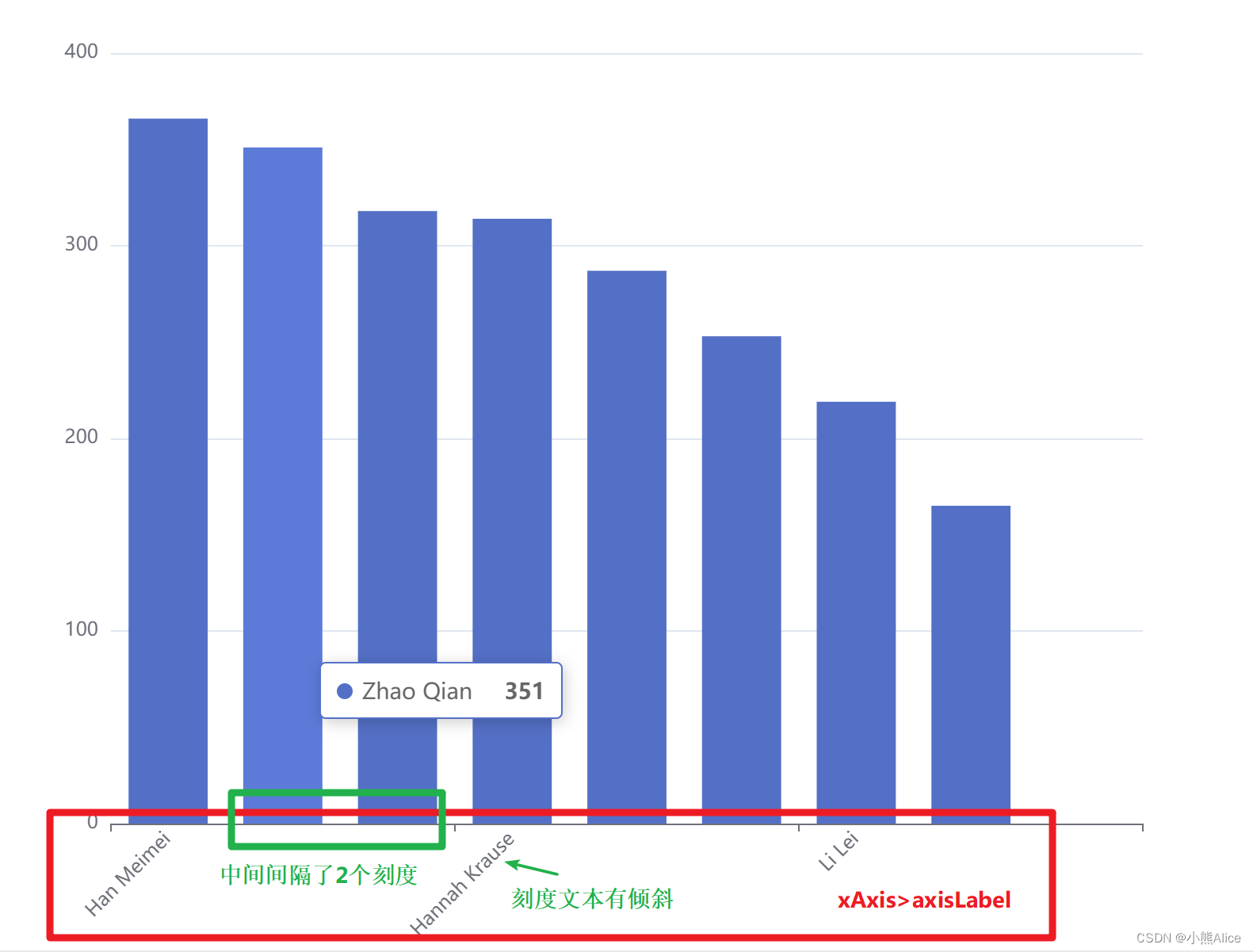
4、x轴坐标刻度样式设置
【代码解读】
option = {
  dataset: [
    {
      dimensions: ['name', 'age', 'profession', 'score', 'date'],
      source: [
        ['Hannah Krause', 41, 'Engineer', 314, '2011-02-12'],
        ['Zhao Qian', 20, 'Teacher', 351, '2011-03-01'],
        ['Jasmin Krause ', 52, 'Musician', 287, '2011-02-14'],
        ['Li Lei', 37, 'Teacher', 219, '2011-02-18'],
        ['Karle Neumann', 25, 'Engineer', 253, '2011-04-02'],
        ['Adrian Groß', 19, 'Teacher', '-', '2011-01-16'],
        ['Mia Neumann', 71, 'Engineer', 165, '2011-03-19'],
        ['Böhm Fuchs', 36, 'Musician', 318, '2011-02-24'],
        ['Han Meimei', 67, 'Engineer', 366, '2011-03-12']
      ]
    },
    {
      transform: {
        type: 'sort',
        config: { dimension: 'score', order: 'desc' } //asc升序,desc降序
      }
    }
  ],
   tooltip: {  },
  xAxis: {
    type: 'category',
    //X轴坐标配置:间隔多少个显示x刻度,x刻度文本的倾斜角度
    axisLabel: { interval: 2, rotate: 45 }
  },
  yAxis: {},
  series: {
    type: 'bar',
    encode: { x: 'name', y: 'score' },
    datasetIndex: 1
  }
};
【生成图片】
记录在项目中用到过且常用的样式调整!


 606
606


 被折叠的 条评论
为什么被折叠?
被折叠的 条评论
为什么被折叠?
 到【灌水乐园】发言


