


1、安装postcss-pxtorem
npm i postcss-pxtorem -D
2、配置文件
vite.config.ts 文件
```html
css: {
      postcss: {
        plugins: [
          require('postcss-pxtorem')({
            rootValue: 37.5, // UI设计稿的宽度/10
            unitPrecision: 3, // 转rem精确到小数点多少位
            propList: ['*'], // 需要转换的属性 *表示所有
            selectorBlackList: ['ignore'], // 不进行px转换的选择器
            replace: true, // 是否直接更换属性值,而不添加备用属性
            mediaQuery: false, // 是否在媒体查询的css代码中也进行转换
            minPixelValue: 0, // 设置要替换的最小像素值
            exclude: /node_modules/i // 排除node_modules文件夹下的文件
          }),
        ]
      }
    },
3、创建rem.tsx文件,处理pc端适配
rem.tsx文件
// 判断是否是PC端
const isPc = !(/Android|iPhone|SymbianOS|Windows Phone|iPad|iPod/i.test(navigator.userAgent))
// 设置基础根文件大小
let baseSize = 37.5
// rem 函数
function setRem() {
  const clientWidth = document.documentElement.clientWidth
  // 设计稿一般都是以375的宽度
  let scale = clientWidth / (baseSize * 10)
  // 设置页面根节点字体大小(“Math.min(scale, 2)” 指最高放大比例为2,可根据实际业务需求调整)
  let enlarge = 1.5
  if (isPc) {
    enlarge = 1
    scale = clientWidth / 980 // 980 是PC端设计稿的宽度
  }
  document.documentElement.style.fontSize = baseSize * Math.min(scale, enlarge) + 'px'
}
// 调用方法
setRem()

// 监听窗口在变化时重新设置跟文件大小
window.onresize = function () {
  setRem()
}

export default {}
4、main.ts文件中引入
import './utils/rem'
5、运行
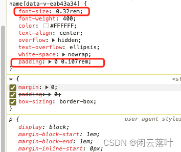
运行后查看样式,px都被转为了rem


 767
767


 被折叠的 条评论
为什么被折叠?
被折叠的 条评论
为什么被折叠?
 到【灌水乐园】发言


