


- 效果图

- HTML架构

<!DOCTYPE html>
<html lang="en">
<head>
    <meta charset="UTF-8">
    <meta name="viewport" content="width=device-width, initial-scale=1.0">
    <meta http-equiv="X-UA-Compatible" content="ie=edge">
    <title>主页</title>
</head>
<body>
    <div>
        <ul>
            <li><a>主页</a></li>
            <li><a>菜单一</a></li>
            <li><a>菜单二</a></li>
            <li><a>菜单三</a></li>
            <li><a>菜单四</a></li>
            <li><a>菜单五</a></li>
        </ul>
    </div>
</body>
</html>- 样式
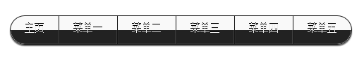
没加背景时候的效果

加了背景后的效果

<!DOCTYPE html>
<html lang="en">
<head>
    <meta charset="UTF-8">
    <meta name="viewport" content="width=device-width, initial-scale=1.0">
    <meta http-equiv="X-UA-Compatible" content="ie=edge">
    <title>主页</title>
    <style type="text/css">
        ul,li {
            list-style-type: none;
            padding: 0;
        }
        .ulStyle {
            float: left;
            height: 40px;
            margin: 20px 20px;
            border-radius:30px !important;
            border: 1px solid #151515;
            box-shadow: 0px 2px 2px rgba(0,0,0,0.6);
            overflow: hidden;
        }
        .ulStyle li{
            float: left;
        }
        .ulStyle li a {
            float: left;
            display: block;
            text-decoration: none;
            padding: 0 20px;
            height: 40px;
            line-height: 36px;
            font-size: 14px;
            color: #eee;
            text-align: center;
            border-right: 1px solid #151515;
            box-shadow:-1px 0 0 rgba(255,255,255,0.1)inset,inset 0px -1px 1px rgba(200,200,200,0.1),inset 0px 1px 2px rgba(255,255,255,0.1);
            text-shadow: 0px -1px 0px #000;
            background:-webkit-linear-gradient(top,rgba(200,200,200,0.1) 0%,rgba(200,200,200,0.1) 50%,#222 50%,#222);
	        background:-moz-linear-gradient(top,rgba(200,200,200,0.1) 0%,rgba(200,200,200,0.1) 50%,#222 50%,#222);
	        background:-o-linear-gradient(top,rgba(200,200,200,0.1) 0%,rgba(200,200,200,0.1) 50%,#222 50%,#222);
        	background:-ms-linear-gradient(top,rgba(200,200,200,0.1) 0%,rgba(200,200,200,0.1) 50%,#222 50%,#222);
        	background:linear-gradient(top,rgba(200,200,200,0.1) 0%,rgba(200,200,200,0.1) 50%,#222 50%,#222);
        }
        .ulStyle li:first-child a{border-radius: 30px 0 0 30px;}
        .ulStyle li:last-child a{border-radius:0 30px 30px 0; border-right: none;}
        .ulStyle li a:hover{
            cursor: pointer;
            background:-webkit-linear-gradient(top,rgba(50,50,50,0.4) 20%,rgba(100,100,100,0.3));
          	background:-moz-linear-gradient(top,rgba(50,50,50,0.4) 20%,rgba(100,100,100,0.3));
          	background:-o-linear-gradient(top,rgba(50,50,50,0.4) 20%,rgba(100,100,100,0.3));
        	background:-ms-linear-gradient(top,rgba(50,50,50,0.4) 20%,rgba(100,100,100,0.3));
        	background:linear-gradient(top,rgba(50,50,50,0.4) 20%,rgba(100,100,100,0.3));
            box-shadow: 0px 2px 4px rgba(0,0,0,0.8) inset;
            color: #b7def5;
            text-shadow: 0px 0px 8px rgba(0,162,255,0.8);
        }
        .divStyle {
            width: 550px;
            height: 100px;
            background: #2f2f2f;
            position: relative;
            overflow: hidden;
            margin: 30px auto;
        }
    </style>
</head>
<body>
    <div class="divStyle">
        <ul class="ulStyle">
            <li><a href="../index.html">主页</a></li>
            <li><a>菜单一</a></li>
            <li><a>菜单二</a></li>
            <li><a>菜单三</a></li>
            <li><a>菜单四</a></li>
            <li><a>菜单五</a></li>
        </ul>
    </div>
</body>
</html>
问题&解决方案:
- 在设置圆角后,调试并没有反应,反复调试后才发现是浏览器问题,改成用IE浏览;
- 关于设置渐变色用不同浏览器浏览
-
-moz-:代表FireFox浏览器私有属性
-
-ms-:代表IE浏览器私有属性
-
-webkit-:代表safari,chrome浏览器私有属性
-
-o-:代表opera浏览器私有属性
学习资料:
站长素材-CSS3实现黑色卷角翻页导航条:http://sc.chinaz.com/jiaoben/140301562600.htm


 1286
1286


 被折叠的 条评论
为什么被折叠?
被折叠的 条评论
为什么被折叠?
 到【灌水乐园】发言


