


浏览器利用可见区域的像素与主体像素的比例来渲染视图,尽管设备的宽度在变。
首先在head中加入meta,指定设备的宽度;
<meta name="viewport" content="target-densitydpi=device-dpi, width=720, user-scalable=no">
将主体设置为指定宽;100%的viewport高度。
根据情况设置内容的宽高;
实现代码:
<!DOCTYPE html>
<html>
<head>
<meta http-equiv="Content-Type" content="text/html; charset=GBK">
<meta name="viewport" content="target-densitydpi=device-dpi, width=720, user-scalable=no">
<title>viewport</title>
<style type="text/css">
body{
margin:0px;
}
.main {
width:720px;
background-color:red;
height:100vh;
margin:auto;
}
.con{
width:80%;
height:100px;
background-color:#ccc;
margin:auto;
}
</style>
</head>
<body>
<div class="main">
<div class="con">
con
</div>
</div>
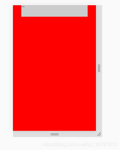
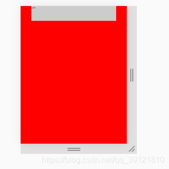
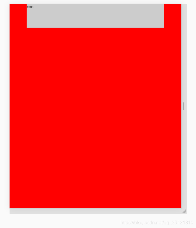
</body></html>效果:


 扫一扫
扫一扫


 被折叠的 条评论
为什么被折叠?
被折叠的 条评论
为什么被折叠?
 到【灌水乐园】发言


