


一、Text组件
Text 组件用于显示文本 , 类似于 span 标签 , 是行内元素

- selectable 属性决定文本内容是否可以让用户选中
- space 有三个取值 见右图
- decode 是否解码
decode 可以解析的有
< > & '    
代码示例:
<!-- text:行内元素
换行:\n
-->
<!-- 1.基本使用 -->
<text>Hello World\n</text>
<text>你好,小程序\n</text>
<!-- 2.selectable:true
默认情况下text中的文本长按是不能选中的
-->
<!-- <text selectable="{{true}}">长按选中</text> -->
<!-- 加属性,默认true -->
<text selectable>长按选中</text>
<!-- 3.space:决定文本空格的大小
ensp:半个中文字符大小
emsp:一个中文字符大小
-->
<text>Hello World\n</text>
<text space="nbsp">Hello World\n</text>
<text space="ensp">Hello World\n</text>
<text space="emsp">Hello World\n</text>
<!-- 4.decode属性:是否解码文本 -->
<text decode>5 > 3</text>
效果图:

二、Button组件解析
Button 组件用于创建 按钮,默认块级元素
常见属性:


代码示例:
button.wxml:
<!-- 1.button的基本使用 -->
<button>按钮</button>
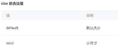
<!-- 2.size属性:mini -->
<button size="mini">按钮1</button>
<button size="mini">按钮2</button>
<!-- 3.type属性 -->
<button size="mini" type="primary">按钮3</button>
<button size="mini" type="default">按钮4</button>
<button size="mini" type="warn">按钮5</button>
<!-- 4.镂空效果 -->
<button size="mini" plain>按钮6</button>
<!-- 5.disabled:不可用 -->
<button size="mini" disabled>按钮7</button>
<!-- 6.loading -->
<button size="mini" loading="{{isLoading}}">按钮7</button>
<!-- 7.hover-class -->
<button hover-class="pressed">按钮8</button>
button.js:
Page({

  /**
   * 页面的初始数据
   */
  data: {
    isLoading:true
  },

  /**
   * 生命周期函数--监听页面加载
   */
  onLoad: function (options) {

  },

  /**
   * 生命周期函数--监听页面初次渲染完成
   */
  onReady: function () {

  },

  /**
   * 生命周期函数--监听页面显示
   */
  onShow: function () {

  },

  /**
   * 生命周期函数--监听页面隐藏
   */
  onHide: function () {

  },

  /**
   * 生命周期函数--监听页面卸载
   */
  onUnload: function () {

  },

  /**
   * 页面相关事件处理函数--监听用户下拉动作
   */
  onPullDownRefresh: function () {

  },

  /**
   * 页面上拉触底事件的处理函数
   */
  onReachBottom: function () {

  },

  /**
   * 用户点击右上角分享
   */
  onShareAppMessage: function () {

  }
})
button.wxss:
.pressed{
  background-color: red;
  color: white;
}
效果图:


 1599
1599


 被折叠的 条评论
为什么被折叠?
被折叠的 条评论
为什么被折叠?
 到【灌水乐园】发言


