


一、View组件
视图组件(块级元素,独占一行,通常用作容器组件)

代码示例:
view.wxml:
<!-- 1.view的基本使用 -->
<view class="box">哈哈哈</view>
<view>呵呵呵</view>

<!-- 2.hover-class:当用户按下组件时,显示的样式 -->
<view class="box1" hover-class="hover-view" hover-stay-time="400">box1</view>

<!-- 3.hover-stop-propagation:阻止祖先组件的点击态 -->
<view class="box2" hover-class="box2-hover">
  <view class="box1" hover-class="hover-view" hover-stay-time="400" hover-stop-propagation>box1</view>
</view>
view.wxss:
.box{
  background-color: red;
}

.box1{
  width: 100px;
  height: 100px;
  background-color: purple;
}

.hover-view{
  background-color: orange;
  font-size: 30px;
}

.box2{
  width: 200px;
  height: 200px;
  background-color: blue;
  margin-top: 20px;
}

.box2-hover{
  background-color: green;
}
二、Image组件
Image 组件用于显示图片,有如下常见属性:

其中 src 可以是本地图片,也可以是网络图片
Mode 属性使用也非常关键,详情查看官网:
https://developers.weixin.qq.com/miniprogram/dev/component/image.html
注意: image 组件默认宽度 320px 、高度 240px
这里补充一个 API wx.chooseImage (具体用法查看文档)
代码示例:
image.wxml:
<!-- 1.image的基本使用 -->
<!-- 重点:
    1)image组件可以写成单标签(结尾必须加 /),也可以写成双标签
    2)image组件有默认大小 320*240
    3)image组件是一个行内块级元素
 -->
 <!-- <image /> -->

<!-- 2.src:本地地址/远程地址 -->
<!-- 本地图片 -->
<image src="../../test/1.jpg" />
<image src="/test/1.jpg" />

<!-- 远程图片 -->
<image src="https://res.wx.qq.com/wxdoc/dist/assets/img/0.4cb08bb4.jpg"/>

<!-- 补充:相册里的图片 -->
<button bindtap="handleChooseAlbum">点击选择</button>
<image src="{{imagePath}}" />

<!-- 3.bindload:监听图片加载完成
       lazy-load:图片懒加载
 -->
<view>----------------------------</view>
<image wx:for="{{1}}" src="https://res.wx.qq.com/wxdoc/dist/assets/img/0.4cb08bb4.jpg" bindload="handleImageLoad" lazy-load/>

<!-- 4.show-menu-by-longpress:长按图片出现识别小程序码 -->
<image show-menu-by-longpress src="https://res.wx.qq.com/wxdoc/dist/assets/img/0.4cb08bb4.jpg"/>
image.js:
Page({

  /**
   * 页面的初始数据
   */
  data: {
    imagePath: ''
  },

  handleChooseAlbum() {
    //系统API,让用户在相册中选择图片,或者拍照
    wx.chooseImage({
      complete: res => {
        //1.取出路径
        const path = res.tempFilePaths[0]

        //2.设置imagePath,使用箭头函数
        this.setData({
          imagePath: path
        })
      }
    })
  },

  handleImageLoad(){
    console.log("图片加载完成")
  }
})
三、Input组件

代码示例:
input.wxml:
<!-- 1.input的基本使用
    可以是单标签,也可以是双标签
 -->
<input />

<!-- 2.value:input的默认值 -->
<input value="哈哈哈"/>

<!-- 3.type:决定键盘类型(如英文字母+其它符号/数字/身份证号) -->
<input type="number"/>

<!-- 4.password:暗文 -->
<input type="password"></input>

<!-- 5.placeholder:占位文字 -->
<input type="text" placeholder="请输入" confirm-type="next"></input>

<!-- 6.input绑定事件 -->
<input bindinput="handleInput" bindfocus="handleFocus" bindblur="handleBlur"></input>
input.js:
Page({

  /**
   * 页面的初始数据
   */
  data: {

  },

  handleInput(event){
    console.log("用户输入内容:",event)
  },

  handleFocus(event){
    console.log("input获取焦点:",event)
  },

  handleBlur(event){
    console.log("input失去焦点:",event)
  }
})
input.wxss:
input{
  border: 1px solid red;
  margin: 10px 30px;
}
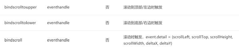
四、scroll-view 组件
scroll view 可以实现局部滚动,常见属性如下:
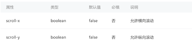
注意事项:
实现滚动效果必须添加 scroll x 或者 scroll y 属性(只需要添加即可,属性值相当于为 true 了)
垂直方向滚动必须设置 scroll view 一个高度
代码示例:
scroll.wxml:
<!-- 1.水平滚动:scroll-x -->
<!-- view是块级元素 -->
<scroll-view class="container1" scroll-x>
<view wx:for="{{10}}" class="item1">{{item}}</view>
</scroll-view>

<!-- 2.垂直滚动:scroll-y -->
<scroll-view class="container2" scroll-y>
<view wx:for="{{10}}" class="item2">{{item}}</view>
</scroll-view>

<!-- 3.其它补充 -->
<scroll-view class="container2" scroll-y bindscroll="handleScroll">
<view wx:for="{{10}}" class="item2">{{item}}</view>
</scroll-view>
scroll.wxss:
.container1 {
  background-color: orange;
  white-space: nowrap;
  /**不换行*/
}

.item1 {
  width: 100px;
  height: 100px;
  background-color: red;
  margin: 10px;
  display: inline-block;
  /**不再是块级元素*/
}

.container2 {
  margin-top: 10px;
  background-color: green;
  height: 200px;
}

.item2 {
  height: 100px;
  background-color:greenyellow;
  margin: 10px;
}
scroll.js:
// pages/scroll/scroll.js
Page({

  handleScroll(event){
    console.log("正在滚动",event)
  }
})
效果图:


五、共同属性


 4665
4665


 被折叠的 条评论
为什么被折叠?
被折叠的 条评论
为什么被折叠?
 到【灌水乐园】发言


