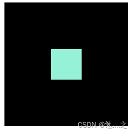
一、使用grid布局
<!DOCTYPE html>
<html lang="en">
<head>
<title>test</title>
<style>
#outside {
width: 200px;
height: 200px;
background: #000;
display: grid;
place-items: center;
}
#inside {
width: 50px;
height: 50px;
background: #96f2d7;
}
</style>
</head>
<body>
<div id="outside">
<div id="inside"></div>
</div>
</body>
</html>
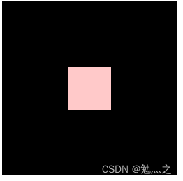
二、使用flex布局
<!DOCTYPE html>
<html lang="en">
  <head>
    <title>test</title>
    <style>
      #outside {
        width: 400px;
        height: 400px;
        background: #000;
        display: flex;
        justify-content: center;
        align-items: center;
      }
      #inside {
        width: 100px;
        height: 100px;
        background: #ffc9c9;
      }
    </style>
  </head>
  <body>
    <div id="outside">
      <div id="inside"></div>
    </div>
  </body>
</html>
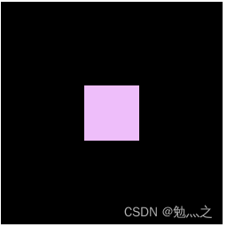
三、使用定位+外边距
<!DOCTYPE html>
<html lang="en">
  <head>
    <title>test</title>
    <style>
      #outside {
        width: 300px;
        height: 300px;
        background: #000;
        position: relative;
      }
      #inside {
        width: 100px;
        height: 100px;
        background: #eebefa;
        position: absolute;
        top: 0px;
        right: 0px;
        bottom: 0px;
        left: 0px;
        margin: auto;
      }
    </style>
  </head>
  <body>
    <div id="outside">
      <div id="inside"></div>
    </div>
  </body>
</html>
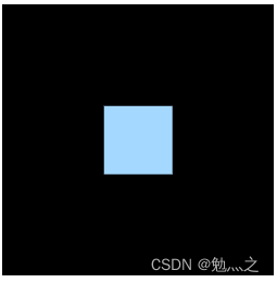
四、使用定位+平移
<!DOCTYPE html>
<html lang="en">
  <head>
    <title>test</title>
    <style>
      #outside {
        width: 200px;
        height: 200px;
        background: #000;
        position: relative;
      }
      #inside {
        width: 50px;
        height: 50px;
        background: #a5d8ff;
        position: absolute;
        top: 50%;
        left: 50%;
        transform: translate(-50%, -50%);
      }
    </style>
  </head>
  <body>
    <div id="outside">
      <div id="inside"></div>
    </div>
  </body>
</html>
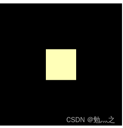
五、使用外边距 + 平移
<!DOCTYPE html>
<html lang="en">
<head>
<title>test</title>
<style>
#outside {
width: 200px;
height: 200px;
background: #000;
overflow: hidden;
}
#inside {
width: 50px;
height: 50px;
background: #ffffb8;
margin: 50% auto;
transform: translateY(-50%);
}
</style>
</head>
<body>
<div id="outside">
<div id="inside"></div>
</div>
</body>
</html>
六、使用文本对齐 + 行高
<!DOCTYPE html>
<html lang="en">
  <head>
    <title>test</title>
    <style>
      #outside {
        width: 200px;
        height: 200px;
        background: #000;
        text-align: center;
        line-height: 200px;
        vertical-align: middle;
      }
      #inside {
        color: #e9ecef;
        display: inline;
      }
    </style>
  </head>
  <body>
    <div id="outside">
      <div id="inside">只适用于行内元素</div>
    </div>
  </body>
</html>

七、使用表格单元
<!DOCTYPE html>
<html lang="en">
  <head>
    <title>test</title>
    <style>
      #outside {
        width: 200px;
        height: 200px;
        background: #000;
        display: table-cell;
        text-align: center;
        vertical-align: middle;
      }
      #inside {
        color: #ffdeeb;
      }
    </style>
  </head>
  <body>
    <div id="outside">
      <div id="inside">只适用于行内元素</div>
    </div>
  </body>
</html>


 474
474


 被折叠的 条评论
为什么被折叠?
被折叠的 条评论
为什么被折叠?
 到【灌水乐园】发言


