


flex布局相对浮动布局简便
案例:
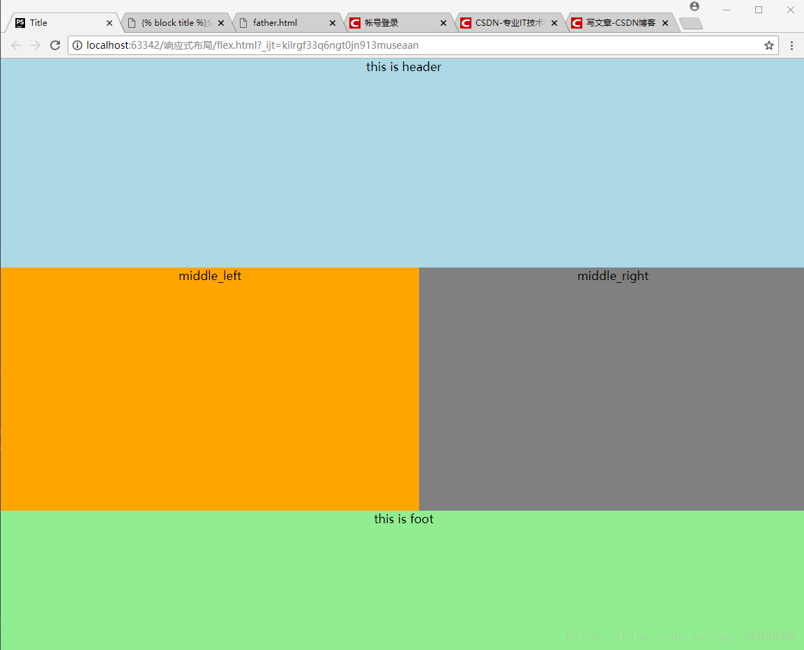
flex.html
<!DOCTYPE html>
<html lang="en">
<head>
    <meta charset="UTF-8">
    <title>Title</title>


    <style>

        html,body{
            width: 100%;
            height:100%;
        }

        *{
            margin:0px;
            padding:0px;
        }


        #body{
            /* 父级元素类型设置为flex */
            display: flex;
            width:100%;
            height:100%;
            /* 设置布局主轴,column为纵轴为主布局,row为横轴为主布局,*/
            flex-direction: column;
            /* 横轴布局一般用于内部盒子布局而不是用于大体布局 */


        }

        #body .header{


            text-align: center;
            width:100%;
            height:300px;
            background:lightblue;
        }


        #body .middle{

            display: flex;
            /* middle 子元素按照横轴布局 */
            flex-direction: row;
            /* 子盒子其他盒子都有高度时,此盒子设置flex:1,表示占用剩余的所有高度*/
            flex:1;


        }

        #body .foot{
            text-align: center;
            width:100%;
            height:200px;
            background:lightgreen;

        }


        #body .middle .middle_left{
            text-align: center;
            width:600px;
            background:orange;

        }


        #body .middle .middle_right{
            text-align: center;
            background:gray;
                /* 子盒子其他盒子都有宽度时,此盒子设置flex:1,表示占用剩余的所有宽度*/
            flex:1;
        }


    </style>


</head>
<body>


        <div id="body">


            <div class="header">

                this is header

            </div>


            <div class="middle">

                <div class="middle_left">
                    middle_left

                </div>
                <div class="middle_right">
                    middle_right

                </div>

            </div>


            <div class="foot">

                this is foot

            </div>


        </div>


</body>
</html>


 1677
1677


 被折叠的 条评论
为什么被折叠?
被折叠的 条评论
为什么被折叠?
 到【灌水乐园】发言


