


一、margin为负值产生的影响
对于自身的影响
当元素不存在width属性或者(width:auto)的时候,负margin会增加元素的宽度,看下下面的例子
-
<div
class=
”container”>
-
<div
class=
”box1”
>
-
I
dont have the width
-
</div>
-
<
/div>
-
.container{
-
margin:0 auto;
-
width: 500px;
-
border: 1px #ccc solid;
-
margin-bottom: 20px;
-
}
-
.box1{
-
margin-left: -20px;
-
}
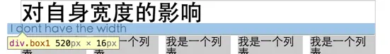
可以看到box1增加了20px宽度,margin-left和margin-right都是可以增加宽度,
注意:
margin-top为负值不会增加高度,只会产生向上位移
margin-bottom为负值不会产生位移,会减少自身的供css读取的高度
为什么是供css读取的高度
我们再来做个实验
-
<style>
-
#box
{
-
width: 50%
;
-
margin-bottom: -25px
;
-
background-color: rgba(90, 243, 151, 0.8)
;
-
height: 50px
;
-
}
-
</style>
-
<div id="box">
-
box
-
</div>
-
<script src="http://cdn.bootcss.com/jquery/2.1.1/jquery.js">
</script>
-
<script>
-
var
x = $(
'#box'
).height()
-
console
.log(x);
-
</script>
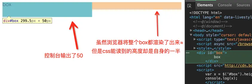
下文的应用段落就会利用这个特点做一个多列等高布局。
对文档流的影响
元素如果用了margin-left:-20px;毋庸置疑的自身会向左偏移20px和定位(position:relative)有点不一样的是,在其后面的元素会补位,也就是后面的行内元素会紧贴在此元素的之后。总结,不脱离文档流不使用float的话,负margin元素是不会破坏页面的文档流。
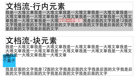
所以如果你使用负margin上移一个元素,所有跟随的元素都会被上移。
对浮动元素的影响
先定义3个box
-
<div
class=
"container">
-
<div
class=
"flb flbox1">box1</div>
-
<div
class=
"flb flbox2">box2</div>
-
<div
class=
"flb flbox3">box3</div>
-
</div>
-
.flb{
-
float: left;
-
width: 100px;
-
height: 100px;
-
}
-
.flbox1{background-color: rgba(33, 114, 214, 0.8);}
-
.flbox2{background-color: rgba(255, 82, 0, 0.8);}
-
.flbox3{background-color: rgba(90, 243, 151, 0.8);}
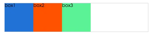
demo1,给他们都加上margin-left:-25px;
-
.flb{
-
float: left;
-
width: 100px;
-
height: 100px;
-
margin-left: -25px;
-
}
-
.flbox1{background-color: rgba(33, 114, 214, 0.8);}
-
.flbox2{background-color: rgba(255, 82, 0, 0.8);}
-
.flbox3{background-color: rgba(90, 243, 151, 0.8);}
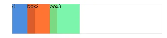
可以看出3个盒子都向左移动25px;
box1自身向左移动了25px,box2又覆盖了其25px,所以我们就看到了“宽度”为50px的box1
box2,box3以此类推!
让我再看看margin-left: -50px;的情况
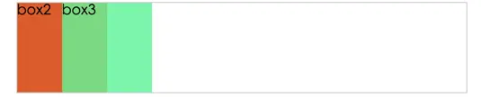
如果只给box3设置margin-left:-200px;
-
.flb{
-
float: left;
-
width: 100px;
-
height: 100px;
-
-
}
-
.flbox1{background-color: rgba(33, 114, 214, 0.8);}
-
.flbox2{background-color: rgba(255, 82, 0, 0.8);}
-
.flbox3{background-color: rgba(90, 243, 151, 0.8);
-
margin-left: -200px;}
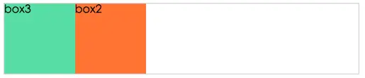
看一看到box3,向左偏移了200px,完全将box1覆盖了,box3下面还能隐约的看到了box1。
总结:
负margin会改变浮动元素的显示位置,即使我的元素写在DOM的后面,我也能让它显示在最前面。圣杯布局、双飞翼布局啊什么的,都是利用这个原理实现的。(下文有详细)
对绝对定位影响
<div class="absolute"></div>
-
.absolute{
-
position: absolute;
-
top:50%;
-
left:50%;
-
height: 200px;
-
width: 200px;
-
background-color: #ccc;
-
margin-top: -100px;
-
margin-left: -100px;
-
}

对于绝对定位元素,负margin会基于其绝对定位坐标再偏移,
唯有的缺点就是你必须知道这个觉得定位元素宽度的和高度才能并设置负margin值使其居中浏览器窗口,
若对于不确定宽度和高度可以用
transform: translate3d(-50%,-50%,0);使用translate3d可以开启GPU加速,就不用cpu去从新计算所有点素位置,开启GPU加速后,GPU自动将这个元素放在一个新的“层”,直接偏移这个“层”来提高渲染速度(个人理解,若有错误欢迎指正)。
二、margin为负值的常见布局应用
左右固定,中间自适应(双飞翼)
双飞翼的好处:
1.可以让主要内容出现在dom结构的前面,现将主要内容渲染
2.中间只适应,两边固定宽度的效果
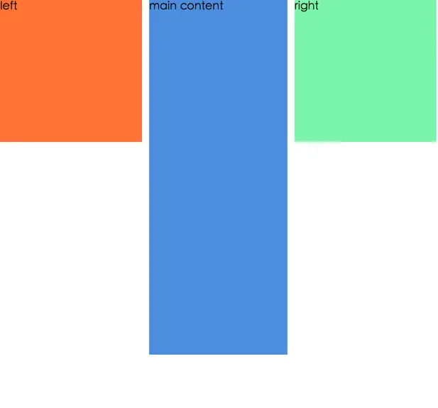
-
<div
class=
"main">
-
<div
class=
"main-content">main content</div>
-
</div>
-
<div
class=
"left">left</div>
-
<div
class=
"right">right</div>
-
*{
-
margin:0;
-
padding: 0
-
}
-
.main{
-
float: left;
-
width: 100%;
-
-
}
-
.main .main-content{
-
margin: 0 210px;
-
background-color: rgba(33, 114, 214, 0.8);
-
height: 500px
-
}
-
.left{
-
width: 200px;
-
float: left;
-
background-color: rgba(255, 82, 0, 0.8);
-
margin-left: -100%;
-
height: 200px
-
-
}
-
.right{
-
width: 200px;
-
height: 200px;
-
margin-left: -200px;
-
float: left;
-
background-color: rgba(90, 243, 151, 0.8);
-
}
去除列表右边框
利用负margin增加宽度的特点,举个在实际中应用例子��
对于图片列表,我会常常设计成两边对齐,中间元素平均分布,类似下面的布局

想让每一排最后一个对齐父元素的右边框,一般都两种处理,第一种会在给个循环体内的最后一个添加一个float:right属性或者做特殊处理,但这样还需要后端配合,我们自己能解决的就尽量自己解决。还有就是用css3的flexbox布局能解决这个两边对齐,但是这种布局兼容性不好,你的用户用IE的话,不推荐!
so,负margin就能发挥其增加元素宽度的特点,完美的解决这个问题!
-
<div class="container">
-
<ul class="list">
-
<li>我是一个列表
</li>
-
<li>我是一个列表
</li>
-
<li>我是一个列表
</li>
-
<li>我是一个列表
</li>
-
<li>我是一个列表
</li>
-
<li>我是一个列表
</li>
-
<li>我是一个列表
</li>
-
<li>我是一个列表
</li>
-
<li>我是一个列表
</li>
-
<li>我是一个列表
</li>
-
</ul>
-
</div>
-
.container{
-
margin:0 auto;
-
width: 500px;
-
border: 1px #ccc solid;
-
margin-bottom: 20px;
-
}
-
.list{
-
overflow: hidden;
-
margin-right: -10px;
-
-
}
-
.list li{
-
width:92px;
-
height: 92px;
-
background-color: #ccc;
-
margin-bottom: 20px;
-
float: left;
-
margin-right: 10px;
-
}
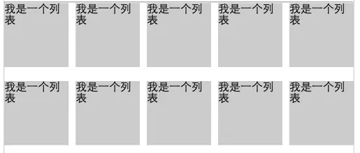
计算公式:
假设一横列展示的数量为x,元素见的间距为y,父距宽度z
则元素的宽度=(z-y(x-1))/x
本例中li的宽度为(500-10(5-1))/5=92
负边距+定位:水平垂直居中
上面已经举例,用了负margin会向对应方向偏移的特点!
去除列表最后一个li元素的border-bottom
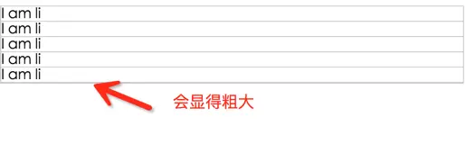
很多情况下,我们会用li标签来模拟表格,再给li标签添加下边距的时候,最后一个li标签表格会和父元素的边框靠在一起,会显得整个“table”的底部边框会比其他的边粗一些!
-
<style>
-
ul
.table
{
-
border:1px #ccc solid
;
-
margin-top:100px
;
-
}
-
ul
.table
li
{
-
border-bottom: 1px #ccc solid
;
-
list-style: none
;
-
}
-
</style>
-
<ul class="table">
-
<li>I am li
</li>
-
<li>I am li
</li>
-
<li>I am li
</li>
-
<li>I am li
</li>
-
<li>I am li
</li>
-
</ul>
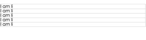
下面添加一个margin-bottom:-1px;的属性,就可以使其看起来更完美
-
<style>
-
ul
.table
{
-
border:1px #ccc solid
;
-
margin-top:100px
;
-
}
-
ul
.table
li
{
-
border-bottom: 1px #ccc solid
;
-
list-style: none
;
-
margin-bottom: -1px
;
-
}
-
</style>
-
<ul class="table">
-
<li>I am li
</li>
-
<li>I am li
</li>
-
<li>I am li
</li>
-
<li>I am li
</li>
-
<li>I am li
</li>
-
</ul>
多列等高
利用margin-bottom为负值会减少css读取元素高度的特性,加上padding-bottom和overflow:hidden,就能做一个未知高度的多列等高布局(当然也可以用table)
-
<style>
-
.container
{
-
margin:0 auto
;
-
width: 100%
;
-
overflow: hidden
;
-
}
-
.left
{
-
height: 50px
;
-
width: 33.33%
;
-
margin-bottom: -5000px
;
-
padding-bottom: 5000px
;
-
float: left
;
-
background-color: rgba(33, 114, 214, 0.8)
;
-
}
-
.main
{
-
height:100px
;
-
margin-bottom: -5000px
;
-
width: 33.33%
;
-
float: left
;
-
padding-bottom: 5000px
;
-
background-color: rgba(255, 82, 0, 0.8)
;
-
}
-
.right
{
-
width: 33.33%
;
-
float: left
;
-
margin-bottom: -5000px
;
-
padding-bottom: 5000px
;
-
background-color: rgba(90, 243, 151, 0.8)
-
}
-
</style>
-
<div class="container">
-
<div class="left"> height:50px
</div>
-
<div class="main">height:100px
</div>
-
<div class="right">height:30px
</div>
-
</div>
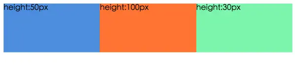
虽然设置了5000的内边距,但是我用-5000的外边距去抵消掉,所以对于父元素来说(上文所说的css能读取的高度),他还是原来的高度(但其自身实际高度为5000p x+本来高度),然后父元素在加上overflow:hidden;以最高的高度进行裁切,所以就有了看起来“等高”的3个div。
今天整理和实验了下负margin的原理和应用,希望你看了文章有所收获,欢迎交流!
http://www.cnblogs.com/2050/archive/2012/08/13/2636467.html#2457812
原文链接:http://www.jianshu.com/p/549aaa5fabaa


 扫一扫
扫一扫
 1193
1193

 被折叠的 条评论
为什么被折叠?
被折叠的 条评论
为什么被折叠?
 到【灌水乐园】发言


