


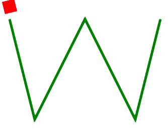
效果图:
用到的CSS属性:
- offset-path: 表示运动的路径
- offset-distance: 运动的距离,可以是数值或者百分比,如果是100%则表示走完整条路径
额外的属性:
- offset-rotate: 表示运动的角度, 默认是auto, 表示指定计算当前路径的切线方向, 也就是上图
MDN: https://developer.mozilla.org/en-US/docs/Web/CSS/offset-rotate
假设设置了: offset-rotate: 45deg;

完整代码:
<!DOCTYPE html>
<html lang="en">
  <head>
    <meta charset="UTF-8" />
    <meta http-equiv="X-UA-Compatible" content="IE=edge" />
    <meta name="viewport" content="width=device-width, initial-scale=1.0" />
    <title>Document</title>
    <style>
      .box {
        width: 5px;
        height: 5px;
        background: red;
        offset-path: path("M10,10 L20,50 L40,10 L60,50 L70,10");
        animation: move 3s linear infinite;
        offset-rotate: 45deg;
      }
      @keyframes move {
        100% {
          offset-distance: 100%;
        }
      }
    </style>
  </head>
  <body>
    <div class="box"></div>
    <svg xmlns="http://www.w3.org/2000/svg" version="1.1">
      <path d="M10,10 L20,50 L40,10 L60,50 L70,10" stroke="green" stroke-width="1" fill="none" />
    </svg>
  </body>
</html>


 1708
1708


 被折叠的 条评论
为什么被折叠?
被折叠的 条评论
为什么被折叠?
 到【灌水乐园】发言


