


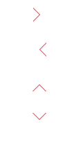
 本文详细介绍如何使用CSS实现空心的上下左右箭头,包括三角形的基本制作方法及通过定位和边框颜色技巧实现空心效果。
效果如下

实现之前先了解一下css的一个属性:
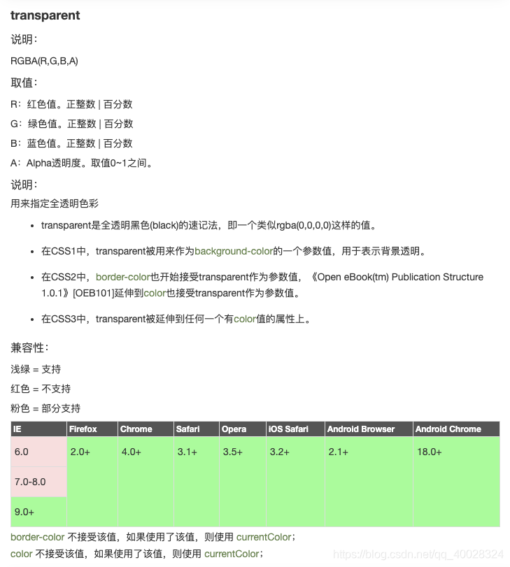
也就是说 这个属性可以设置透明的色值,
举个例子:

看这个形状是如何实现的
<!DOCTYPE html>
<html lang="en">

<head>
  <meta charset="UTF-8">
  <meta name="viewport" content="width=device-width, initial-scale=1.0">
  <title>Document</title>
  <style>
    .div-box {
      width: 0;
      height: 0;
      border: 30px solid red;
      border-right: 30px solid transparent;
    }
  </style>
</head>

<body>
  <div class="div-box"></div>
</body>

</html>
可以看出其实div-box并没有宽高,而是被边框撑起来的一个正方形,由于边框是 30px 所以原本应是60px*60px的红色正方形,经过了对 有边框的透明设置,导致有边框的颜色没有了,但是上边框和下边框并不受影响,所以出现了右侧被掏空了一个三角形的形状。
而实心三角形只需要这个属性就可以实现了:
<!DOCTYPE html>
<html lang="en">

<head>
  <meta charset="UTF-8">
  <meta name="viewport" content="width=device-width, initial-scale=1.0">
  <title>Document</title>
  <style>
    .arrow_top {
      width: 0;
      height: 0;
      border-bottom: 30px solid #ff7f0b;
      /* border: 30px solid #ff7f0b; */
      border-left: 30px solid transparent;
      border-right: 30px solid transparent;
      font-size: 0;
      line-height: 0;
    }

    .arrow_right {
      width: 0;
      height: 0;
      border-left: 30px solid transparent;
      border-right: 30px solid transparent;
      border-bottom: 30px solid #ff7f0b;
      font-size: 0;
      line-height: 0;
      transform: rotate(90deg);
    }

    .arrow_bottom {
      width: 0;
      height: 0;
      border-left: 30px solid transparent;
      border-right: 30px solid transparent;
      border-bottom: 30px solid #ff7f0b;
      font-size: 0;
      line-height: 0;
      transform: rotate(180deg);
    }

    .arrow_left {
      width: 0;
      height: 0;
      border-left: 30px solid transparent;
      border-right: 30px solid transparent;
      border-bottom: 30px solid #ff7f0b;
      font-size: 0;
      line-height: 0;
      transform: rotate(270deg);
    }
  </style>
</head>

<body>
  <p class="arrow_top"></p> <br>
  <p class="arrow_right"></p><br>
  <p class="arrow_bottom"></p><br>
  <p class="arrow_left"></p><br><br>
</body>

</html>
这里 使用了 transform让 三角形旋转的方式,也可以使用四条边组合的形式来设置 三角形的角度。
向上箭头 向下箭头 向左箭头 向右箭头如何实现?
实现思路是先实现一个三角形出来 然后在它的同级放一个兄弟元素,这个元素是白色的边,完全盖住这个三角形,然后通过定位移动1px,就实现了。

完整代码:
<!DOCTYPE html>
<html lang="en">

<head>
  <meta charset="UTF-8">
  <title>css制作空心的上下左右的箭头</title>
  <style type="text/css">
    .box {
      width: 100px;
      height: 500px;
      margin: 0 auto;
      background: white;
    }

    .arrow-box {
      width: 30px;
      height: 30px;
      margin: 20px auto;
      position: relative;
    }

    /*右箭头*/
    .right {
      width: 20px;
      height: 20px;
      position: absolute;
      left: 0;
      top: 0;
    }

    .right-arrow1,
    .right-arrow2 {
      width: 0;
      height: 0;
      display: block;
      position: absolute;
      left: 0;
      top: 0;
      border-top: 10px transparent dashed;
      border-right: 10px transparent dashed;
      border-bottom: 10px transparent dashed;
      border-left: 10px white solid;
      overflow: hidden;
    }

    .right-arrow1 {
      left: 1px;
      /*重要*/
      border-left: 10px red solid;
    }

    .right-arrow2 {
      border-left: 10px white solid;
    }

    /*左箭头*/

    .left {
      width: 20px;
      height: 20px;
      position: absolute;
      left: 0;
      top: 0;
      z-index: 2;
      /*兼容ie8-*/
    }

    .left-arrow1,
    .left-arrow2 {
      width: 0;
      height: 0;
      display: block;
      position: absolute;
      left: 0;
      top: 0;
      z-index: 5;
      /*兼容ie8-*/
      border-top: 10px transparent dashed;
      border-left: 10px transparent dashed;
      border-bottom: 10px transparent dashed;
      border-right: 10px white solid;
      overflow: hidden;
    }

    .left-arrow1 {
      border-right: 10px red solid;
    }

    .left-arrow2 {
      left: 1px;
      /*重要*/
      border-right: 10px white solid;
    }

    /*上箭头*/

    .top {
      width: 20px;
      height: 20px;
      position: absolute;
      left: 0;
      top: 0;
      z-index: 2;
      /*兼容ie8-*/
    }

    .top-arrow1,
    .top-arrow2 {
      width: 0;
      height: 0;
      display: block;
      position: absolute;
      left: 0;
      top: 0;
      z-index: 5;
      /*兼容ie8-*/
      border-top: 10px transparent dashed;
      border-left: 10px transparent dashed;
      border-right: 10px transparent dashed;
      border-bottom: 10px white solid;
      overflow: hidden;
    }

    .top-arrow1 {
      border-bottom: 10px red solid;
    }

    .top-arrow2 {
      top: 1px;
      /*重要*/
      border-bottom: 10px white solid;
    }

    /*下箭头*/

    .bottom {
      width: 20px;
      height: 20px;
      position: absolute;
      left: 0;
      top: 0;
      z-index: 2;
      /*兼容ie8-*/
    }

    .bottom-arrow1,
    .bottom-arrow2 {
      width: 0;
      height: 0;
      display: block;
      position: absolute;
      left: 0;
      top: 0;
      z-index: 5;
      /*兼容ie8-*/
      border-bottom: 10px transparent dashed;
      border-left: 10px transparent dashed;
      border-right: 10px transparent dashed;
      border-top: 10px white solid;
      overflow: hidden;
    }

    .bottom-arrow1 {
      top: 1px;
      /*重要*/
      border-top: 10px red solid;
    }

    .bottom-arrow2 {
      border-top: 10px white solid;
    }
  </style>

<body>
  <div class="box">
    <div class="arrow-right arrow-box">
      <b class="right"><i class="right-arrow1"></i><i class="right-arrow2"></i></b>
    </div>
    <div class="arrow-left arrow-box">
      <b class="left"><i class="left-arrow1"></i><i class="left-arrow2"></i></b>
    </div>
    <div class="arrow-top arrow-box">
      <b class="top"><i class="top-arrow1"></i><i class="top-arrow2"></i></b>
    </div>
    <div class="arrow-bottom arrow-box">
      <b class="bottom"><i class="bottom-arrow1"></i><i class="bottom-arrow2"></i></b>
    </div>
  </div>
</body>

</html>


 扫一扫
扫一扫


 1050
1050

 被折叠的 条评论
为什么被折叠?
被折叠的 条评论
为什么被折叠?
 到【灌水乐园】发言


