


实现方法:利用元素的border画出三角形。
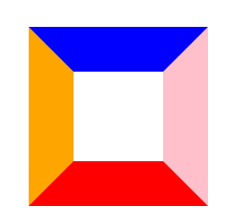
1、先看看设置了四个border的div:
.triangle1 {
  width: 100px;
  height: 100px;
  border-top: 50px solid blue;
  border-bottom: 50px solid red;
  border-left: 50px solid orange;
  border-right: 50px solid pink;
}
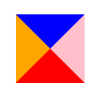
2、不难看出,当width和height为0时,border就呈现三角形形状了,看看效果:
.triangle1 {
  width: 0px;
  height: 0px;
  border-top: 50px solid blue;
  border-bottom: 50px solid red;
  border-left: 50px solid orange;
  border-right: 50px solid pink;
}
3、保留一个三角形,将不需要的border设置成透明的,想要哪个方向的就保留哪个的
.triangle1 {
  width: 0px;
  height: 0px;
  border-top: 50px solid blue;
  border-bottom: 50px solid transparent;
  border-left: 50px solid transparent;
  border-right: 50px solid transparent;
}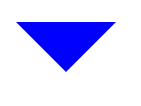
虽然另外三个border不显示,但还是占位的,像上面示例的向下三角形,我们可以把border-bottom的设置去掉,这样border-bottom就不占位了。其他方向的三角形以此类推。
.triangle1 {
width: 0px;
height: 0px;
border-top: 50px solid blue;
border-left: 50px solid transparent;
border-right: 50px solid transparent;
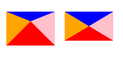
}4、各个border设置不同的宽度,可以得到不同形状的三角形
.triangle1 {
  width: 0px;
  height: 0px;
  border-top: 20px solid blue;
  border-bottom: 50px solid red;
  border-left: 50px solid orange;
  border-right: 50px solid pink;
}
.triangle2 {
  width: 0px;
  height: 0px;
  border-top: 30px solid blue;
  border-bottom: 30px solid red;
  border-left: 50px solid orange;
  border-right: 50px solid pink;
}
记录于2023-7-12.


 757
757


 被折叠的 条评论
为什么被折叠?
被折叠的 条评论
为什么被折叠?
 到【灌水乐园】发言


