


一、前言
众所周知,在app端中,普通的组件是无法覆盖原生组件,即使是官方提供的cover-view也只是在实体内容中覆盖一些原生的如地图。但是无法覆盖底部的tabbar。
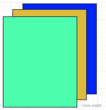
二、了解层级关系
实际上app端每点击一次的层级是这样的,我们可以利用简单粗暴的方法,利用app端的层级关系,设置层级为透明即可,顺便再兼容一下h5端
三、配置路由关系
在pages.json中进行配置,设置页面为无样式,背景透明即可
{
      "path": "components/popup/index",
      "style": {
        "navigationStyle": "custom",
        "backgroundColor": "transparent",
        "app-plus": {
          "animationType": "fade-in",
          "background": "transparent",
          "popGesture": "none"
        }
      }
    },
四、核心组件代码
在components/popup/index中正常去写样式逻辑,全屏,如果是h5端就正常弹窗,如果非h5端就做跳转
<template>
  <view class="mask" @click="msckClose" v-show="isshow">
    <view class="content">
      <view v-if="options.title" class="title">{{ options.title }}</view>
      <component :is="components[options.slot]" />
    </view>
  </view>
</template>
<script lang="ts" setup>
import { ref, defineExpose, provide, markRaw } from 'vue';

import { onLoad } from '@dcloudio/uni-app';
import { objectToQueryString } from '@/utils/tool';
import option from './option';
const isshow = ref(false); // 是否显示
const options = ref<optionType>({
  title: '',
  slot: '',
  maskCloseAble: true,
}); // 配置
const components: any = ref(option);
interface optionType {
  title?: string; // 名称
  slot: string; // 组件名称
  maskCloseAble?: boolean | string; // 背景是否可以点击关闭
}

const initdata = (option: any) => {
  if (option?.title) {
    options.value = option;
  }
  if (option?.type == 'app') {
    isshow.value = true;
  }
};
onLoad((option) => {
  initdata(option);
});
// 打开弹窗
const show = (options: optionType) => {
  // #ifndef H5
  uni.navigateTo({
    url: `/components/popup/index?type=app&${objectToQueryString(options)}`,
  });
  // #endif

  // #ifdef H5
  initdata({
    type: 'app',
    ...options,
  });
  // #endif
};
// 关闭弹窗
const close = () => {
  // #ifndef H5
  uni.navigateBack();
  // #endif

  // #ifdef H5
  isshow.value = false;
  // #endif
};
// 背景是否可以关闭
const msckClose = () => {
  if (JSON.parse(options.value.maskCloseAble as string)) {
    close();
  }
};
provide('popupClose', close);
defineExpose({
  show,
  close,
});
</script>
<style lang="css">
page {
  background: transparent;
}
</style>
<style lang="scss" scoped>
.mask {
  position: fixed;
  left: 0;
  top: 0;
  right: 0;
  bottom: 0;
  /* #ifndef APP-NVUE */
  display: flex;
  /* #endif */
  justify-content: center;
  align-items: center;
  background-color: rgba(0, 0, 0, 0.4);
  z-index: 999;
  .content {
    width: 560rpx;
    min-height: 340rpx;
    background: #ffffff;
    box-shadow: 0rpx -6rpx 37rpx 0rpx rgba(219, 218, 218, 0.25);
    border-radius: 37rpx;
  }
  .title {
    font-size: 32rpx;
    font-weight: 600;
    color: #10275a;
    text-align: center;
    margin: 60rpx auto 20rpx;
  }
}
</style>
我们这里预留了一个动态的component,建立一个popup/option.ts,这样所有的弹窗内容就可以定制化的统一管理
import { markRaw } from 'vue';
import loginOut from './loginOut/index.vue';
import searchTip from './searchTip/index.vue';
export default {
  loginOut: markRaw(loginOut),
  searchTip: markRaw(searchTip),
};
不要忽略:使用时,切记copy一个popup实例,避免直接去引入弹窗index组件导致逻辑互相影响,因为我们调用了组件实例和跳转,可能会冲突,或者你像我这样简单一点复制一个popup,重新命名,重新引入,我这里是popup-app.vue
五、调用案例
<template>
	<Popup ref="popup"></Popup>
</template>
<script setup lang="ts">
import Popup from '@/components/qc-popup/popup-app.vue';
const loginOut = () => {
	popup.value.show({
	  title: '退出登录',
	  slot: 'loginOut',
	  maskCloseAble: false,
	});
};
</script>


 4341
4341


 被折叠的 条评论
为什么被折叠?
被折叠的 条评论
为什么被折叠?
 到【灌水乐园】发言


