


本文地址:https://blog.csdn.net/qq_40785165/article/details/117487684,转载需附上此地址
大家好,我是小黑,一个还没秃头的程序员~~~
奋斗的意义,不在于,一定会让你取得多大的成就,只是让你在平凡的日子里,活得比原来的那个自己,更好一点。
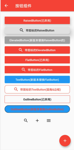
今天分享的内容是Flutter的表单组件中的各种按钮的使用,源码地址:https://gitee.com/fjjxxy/flutter-study.git,效果如下:
今天介绍的按钮有以下几个:
- RaisedButton(已弃用)
- ElevatedButton
- FlatButton(已弃用)
- TextButton
- OutlineButton(已弃用)
- OutlinedButton
- ButtonBar(按钮组)
- IconButton
- FloatingActionButton
其实这些按钮的参数有很多都是相同作用的,希望大家可以进行类比理解
(一)RaisedButton和ElevatedButton
前者在新版本中已经被弃用了,但不代表不能用,官方建议是用后者替代,
效果如下:

旧版与新版的参数有较大的区别,RaisedButton的部分参数如下:
| 参数 | 说明 |
|---|---|
| onPressed | 点击事件 |
| onLongPress | 长按点击事件 |
| textColor | 文字颜色 |
| child | 内部布局 |
| elevation | 阴影大小 |
| color | 按钮背景颜色 |
| textColor | 文字颜色 |
| splashColor | 波纹颜色 |
| shape | 处理圆角、边框等样式 |
| splashColor | 波纹颜色 |
代码如下:
            RaisedButton(
              onPressed: () {
                Toast.toast(context, msg: "点击按钮");
              },
              child: Text("RaisedButton(已弃用)"),
              elevation: 10,
              color: Colors.red,
              textColor: Colors.white,
            ),
            RaisedButton.icon(
              onPressed: () {},
              icon: Icon(Icons.search),
              label: Text("带图标的RaisedButton"),
              elevation: 20,
              shape: RoundedRectangleBorder(
                  borderRadius: BorderRadius.circular(10)),
            ),
ElevatedButton的部分参数如下:
| 参数 | 说明 |
|---|---|
| onPressed | 点击事件 |
| onLongPress | 长按点击事件 |
| style | 按钮样式 |
| child | 内部组件 |
RaisedButton使用了不同的参数实现样式,ElevatedButton的样式都在style中使用,使用MaterialStateProperty对各种状态进行判断并返回相应的样式组件,也可以通用一种样式组件,代码如下:
- MaterialStateProperty.resolveWith:不同状态下设置不同的样式
- MaterialStateProperty.all:所有状态下的样式
                style: ButtonStyle(
                    backgroundColor: MaterialStateProperty.resolveWith(
                      (states) {
                        if (states.contains(MaterialState.focused) ||
                            states.contains(MaterialState.pressed)) {
                          return Colors.red;
                        }
                        return Colors.blue;
                      },
                    ),
                    //设置字体颜色的
                    foregroundColor: MaterialStateProperty.all(Colors.white))
 ElevatedButton(
              onPressed: () {},
              child: Text("ElevatedButton(新版本替换RaisedButton的)"),
              style: ButtonStyle(
                  backgroundColor: MaterialStateProperty.all(Colors.grey)),
            ),
            ElevatedButton.icon(
              onPressed: () {},
              icon: Icon(Icons.search),
              label: Text("带图标的ElevatedButton"),
            ),
(二)FlatButton和TextButton
前者以及弃用,官方建议使用后者,这两个与上述的按钮参数一致,大家可以自己敲敲代码试试看,这里就不做介绍了
(三)OutlineButton和OutlinedButton
这两个组件名称很相似,前者以及弃用,官方建议用后者代替,这个按钮自带边框,类似于一个带有灰色边框没有背景颜色的FlatButton,OutlineButton与之前被弃用的的按钮相比,有个不同的参数,如下:
| 参数 | 说明 |
|---|---|
| borderSide | 可以设置边框的颜色、粗细 |
代码如下:
 OutlineButton(
              borderSide: BorderSide(color: Colors.red,width: 1,style: BorderStyle.solid),
              onPressed: () {},
              textColor: Colors.black,
              child: Text("OutlineButton(已弃用)"),
            ),
OutlinedButton与上述两个新版按钮的使用一致,都可以使用style进行样式的统一设置,style中side可以用来设置边框的颜色和粗细,shape可以处理圆角的样式,代码如下:
                   OutlinedButton(
                onPressed: () {},
                style: ButtonStyle(
                  backgroundColor: MaterialStateProperty.all(Colors.blue),
                  shape: MaterialStateProperty.all(RoundedRectangleBorder(
                      borderRadius: BorderRadius.circular(20))),
                  side: MaterialStateProperty.all(
                      BorderSide(color: Colors.black)),
                ),
                child: Text("OutlinedButton(新版本替换OutlineButton)"))
效果如下:

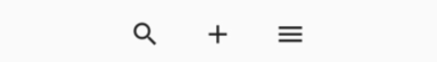
(四)ButtonBar按钮组
顾名思义,即可以放置一组按钮,这里配合IconButton进行说明,IconButton是只有图标的按钮,所以没有child参数,可以放置在AppBar右侧做按钮使用,这里就不介绍参数了,与之前几个被弃用的差不多,代码如下:
                ButtonBar(
                  children: [
                    IconButton(onPressed: () {}, icon: Icon(Icons.search)),
                    IconButton(onPressed: () {}, icon: Icon(Icons.add)),
                    IconButton(onPressed: () {}, icon: Icon(Icons.menu)),
                  ],
                )
效果如下:
(五)FloatingActionButton浮动按钮
在AppBar下定义floatingActionButton参数即可实现浮动按钮,FloatingActionButton部分参数如下:
| 参数 | 说明 |
|---|---|
| tooltip | 点击时的文字提示 |
| foregroundColor | 图标的颜色 |
| backgroundColor | 按钮的背景颜色 |
| elevation | 阴影的大小 |
| mini | 是否缩小化 |
| shape | 处理边框样式 |
| onPressed | 点击事件 |
| child | 内部组件,一般为图标 |
效果如图:
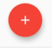
代码如下:
      floatingActionButton: FloatingActionButton(
        foregroundColor: Colors.white,
        backgroundColor: Colors.red,
        elevation: 10,
        onPressed: () {},
        tooltip: "你好,flutter",
        child: Icon(Icons.add),
        mini: false,
      )
到此为止,Flutte表单控件中的各种按钮组件的使用就介绍完了,多写才能熟能生巧,感兴趣的小伙伴可以下载源码看一下,希望大家可以点个star,支持一下小白的flutter学习经历,最后,希望喜欢我文章的朋友们可以帮忙点赞、收藏、评论,也可以关注一下,如果有问题可以在评论区提出,后面我会持续更新Flutter的学习记录,与大家分享,谢谢大家的支持与阅读!


 7393
7393


 被折叠的 条评论
为什么被折叠?
被折叠的 条评论
为什么被折叠?
 到【灌水乐园】发言


