


文章目录
前言
在学习前端初期,肯定先学习HTML、CSS等知识,那么学习WPF也是一样的思路。下面就介绍九种WPF常用的布局格式,有点类似前端的HTML、CSS。
一、Grid
Grid是WPF中最常用的布局容器。
| 属性 | 描述 |
| RowDefinitions | 定义行 |
| ColumnDefinitions | 定义列 |
| ShowGridLines | 显示虚线,辅助功能 |
<Window x:Class="WpfApp1.MainWindow"
        xmlns="http://schemas.microsoft.com/winfx/2006/xaml/presentation"
        xmlns:x="http://schemas.microsoft.com/winfx/2006/xaml"
        xmlns:d="http://schemas.microsoft.com/expression/blend/2008"
        xmlns:mc="http://schemas.openxmlformats.org/markup-compatibility/2006"
        xmlns:local="clr-namespace:WpfApp1"
        mc:Ignorable="d"
        Title="GridDemo" Height="450" Width="800">

    <Grid ShowGridLines="True" >
        <Grid.RowDefinitions>
            <RowDefinition Height="40"></RowDefinition>
            <RowDefinition Height="Auto"></RowDefinition>
            <RowDefinition Height="2*"></RowDefinition>
            <RowDefinition Height="2*"></RowDefinition>
        </Grid.RowDefinitions>

        <Grid.ColumnDefinitions>
            <ColumnDefinition Width="200"></ColumnDefinition>
            <ColumnDefinition Width="Auto"></ColumnDefinition>
            <ColumnDefinition Width="2*"></ColumnDefinition>
            <ColumnDefinition Width="*"></ColumnDefinition>
        </Grid.ColumnDefinitions>

        <Button Grid.Row="0" Grid.Column="0" Content="Button1"></Button>
        <Button Grid.Row="1" Grid.Column="0" Content="Button2"></Button>
        <Button Grid.Row="2" Grid.Column="0" Content="Button3"></Button>
        <Button Grid.Row="3" Grid.Column="0" Content="Button4"></Button>

        <Button Grid.Row="0" Grid.Column="1" Content="Button5"></Button>
    </Grid>


</Window>
上述代码,定义了四行四列的布局样式。如图所示

定义行列之后,添加用户标签时用Grid.Row和Grid.Column定位到指定位置。
Grid的列宽与行高采用固定、自动、按比例三种方式。
- 绝对值:是一个固定的数值,不会根据网格的大小或行内的内容而改变。
- 自动(Auto):会根据内容自动调整宽高和行高。如果没有内容,则不会显示。
- 星号(*):按比例分配可用空间,比如示例中,2*和*,前者占剩余全部宽度的2/3,后者占1/3。会根据窗体的宽高自动变化。
适用场景:适合需要精确控制位置和大小的复杂界面布局,如登录表单、数据网格或多列内容排列,适合复杂布局。
二、StackPanel
用于在水平方向或垂直方向上按顺序排列子元素。它非常适合于简单的布局需求,比如垂直排列按钮、水平排列图像等。
| 属性 | 描述 |
| Orientation | 定义排列方向。 Horizontal:水平布局 Vertical:垂直布局 |
| FlowDirection | 元素的排列方向。只有Orientation设置为Horizontal才有效。 RightToLeft:从右到左 LeftToRight:从左到右(默认) |
<Window x:Class="WpfApp1.MainWindow"
        xmlns="http://schemas.microsoft.com/winfx/2006/xaml/presentation"
        xmlns:x="http://schemas.microsoft.com/winfx/2006/xaml"
        xmlns:d="http://schemas.microsoft.com/expression/blend/2008"
        xmlns:mc="http://schemas.openxmlformats.org/markup-compatibility/2006"
        xmlns:local="clr-namespace:WpfApp1"
        mc:Ignorable="d"
        Title="GridDemo" Height="450" Width="800">

    <StackPanel Name="stackpanel1" Orientation="Horizontal">
        <Button Content="Button1"></Button>
        <Button Content="Button2"></Button>
        <Button Content="Button3"></Button>
    </StackPanel>


</Window>
水平布局

垂直布局

水平布局+从右向左排列

还可以嵌套在Grid中
<Window x:Class="WpfApp1.MainWindow"
        xmlns="http://schemas.microsoft.com/winfx/2006/xaml/presentation"
        xmlns:x="http://schemas.microsoft.com/winfx/2006/xaml"
        xmlns:d="http://schemas.microsoft.com/expression/blend/2008"
        xmlns:mc="http://schemas.openxmlformats.org/markup-compatibility/2006"
        xmlns:local="clr-namespace:WpfApp1"
        mc:Ignorable="d"
        Title="GridDemo" Height="450" Width="800">


    <Grid ShowGridLines="True" >
        <Grid.RowDefinitions>
            <RowDefinition Height="40"></RowDefinition>
            <RowDefinition Height="Auto"></RowDefinition>
            <RowDefinition Height="2*"></RowDefinition>
            <RowDefinition Height="2*"></RowDefinition>
        </Grid.RowDefinitions>

        <Grid.ColumnDefinitions>
            <ColumnDefinition Width="200"></ColumnDefinition>
            <ColumnDefinition Width="Auto"></ColumnDefinition>
            <ColumnDefinition Width="2*"></ColumnDefinition>
            <ColumnDefinition Width="*"></ColumnDefinition>
        </Grid.ColumnDefinitions>

        <Button Grid.Row="0" Grid.Column="0" Content="Button1"></Button>
        <Button Grid.Row="1" Grid.Column="0" Content="Button2"></Button>
        <Button Grid.Row="2" Grid.Column="0" Content="Button3"></Button>
        <Button Grid.Row="3" Grid.Column="0" Content="Button4"></Button>

        <Button Grid.Row="0" Grid.Column="1" Content="Button5"></Button>

        <StackPanel Name="stackpanel1" Orientation="Horizontal" Grid.Row="0" Grid.Column="2">
            <Button Content="Button6"></Button>
            <Button Content="Button7"></Button>
            <Button Content="Button8"></Button>
        </StackPanel>

    </Grid>

</Window>
效果图

适用场景:适合需要依次排列控件的简单场景,如按钮组、工具栏或设置选项列表。
三、WrapPanel
用于按顺序排列子元素,并在一行(或一列)放不下所有子元素时自动换行。它非常适合用于创建动态、响应式的布局,例如图像库、工具栏、标签页等。
| 属性 | 描述 |
| Orientation | 定义排列方向。 Horizontal:水平布局 Vertical:垂直布局 |
<Window x:Class="WpfApp1.MainWindow"
        xmlns="http://schemas.microsoft.com/winfx/2006/xaml/presentation"
        xmlns:x="http://schemas.microsoft.com/winfx/2006/xaml"
        xmlns:d="http://schemas.microsoft.com/expression/blend/2008"
        xmlns:mc="http://schemas.openxmlformats.org/markup-compatibility/2006"
        xmlns:local="clr-namespace:WpfApp1"
        mc:Ignorable="d"
        Title="GridDemo" Height="450" Width="800">

    <WrapPanel Orientation="Horizontal">
        <Button Content="Button 1" Width="100" Height="30"/>
        <Button Content="Button 2" Width="100" Height="30"/>
        <Button Content="Button 3" Width="100" Height="30"/>
        <Button Content="Button 4" Width="100" Height="30"/>
        <Button Content="Button 5" Width="100" Height="30"/>
        <Button Content="Button 6" Width="100" Height="30"/>
        <Button Content="Button 7" Width="100" Height="30"/>
        <Button Content="Button 8" Width="100" Height="30"/>
    </WrapPanel>

</Window>
水平排列

垂直排列

当剩余空间不足以存放下一个控件时,会自动换行。
以此类推,WrapPanel也可以嵌套在Grid中。
WrapPanel与StackPanel有点类似,它们之间的主要区别在于处理子元素溢出容器空间时的行为。
- WrapPanel:在指定方向上排列子元素,当一行(或一列)放不下所有子元素时,自动换行到下一行(或下一列)。
- StackPanel:在指定方向上排列子元素,不会自动换行。如果子元素超出容器边界,会被剪裁掉或导致滚动条出现(如果容器支持滚动)。
适用场景:适合动态内容或不确定数量的控件排列,如图片库、标签云或工具按钮面板。
四、DockPanel
用于将子元素停靠(Dock)到其边缘(上、下、左、右),并且可以指定一个子元素填充剩余的空间。它适合用于创建灵活的布局,例如窗口的基本结构、导航栏、工具栏等。
| 属性 | 描述 |
| LastChildFill | 用于控制 DockPanel中的最后一个子元素是否自动填充剩余的空间。默认情况下,这个属性的值是 True,意味着最后一个子元素将自动占据所有未被前面子元素使用的空间。 |
| DockPanel.Dock | 设置元素的锚定位置。 Top:停靠在顶部 Bottom:停靠在底部 Left:停靠在左侧 Right:停靠在右侧 |
<Window x:Class="WpfApp1.MainWindow"
        xmlns="http://schemas.microsoft.com/winfx/2006/xaml/presentation"
        xmlns:x="http://schemas.microsoft.com/winfx/2006/xaml"
        xmlns:d="http://schemas.microsoft.com/expression/blend/2008"
        xmlns:mc="http://schemas.openxmlformats.org/markup-compatibility/2006"
        xmlns:local="clr-namespace:WpfApp1"
        mc:Ignorable="d"
        Title="GridDemo" Height="450" Width="800">

    <DockPanel LastChildFill="True">
        <Button Content="Top" DockPanel.Dock="Top" Height="50"/>
        <Button Content="Bottom" DockPanel.Dock="Bottom" Height="50"/>
        <Button Content="Left" DockPanel.Dock="Left" Width="100"/>
        <Button Content="Right" DockPanel.Dock="Right" Width="100"/>
        <Button Content="Fill"/>
    </DockPanel>

</Window>

DockPanel可以与其他布局控件组合使用,以实现更复杂的布局。例如,可以在 DockPanel内部嵌套 WrapPanel、或 WrapPanel,Grid或者在这些布局控件中嵌套 DockPanel。
<Window x:Class="WpfApp1.MainWindow"
        xmlns="http://schemas.microsoft.com/winfx/2006/xaml/presentation"
        xmlns:x="http://schemas.microsoft.com/winfx/2006/xaml"
        xmlns:d="http://schemas.microsoft.com/expression/blend/2008"
        xmlns:mc="http://schemas.openxmlformats.org/markup-compatibility/2006"
        xmlns:local="clr-namespace:WpfApp1"
        mc:Ignorable="d"
        Title="GridDemo" Height="450" Width="800">

    <DockPanel>
        <StackPanel DockPanel.Dock="Top" Orientation="Horizontal">
            <Button Content="Home"/>
            <Button Content="Settings"/>
            <Button Content="Help"/>
        </StackPanel>

        <Grid DockPanel.Dock="Bottom" Height="100">
            <TextBlock Text="Status Bar" VerticalAlignment="Center" HorizontalAlignment="Center"/>
        </Grid>

        <WrapPanel DockPanel.Dock="Left" Width="200" Orientation="Vertical">
            <Button Content="Option 1"/>
            <Button Content="Option 2"/>
            <Button Content="Option 3"/>
        </WrapPanel>

        <TextBox Text="Main Content" />
    </DockPanel>

</Window>

适用场景:适合需要固定边缘布局的场景,如工具栏、状态栏或导航栏。
五、UniformGrid
用于将所有子元素均匀地排列在一个网格中。它确保所有单元格的大小相等,并且每个子元素都占据一个单元格。UniformGrid适用于需要创建均匀排列的布局,例如按钮矩阵、棋盘格、照片墙等。
| 属性 | 描述 |
| Rows | 设置行数 |
| Columns | 设置列数 |
| FirstColumn | 第一个子元素将放置开始位置的第几个 |
<Window x:Class="WpfApp1.MainWindow"
        xmlns="http://schemas.microsoft.com/winfx/2006/xaml/presentation"
        xmlns:x="http://schemas.microsoft.com/winfx/2006/xaml"
        xmlns:d="http://schemas.microsoft.com/expression/blend/2008"
        xmlns:mc="http://schemas.openxmlformats.org/markup-compatibility/2006"
        xmlns:local="clr-namespace:WpfApp1"
        mc:Ignorable="d"
        Title="GridDemo" Height="450" Width="800">

    <UniformGrid Rows="2" Columns="3">
        <Button Content="Button 1"/>
        <Button Content="Button 2"/>
        <Button Content="Button 3"/>
        <Button Content="Button 4"/>
        <Button Content="Button 5"/>
        <Button Content="Button 6"/>
    </UniformGrid>

</Window>

设置FirstColumn="2"

如果只指定行数或列数,UniformGrid将自动计算另一维度的数量,以适应所有子元素。
UniformGrid有个局限,如果未能指定足够的行和列来容纳所有子元素,超出的子元素将不会被显示。
UniformGrid同理,也可以和其他布局控件一起使用。
适用场景:适合需要均匀分布的场景,如棋盘布局、图标排列或平等分割的面板。
六、Canvas
Canvas允许在其子元素上进行绝对定位,即可以通过指定子元素的坐标(X 和 Y)来控制其在中的位置。这种布局方式适用于需要精确控制子元素位置的场景。
| 属性 | 描述 |
| Canvas.Left | 子元素相对于 Canvas左边缘的距离 |
| Canvas.Right | 子元素相对于 Canvas右边缘的距离 |
| Canvas.Top | 子元素相对于 Canvas顶部边缘的距离 |
| Canvas.Bottom | 子元素相对于 Canvas底部边缘的距离 |
<Window x:Class="WpfApp1.MainWindow"
        xmlns="http://schemas.microsoft.com/winfx/2006/xaml/presentation"
        xmlns:x="http://schemas.microsoft.com/winfx/2006/xaml"
        xmlns:d="http://schemas.microsoft.com/expression/blend/2008"
        xmlns:mc="http://schemas.openxmlformats.org/markup-compatibility/2006"
        xmlns:local="clr-namespace:WpfApp1"
        mc:Ignorable="d"
        Title="GridDemo" Height="450" Width="800">

    <Canvas Width="300" Height="200" Background="LightGray">
        <Button Content="Button 1" Canvas.Left="50" Canvas.Top="50" Width="100" Height="30"/>
        <Button Content="Button 2" Canvas.Right="50" Canvas.Bottom="50" Width="100" Height="30"/>
    </Canvas>

</Window>

Canvas同理,也可以和其他布局控件一起使用。
需要注意的地方是:
- 如果同时设置 Canvas.Left又设置Canvas.Right,则以Canvas.Left为准。
- 如果同时设置Canvas.Top又设置Canvas.Bottom,则以Canvas.Top为准。
适用场景:适合需要精确定位的场景,如绘图应用、游戏界面或自定义控件布局。
七、ScrollViewer
ScrollViewer为包含的内容提供了水平和垂直滚动功能。通过使用 ScrollViewer,你可以让超出视口(可见区域)的内容在需要时滚动显示。
| 属性 | 描述 |
| HorizontalScrollBarVisibility | 控制水平滚动条的可见性。 Disabled:禁用 Auto:自动 Hidden:隐藏 Visible:可见 |
| VerticalScrollBarVisibility | 控制垂直滚动条的可见性。 |
| CanContentScroll | 如果设置为 True,子内容会实现逻辑滚动(如项的滚动),而不是物理滚动(如像素的滚动)。对于包含 ListBox 或 ListView 等控件的内容特别有用。 |
<Window x:Class="WpfApp1.MainWindow"
        xmlns="http://schemas.microsoft.com/winfx/2006/xaml/presentation"
        xmlns:x="http://schemas.microsoft.com/winfx/2006/xaml"
        xmlns:d="http://schemas.microsoft.com/expression/blend/2008"
        xmlns:mc="http://schemas.openxmlformats.org/markup-compatibility/2006"
        xmlns:local="clr-namespace:WpfApp1"
        mc:Ignorable="d"
        Title="GridDemo" Height="150" Width="300">

    <ScrollViewer HorizontalScrollBarVisibility="Auto" VerticalScrollBarVisibility="Auto" CanContentScroll="True">
        <StackPanel>
            <TextBlock Text="Item 1" FontSize="16"/>
            <TextBlock Text="Item 2" FontSize="16"/>
            <TextBlock Text="Item 3" FontSize="16"/>
            <TextBlock Text="Item 4" FontSize="16"/>
            <TextBlock Text="Item 5" FontSize="16"/>
            <TextBlock Text="Item 6" FontSize="16"/>
            <TextBlock Text="Item 7" FontSize="16"/>
            <TextBlock Text="Item 8" FontSize="16"/>
            <TextBlock Text="Item 9" FontSize="16"/>
            <TextBlock Text="Item 10" FontSize="16"/>
        </StackPanel>
    </ScrollViewer>

</Window>

适用场景:适合需要滚动显示大量内容的场景,如文档查看器、图片浏览器或长列表显示。
八、ViewBox
用于缩放和调整其子元素的大小以适应自身的大小。它在需要根据容器大小自动调整内容大小的场景中非常有用。
| 属性 | 描述 |
| Stretch | 控制内容的缩放方式。 None:不缩放 Fill:内容拉伸以填满 ViewBox,可能会改变内容的纵横比。 Uniform:内容按比例缩放,以适应 ViewBox,同时保持内容的纵横比。 UniformToFill:内容按比例缩放,以填满 ViewBox,但内容可能会被裁剪。 |
| StretchDirection | 控制内容缩放的方向 Both:内容可以按比例放大或缩小以适应 ViewBox。 UpOnly:内容只能按比例放大,不能缩小。 DownOnly:内容只能按比例缩小,不能放大。 |
<Window x:Class="WpfApp1.MainWindow"
        xmlns="http://schemas.microsoft.com/winfx/2006/xaml/presentation"
        xmlns:x="http://schemas.microsoft.com/winfx/2006/xaml"
        xmlns:d="http://schemas.microsoft.com/expression/blend/2008"
        xmlns:mc="http://schemas.openxmlformats.org/markup-compatibility/2006"
        xmlns:local="clr-namespace:WpfApp1"
        mc:Ignorable="d"
        Title="GridDemo" Height="300" Width="450">

    <Viewbox Width="200" Height="200"  StretchDirection="UpOnly">
        <Grid Background="LightGray">
            <Ellipse Fill="Red" Width="100" Height="50" />
        </Grid>
    </Viewbox>

</Window>
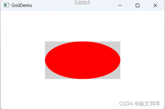
适用场景:适合显示可缩放的图像或图标。
九、Border
Border 用于为其他控件或内容提供边框和背景。它常用于给控件增加视觉效果,比如添加边框、背景色、圆角等。Border 控件非常灵活,可以与其他布局控件结合使用,以实现各种复杂的界面效果。
| 属性 | 描述 |
| BorderBrush | 用于设置边框的颜色。可以是单一颜色、渐变色或图像。 |
| BorderThickness | 用于设置边框的厚度。可以是一个数字,也可以是四个数字(分别代表左、上、右、下的厚度)。 |
| Background | 用于设置背景颜色。可以是单一颜色、渐变色或图像。 |
| CornerRadius | 用于设置边框的圆角半径。可以是一个数字,也可以是四个数字(分别代表左上、右上、右下、左下的半径)。 |
<Window x:Class="WpfApp1.MainWindow"
        xmlns="http://schemas.microsoft.com/winfx/2006/xaml/presentation"
        xmlns:x="http://schemas.microsoft.com/winfx/2006/xaml"
        xmlns:d="http://schemas.microsoft.com/expression/blend/2008"
        xmlns:mc="http://schemas.openxmlformats.org/markup-compatibility/2006"
        xmlns:local="clr-namespace:WpfApp1"
        mc:Ignorable="d"
        Title="GridDemo" Height="300" Width="450">

    <Border BorderBrush="Black" BorderThickness="5" Background="LightGray" CornerRadius="50"  Padding="10" Width="200" Height="100">
        <TextBlock Text="查看" FontSize="20"  VerticalAlignment="Center" HorizontalAlignment="Center" />
    </Border>

</Window>
适用场景:适合需要强调或分隔内容的场景,如分组框、卡片布局或内容装饰。
总结
- StackPanel 和 WrapPanel 用于简单的顺序排列,适合排列一组控件或动态内容。
- DockPanel 和 Grid 适合更复杂的布局,提供灵活的控件排列方式,分别适用于固定边缘布局和精确控制的复杂界面。
- UniformGrid 适合均匀分布的内容排列,如棋盘或图标排列。
- Canvas 提供自由布局,适合绘图和游戏界面等需要绝对定位的场景。
- ScrollViewer 为内容提供滚动功能,适合显示大量超出可视区域的内容。
- Border 用于装饰和分隔内容,提升界面的视觉效果。
- ViewBox 用于缩放内容,适合需要自适应尺寸或整体缩放的场景。
布局所涉及的知识点很多,后面会继续补充该文档。


 1万+
1万+


 被折叠的 条评论
为什么被折叠?
被折叠的 条评论
为什么被折叠?
 到【灌水乐园】发言


