


📢鸿蒙专栏:想学鸿蒙的,冲
📢C语言专栏:想学C语言的,冲
📢VUE专栏:想学VUE的,冲这里
📢Krpano专栏:想学Krpano的,冲
🔔上述专栏,都在不定期持续更新中!!!!!!!!!!!!!
目录
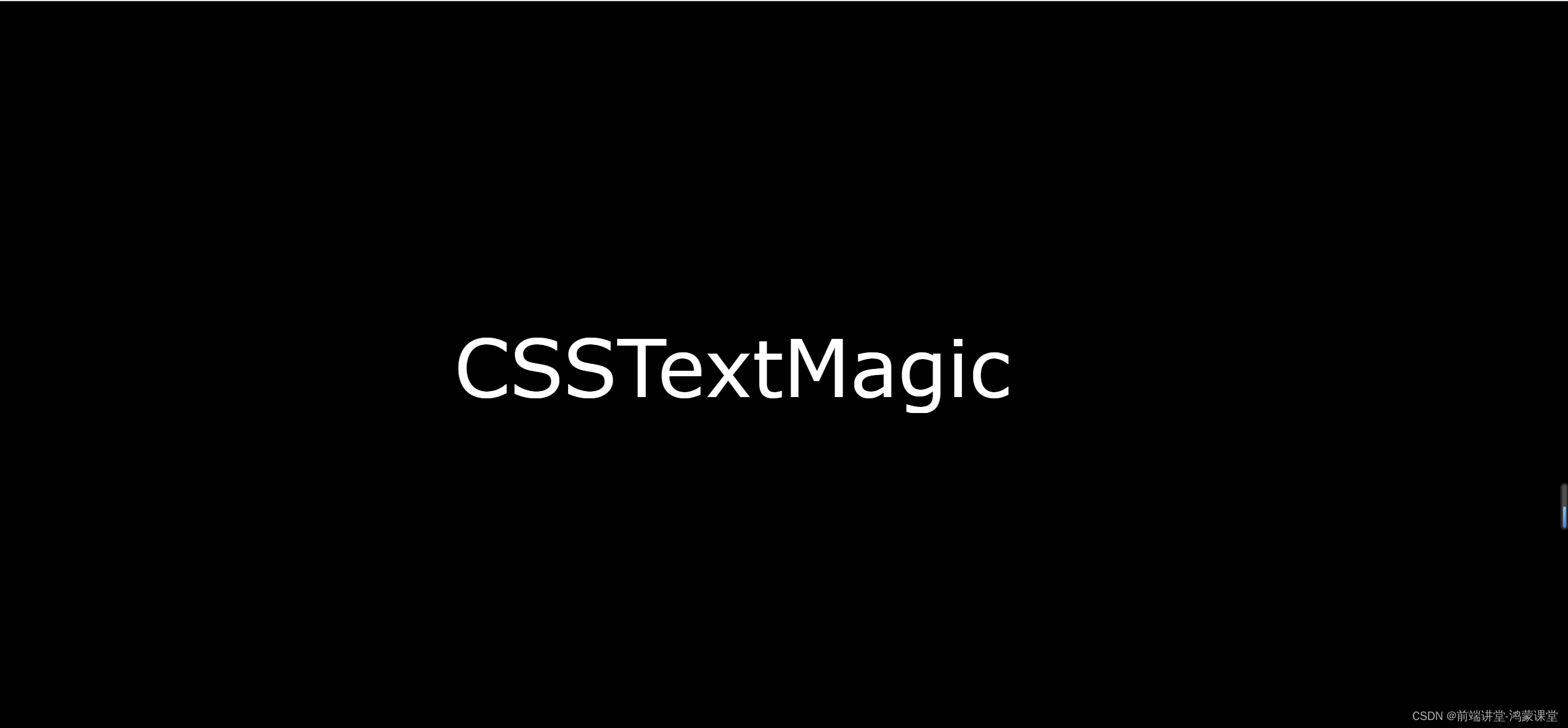
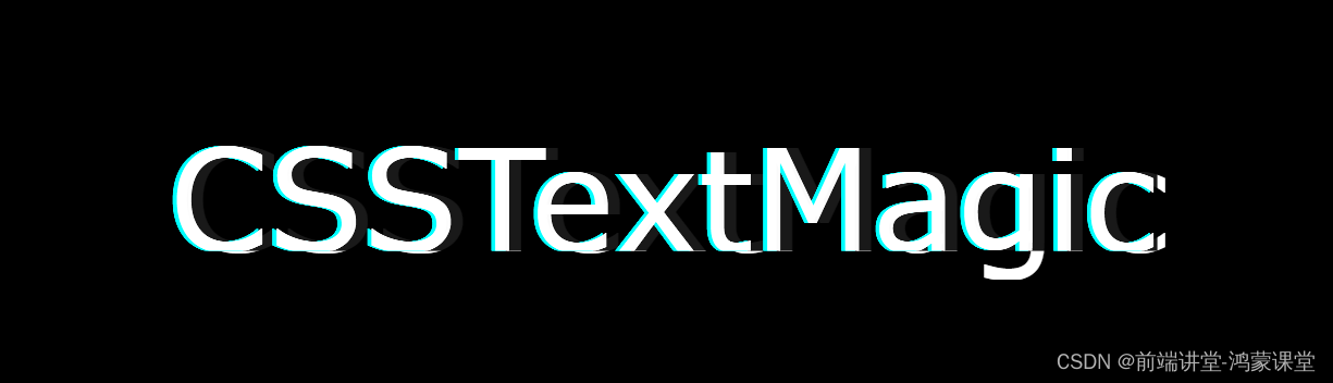
你是否曾经想过,如果你的网站上的文字突然出现了故障,会是什么样子?你是否觉得这种效果很酷,很有未来感,很有个性?你是否想知道如何用CSS来实现这种效果,让你的网站变得与众不同?如果你的答案是肯定的,那么恭喜你,你来对地方了!今天,我要教你如何用CSS来创造出这样的文字效果:
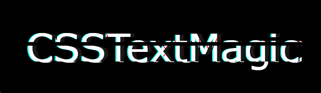
是不是有一种科幻大片的既视感
那么要实现这种效果,我们要怎么做呢?我们需要准备什么?好吧,我可以告诉你,什么都不用准备,我们只需要使用HTML+CSS3就可以实现
✨ 第一步:
我们来分析一下这个效果的特点,发现它主要是由三个方面组成的:
- 文字的错位:文字的一部分被向左或向右移动了一些距离,造成了一种视觉上的错乱。
- 文字的颜色变化:文字的一部分被染上了不同的颜色,比如白色,青色,和红色,造成了一种视觉上的冲突。
- 文字的闪烁:文字的一部分会不断地出现和消失,造成了一种视觉上的动态。
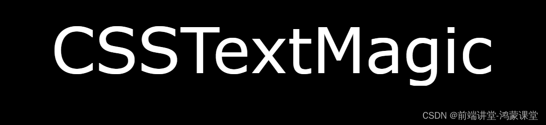
那么, 把文字写出来,这个会吧!你不回答我就默认会了
<div class="text-magic" data-word="CSSTextMagic">
	CSSTextMagic
</div>
当然光有文字是不行的,搞点样式,让文字好看一点
body,html{
	background: #000;
}
.text-magic {
	position: absolute;
	top: 50%;
	left: 50%;
	transform: translate(-50%, -50%) scale(2.4);
	width: 300px;
	font-size: 36px;
	font-family: Raleway, Verdana, Arial;
	color: #fff;
} 
✨ 第二步:
提前准备好一条来回滚动的线 ,只要在HTML里面加入:
<div class="text-magic" data-word="CSSTextMagic">
	CSSTextMagic
	<div class="white"></div>
</div>
当然也是必不可少的要来一点CSS:
        .white {
		    position: absolute;
		    left: -10px;
		    width: 100%;
		    height: 3px;
		    background: #000;
		    z-index: 4;
		}
哎吆,不好意思,因为是一条黑色的线,所以我们现在是看不见的
✨ 第三步
既然文字已经有了,那么错位的效果是怎么出来的呢?这里我们用到了::before、::after
        .text-magic::before {
		    content: attr(data-word);
		    position: absolute;
		    top: 0;
		    left: 0.5px;
		    height: 0px;
		    color: rgba(255, 255, 255, 0.9);
		    overflow: hidden;
		    z-index: 2;
		    filter: contrast(200%);
		    text-shadow: 1px 0 0 red;
		}

		.text-magic::after {
		    content: attr(data-word);
		    position: absolute;
		    top: 0;
		    left: -3px;
		    height: 36px;
		    color: rgba(255, 255, 255, 0.8);
		    overflow: hidden;
		    z-index: 3;
		    background: rgba(0, 0, 0, 0.9);
		    filter: contrast(200%);
		    text-shadow: -1px 0 0 cyan;
		    mix-blend-mode: darken;
		}
嗯嗯嗯 不错不错,已经见到了黎明的曙光
 到了这一步 你要是没有出来这个效果,恩~~~我只能说跟我没关系,我不背锅
✨ 第四步
终于到了全村父老乡亲最关心的环节,写动画~写动画~写动画~重要的事情说三遍
        @keyframes redShadow {
		    20% {
		        height: 32px;
		    }
		    60% {
		        height: 6px;
		    }
		    100% {
		        height: 42px;
		    }
		}

		@keyframes redHeight {
		    20% {
		        height: 42px;
		    }
		    35% {
		        height: 12px;
		    }
		    50% {
		        height: 40px;
		    }
		    60% {
		        height: 20px;
		    }
		    70% {
		        height: 34px;
		    }
		    80% {
		        height: 22px;
		    }
		    100% {
		        height: 0px;
		    }
		}

		@keyframes whiteMove {
		    8% {
		        top: 38px;
		    }
		    14% {
		        top: 8px;
		    }
		    20% {
		        top: 42px;
		    }
		    32% {
		        top: 2px;
		    }
		    99% {
		        top: 30px;
		    }
		}
这里我们费了九牛二虎之力,写了三组动画,怎么引用你知道吧~
- redShadow 要放在 .text-magic::before 里面 animation: redShadow 1s ease-in infinite;
- redHeight 要放在 .text-magic::after 里面 animation: redHeight 1.5s ease-out infinite;
- whiteMove 要放在 .white 里面 animation: whiteMove 3s ease-out infinite;
好了,最后还是把完整代码给你贴出来吧:
<!DOCTYPE html>
<html>
	<head>
		<meta charset="utf-8">
		<title></title>
	</head>
	<style>
		body,html{
			background: #000;
		}
		.text-magic {
		    position: absolute;
		    top: 50%;
		    left: 50%;
		    transform: translate(-50%, -50%) scale(2.4);
		    width: 300px;
		    font-size: 36px;
		    font-family: Raleway, Verdana, Arial;
		    color: #fff;
		}
		.white {
		    position: absolute;
		    left: -10px;
		    width: 100%;
		    height: 3px;
		    background: #000;
		    z-index: 4;
		    animation: whiteMove 3s ease-out infinite;
		}

		.text-magic::before {
		    content: attr(data-word);
		    position: absolute;
		    top: 0;
		    left: 0.5px;
		    height: 0px;
		    color: rgba(255, 255, 255, 0.9);
		    overflow: hidden;
		    z-index: 2;
		    animation: redShadow 1s ease-in infinite;
		    filter: contrast(200%);
		    text-shadow: 1px 0 0 red;
		}

		.text-magic::after {
		    content: attr(data-word);
		    position: absolute;
		    top: 0;
		    left: -3px;
		    height: 36px;
		    color: rgba(255, 255, 255, 0.8);
		    overflow: hidden;
		    z-index: 3;
		    background: rgba(0, 0, 0, 0.9);
		    animation: redHeight 1.5s ease-out infinite;
		    filter: contrast(200%);
		    text-shadow: -1px 0 0 cyan;
		    mix-blend-mode: darken;
		}

		@keyframes redShadow {
		    20% {
		        height: 32px;
		    }
		    60% {
		        height: 6px;
		    }
		    100% {
		        height: 42px;
		    }
		}

		@keyframes redHeight {
		    20% {
		        height: 42px;
		    }
		    35% {
		        height: 12px;
		    }
		    50% {
		        height: 40px;
		    }
		    60% {
		        height: 20px;
		    }
		    70% {
		        height: 34px;
		    }
		    80% {
		        height: 22px;
		    }
		    100% {
		        height: 0px;
		    }
		}

		@keyframes whiteMove {
		    8% {
		        top: 38px;
		    }
		    14% {
		        top: 8px;
		    }
		    20% {
		        top: 42px;
		    }
		    32% {
		        top: 2px;
		    }
		    99% {
		        top: 30px;
		    }
		}

	</style>
	<body>
		<div class="text-magic" data-word="CSSTextMagic">
		    CSSTextMagic
		    <div class="white"></div>
		</div>
	</body>
</html>
结语
恭喜你,你已经成功地用CSS创造出了一个超酷的文字故障效果!你是不是觉得自己很厉害,很有才华,很有魅力?你是不是觉得你的网站很炫酷,很有个性,很有吸引力?你是不是觉得你的读者很惊讶,很佩服,很崇拜你?如果你的答案是肯定的,那么你真的很棒,你真的很棒,你真的很棒!(这里是故意重复的,不是故障,不要慌)
当然,这只是一个简单的例子,你还可以用CSS来实现更多的效果,比如波浪,闪电,火焰等等。你只需要用你的想象力,你的创造力,你的热情,你的勇气,你的智慧,你的美貌,你的魅力,你的……好吧,我知道你已经明白了。你可以做任何你想做的事,你可以创造任何你想创造的效果,你可以成为任何你想成为的人。你是最棒的,你是最棒的,你是最棒的!(这里也是故意重复的,不是故障,不要慌)
希望你喜欢这篇文章,如果你有任何问题,意见,建议,或者想要和我交朋友,欢迎在评论区留言,或者给我发邮件,或者给我打电话,或者给我发短信,或者给我发微信,或者给我发QQ,或者给我发……好吧,我知道你已经明白了。你可以用任何方式联系我,我会很高兴和你聊天,分享,交流,合作,约会,结婚,生子,恩~后面三个就算了,……好吧,我知道你已经明白了。你可以和我做任何你想做的事。
谢谢你的阅读,祝你有一个美好的一天,我们改日再会!
等等留步,下一篇我们再搞一个文字分裂效果,酷


 扫一扫
扫一扫


 860
860

 被折叠的 条评论
为什么被折叠?
被折叠的 条评论
为什么被折叠?
 到【灌水乐园】发言


