


垂直水平居中
**情况一:**元素宽高未知
方法一:定位
	.box {
		width: 500px;
		height: 500px;
		border: 1px solid red;
		position: relative;
	}
	.content {
		width: 100px;
		height: 100px;
		background: green;
		position: absolute;
		top: 50%;
		left: 50%; //相对于父元素的50%
		transform: translate(-50%,-50%);  //相对于自身的50%
	}
方法二:弹性布局(高度已知也可用)
	.box {
		width: 500px;
		height: 500px;
		border: 1px solid red;
		display: flex;
		justify-content: center;
		align-items:center;
	}
	.content {
		width: 100px;
		height: 100px;
		background: green;
	}
情况二:高度已知
方法一:使用定位
	.box {
		width: 500px;
		height: 500px;
		border: 1px solid red;
		position: relative;
	}
	.content {
		width: 100px;
		height: 100px;
		background: green;
		position: absolute;
		top: 50%;
		left: 50%;
		margin: -50px 0 0 -50px;
	}
方法二:
.box {
		width: 500px;
		height: 500px;
		border: 1px solid red;
		position: relative;
	}
	.content {
		width: 100px;
		height: 100px;
		background: green;
		position: absolute;
		top: 0;
		left: 0;
		right: 0;
		bottom: 0;
		margin: auto;
	}
上图如下
水平居中
情况一:有宽高,子元素为块级元素
.box {
		width: 300px;
		height: 300px;
		border: 1px solid red;
	}
	.content {
		width: 100px;
		height: 100px;
		background: skyblue;
		margin: 0 auto;
	}
情况二:无宽高,元素为行非块级元素
	.box {
		width: 300px;
		height: 300px;
		border: 1px solid red;
		text-align: center;
	}
	.content {
		background: skyblue;
	}

垂直居中
情况一:块级元素
方法一:
	.box {
		width: 500px;
		height: 500px;
		border: 1px solid red;
		position: relative;
	}
	.content {
		width: 100px;
		height: 100px;
		background: green;
		position: absolute;
		top: 50%;
		left: 50%;
		margin: -50px 0 0 -50px;//或者transform:translate(-50%,-50%)
	}
方法二:
```
.box {
width: 500px;
height: 500px;
border: 1px solid red;
display: flex;
align-items:center;
}
.content {
background: green;
}*/
```
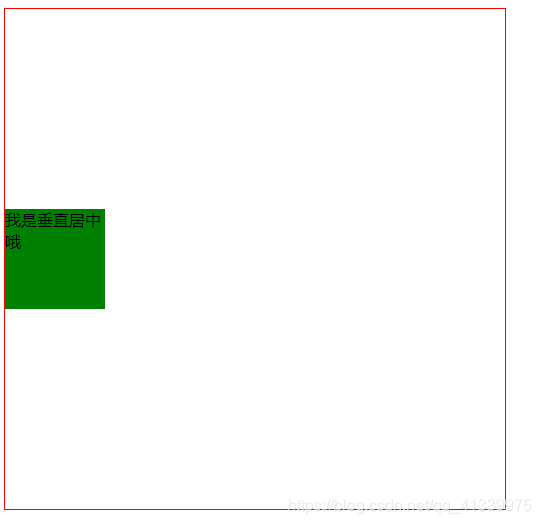
情况二:非块级元素
	.box {
		width: 500px;
		height: 500px;
		border: 1px solid red;
	}
	.content {
		background: green;
		line-height: 500px;
	}*/
</style>
<body>
	<div class="box">
		<span class="content">我是垂直居中哦</span>
	</div>
</body>

	.box {
		width: 200px;
		height: 200px;
		border: 1px solid red;
		vertical-align: middle;
        display: table-cell;
	}
	.content {
		background: green;
	}*/
</style>
<body>
	<div class="box">
		<span class="content">我是垂直居中哦噢噢噢噢哦哦哦哦哦哦哦哦哦哦哦哦哦哦哦哦哦哦哦哦哦哦哦哦哦哦哦哦哦哦哦哦哦哦哦哦哦哦哦哦哦哦哦哦哦哦哦哦哦哦哦哦哦哦哦哦哦哦哦哦</span>
	</div>
</body>


 141
141

 被折叠的 条评论
为什么被折叠?
被折叠的 条评论
为什么被折叠?
 到【灌水乐园】发言


