


通用表格组件
场景说明
参照 ruoyi-vue 完成权限管理系统后台时,在大部分页面上都需要使用到表格。ruoyi-vue 做法是每个表格都单独完成,观察每个表格样式很接近,遂想封装一个通用表格组件来取代之前的代码。
以下是 ruoyi-vue 的页面:
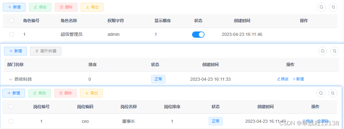
通用表格组件
极其糟糕的思路一:将通用表格组件仅抽取出一个 vue 文件,传入表格列表数据通过 v-for 循环生成 el-table-column,针对不同的列如状态,操作列需要实现不一样的样式和功能,采用 v-if 来判断。当多复用几个表格场景后就发现此种方式纯纯屎山,复用场景一多,v-if,v-else-if 看着都头皮发麻,在通用组件中还参杂业务代码,各种坑是一个不差。以下是屎山代码,谨以为鉴:
<template>
    <div>
        <el-row :gutter="10" class="mb8">
            <el-col :span="1.5">
                <el-button type="primary" plain @click="handleAdd">
                    <icon icon="svg-icon:add" />
                    {{ $t('common.add') }}
                </el-button>
            </el-col>
            <el-col :span="1.5">
                <el-button type="warning" plain @click="handleExport">
                    <icon icon="svg-icon:export" />
                    {{ $t('common.export') }}
                </el-button>
            </el-col>
            <el-col :span="1.5">
                <el-button type="warning" plain @click="handleExport('template')">
                    <icon icon="svg-icon:export" />
                    {{ $t('common.importTemplate') }}
                </el-button>
            </el-col>

            <el-col :span="1.5">
                <el-upload v-model:file-list="fileList" class="upload-demo" method="post" :on-success="handleUploadSuccess"
                    :on-error="handleUploadError" :show-file-list="false" :action="uploadRequestConfig.uploadUrl"
                    :headers="uploadRequestConfig.headers">
                    <el-button type="success" plain>
                        <icon icon="svg-icon:import" />
                        {{ $t('common.import') }}
                    </el-button>
                </el-upload>
            </el-col>
        </el-row>
        <el-table v-loading="props.isLoading" :data="props.tableList">
            <el-table-column type="selection" width="55" align="center" />
            <template v-for="rows in props.tableHeaderConfig" :key="rows.label">

                <el-table-column :label="rows.label" align="center" :width="rows.width" v-if="rows.label == $t('common.status')">
                    <template #default="scope">
                        <el-switch active-value="1" inactive-value="0" v-model="scope.row.status"
                            @change="handleEdit(scope.row, true)"></el-switch>
                    </template>
                </el-table-column>
                <el-table-column :label="rows.label" align="center" :width="rows.width" v-else-if="rows.label === $t('permission.functionList')">
                    <template #default="scope">
                        <span>{{ getFunctionListString(scope.row) }}</span>
                    </template>
                </el-table-column>
                <el-table-column :label="rows.label" align="center" prop="createTime" :width="rows.width"
                    v-else-if="rows.label === $t('common.createTime')">
                    <template #default="scope">
                        <span>{{ dataFormat(scope.row.createTime, "YYYY/MM/DD HH:mm:ss") }}</span>
                    </template>
                </el-table-column>
                <el-table-column :label="rows.label" :prop="rows.prop" :width="rows.width" v-else />
            </template>
            <el-table-column :label="$t('common.operation')" align="center" class-name="small-padding fixed-width" fixed="right" min-width="120">
                <template #default="scope">
                    <el-button size="small" link type="primary" @click="handleEdit(scope.row)">
                        <icon icon="svg-icon:edit" />{{ $t('common.edit') }}
                    </el-button>
                    <el-button size="small" link type="primary">
                        <icon icon="svg-icon:delete" />{{ $t('common.delete') }}
                    </el-button>
                </template>
            </el-table-column>
        </el-table>
    </div>
</template>

<script setup lang="ts">
import { ref } from "vue";
import type { UploadUserFile, FormInstance } from 'element-plus'
import { ElMessage } from 'element-plus';

import { dataFormat } from "@/utils/index";
import Icon from "@/components/Icon.vue";
import { FunctionList, RoleList } from "@/api/types";
import { TableOperation } from "@/components/CommonTable";
import { $t } from "@/utils/i18n";

const props = defineProps({
    isLoading: {
        type: Boolean,
        default: false
    },
    tableList: {
        type: Array,
        default: [],
    },
    tableHeaderConfig: {
        default: () => ([{
            label: '',
            prop: '',
            width: 120,
        }])
    },
    // 提供给upload组件的请求配置
    uploadRequestConfig: {
        type: Object,
        default: () => ({
            uploadUrl: '',
            headers: {
                Authorization: ''
            }
        })
    }
})
const fileList = ref<UploadUserFile[]>();
const emit = defineEmits(["handleEvent"])
const handleAdd = () => {
    emit("handleEvent", { mode: TableOperation.Add })
}
const handleExport = (exportType: 'template' | undefined) => {
    emit("handleEvent", {
        mode: TableOperation.Export,
        option: {
            exportType
        }
    })
}
const getFunctionListString = (role: RoleList) => {
    if (!!role.functionList) {
        return role.functionList.reduce((prev: string, next: FunctionList, index: number) => index == 0 ? prev + next.functionKey : prev + ',' + next.functionKey, "")
    } else {
        return ''
    }
}
const handleUploadSuccess = (response: any) => {
    if (response.code === 200) {
        ElMessage({
            type: 'success',
            message: response.msg
        })
    } else {
        ElMessage({
            type: 'error',
            message: response.msg
        })
    }
}
const handleUploadError = (error: Error) => {
    ElMessage({
        type: 'error',
        message: $t('common.operationFail')
    })
}

const handleEdit = (row: any, isEditStatus = false) => {
    emit("handleEvent", {
        mode: TableOperation.Edit,
        option: {
            rowData: row,
            isEditStatus
        }
    })
}
</script>
差强人意的思路二:将组件拆分成两个组件,一是按钮栏为 CoTableOperation.vue,一是表格CoTable.vue,拆分的组件如下:
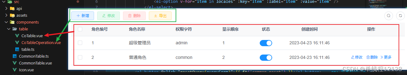
CoTableOperation.vue 的思路如下:
按钮栏功能主要包括最大交集的功能是新增,修改,删除,导入,导出,每个页面的颜色和样式又是相同的,通过传入组件的功能数组列表自动生成按钮,如果需要自定义的按钮则通过插槽导入。代码部分如下:
export type TableOperation = 'Add' | 'Edit' | 'Delete' | 'Export' | 'Import' ;
<script lang="ts">
import { h, defineComponent } from "vue";
import { ElRow, ElCol, ElButton } from 'element-plus'

import { TableOperation } from "./table";
import Icon from "@/components/Icon.vue";
import { $t } from "@/utils/i18n";

export default defineComponent({
    props: {
        tableOperation: {
            type: Array as () => TableOperation[],
            default: () => []
        }
    },
    emits: ["tableOperationHandler"],
    setup(props, ctx) {
        const { slots } = ctx;
        const tableOperationMap = {
            Add: {
                icon: "svg-icon:add",
                label: "common.add",
                type: "primary",
                plain: true,
                onClick: () => {
                    ctx.emit("tableOperationHandler", "Add");
                }
            },
            Edit: {
                icon: "svg-icon:edit",
                label: "common.edit",
                type: "success",
                plain: true,
                onClick: () => {
                    ctx.emit("tableOperationHandler", "Edit");
                }
            },
            Delete: {
                icon: "svg-icon:delete",
                label: "common.delete",
                type: "danger",
                plain: true,
                onClick: () => {
                    ctx.emit("tableOperationHandler", "Delete");
                }
            },
            Export: {
                icon: "svg-icon:export",
                label: "common.export",
                type: "info",
                plain: true,
                onClick: () => {
                    ctx.emit("tableOperationHandler", "Export");
                }
            },
            Import: {
                icon: "svg-icon:import",
                label: "common.import",
                type: "warning",
                plain: true,
                onClick: () => {
                    ctx.emit("tableOperationHandler", "Import");
                }
            }
        }
        const children = props.tableOperation.map(item => {
            const { icon, label, type, plain, onClick } = tableOperationMap[item];
            return h(ElCol, { span: 1.5 }, [
                h(
                    ElButton,
                    {
                        type,
                        plain,
                        onClick
                    },
                    () => {
                        return [h(Icon, { icon }), $t(label)]
                    }
                )
            ])
        })
        return () => {
            return h(ElRow, { gutter: 10 }, [children, h(ElCol, { span: 1.5 }, slots.default && slots.default())])
        };
    },
})
</script>
代码的思想是通过传入组件功能列表属性 tableOperation 匹配 tableOperationMap 映射表,通过 h 函数生成组件。每个按钮的事件都是使用 tableOperationHandler 来传递,触发的按钮功能作为参数进行传递。
CoTable.vue 的思路如下:
表格中不需要自定义的内容通过 tableHeaderConfig 列表,使用 v-for 循环生成 el-table-column。需要自定义的内容通过 customizeTableHeaderConfig 列表,使用 v-for 循环生成 slot 插槽,插槽 name 是表头的 prop 属性。
<script setup lang="ts">
import { PropType } from "vue";

import { TableHeaderOption } from "./table";
import Icon from "@/components/Icon.vue";
import { $t } from "@/utils/i18n";

const props = defineProps({
    isLoading: {
        type: Boolean,
        default: false
    },
    tableList: {
        type: Array,
        default: () => ([]),
    },
    tableHeaderConfig: {
        type: Object as PropType<TableHeaderOption[]>,
        default: () => ([{
            label: '',
            prop: '',
            width: 120,
        }])
    },
    customizeTableHeaderConfig: {
        type: Object as PropType<TableHeaderOption[]>,
        default: () => ([])
    }
})
</script>
<template>
    <el-table v-loading="props.isLoading" :data="props.tableList">
        <el-table-column type="selection" width="55" align="center" />
        <el-table-column :label="rows.label" :prop="rows.prop" :width="rows.width"
            v-for="rows in props.tableHeaderConfig" :key="rows.label" />
        <el-table-column v-for="rows in props.customizeTableHeaderConfig" :key="rows.label" :label="rows.label"
            :prop="rows.prop">
            <template #default="scope">
                <slot :name="rows.prop" :scope="scope.row"></slot>
            </template>
        </el-table-column>
        <el-table-column :label="$t('common.operation')" align="center" class-name="small-padding fixed-width"
            fixed="right" min-width="120">
            <template #default="scope">
                <slot :scope="scope.row">
                    <el-button size="small" link type="primary">
                        <icon icon="svg-icon:edit" />{{ $t('common.edit') }}
                    </el-button>
                    <el-button size="small" link type="primary">
                        <icon icon="svg-icon:delete" />{{ $t('common.delete') }}
                    </el-button>
                </slot>
            </template>
        </el-table-column>
    </el-table>
</template>
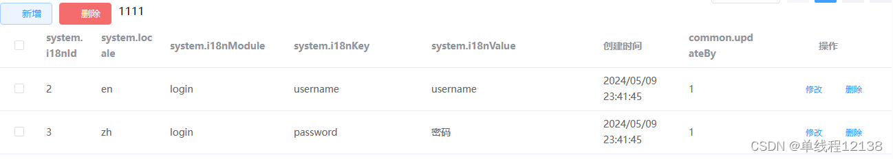
使用方式如下:
<co-table-operation :tableOperation='["Add", "Delete"]' @tableOperationHandler="tableOperationHandler">
    <div>1111</div>
</co-table-operation>
<co-table :tableList="tableData.i18nList" :isLoading="tableData.isLoading"
    :tableHeaderConfig="tableData.headerConfig"
    :customizeTableHeaderConfig="tableData.customizeTableHeaderConfig">
    <template #createTime="scope">
        <span>{{  dataFormat(scope.createTime, "YYYY/MM/DD HH:mm:ss") }}</span>
    </template>
    <template #updateBy="scope">
        <span>{{ scope.scope.updateBy }}</span>
    </template>
</co-table>
效果图如下:


 641
641


 被折叠的 条评论
为什么被折叠?
被折叠的 条评论
为什么被折叠?
 到【灌水乐园】发言


