


React开发组件-气泡提示,对话框与标签页
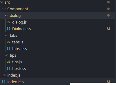
这是项目的结构:
dialog组件:
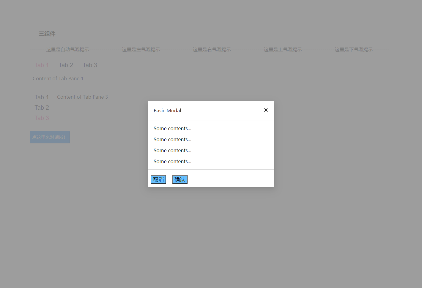
用法:
<Dialog
      title="Basic Modal"
      visible={visible}
      onOk={handleOk}
      onCancel={handleCancel}
    >
      <p>Some contents...</p>
      <p>Some contents...</p>
      <p>Some contents...</p>
      <p>Some contents...</p>
    </Dialog>
可以看到这里暴露给用户的接口有title对话框标题,visible控制对话框是否可见,onOK传入确认按钮的回调事件,onCancel传入取消按钮的回调事件,支持嵌套组件。
function Dialog(props) {
    return ReactDOM.createPortal(//dialog的重点!!一定要把它挂载在根节点的这里挂在body节点之下,防止被用户定义的容器覆盖隐藏
                    <div style={{ visibility:props.visible?'visible':'hidden'}} className="dialog" onClick={props.onCancel}>//根据props.visible决定是否展示,这里点击阴影时会关闭对话框
                        <div className="container" onClick={(e) => { e.stopPropagation() }}>//阻止冒泡触发父组件的关闭对话框事件
                            <div className="head">
                                <p id="title">{props.title}</p>
                                <span className="close">
                                    <svg onClick={props.onCancel} // 这里用svg画叉叉按钮(copy)
                                        viewBox="64 64 896 896"
                                        focusable="false"
                                        width="1em"
                                        height="1em">
                                        <path d="M563.8 512l262.5-312.9c4.4-5.2.7-13.1-6.1-13.1h-79.8c-4.7 0-9.2 2.1-12.3 5.7L511.6 449.8 295.1 191.7c-3-3.6-7.5-5.7-12.3-5.7H203c-6.8 0-10.5 7.9-6.1 13.1L459.4 512 196.9 824.9A7.95 7.95 0 00203 838h79.8c4.7 0 9.2-2.1 12.3-5.7l216.5-258.1 216.5 258.1c3 3.6 7.5 5.7 12.3 5.7h79.8c6.8 0 10.5-7.9 6.1-13.1L563.8 512z">
                                        </path>
                                    </svg>
                                </span>
                            </div>
                            <hr />
                            <div style={{ marginLeft: '20px' }}>
                                {props.children} //将子组件内容读入渲染
                            </div>
                            <hr />
                            <div className="foot">
                                <button onClick={props.onCancel}>取消</button>
                                <button onClick={props.onOk}>确认</button>
                            </div>
                        </div>
                    </div>,document.body);
}
核心:
ReactDOM.createPortal(child, container)
第一个参数(child)是任何,例如一个元素,字符串或 fragment。第二个参数(container)是一个 DOM 元素。这个方法可以将我们的对话框挂载到任何我们想挂载的节点,这里挂载到body下防止覆盖和隐藏(overflow:hidden)
阻止冒泡防止内对话框内部点击时触发外部事件。
{props.children}渲染传入的子组件
样式方面:
.dialog{
    display: flex;
    position: absolute;
    width: 100%;
    height: 100%;
    justify-content: center;
    align-items: center;
    background-color: rgba(140, 140, 140, 0.85);
    z-index: 1;
    top:0px;
    left:0px;
}
主要是最外层这个容器的样式,flex做垂直和水平居中,定位为绝对定位+高度宽度100%,然后z-index提高优先级。
tabs组件:
用法:
<Tabs defaultActiveKey="1" tabPosition="left">
  <div tab="Tab 1" key="1">
    Content of Tab Pane 1
</div>
  <div tab="Tab 2" key="2">
    Content of Tab Pane 2
</div>
  <div tab="Tab 3" key="3">
    Content of Tab Pane 3
</div>
</Tabs>
-
defaultActiveKey:默认选择的标签key
-
tabPosition:标签的方向,实现了‘left’和‘right’
-
嵌套子组件:tab标签值,key
function Tabs(props) {
    const [key, setKey] = useState(props.defaultActiveKey);// 设置组件的默认状态
    const buttoChang = (e) => {
        if(key!=e.target.name)
        {
            setKey(e.target.name) // 用name属性,绑定了传入得唯一key!!每次点击时更新key从而更改下方的内容
            if(props.onChange)props.onChange(e.target.name); //回调,传入当前选中key
        }
    }
    return (
        <div>
            <div style={{ display: props.tabPosition=='top'?'flex':'inline-block' ,//left时需要为弹性布局放置右部内容
            borderBottom:props.tabPosition=='top'?'solid 1px':'', //根据方向画线
            borderRight:props.tabPosition=='left'?'solid 1px':''}}>
                {
                    props.children.map(element => {
                        return <button
                            style={{display:'block'}}
                            className={key != element.key ? "myButton" : "myButton myButton-active"}
                            key={element.key} name={element.key}
                            onClick={buttoChang}>{element.props.tab}
                        </button>
                    })// map渲染按钮,文字内容为传入的tab值,根据组件状态key选择active的button
                }
            </div>
            {
                props.children.map((item) => {
                    return (
                        <div key={ item.key } style={{ position: key == item.key ? 'relative' : 'absolute',
                        visibility: key == item.key ? 'visible' : 'hidden',
                        margin:'10px' }}>
                            {item}
                        </div>
                    )
                })
            }// 渲染三个绝对定位的div,根据选择的key让对应内容变为可见
        </div>
    )
}
核心:
对于外部传入的key的绑定与更改,这里在渲染时都给组件绑定了key值,更改组件状态的key值则是用按钮触发事件获得的e.target.name去设置的。
tips组件:
用法:
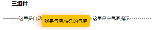
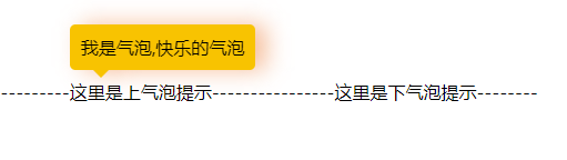
<Tip title="我是气泡,快乐的气泡" placement="top"><div>这里是上气泡提示</div></Tip>
title设置气泡的文字内容,placement则是设置气泡的位置,有top,right,bottom,left四个方向
class Tip extends React.Component {
    constructor() {
        super();
        this.state = {
            flag: false,
            arrowTop: '0px',
            arrowLeft: '0px',
            arrow: '',
            sendTop: '0px',
            sendLeft: '0px'
        }
    }
    componentDidMount() {
        const setSend = () => {
            // 计算气泡框的位置,和小箭头的位置的函数,这块虽然有效果但整体代码不是很好,以后看看怎么优化,下面会写下思路
            mywidth = this.send.clientWidth;
            myheight = this.send.clientHeight;
            const { left, top, right, bottom } = this.tip.getBoundingClientRect();//获取元素绝对位置
            const { clientWidth, clientHeight } = document.documentElement;
            switch (this.props.placement) {
                case 'top':
                    this.setState({
                        arrowTop: '40px',//padding+字体算出来的,适应性有待验证
                        arrowLeft: '20px',
                        sendTop: '-50px',
                        arrow: '#F8C301 rgba(255,255,255,0) rgba(255,255,255,0) rgba(255,255,255,0)'
                    })
                    break;
                case 'right':
                    this.setState({
                        arrowTop: '5px',
                        arrowLeft: '-16px',
                        sendLeft: this.tip.clientWidth + 8 + 'px',
                        sendTop:myheight>this.tip.clientHeight?'0px':(this.tip.clientHeight-myheight)/2+'px',
                        arrow: 'rgba(255,255,255,0) #F8C301 rgba(255,255,255,0) rgba(255,255,255,0)'
                    })
                    break;
                case 'bottom':
                    this.setState({
                        arrowTop: '-16px',
                        arrowLeft: '20px',
                        sendTop: 8 + this.tip.clientHeight + 'px',
                        arrow: 'rgba(255,255,255,0) rgba(255,255,255,0) #F8C301 rgba(255,255,255,0)'
                    })
                    break;
                case 'left':
                    this.setState({
                        arrowTop: '5px',
                        arrow: 'rgba(255,255,255,0) rgba(255,255,255,0) rgba(255,255,255,0) #F8C301',
                        sendLeft: -this.send.clientWidth - 8 + 'px',
                        sendTop:myheight>this.tip.clientHeight?'0px':(this.tip.clientHeight-myheight)/2+'px',
                        arrowLeft: this.send.clientWidth - 1 + 'px'
                    })
                    break;
                default:
                    // 不指定时自动计算

                    //this.send.parentElement.style.position='absolute';

                    // 计算四个方向的百分比
                    // 由于气泡是单行文本,上下方向的百分比占比会小很多,基本上气泡就只会是上下
                    // console.log(clientWidth + ' ' + right)
                    x1 = (mywidth + 8) / left;
                    y1 = (myheight + 8) / top;
                    x2 = clientWidth - right>0?(mywidth + 8) / (clientWidth - right):Infinity;
                    y2 = clientHeight - bottom>0?(myheight + 8) / (clientHeight - bottom):Infinity;
                    const array = [x1, y1, x2, y2]
                    console.log(array);
                    let m = 0, min = x1;
                    array.forEach((item, index) => {
                        if (item < min) {
                            min = item;
                            m = index;
                        }
                    })
                    switch (m) {
                        case 0: //左
                            this.setState({
                                arrowTop: '5px',
                                arrow: 'rgba(255,255,255,0) rgba(255,255,255,0) rgba(255,255,255,0) #F8C301',
                                sendTop:myheight>this.tip.clientHeight?'0px':(this.tip.clientHeight-myheight)/2+'px',
                                sendLeft: -mywidth - 8 + 'px',
                                arrowLeft: mywidth + 'px'
                            })
                            break;
                        case 1: //上
                            this.setState({
                                arrowTop: '40px',//padding+字体算出来的,适应性有待验证
                                arrowLeft: '20px',
                                sendTop: '-50px',
                                sendLeft:'0px',
                                arrow: '#F8C301 rgba(255,255,255,0) rgba(255,255,255,0) rgba(255,255,255,0)'
                            })
                            break;
                        case 2: //右
                            this.setState({
                                arrowTop: '5px',
                                arrowLeft: '-16px',
                                sendLeft: this.tip.clientWidth + 8 + 'px',
                                sendTop:myheight>this.tip.clientHeight?'0px':(this.tip.clientHeight-myheight)/2+'px',
                                arrow: 'rgba(255,255,255,0) #F8C301 rgba(255,255,255,0) rgba(255,255,255,0)'
                            })
                            break;
                        case 3: //下
                            this.setState({
                                arrowTop: '-16px',
                                arrowLeft: '20px',
                                sendTop: 8 + this.tip.clientHeight + 'px',
                                sendLeft:'0px',
                                arrow: 'rgba(255,255,255,0) rgba(255,255,255,0) #F8C301 rgba(255,255,255,0)'
                            })
                            break;
                        default:
                            break;
                    }
                    break;
            }
        }
        setSend();
        window.addEventListener('resize', debounce(setSend));
    }
    render() {
        return (
            <div
                ref={(e) => { this.tip = e }}
                onMouseOver={() => { this.setState({ flag: true }) }} //气泡隐藏
                onMouseLeave={() => { this.setState({ flag: false }) }}//触发显示气泡
                style={{ display: 'inline-block' }}  //inline-block父组件宽高度与子组件相同,方便我获取子组件的大小
            >
                <div style={{ position: 'relative', visibility: this.state.flag ? 'visible' : 'hidden' }}>
                    <div ref={(e) => { this.send = e }}
                        className='send'
                        style={{
                            top: this.state.sendTop,
                            left: this.state.sendLeft,
                            filter: this.props.placement == 'left' ?
                                'drop-shadow(-10px 0px 10px  rgba(238, 125, 55,0.5))'
                                : 'drop-shadow(10px 0px 10px  rgba(238, 125, 55,0.5))'
                        }}>// 这里气泡向左需要更改下阴影方向
                        {this.props.title}
                        <div className='arrow'
                            style={{ top: this.state.arrowTop, left: this.state.arrowLeft, borderColor: this.state.arrow }} />//小箭头
                    </div>
                </div>
                {this.props.children}
            </div>)
    }
};
气泡思路:
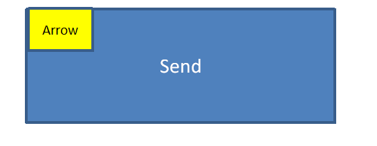
两个框使用绝对定位的框,如图:
arrow的处理:
position:absolute;
width:0;
height:0;
font-size:0;
border:solid 8px;
borderColor:'#F8C301 rgba(255,255,255,0) rgba(255,255,255,0) rgba(255,255,255,0)'
设置一个无内容的div,然后设置边框8px,可以想象,此时是一个16px的黑色小正方形,按照你想要设置的气泡方向去设置颜色,比如#F8C301 rgba(255,255,255,0) rgba(255,255,255,0) rgba(255,255,255,0)这样就是上部边框为黄色,其余全部为透明,三角形就出来了。
接着就是arrow位置的移动,这里除了左气泡需要获取sendwidth去移动之外,其余参数基本是常数(单行气泡的情况下)
然后是send的移动,由于使用了相对定位:
- 上:向上移动50px,(单行情况下),padding20+字体22+箭头8;不用左右
- 下:向下移动50px,(单行情况下),padding20+字体22+箭头8;不用左右
- 左:向左移动(send.width+8箭头),如果文本内容的高度高于send时坐下手动居中(myheight>this.tip.clientHeight ? ‘0px’ : (this.tip.clientHeight-myheight)/2+‘px’)
- 右:向右移动(send.width+8箭头),如果文本内容的高度高于send时坐下手动居中(myheight>this.tip.clientHeight ? ‘0px’ : (this.tip.clientHeight-myheight)/2+‘px’)
当用户不设置方向时自动计算其位置:
this.tip.getBoundingClientRect()这个函数可以获得元素所在相对浏览器的绝对位置
然后我们就可以计算上下左右的(send(高度|宽度)/所提示文本相对浏览器所剩上下左右长度),其中最小的值就是我们要设置的方向(有待商榷,暂时想到这个)


 1301
1301


 被折叠的 条评论
为什么被折叠?
被折叠的 条评论
为什么被折叠?
 到【灌水乐园】发言


