


文章目录
机器学习——数据科学包(五)
一、在图形中画注释的符号


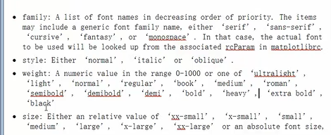
二、文字
(一)相关参数
(二)程序


三 、Tex公式
(一)公式参考网址
https://matplotlib.org/tutorials/text/mathtext.html

(二)应用实例
import matplotlib.pyplot as plt

fig=plt.figure()

ax=fig.add_subplot(111)

ax.set_xlim([1,7])

ax.set_ylim([1,5])

ax.text(2,4,r"$\alpha_i \beta_j  \pi \lambda \omega  $",size=25) #r代表字符串不转义

ax.text(4,4,r"$ \sin(0)=\cos(\frac{\pi} {2}) $",size=25)

ax.text(2,2,r"$ \lim_{x \rightarrow y} \frac{1} {x^3} $",size=25)

ax.text(4,2,r"$ \sqrt[4] {x}=\sqrt{y} $",size=25)

plt.show()

三 、区域填充
(一)fill函数
对曲线下面或者曲线之间的区域进行
fill, fill_between
import numpy as np
import matplotlib.pyplot as plt

x=np.linspace(0,5*np.pi,1000)

y1=np.sin(x)

y2=np.sin(2*x)

# plt.plot(x,y1)#plot画的是黑色边缘的线
# plt.plot(x,y2)

plt.fill(x,y1,'b',alpha=0.3)

plt.fill(x,y2,'r',alpha=0.3)


plt.show()

(二)fill_between函数
import numpy as np
import matplotlib.pyplot as plt

# x=np.linspace(0,5*np.pi,1000) #在[0,5*np.pi]范围内返回1000个等距离的样本
x=np.linspace(0,5*np.pi,100)

y1=np.sin(x)

y2=np.sin(2*x)

fig=plt.figure()

ax=plt.gca()

ax.plot(x,y1,color='r')
ax.plot(x,y2,color='b')

# ax.fill_between(x,y1,y2,where=y1>=y2,facecolor='yellow')
# ax.fill_between(x,y1,y2,where=y2>y1,facecolor='green')

ax.fill_between(x,y1,y2,where=y1>=y2,facecolor='yellow',interpolate=True) #自动的求出x和y的交叉值然后进行精确的填充。
ax.fill_between(x,y1,y2,where=y2>y1,facecolor='green',interpolate=True)

plt.show()

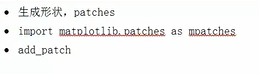
四、形状
import numpy as np
import matplotlib.pyplot as plt
import matplotlib.patches as mpatches #新的patches类

fig, ax=plt.subplots() #生成图

xy1=np.array([0.2,0.2]) #给出圆形中心坐标
xy2=np.array([0.2,0.8])
xy3=np.array([0.8,0.2])
xy4=np.array([0.8,0.8])

circle=mpatches.Circle(xy1,0.05)#圆形半径
ax.add_patch(circle)

rect=mpatches.Rectangle(xy2,0.2,0.1,color='r')
ax.add_patch(rect)

polygon=mpatches.RegularPolygon(xy3,5,0.1,color='g')
ax.add_patch(polygon)

ellipse=mpatches.Ellipse(xy4,0.4,0.2,color='y')
ax.add_patch(ellipse)


plt.axis('equal')#横纵坐标的比例相同
plt.grid()# 加入网格
plt.show()

五、样式—美化
(一)默认的美化自带样式

(二)应用
import numpy as np
import matplotlib.pyplot as plt

plt.style.use('ggplot')

fig, axes=plt.subplots(ncols=2,nrows=2) #生成2行2列的4个子图

ax1, ax2, ax3, ax4 = axes.ravel()

#画第一个图
x, y=np.random.normal(size=(2,100))
ax1.plot(x,y,'o')

#画第二个图
x=np.arange(0,10)
y=np.arange(0,10)

ncolors=len([u'b',u'g',u'r',u'c',u'm',u'y',u'k']) #plt.rcParams['axes.color_cycle']表示产生
# 颜色的循环[u'b',u'g',u'r',u'c',u'm',u'y',u'k']对七种颜色依次画出线

shift=np.linspace(0,10,ncolors)

for s in shift:
    ax2.plot(x,y+s,'-')

#画第三幅图
x=np.arange(5)
y1,y2,y3=np.random.randint(1,25,size=(3,5))
width=0.25

ax3.bar(x,y1,width)
ax3.bar(x+width,y2,width,color=[u'b',u'g',u'r',u'c',u'm',u'y',u'k'][1])
ax3.bar(x+2*width,y2,width,color=[u'b',u'g',u'r',u'c',u'm',u'y',u'k'][2])

#画第四个图
for i, color in enumerate([u'b',u'g',u'r',u'c',u'm',u'y',u'k']):
    xy=np.random.normal(size=2)#随机的坐标轴
    ax4.add_patch(plt.Circle(xy,radius=0.3,color=color))

ax4.axis('equal') #把x,y轴调整对称

plt.show()
ggplot形式:

六、极坐标:以角度和半径形成的坐标体系
(一)生成一到五的半径
import numpy as np
import matplotlib.pyplot as plt

r=np.arange(1,6,1) #生成1到5的半径

thea=[0,np.pi/2,np.pi,3*np.pi/2,2*np.pi]

ax=plt.subplot(111,projection='polar') #在此处定义为极坐标

ax.plot(thea,r,color='r',linewidth=3)

ax.grid(True) #加网格


plt.show()

(二)生成4边形
import numpy as np
import matplotlib.pyplot as plt

r=np.empty(5)#生成所有元素为5的数组
r.fill(5)

thea=[0,np.pi/2,np.pi,3*np.pi/2,2*np.pi]

ax=plt.subplot(111,projection='polar') #在此处定义为极坐标

ax.plot(thea,r,color='r',linewidth=3)

ax.grid(True) #加网格


plt.show()

七、实战项目
(一)函数积分图
参考网址:https://matplotlib.org/api/pyplot_api
import numpy as np
import matplotlib.pyplot as plt
from matplotlib.patches import Polygon

def func(x):
 return -(x-2)*(x-8)+40

x=np.linspace(0,10)

y=func(x)

fig, ax=plt.subplots()

plt.plot(x,y,'r',linewidth=2)
a=2
b=9

ax.set_xticks([a,b])

ax.set_yticks([])

ax.set_xticklabels(['$a$','$b$'])

ix=np.linspace(a,b)
iy=func(ix)

ixy=zip(ix,iy)

verts=[(a,0)]+list(ixy)+[(b,0)] #产生规则的数组

poly=Polygon(verts,facecolor='0.9',edgecolor='0.5') #生成poly对象,数字越大,颜色越浅

ax.add_patch(poly)

plt.figtext(0.9,0.05,'$x$')#x轴标记
plt.figtext(0.1,0.9,'$y$')

#添加函数的数学公式
x_math=(a+b)*0.5
y_math=35

plt.text(x_math,y_math,r'$\int_a^b (-(x-2)*(x-8)+40)dx$',horizontalalignment='center')#按照中间对齐
plt.ylim(ymin=25)#将位置y坐标调小一点
plt.show()

(二)散点-条形图(一)
所需参数

import numpy as np
import matplotlib.pyplot as plt


plt.style.use('ggplot')#决定风格

x=np.random.randn(200)#随机生成200个随机数
y=x+np.random.randn(200)*0.5

#定义变量
margin_border=0.05
width=0.4
margin_between=0.05
height=0.2

#生成三个图的坐标轴
#主图
left_s=margin_border
bottom_s=margin_border
height_s=width
width_s=width

left_x=margin_border
bottom_x=margin_border+width+margin_between
height_x=height
width_x=width

left_y=margin_border+width+margin_between
bottom_y=margin_border
height_y=width
width_y=height

plt.figure(1,figsize=(8,8)) #生成一个8*8的画布

rect_s=[left_s,bottom_s,width_s,height_s]
rect_x=[left_x,bottom_x,width_x,height_x]
rect_y=[left_y,bottom_y,width_y,height_y]

axScatter=plt.axes(rect_s)
axHisX=plt.axes(rect_x)
axHisY=plt.axes(rect_y)

#去掉图一的x轴标注和图三的y轴标注
axHisX.set_xticks([])
axHisY.set_yticks([])

#画散点图
axScatter.scatter(x,y)

bin_width=0.25

xymax=np.max([np.max(np.fabs(x)),np.max(np.fabs(y))])

lim=int(xymax/bin_width+1)*bin_width#得到图形精确宽度值

axScatter.set_xlim(-lim,lim)#对图形的x轴和y轴进行限制
axScatter.set_ylim(-lim,lim)

#画条形图
bins=np.arange(-lim,lim+bin_width,bin_width)#以bin_width为步长

axHisX.hist(x,bins=bins)
axHisY.hist(y,bins=bins,orientation='horizontal')
#设置柱形图的坐标范围
axHisX.set_xlim(axScatter.get_xlim())
axHisY.set_ylim(axScatter.get_ylim() )

plt.show()


 1万+
1万+


 被折叠的 条评论
为什么被折叠?
被折叠的 条评论
为什么被折叠?
 到【灌水乐园】发言


