


「学习笔记」移动Web开发之flex布局9
一、flex布局体验
1.1 传统布局与flex布局
【传统布局】
- 兼容性好
- 布局繁琐
- 局限性,不能在移动端很好的布局
【flex布局】
- 操作方便,布局极为简单,移动端应用很广泛
- PC 端浏览器支持情况较差
- IE11 或更低版本,不支持或仅部分支持
建议:
- 如果是 PC 端页面布局,我们还是建议使用传统布局
- 如果是移动端或者不考虑兼容性问题的 PC 端页面布局,我们还是使用 flex 弹性布局
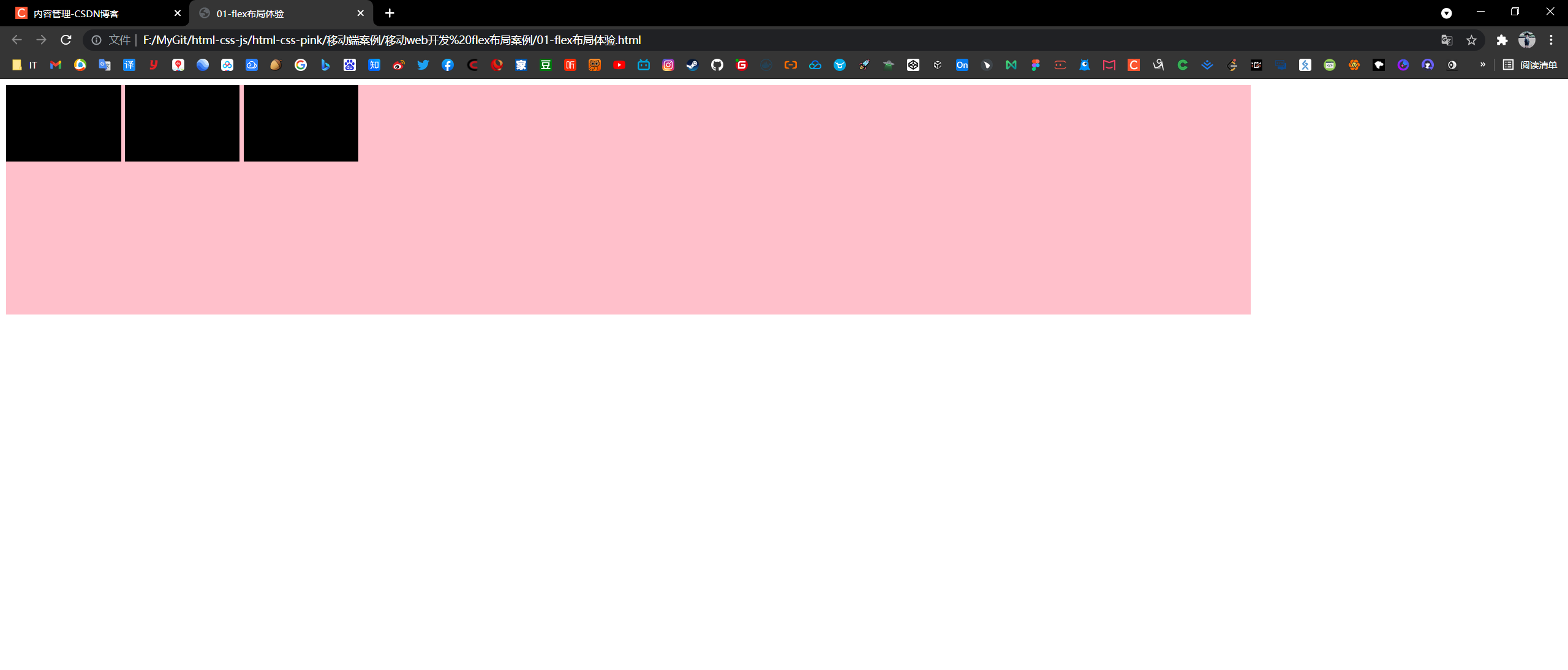
1.2 初体验
<!DOCTYPE html>
<html lang="en">

<head>
    <meta charset="UTF-8">
    <meta name="viewport" content="width=device-width, initial-scale=1.0">
    <meta http-equiv="X-UA-Compatible" content="ie=edge">
    <title>01-flex布局体验</title>
    <style>
        div {
            display: flex;
            width: 80%;
            height: 300px;
            background-color: pink;
        }

        div span {
            /* 弹性布局中:行内盒子的宽高可直接设置了 */
            /* 免去了浮动的设置,以及对父盒子清除浮动的麻烦 */
            width: 150px;
            height: 100px;
            background-color: black;
            margin-right: 5px;
        }
    </style>
</head>

<body>
    <div>
        <span>1</span>
        <span>2</span>
        <span>3</span>
    </div>
</body>

</html>
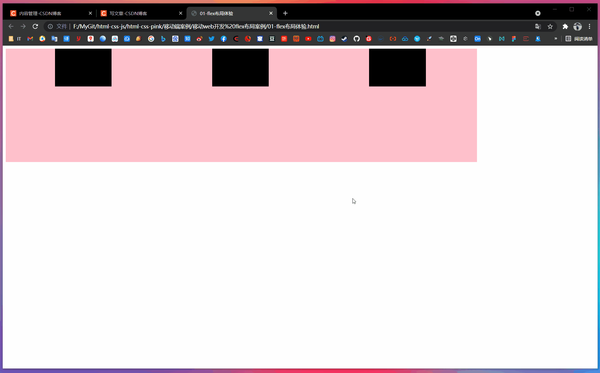
等间距分布
<!DOCTYPE html>
<html lang="en">

<head>
    <meta charset="UTF-8">
    <meta name="viewport" content="width=device-width, initial-scale=1.0">
    <meta http-equiv="X-UA-Compatible" content="ie=edge">
    <title>01-flex布局体验</title>
    <style>
        div {
            display: flex;
            width: 80%;
            height: 300px;
            background-color: pink;
            justify-content: space-around;
        }

        div span {
            /* 弹性布局中:行内盒子的宽高可直接设置了 */
            width: 150px;
            height: 100px;
            background-color: black;
            margin-right: 5px;
        }
    </style>
</head>

<body>
    <div>
        <span>1</span>
        <span>2</span>
        <span>3</span>
    </div>
</body>

</html>
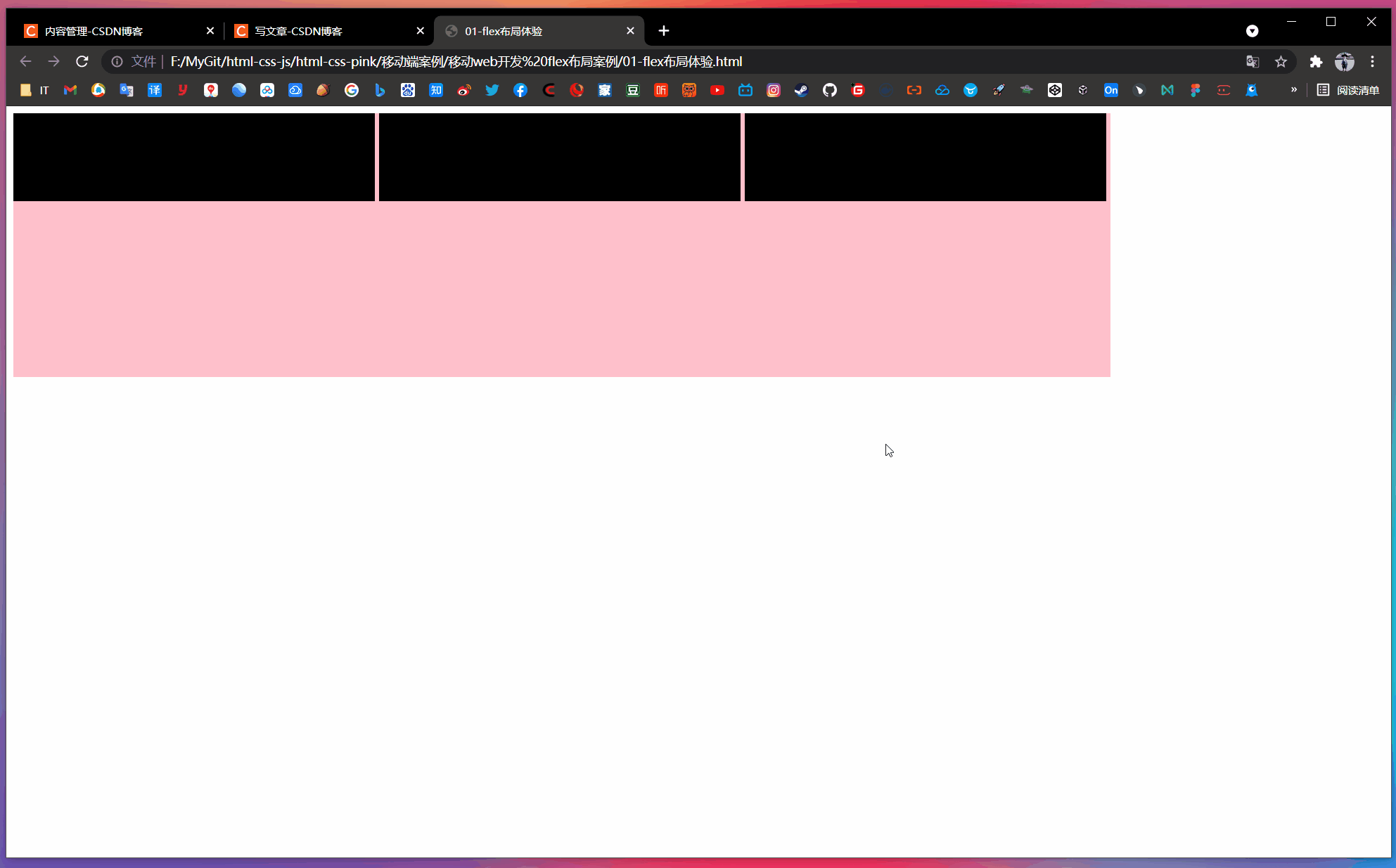
平均分为三等分
<!DOCTYPE html>
<html lang="en">

<head>
    <meta charset="UTF-8">
    <meta name="viewport" content="width=device-width, initial-scale=1.0">
    <meta http-equiv="X-UA-Compatible" content="ie=edge">
    <title>01-flex布局体验</title>
    <style>
        div {
            display: flex;
            width: 80%;
            height: 300px;
            background-color: pink;
            justify-content: space-around;
        }

        div span {
            /* 弹性布局中:行内盒子的宽高可直接设置了 */
            /* width: 150px; */
            height: 100px;
            background-color: black;
            margin-right: 5px;
            flex: 1;
        }
    </style>
</head>

<body>
    <div>
        <span>1</span>
        <span>2</span>
        <span>3</span>
    </div>
</body>

</html>
二、flex布局原理
2.1 布局原理
flex 是 flexible Box 的缩写,意为“弹性布局”,用来为盒状模型提供最大的灵活性,任何一个容器都可以指定为 flex 布局。
- 当我们为父盒子设为 flex 布局以后,子元素的 float、clear 和 vertical-align 属性将失效。
- 伸缩布局 = 弹性布局 = 伸缩盒布局 = 弹性盒布局 = flex 布局
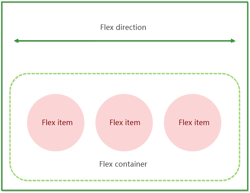
采用 flex 布局的元素,称为 flex 容器(flex container),简称“容器”。它的所有子元素自动成为容器成员,称为 flex 项目(flex item),简称“项目”。
- 上面的体验中 div 就是 flex 父容器
- 上面的体验中 span 就是子容器 flex 项目
- 子容器可以横向排列也可以纵向排列
【子容器横向排列时的图示】
【总结 flex 布局原理】
就是通过给父盒子添加 flex 属性,来控制子盒子的位置和排列方式。
三、flex布局父项常见属性
3.1 常见父项属性
以下由 6 个属性是对父元素设置的
flex-direction:设置主轴的方向justify-content:设置主轴上的子元素排列方式flex-wrap:设置子元素是否换行align-content:设置侧轴上的子元素的排列方式(多行)align-items:设置侧轴上的子元素排列方式(单行)flex-flow:复合属性,相当于同时设置了 flex-direction 和 flex-wrap
3.2 flex-direction设置主轴的方向
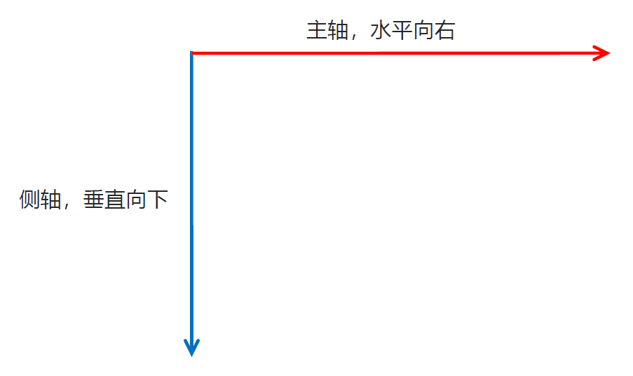
(1)主轴与侧轴
在 flex 布局中,是分为主轴和侧轴两个方向,同样的叫法有:行 和 列、x轴 和 y轴
- 默认主轴方向就是 x轴 方向,水平向右
- 默认侧轴方向就是 y轴 方向,水平向下
(2)属性值
flex-direction 属性决定主轴的方向(即:项目的排列方向)
注意:主轴和侧轴是会变化的,就看 flex-direction 设置谁为主轴,剩下的就是侧轴。而我们的子元素是跟着主轴来排列的。
| 属性值 | 说明 |
|---|---|
row | 从左到右(默认值) |
row-reverse | 从右到左 |
column | 从上到下 |
column-reverse | 从下到上 |
【案例】
<!DOCTYPE html>
<html lang="en">

<head>
    <meta charset="UTF-8">
    <meta name="viewport" content="width=device-width, initial-scale=1.0">
    <meta http-equiv="X-UA-Compatible" content="ie=edge">
    <title>02-flex主轴方向</title>
    <style>
        div {
            /* 给父级添加flex属性 */
            display: flex;
            width: 800px;
            height: 300px;
            background-color: pink;
            /* 默认的主轴是 x 轴,那么 y 轴就是侧轴喽 */
            /* 我们的元素是跟着主轴来排列的 */
            flex-direction: row;
            /* 简单了解翻转即可 */
            /* flex-direction: row-reverse; */
            /* 我们可以把我们的主轴设置为 y 轴 那么 x 轴就成了侧轴 */
            /* flex-direction: column; */
        }

        div span {
            width: 150px;
            height: 100px;
            background-color: purple;
        }
    </style>
</head>

<body>
    <div>
        <span>1</span>
        <span>2</span>
        <span>3</span>
    </div>
</body>

</html>
<!DOCTYPE html>
<html lang="en">

<head>
    <meta charset="UTF-8">
    <meta name="viewport" content="width=device-width, initial-scale=1.0">
    <meta http-equiv="X-UA-Compatible" content="ie=edge">
    <title>02-flex主轴方向</title>
    <style>
        div {
            /* 给父级添加flex属性 */
            display: flex;
            width: 800px;
            height: 300px;
            background-color: pink;
            /* 默认的主轴是 x 轴,那么 y 轴就是侧轴喽 */
            /* 我们的元素是跟着主轴来排列的 */
            /* flex-direction: row; */
            /* 简单了解翻转即可 */
            flex-direction: row-reverse;
            /* 我们可以把我们的主轴设置为 y 轴 那么 x 轴就成了侧轴 */
            /* flex-direction: column; */
        }

        div span {
            width: 150px;
            height: 100px;
            background-color: purple;
        }
    </style>
</head>

<body>
    <div>
        <span>1</span>
        <span>2</span>
        <span>3</span>
    </div>
</body>

</html>
<!DOCTYPE html>
<html lang="en">

<head>
    <meta charset="UTF-8">
    <meta name="viewport" content="width=device-width, initial-scale=1.0">
    <meta http-equiv="X-UA-Compatible" content="ie=edge">
    <title>02-flex主轴方向</title>
    <style>
        div {
            /* 给父级添加flex属性 */
            display: flex;
            width: 800px;
            height: 300px;
            background-color: pink;
            /* 默认的主轴是 x 轴,那么 y 轴就是侧轴喽 */
            /* 我们的元素是跟着主轴来排列的 */
            /* flex-direction: row; */
            /* 简单了解翻转即可 */
            /* flex-direction: row-reverse; */
            /* 我们可以把我们的主轴设置为 y 轴 那么 x 轴就成了侧轴 */
            flex-direction: column;
        }

        div span {
            width: 150px;
            height: 100px;
            background-color: purple;
        }
    </style>
</head>

<body>
    <div>
        <span>1</span>
        <span>2</span>
        <span>3</span>
    </div>
</body>

</html>
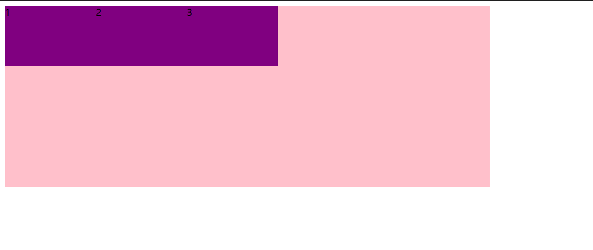
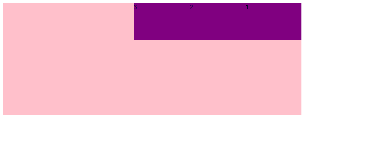
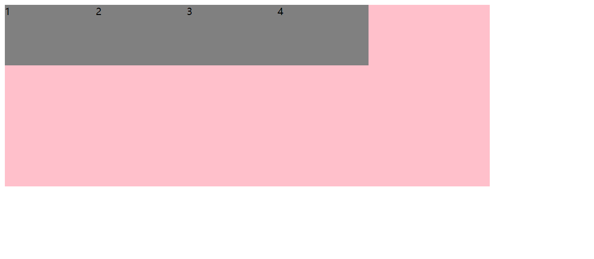
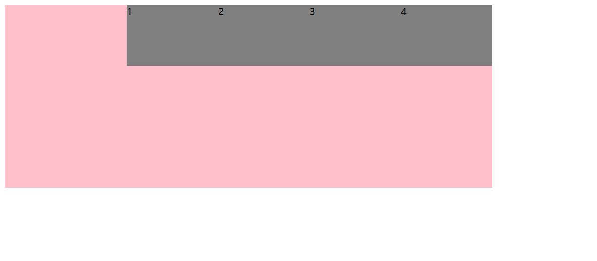
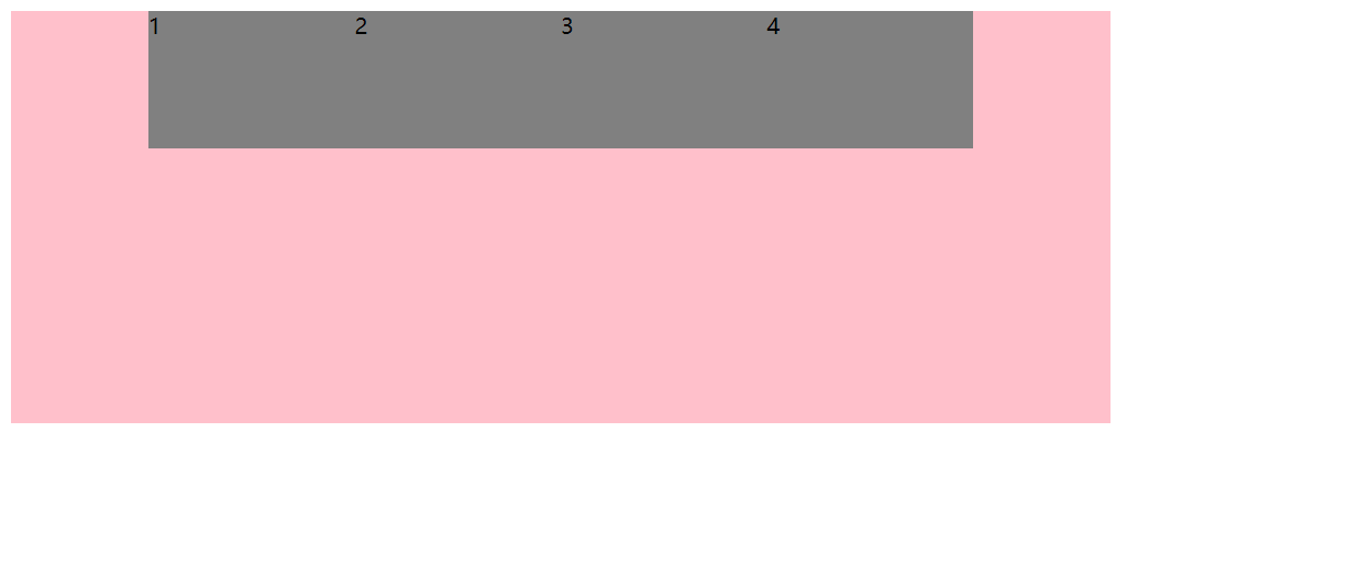
3.3 justify-content设置主轴上的子元素排列方式
justify-content 属性定义了项目在主轴上的对齐方式
注意:使用这个属性之前一定要确定好主轴是哪个!
| 属性值 | 说明 |
|---|---|
flex-start | 从头部开始,如果主轴是 x轴,则从左到右(默认值) |
flex-end | 从尾部开始排列 |
center | 在主轴居中对齐(如果主轴是 x轴 则 水平居中) |
space-around | 平分剩余空间 |
space-between | 先两边贴边再平方剩余空间(重要) |
【案例】
<!DOCTYPE html>
<html lang="en">

<head>
    <meta charset="UTF-8">
    <meta name="viewport" content="width=device-width, initial-scale=1.0">
    <meta http-equiv="X-UA-Compatible" content="ie=edge">
    <title>03-flex设置主轴上的子元素排列方式1</title>
    <style>
        div {
            display: flex;
            width: 800px;
            height: 300px;
            background-color: pink;
            /* 默认的主轴是 x轴 row */
            flex-direction: row;
            /* justify-content: 是设置主轴上子元素的排列方式 */
            /* 从头部开始,如果主轴是 x轴,则从左到右(默认值) */
            justify-content: flex-start;
            /* 从尾部开始排列 */
            /* justify-content: flex-end; */
            /* 让我们子元素居中对齐 */
            /* justify-content: center; */
            /* 平分剩余空间 */
            /* justify-content: space-around; */
            /* 先两边贴边,在分配剩余的空间 */
            /* justify-content: space-between; */
        }

        div span {
            width: 150px;
            height: 100px;
            background-color: gray;
        }
    </style>
</head>

<body>
    <div>
        <span>1</span>
        <span>2</span>
        <span>3</span>
        <span>4</span>
    </div>
</body>

</html>
<!DOCTYPE html>
<html lang="en">

<head>
    <meta charset="UTF-8">
    <meta name="viewport" content="width=device-width, initial-scale=1.0">
    <meta http-equiv="X-UA-Compatible" content="ie=edge">
    <title>03-flex设置主轴上的子元素排列方式1</title>
    <style>
        div {
            display: flex;
            width: 800px;
            height: 300px;
            background-color: pink;
            /* 默认的主轴是 x轴 row */
            flex-direction: row;
            /* justify-content: 是设置主轴上子元素的排列方式 */
            /* 从头部开始,如果主轴是 x轴,则从左到右(默认值) */
            /* justify-content: flex-start; */
            /* 从尾部开始排列 */
            justify-content: flex-end;
            /* 让我们子元素居中对齐 */
            /* justify-content: center; */
            /* 平分剩余空间 */
            /* justify-content: space-around; */
            /* 先两边贴边,在分配剩余的空间 */
            /* justify-content: space-between; */
        }

        div span {
            width: 150px;
            height: 100px;
            background-color: gray;
        }
    </style>
</head>

<body>
    <div>
        <span>1</span>
        <span>2</span>
        <span>3</span>
        <span>4</span>
    </div>
</body>

</html>
<!DOCTYPE html>
<html lang="en">

<head>
    <meta charset="UTF-8">
    <meta name="viewport" content="width=device-width, initial-scale=1.0">
    <meta http-equiv="X-UA-Compatible" content="ie=edge">
    <title>03-flex设置主轴上的子元素排列方式1</title>
    <style>
        div {
            display: flex;
            width: 800px;
            height: 300px;
            background-color: pink;
            /* 默认的主轴是 x轴 row */
            flex-direction: row;
            /* justify-content: 是设置主轴上子元素的排列方式 */
            /* 从头部开始,如果主轴是 x轴,则从左到右(默认值) */
            /* justify-content: flex-start; */
            /* 从尾部开始排列 */
            /* justify-content: flex-end; */
            /* 让我们子元素居中对齐 */
            justify-content: center;
            /* 平分剩余空间 */
            /* justify-content: space-around; */
            /* 先两边贴边,在分配剩余的空间 */
            /* justify-content: space-between; */
        }

        div span {
            width: 150px;
            height: 100px;
            background-color: gray;
        }
    </style>
</head>

<body>
    <div>
        <span>1</span>
        <span>2</span>
        <span>3</span>
        <span>4</span>
    </div>
</body>

</html>
<!DOCTYPE html>
<html lang="en">

<head>
    <meta charset="UTF-8">
    <meta name="viewport" content="width=device-width, initial-scale=1.0">
    <meta http-equiv="X-UA-Compatible" content="ie=edge">
    <title>03-flex设置主轴上的子元素排列方式1</title>
    <style>
        div {
            display: flex;
            width: 800px;
            height: 300px;
            background-color: pink;
            /* 默认的主轴是 x轴 row */
            flex-direction: row;
            /* justify-content: 是设置主轴上子元素的排列方式 */
            /* 从头部开始,如果主轴是 x轴,则从左到右(默认值) */
            /* justify-content: flex-start; */
            /* 从尾部开始排列 */
            /* justify-content: flex-end; */
            /* 让我们子元素居中对齐 */
            /* justify-content: center; */
            /* 平分剩余空间 */
            justify-content: space-around;
            /* 先两边贴边,在分配剩余的空间 */
            /* justify-content: space-between; */
        }

        div span {
            width: 150px;
            height: 100px;
            background-color: gray;
        }
    </style>
</head>

<body>
    <div>
        <span>1</span>
        <span>2</span>
        <span>3</span>
        <span>4</span>
    </div>
</body>

</html>


<!DOCTYPE html>
<html lang="en">

<head>
    <meta charset="UTF-8">
    <meta name="viewport" content="width=device-width, initial-scale=1.0">
    <meta http-equiv="X-UA-Compatible" content="ie=edge">
    <title>03-flex设置主轴上的子元素排列方式1</title>
    <style>
        div {
            display: flex;
            width: 800px;
            height: 300px;
            background-color: pink;
            /* 默认的主轴是 x轴 row */
            flex-direction: row;
            /* justify-content: 是设置主轴上子元素的排列方式 */
            /* 从头部开始,如果主轴是 x轴,则从左到右(默认值) */
            /* justify-content: flex-start; */
            /* 从尾部开始排列 */
            /* justify-content: flex-end; */
            /* 让我们子元素居中对齐 */
            /* justify-content: center; */
            /* 平分剩余空间 */
            /* justify-content: space-around; */
            /* 先两边贴边,在分配剩余的空间 */
            justify-content: space-between;
        }

        div span {
            width: 150px;
            height: 100px;
            background-color: gray;
        }
    </style>
</head>

<body>
    <div>
        <span>1</span>
        <span>2</span>
        <span>3</span>
        <span>4</span>
    </div>
</body>

</html>

注意:以上例子并不能根据浏览器窗口大小自动调整子项之间的间距,因为父盒子的宽度是固定死 800px 的,假如我们把父盒子宽度设为 80%,那么就可以有效果了。
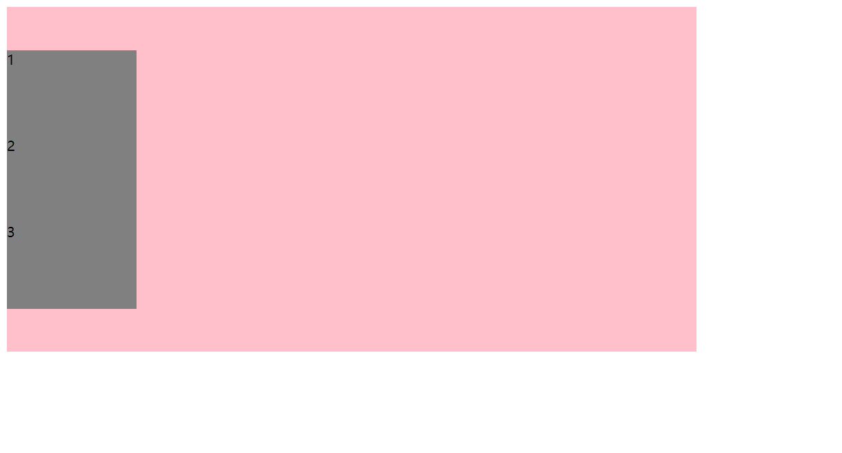
【以上到下为主轴的案例】
<!DOCTYPE html>
<html lang="en">

<head>
    <meta charset="UTF-8">
    <meta name="viewport" content="width=device-width, initial-scale=1.0">
    <meta http-equiv="X-UA-Compatible" content="ie=edge">
    <title>04-flex设置主轴上的子元素排列方式2</title>
    <style>
        div {
            display: flex;
            width: 800px;
            height: 400px;
            background-color: pink;
            /* 我们现在的主轴是 y轴 */
            flex-direction: column;
            /* justify-content: 是设置主轴上子元素的排列方式 */
            /* 从头部开始,则从上到下(默认值) */
            justify-content: flex-start;
            /* 从下开始排列 */
            /* justify-content: flex-end; */
            /* 让我们子元素垂直居中对齐 */
            /* justify-content: center; */
            /* 平分剩余空间 */
            /* justify-content: space-around; */
            /* 先上下两边贴边,在分配剩余的空间 */
            /* justify-content: space-between; */
        }

        div span {
            width: 150px;
            height: 100px;
            background-color: gray;
        }
    </style>
</head>

<body>
    <div>
        <span>1</span>
        <span>2</span>
        <span>3</span>
    </div>
</body>

</html>

<!DOCTYPE html>
<html lang="en">

<head>
    <meta charset="UTF-8">
    <meta name="viewport" content="width=device-width, initial-scale=1.0">
    <meta http-equiv="X-UA-Compatible" content="ie=edge">
    <title>04-flex设置主轴上的子元素排列方式2</title>
    <style>
        div {
            display: flex;
            width: 800px;
            height: 400px;
            background-color: pink;
            /* 我们现在的主轴是 y轴 */
            flex-direction: column;
            /* justify-content: 是设置主轴上子元素的排列方式 */
            /* 从头部开始,则从上到下(默认值) */
            /* justify-content: flex-start; */
            /* 从下开始排列 */
            justify-content: flex-end;
            /* 让我们子元素垂直居中对齐 */
            /* justify-content: center; */
            /* 平分剩余空间 */
            /* justify-content: space-around; */
            /* 先上下两边贴边,在分配剩余的空间 */
            /* justify-content: space-between; */
        }

        div span {
            width: 150px;
            height: 100px;
            background-color: gray;
        }
    </style>
</head>

<body>
    <div>
        <span>1</span>
        <span>2</span>
        <span>3</span>
    </div>
</body>

</html>

<!DOCTYPE html>
<html lang="en">

<head>
    <meta charset="UTF-8">
    <meta name="viewport" content="width=device-width, initial-scale=1.0">
    <meta http-equiv="X-UA-Compatible" content="ie=edge">
    <title>04-flex设置主轴上的子元素排列方式2</title>
    <style>
        div {
            display: flex;
            width: 800px;
            height: 400px;
            background-color: pink;
            /* 我们现在的主轴是 y轴 */
            flex-direction: column;
            /* justify-content: 是设置主轴上子元素的排列方式 */
            /* 从头部开始,则从上到下(默认值) */
            /* justify-content: flex-start; */
            /* 从下开始排列 */
            /* justify-content: flex-end; */
            /* 让我们子元素垂直居中对齐 */
            justify-content: center;
            /* 平分剩余空间 */
            /* justify-content: space-around; */
            /* 先上下两边贴边,在分配剩余的空间 */
            /* justify-content: space-between; */
        }

        div span {
            width: 150px;
            height: 100px;
            background-color: gray;
        }
    </style>
</head>

<body>
    <div>
        <span>1</span>
        <span>2</span>
        <span>3</span>
    </div>
</body>

</html>
盒子自动垂直居中的困扰终于解决啦!!!
<!DOCTYPE html>
<html lang="en">

<head>
    <meta charset="UTF-8">
    <meta name="viewport" content="width=device-width, initial-scale=1.0">
    <meta http-equiv="X-UA-Compatible" content="ie=edge">
    <title>04-flex设置主轴上的子元素排列方式2</title>
    <style>
        div {
            display: flex;
            width: 800px;
            height: 400px;
            background-color: pink;
            /* 我们现在的主轴是 y轴 */
            flex-direction: column;
            /* justify-content: 是设置主轴上子元素的排列方式 */
            /* 从头部开始,则从上到下(默认值) */
            /* justify-content: flex-start; */
            /* 从下开始排列 */
            /* justify-content: flex-end; */
            /* 让我们子元素垂直居中对齐 */
            /* justify-content: center; */
            /* 平分剩余空间 */
            justify-content: space-around;
            /* 先上下两边贴边,在分配剩余的空间 */
            /* justify-content: space-between; */
        }

        div span {
            width: 150px;
            height: 100px;
            background-color: gray;
        }
    </style>
</head>

<body>
    <div>
        <span>1</span>
        <span>2</span>
        <span>3</span>
    </div>
</body>

</html>

<!DOCTYPE html>
<html lang="en">

<head>
    <meta charset="UTF-8">
    <meta name="viewport" content="width=device-width, initial-scale=1.0">
    <meta http-equiv="X-UA-Compatible" content="ie=edge">
    <title>04-flex设置主轴上的子元素排列方式2</title>
    <style>
        div {
            display: flex;
            width: 800px;
            height: 400px;
            background-color: pink;
            /* 我们现在的主轴是 y轴 */
            flex-direction: column;
            /* justify-content: 是设置主轴上子元素的排列方式 */
            /* 从头部开始,则从上到下(默认值) */
            /* justify-content: flex-start; */
            /* 从下开始排列 */
            /* justify-content: flex-end; */
            /* 让我们子元素垂直居中对齐 */
            /* justify-content: center; */
            /* 平分剩余空间 */
            /* justify-content: space-around; */
            /* 先上下两边贴边,在分配剩余的空间 */
            justify-content: space-between;
        }

        div span {
            width: 150px;
            height: 100px;
            background-color: gray;
        }
    </style>
</head>

<body>
    <div>
        <span>1</span>
        <span>2</span>
        <span>3</span>
    </div>
</body>

</html>

3.4 flex-wrap设置子元素是否换行
默认情况下,项目都排在一条线(又称“轴线”)上。flex-wrap 属性定义,flex 布局中默认是不换行的。
| 属性值 | 说明 |
|---|---|
nowrap | 不换行(默认值) |
wrap | 换行 |
【案例】
<!DOCTYPE html>
<html lang="en">

<head>
    <meta charset="UTF-8">
    <meta name="viewport" content="width=device-width, initial-scale=1.0">
    <meta http-equiv="X-UA-Compatible" content="ie=edge">
    <title>05-flex-wrap子元素是否换行</title>
    <style>
        div {
            display: flex;
            width: 600px;
            height: 400px;
            background-color: pink;
            /* flex布局中,默认的子元素是不换行的, 如果装不开,会缩小子元素的宽度,放到父元素里面  */
            /* flex-wrap: nowrap; */
            /* 自动换行 */
            /* flex-wrap: wrap; */
        }

        div span {
            width: 150px;
            height: 100px;
            background-color: gray;
            color: #fff;
            margin: 10px;
        }
    </style>
</head>

<body>
    <div>
        <span>1</span>
        <span>2</span>
        <span>3</span>
        <span>4</span>
        <span>5</span>
        <span>6</span>
    </div>
</body>

</html>

<!DOCTYPE html>
<html lang="en">

<head>
    <meta charset="UTF-8">
    <meta name="viewport" content="width=device-width, initial-scale=1.0">
    <meta http-equiv="X-UA-Compatible" content="ie=edge">
    <title>05-flex-wrap子元素是否换行</title>
    <style>
        div {
            display: flex;
            width: 600px;
            height: 400px;
            background-color: pink;
            /* flex布局中,默认的子元素是不换行的, 如果装不开,会缩小子元素的宽度,放到父元素里面  */
            /* flex-wrap: nowrap; */
            /* 自动换行 */
            flex-wrap: wrap;
        }

        div span {
            width: 150px;
            height: 100px;
            background-color: gray;
            color: #fff;
            margin: 10px;
        }
    </style>
</head>

<body>
    <div>
        <span>1</span>
        <span>2</span>
        <span>3</span>
        <span>4</span>
        <span>5</span>
        <span>6</span>
    </div>
</body>

</html>
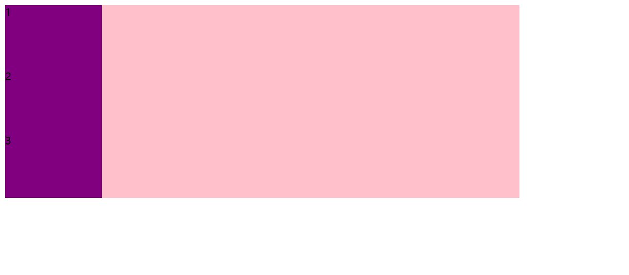
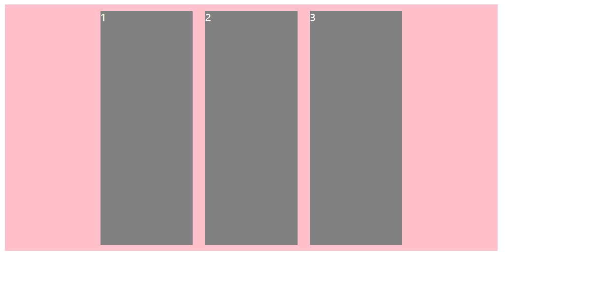
3.5 align-items设置侧轴上的子元素排列方式(单行)
该属性是控制子项在侧轴(默认是 y轴)上的排列方式,在子项为单项(单行)的时候使用。
| 属性值 | 说明 |
|---|---|
flex-start | 从上到下 |
flex-end | 从下到上 |
center | 挤在一起居中 |
stretch | 拉伸(默认值)注:前提是子盒子没有指定高度,否则没有效果! |
【案例】
<!DOCTYPE html>
<html lang="en">

<head>
    <meta charset="UTF-8">
    <meta name="viewport" content="width=device-width, initial-scale=1.0">
    <meta http-equiv="X-UA-Compatible" content="ie=edge">
    <title>06-flex设置侧轴上的子元素排列方式</title>
    <style>
        div {
            display: flex;
            width: 800px;
            height: 400px;
            background-color: pink;
            /* 默认的主轴是 x轴 row */
            flex-direction: row;
            justify-content: center;
            /* 设置侧轴:从上到下 */
            align-items: flex-start;
        }

        div span {
            width: 150px;
            height: 100px;
            background-color: gray;
            color: #fff;
            margin: 10px;
        }
    </style>
</head>

<body>
    <div>
        <span>1</span>
        <span>2</span>
        <span>3</span>
    </div>
</body>

</html>

<!DOCTYPE html>
<html lang="en">

<head>
    <meta charset="UTF-8">
    <meta name="viewport" content="width=device-width, initial-scale=1.0">
    <meta http-equiv="X-UA-Compatible" content="ie=edge">
    <title>06-flex设置侧轴上的子元素排列方式</title>
    <style>
        div {
            display: flex;
            width: 800px;
            height: 400px;
            background-color: pink;
            /* 默认的主轴是 x轴 row */
            flex-direction: row;
            justify-content: center;
            /* 设置侧轴:从下到上 */
            align-items: flex-end;
        }

        div span {
            width: 150px;
            height: 100px;
            background-color: gray;
            color: #fff;
            margin: 10px;
        }
    </style>
</head>

<body>
    <div>
        <span>1</span>
        <span>2</span>
        <span>3</span>
    </div>
</body>

</html>

<!DOCTYPE html>
<html lang="en">

<head>
    <meta charset="UTF-8">
    <meta name="viewport" content="width=device-width, initial-scale=1.0">
    <meta http-equiv="X-UA-Compatible" content="ie=edge">
    <title>06-flex设置侧轴上的子元素排列方式</title>
    <style>
        div {
            display: flex;
            width: 800px;
            height: 400px;
            background-color: pink;
            /* 默认的主轴是 x轴 row */
            flex-direction: row;
            justify-content: center;
            /* 设置侧轴:挤在一起居中 */
            align-items: center;
        }

        div span {
            width: 150px;
            height: 100px;
            background-color: gray;
            color: #fff;
            margin: 10px;
        }
    </style>
</head>

<body>
    <div>
        <span>1</span>
        <span>2</span>
        <span>3</span>
    </div>
</body>

</html>

<!DOCTYPE html>
<html lang="en">

<head>
    <meta charset="UTF-8">
    <meta name="viewport" content="width=device-width, initial-scale=1.0">
    <meta http-equiv="X-UA-Compatible" content="ie=edge">
    <title>06-flex设置侧轴上的子元素排列方式</title>
    <style>
        div {
            display: flex;
            width: 800px;
            height: 400px;
            background-color: pink;
            /* 默认的主轴是 x轴 row */
            flex-direction: row;
            justify-content: center;
            /* 设置侧轴:拉伸(默认) */
            align-items: stretch;
        }

        div span {
            width: 150px;
            /* 拉伸的前提是没有指定高度 */
            /* height: 100px; */
            background-color: gray;
            color: #fff;
            margin: 10px;
        }
    </style>
</head>

<body>
    <div>
        <span>1</span>
        <span>2</span>
        <span>3</span>
    </div>
</body>

</html>
align-items 只能统一对侧轴上的子元素排列方式,假如有多行子元素,要分别对不同的行设置不同的排列方式,那么此种方式就无法做了。
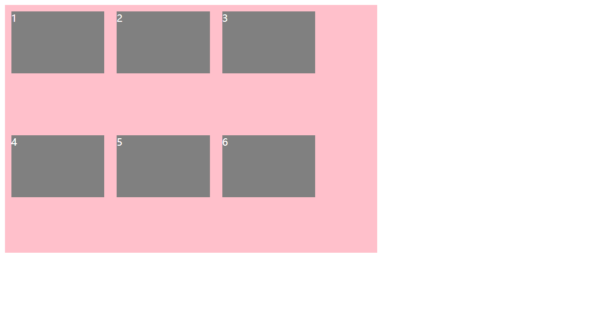
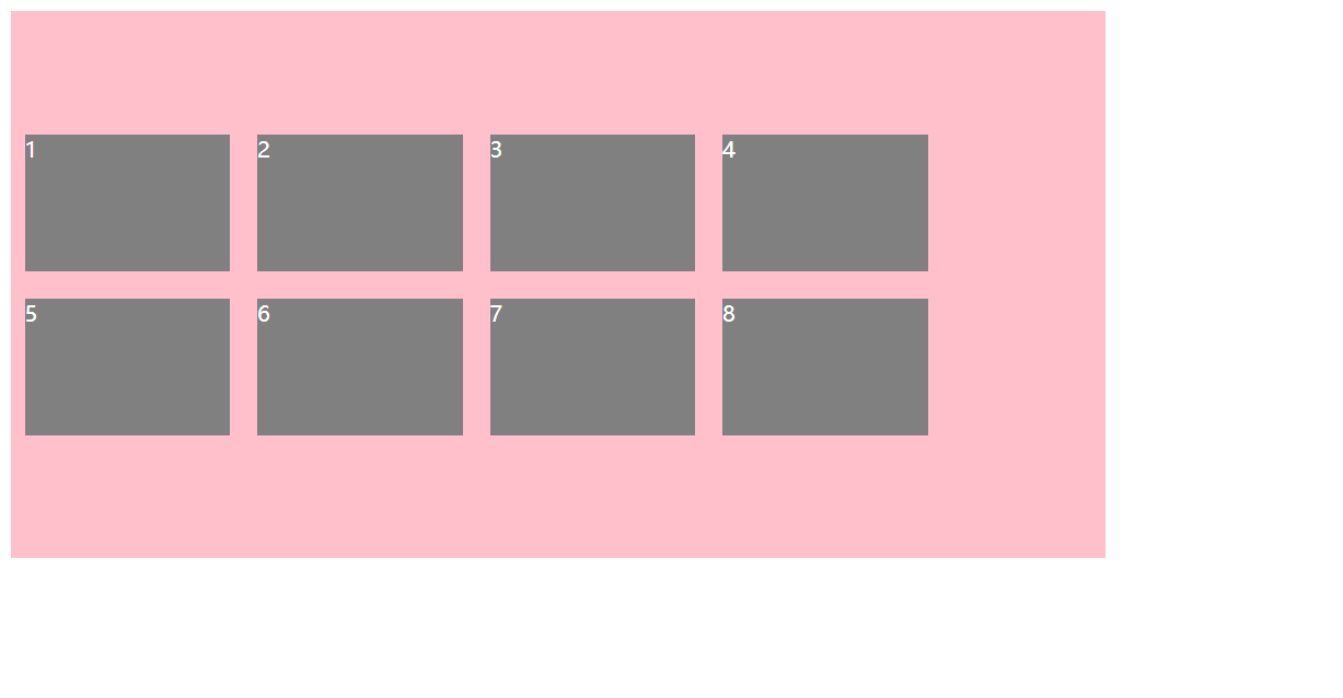
3.6 align-content 设置侧轴上的子元素的排列方式(多行)
设置子项在侧轴上的排列方式并且只能用于子项出现 换行 的情况(多行),在单行下是没有效果的。
| 属性值 | 说明 |
|---|---|
flex-start | 在侧轴的头部开始排列 |
flex-end | 在侧轴的尾部开始排列 |
center | 在侧轴中间显示 |
space-around | 子项在侧轴平分剩余空间 |
space-between | 子项在侧轴先分布在两头,再平分剩余空间 |
stretch | 行拉伸以占据剩余空间(默认值) |
【案例】
<!DOCTYPE html>
<html lang="en">

<head>
    <meta charset="UTF-8">
    <meta name="viewport" content="width=device-width, initial-scale=1.0">
    <meta http-equiv="X-UA-Compatible" content="ie=edge">
    <title>07-flex设置侧轴上的子元素排列方式(多行)</title>
    <style>
        div {
            display: flex;
            width: 800px;
            height: 400px;
            background-color: pink;
            /* 换行 */
            flex-wrap: wrap;
            /* 因为有了换行,此时我们侧轴上控制子元素的对齐方式我们用 align-content */
            align-content: flex-start;
            /* align-content: center; */
            /* align-content: space-around; */
            /* align-content: space-between; */
            /* align-content: stretch; */
        }

        div span {
            width: 150px;
            height: 100px;
            background-color: gray;
            color: #fff;
            margin: 10px;
        }
    </style>
</head>

<body>
    <div>
        <span>1</span>
        <span>2</span>
        <span>3</span>
        <span>4</span>
        <span>5</span>
        <span>6</span>
        <span>7</span>
        <span>8</span>
    </div>
</body>

</html>

<!DOCTYPE html>
<html lang="en">

<head>
    <meta charset="UTF-8">
    <meta name="viewport" content="width=device-width, initial-scale=1.0">
    <meta http-equiv="X-UA-Compatible" content="ie=edge">
    <title>07-flex设置侧轴上的子元素排列方式(多行)</title>
    <style>
        div {
            display: flex;
            width: 800px;
            height: 400px;
            background-color: pink;
            /* 换行 */
            flex-wrap: wrap;
            /* 因为有了换行,此时我们侧轴上控制子元素的对齐方式我们用 align-content */
            /* align-content: flex-start; */
            align-content: center;
            /* align-content: space-around; */
            /* align-content: space-between; */
            /* align-content: stretch; */
        }

        div span {
            width: 150px;
            height: 100px;
            background-color: gray;
            color: #fff;
            margin: 10px;
        }
    </style>
</head>

<body>
    <div>
        <span>1</span>
        <span>2</span>
        <span>3</span>
        <span>4</span>
        <span>5</span>
        <span>6</span>
        <span>7</span>
        <span>8</span>
    </div>
</body>

</html>
<!DOCTYPE html>
<html lang="en">

<head>
    <meta charset="UTF-8">
    <meta name="viewport" content="width=device-width, initial-scale=1.0">
    <meta http-equiv="X-UA-Compatible" content="ie=edge">
    <title>07-flex设置侧轴上的子元素排列方式(多行)</title>
    <style>
        div {
            display: flex;
            width: 800px;
            height: 400px;
            background-color: pink;
            /* 换行 */
            flex-wrap: wrap;
            /* 因为有了换行,此时我们侧轴上控制子元素的对齐方式我们用 align-content */
            /* align-content: flex-start; */
            /* align-content: center; */
            align-content: space-around;
            /* align-content: space-between; */
            /* align-content: stretch; */
        }

        div span {
            width: 150px;
            height: 100px;
            background-color: gray;
            color: #fff;
            margin: 10px;
        }
    </style>
</head>

<body>
    <div>
        <span>1</span>
        <span>2</span>
        <span>3</span>
        <span>4</span>
        <span>5</span>
        <span>6</span>
        <span>7</span>
        <span>8</span>
    </div>
</body>

</html>

<!DOCTYPE html>
<html lang="en">

<head>
    <meta charset="UTF-8">
    <meta name="viewport" content="width=device-width, initial-scale=1.0">
    <meta http-equiv="X-UA-Compatible" content="ie=edge">
    <title>07-flex设置侧轴上的子元素排列方式(多行)</title>
    <style>
        div {
            display: flex;
            width: 800px;
            height: 400px;
            background-color: pink;
            /* 换行 */
            flex-wrap: wrap;
            /* 因为有了换行,此时我们侧轴上控制子元素的对齐方式我们用 align-content */
            /* align-content: flex-start; */
            /* align-content: center; */
            /* align-content: space-around; */
            align-content: space-between;
            /* align-content: stretch; */
        }

        div span {
            width: 150px;
            height: 100px;
            background-color: gray;
            color: #fff;
            margin: 10px;
        }
    </style>
</head>

<body>
    <div>
        <span>1</span>
        <span>2</span>
        <span>3</span>
        <span>4</span>
        <span>5</span>
        <span>6</span>
        <span>7</span>
        <span>8</span>
    </div>
</body>

</html>

<!DOCTYPE html>
<html lang="en">

<head>
    <meta charset="UTF-8">
    <meta name="viewport" content="width=device-width, initial-scale=1.0">
    <meta http-equiv="X-UA-Compatible" content="ie=edge">
    <title>07-flex设置侧轴上的子元素排列方式(多行)</title>
    <style>
        div {
            display: flex;
            width: 800px;
            height: 400px;
            background-color: pink;
            /* 换行 */
            flex-wrap: wrap;
            /* 因为有了换行,此时我们侧轴上控制子元素的对齐方式我们用 align-content */
            /* align-content: flex-start; */
            /* align-content: center; */
            /* align-content: space-around; */
            /* align-content: space-between; */
            align-content: stretch;
        }

        div span {
            width: 150px;
            height: 100px;
            background-color: gray;
            color: #fff;
            margin: 10px;
        }
    </style>
</head>

<body>
    <div>
        <span>1</span>
        <span>2</span>
        <span>3</span>
        <span>4</span>
        <span>5</span>
        <span>6</span>
        <span>7</span>
        <span>8</span>
    </div>
</body>

</html>

3.7 align-content和align-items区别
- align-items 适用于单行情况下,只有上对齐、下对齐、居中和拉伸
- align-content 适应于换行(多行)的情况下(单行情况下无效),可以设置上对齐、下对齐、居中、拉伸以及平均分配剩余空间等属性值
- 总结就是单行找 align-items 多行找 align-content

3.8 flex-flow
flex-flow 属性是 flex-direction 和 flex-wrap 属性的复合属性
flex-flow: row wrap;
flex-direction:设置主轴的方向justify-content:设置主轴上的子元素排列方式flex-wrap:设置子元素是否换行align-content:设置侧轴上的子元素的排列方式(多行)align-items:设置侧轴上的子元素排列方式(单行)flex-flow:复合属性,相当于同时设置了 flex-direction 和 flex-wrap
【案例】
<!DOCTYPE html>
<html lang="en">

<head>
    <meta charset="UTF-8">
    <meta name="viewport" content="width=device-width, initial-scale=1.0">
    <meta http-equiv="X-UA-Compatible" content="ie=edge">
    <title>08-flex-flow复合属性</title>
    <style>
        div {
            display: flex;
            width: 600px;
            height: 300px;
            background-color: pink;
            /* flex-direction: column;
            flex-wrap: wrap; */
            /* 把设置主轴方向和是否换行(换列)简写 */
            flex-flow: column wrap;
        }

        div span {
            width: 150px;
            height: 100px;
            background-color: gray;
        }
    </style>
</head>

<body>
    <div>
        <span>1</span>
        <span>2</span>
        <span>3</span>
        <span>4</span>
        <span>5</span>
    </div>
</body>

</html>

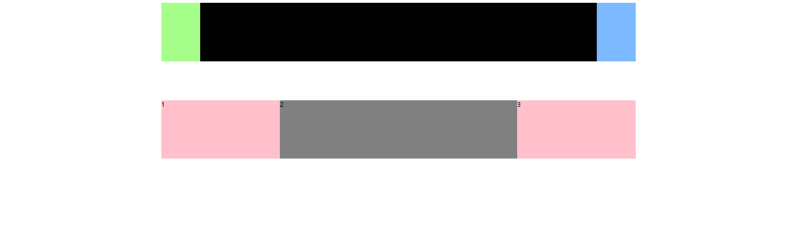
四、flex布局子项常见属性
- flex 子项目占的份数
- align-self 控制子项自己在侧轴的排列方式
- order 属性定义子项的排列顺序(前后顺序)
4.1 flex属性
flex 属性定义子项目分配剩余空间,用 flex 来表示占多少份数。
.item {
    flex: <number>; /* default 0 */
}
【案例】
<!DOCTYPE html>
<html lang="en">
<head>
<meta charset="UTF-8">
<meta name="viewport" content="width=device-width, initial-scale=1.0">
<meta http-equiv="X-UA-Compatible" content="ie=edge">
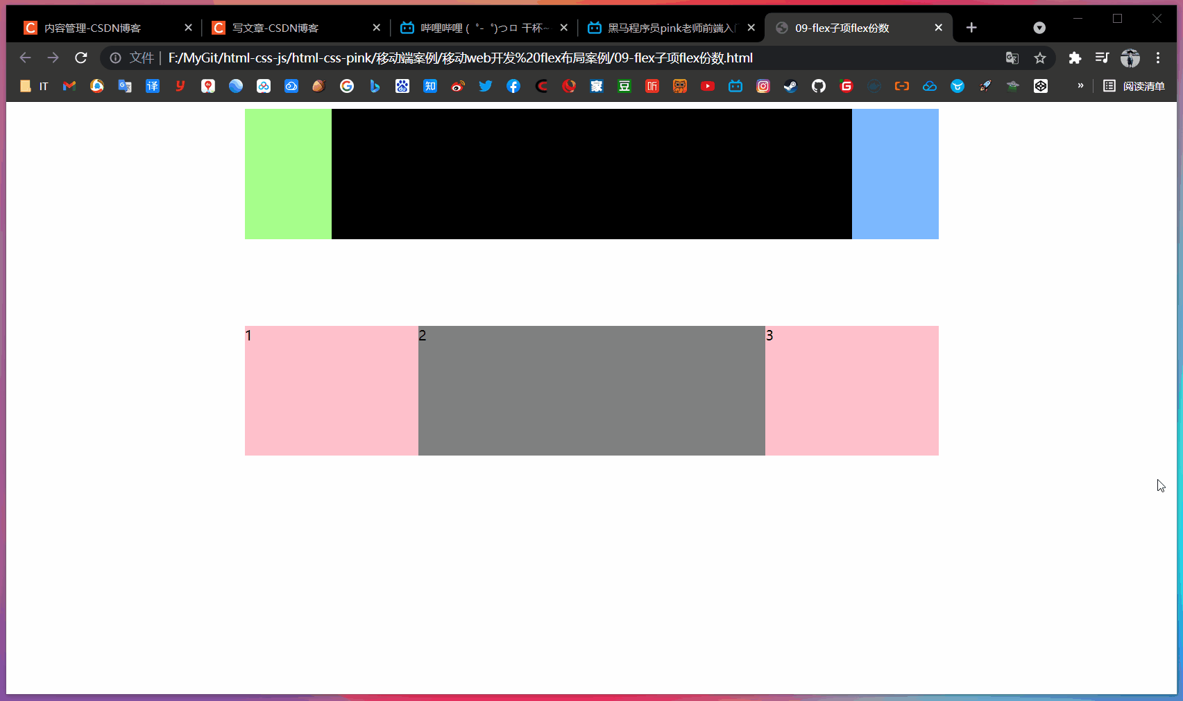
<title>09-flex子项flex份数</title>
<style>
section {
display: flex;
width: 60%;
height: 150px;
background-color: pink;
margin: 0 auto;
}
section div:nth-child(1) {
width: 100px;
height: 150px;
background-color: rgb(166, 255, 139);
}
section div:nth-child(2) {
flex: 1;
background-color: rgb(0, 0, 0);
}
section div:nth-child(3) {
width: 100px;
height: 150px;
background-color: rgb(124, 185, 255);
}
/* --------------------------------- */
p {
display: flex;
width: 60%;
height: 150px;
background-color: pink;
margin: 100px auto;
}
p span {
flex: 1;
}
p span:nth-child(2) {
flex: 2;
background-color: gray;
}
</style>
</head>
<body>
<section>
<div></div>
<div></div>
<div></div>
</section>
<p>
<span>1</span>
<span>2</span>
<span>3</span>
</p>
</body>
</html>
4.2 align-self控制子项自己在侧轴上的排列方式
align-self 属性允许单个项目有与其他项目不一样的对齐方式,可覆盖 align-items 属性。
默认值 auto,表示继承父元素 align-items 属性,如果没有父元素,则等同于 stretch。
span:nth-child(2) {
    /* 设置自己在侧轴上的排列方式 */
    align-self: flex-end;
}
4.3 order属性定义项目的排列顺序
数值越小,排列越靠前,默认为 0。
注意:和 z-index 不一样。
.item {
    order: <number>;
}
【案例】
<!DOCTYPE html>
<html lang="en">

<head>
    <meta charset="UTF-8">
    <meta name="viewport" content="width=device-width, initial-scale=1.0">
    <meta http-equiv="X-UA-Compatible" content="ie=edge">
    <title>10-align-self和order</title>
    <style>
        div {
            display: flex;
            width: 80%;
            height: 300px;
            background-color: pink;
            /* 让三个子盒子沿着侧轴底侧对齐 */
            /* align-items: flex-end; */
            /* 我们想只让3号盒子下来底侧 */
        }

        div span {
            width: 150px;
            height: 100px;
            background-color: gray;
            margin-right: 5px;
        }

        div span:nth-child(2) {
            /* 排列顺序 */
            /* 默认是0,-1比0小所以在前面 */
            order: -1;
        }

        div span:nth-child(3) {
            /* 单独设置 */
            align-self: flex-end;
        }
    </style>
</head>

<body>
    <div>
        <span>1</span>
        <span>2</span>
        <span>3</span>
    </div>
</body>

</html>

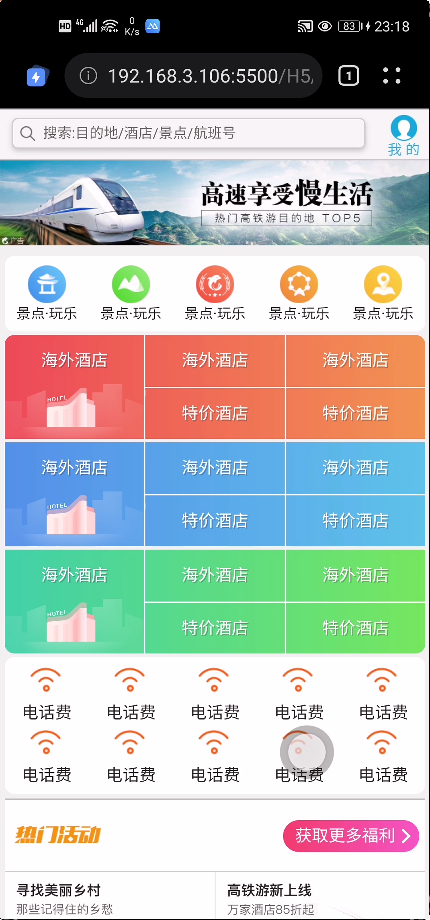
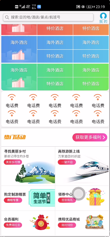
五、携程网首页案例制作
【案例:携程网移动端首页】
访问地址:https://m.ctrip.com/
(1)技术选型
方案:我们采取单独制作移动页面方案
技术:布局采取 flex 布局
(2)搭建相关文件夹结构

(3)设置视口标签以及引入初始化样式
<meta name="viewport" content="width=device-width, user-scalable=no,
initial-scale=1.0, maximum-scale=1.0, minimum-scale=1.0">
<link rel="stylesheet" href="css/normalize.css">
<link rel="stylesheet" href="css/index.css">
(4)常用初始化样式
body {
	max-width: 540px;
	min-width: 320px;
	margin: 0 auto;
	font: normal 14px/1.5 Tahoma, "Lucida Grande", Verdana, "Microsoft Yahei", STXihei, hei;
	color: #000;
	background: #f2f2f2;
	overflow-x: hidden;
	-webkit-tap-highlight-color: transparent;
}
(5)常见模块命名

(6)常见 flex 布局思路

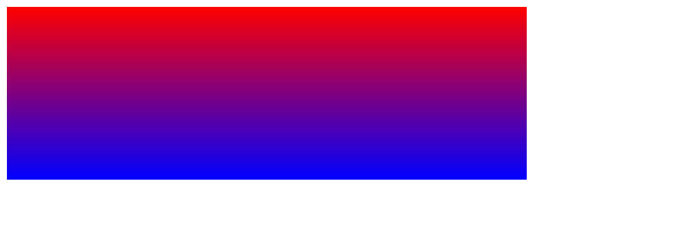
(7)背景线性渐变
语法:
background: linear-gradient(起始方向, 颜色1, 颜色2, ...);
background: -webkit-linear-gradient(left, red , blue);
background: -webkit-linear-gradient(left top, red , blue);
- 背景渐变必须添加浏览器私有前缀
- 起始方向可以是:方位名词 或 度数,如果省略默认就是 top
【案例】
<!DOCTYPE html>
<html lang="en">

<head>
    <meta charset="UTF-8">
    <meta name="viewport" content="width=device-width, initial-scale=1.0">
    <meta http-equiv="X-UA-Compatible" content="ie=edge">
    <title>11-背景线性渐变</title>
    <style>
        div {
            width: 600px;
            height: 200px;
            /* 背景渐变必须添加浏览器私有前缀 */
            /* 由于此处是移动端,所以我们写 webkit 就够了 */
            background: -webkit-linear-gradient(left, red, blue);
            /* background: -webkit-linear-gradient(red, blue); */
            /* background: -webkit-linear-gradient(top left, red, blue); */
        }
    </style>
</head>

<body>
    <div></div>
</body>

</html>

<!DOCTYPE html>
<html lang="en">

<head>
    <meta charset="UTF-8">
    <meta name="viewport" content="width=device-width, initial-scale=1.0">
    <meta http-equiv="X-UA-Compatible" content="ie=edge">
    <title>11-背景线性渐变</title>
    <style>
        div {
            width: 600px;
            height: 200px;
            /* 背景渐变必须添加浏览器私有前缀 */
            /* background: -webkit-linear-gradient(left, red, blue); */
            background: -webkit-linear-gradient(red, blue);
            /* background: -webkit-linear-gradient(top left, red, blue); */
        }
    </style>
</head>

<body>
    <div></div>
</body>

</html>
<!DOCTYPE html>
<html lang="en">

<head>
    <meta charset="UTF-8">
    <meta name="viewport" content="width=device-width, initial-scale=1.0">
    <meta http-equiv="X-UA-Compatible" content="ie=edge">
    <title>11-背景线性渐变</title>
    <style>
        div {
            width: 600px;
            height: 200px;
            /* 背景渐变必须添加浏览器私有前缀 */
            /* background: -webkit-linear-gradient(left, red, blue); */
            /* background: -webkit-linear-gradient(red, blue); */
            background: -webkit-linear-gradient(top left, red, blue);
        }
    </style>
</head>

<body>
    <div></div>
</body>

</html>

【完整代码】
<!DOCTYPE html>
<html lang="en">
<head>
<meta charset="UTF-8">
<meta name="viewport" content="width=device-width, initial-scale=1.0">
<meta http-equiv="X-UA-Compatible" content="ie=edge">
<link rel="stylesheet" href="css/normalize.css">
<link rel="stylesheet" href="css/index.css">
<title>携程在手,说走就走</title>
</head>
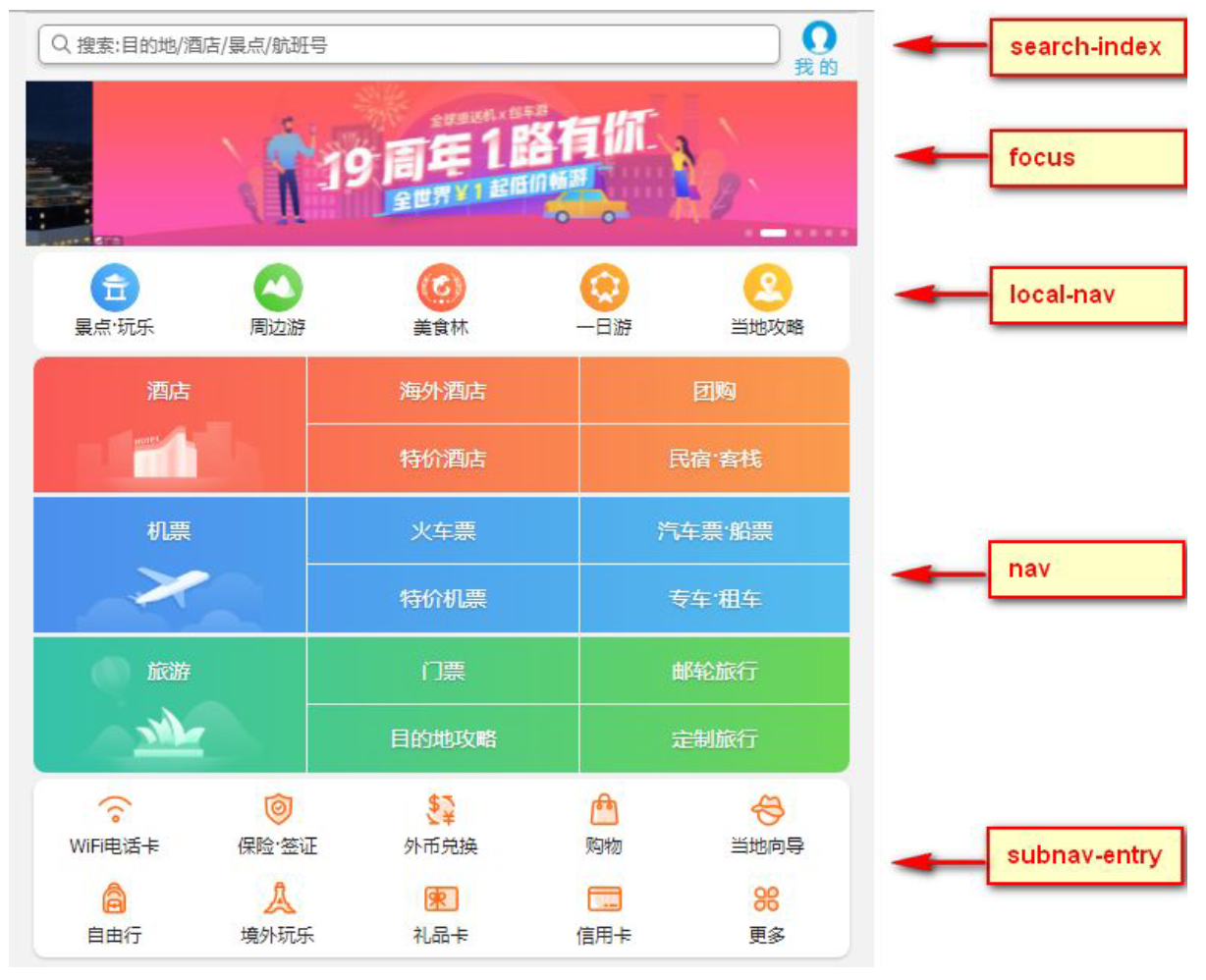
<body>
<!-- 顶部搜索 -->
<div class="search-index">
<div class="search">搜索:目的地/酒店/景点/航班号</div>
<a href="#" class="user">我 的</a>
</div>
<!-- 焦点图模块 -->
<div class="focus">
<img src="upload/focus.jpg" alt="">
</div>
<!-- 局部导航栏 -->
<ul class="local-nav">
<li>
<a href="#" title="景点·玩乐">
<span class="local-nav-icon-icon1"></span>
<span>景点·玩乐</span>
</a>
</li>
<li>
<a href="#" title="景点·玩乐">
<span class="local-nav-icon-icon2"></span>
<span>景点·玩乐</span>
</a>
</li>
<li>
<a href="#" title="景点·玩乐">
<span class="local-nav-icon-icon3"></span>
<span>景点·玩乐</span>
</a>
</li>
<li>
<a href="#" title="景点·玩乐">
<span class="local-nav-icon-icon4"></span>
<span>景点·玩乐</span>
</a>
</li>
<li>
<a href="#" title="景点·玩乐">
<span class="local-nav-icon-icon5"></span>
<span>景点·玩乐</span>
</a>
</li>
</ul>
<!-- 主导航栏 -->
<nav>
<div class="nav-common">
<div class="nav-items">
<a href="#">海外酒店</a>
</div>
<div class="nav-items">
<a href="#">海外酒店</a>
<a href="#">特价酒店</a>
</div>
<div class="nav-items">
<a href="#">海外酒店</a>
<a href="#">特价酒店</a>
</div>
</div>
<div class="nav-common">
<div class="nav-items">
<a href="#">海外酒店</a>
</div>
<div class="nav-items">
<a href="#">海外酒店</a>
<a href="#">特价酒店</a>
</div>
<div class="nav-items">
<a href="#">海外酒店</a>
<a href="#">特价酒店</a>
</div>
</div>
<div class="nav-common">
<div class="nav-items">
<a href="#">海外酒店</a>
</div>
<div class="nav-items">
<a href="#">海外酒店</a>
<a href="#">特价酒店</a>
</div>
<div class="nav-items">
<a href="#">海外酒店</a>
<a href="#">特价酒店</a>
</div>
</div>
</nav>
<!-- 侧导航栏 -->
<ul class="subnav-entry">
<li>
<a href="#">
<span class="subnav-entry-icon"></span>
<span>电话费</span>
</a>
</li>
<li>
<a href="#">
<span class="subnav-entry-icon"></span>
<span>电话费</span>
</a>
</li>
<li>
<a href="#">
<span class="subnav-entry-icon"></span>
<span>电话费</span>
</a>
</li>
<li>
<a href="#">
<span class="subnav-entry-icon"></span>
<span>电话费</span>
</a>
</li>
<li>
<a href="#">
<span class="subnav-entry-icon"></span>
<span>电话费</span>
</a>
</li>
<li>
<a href="#">
<span class="subnav-entry-icon"></span>
<span>电话费</span>
</a>
</li>
<li>
<a href="#">
<span class="subnav-entry-icon"></span>
<span>电话费</span>
</a>
</li>
<li>
<a href="#">
<span class="subnav-entry-icon"></span>
<span>电话费</span>
</a>
</li>
<li>
<a href="#">
<span class="subnav-entry-icon"></span>
<span>电话费</span>
</a>
</li>
<li>
<a href="#">
<span class="subnav-entry-icon"></span>
<span>电话费</span>
</a>
</li>
</ul>
<!-- 销售模块 -->
<div class="sales-box">
<div class="sales-hd">
<h2>热门活动</h2>
<a href="#" class="more">获取更多福利</a>
</div>
<div class="sales-bd">
<div class="row">
<a href="#">
<img src="upload/pic1.jpg" alt="">
</a>
<a href="#">
<img src="upload/pic2.jpg" alt="">
</a>
</div>
<div class="row">
<a href="#">
<img src="upload/pic3.jpg" alt="">
</a>
<a href="#">
<img src="upload/pic4.jpg" alt="">
</a>
</div>
<div class="row">
<a href="#">
<img src="upload/pic5.jpg" alt="">
</a>
<a href="#">
<img src="upload/pic6.jpg" alt="">
</a>
</div>
</div>
</div>
</body>
</html>
body {
  max-width: 540px;
  min-width: 320px;
  margin: 0 auto;
  font: normal 14px/1.5 Tahoma, "Lucida Grande", Verdana, "Microsoft Yahei",
    STXihei, hei;
  color: #000;
  background: #f2f2f2;
  overflow-x: hidden;
  -webkit-tap-highlight-color: transparent;
}

ul {
  list-style: none;
  margin: 0;
  padding: 0;
}

a {
  text-decoration: none;
  color: #222;
}

div {
  box-sizing: border-box;
}

/* 搜索模块 */

.search-index {
  display: flex;
  /* 固定定位跟父级没有关系 它以屏幕为准 */
  position: fixed;
  top: 0;
  left: 50%;
  /* 固定的盒子应该有宽度 */
  -webkit-transform: translateX(-50%);
  transform: translateX(-50%);
  width: 100%;
  min-width: 320px;
  max-width: 540px;
  height: 44px;
  /* background-color: pink; */
  background-color: #f6f6f6;
  border-top: 1px solid #ccc;
  border-bottom: 1px solid #ccc;
}

.search {
  position: relative;
  height: 26px;
  line-height: 24px;
  border: 1px solid #ccc;
  flex: 1;
  font-size: 12px;
  color: #666;
  margin: 7px 10px;
  padding-left: 25px;
  border-radius: 5px;
  box-shadow: 0 2px 4px rgba(0, 0, 0, 0.2);
}

.search::before {
  content: "";
  position: absolute;
  top: 5px;
  left: 5px;
  width: 15px;
  height: 15px;
  background: url(../images/sprite.png) no-repeat -59px -279px;
  background-size: 104px auto;
}

.user {
  width: 44px;
  height: 44px;
  /* background-color: purple; */
  font-size: 12px;
  text-align: center;
  color: #2eaae0;
}

.user::before {
  content: "";
  display: block;
  width: 23px;
  height: 23px;
  background: url(../images/sprite.png) no-repeat -59px -194px;
  background-size: 104px auto;
  margin: 4px auto -2px;
}

/* focus */

.focus {
  padding-top: 44px;
}

.focus img {
  width: 100%;
}

/* local-nav */

.local-nav {
  display: flex;
  height: 64px;
  margin: 3px 4px;
  background-color: #fff;
  border-radius: 8px;
}

.local-nav li {
  flex: 1;
}

.local-nav a {
  display: flex;
  flex-direction: column;
  /* 侧轴居中对齐 因为是单行 */
  align-items: center;
  font-size: 12px;
}

.local-nav li [class^="local-nav-icon"] {
  width: 32px;
  height: 32px;
  background-color: pink;
  margin-top: 8px;
  background: url(../images/localnav_bg.png) no-repeat 0 0;
  background-size: 32px auto;
}

.local-nav li .local-nav-icon-icon2 {
  background-position: 0 -32px;
}

.local-nav li .local-nav-icon-icon3 {
  background-position: 0 -64px;
}

.local-nav li .local-nav-icon-icon4 {
  background-position: 0 -96px;
}

.local-nav li .local-nav-icon-icon5 {
  background-position: 0 -128px;
}

/* nav */

nav {
  overflow: hidden;
  border-radius: 8px;
  margin: 0 4px 3px;
}

.nav-common {
  display: flex;
  height: 88px;
  background-color: pink;
}

.nav-common:nth-child(2) {
  margin: 3px 0;
}

.nav-items {
  /* 不冲突的 */
  flex: 1;
  display: flex;
  flex-direction: column;
}

.nav-items a {
  flex: 1;
  text-align: center;
  line-height: 44px;
  color: #fff;
  font-size: 14px;
  /* 文字阴影 */
  text-shadow: 1px 1px rgba(0, 0, 0, 0.2);
}

.nav-items a:nth-child(1) {
  border-bottom: 1px solid #fff;
}

.nav-items:nth-child(1) a {
  border: 0;
  background: url(../images/hotel.png) no-repeat bottom center;
  background-size: 121px auto;
}

/* -n+2就是选择前面两个元素 */

.nav-items:nth-child(-n + 2) {
  border-right: 1px solid #fff;
}

.nav-common:nth-child(1) {
  background: -webkit-linear-gradient(left, #fa5a55, #fa994d);
}

.nav-common:nth-child(2) {
  background: -webkit-linear-gradient(left, #4b90ed, #53bced);
}

.nav-common:nth-child(3) {
  background: -webkit-linear-gradient(left, #34c2a9, #6cd559);
}

/* subnav-entry */

.subnav-entry {
  display: flex;
  border-radius: 8px;
  background-color: #fff;
  margin: 0 4px;
  flex-wrap: wrap;
  padding: 5px 0;
}

.subnav-entry li {
  /* 里面的子盒子可以写 % 相对于父级来说的 */
  flex: 20%;
}

.subnav-entry a {
  display: flex;
  flex-direction: column;
  align-items: center;
}

.subnav-entry-icon {
  width: 28px;
  height: 28px;
  background-color: pink;
  margin-top: 4px;
  background: url(../images/subnav-bg.png) no-repeat;
  background-size: 28px auto;
}

/* sales-box */

.sales-box {
  border-top: 1px solid #bbb;
  background-color: #fff;
  margin: 4px;
}

.sales-hd {
  position: relative;
  height: 44px;
  border-bottom: 1px solid #ccc;
}

.sales-hd h2 {
  position: relative;
  text-indent: -999px;
  overflow: hidden;
}

.sales-hd h2::after {
  position: absolute;
  top: 5px;
  left: 8px;
  content: "";
  width: 79px;
  height: 15px;
  background: url(../images/hot.png) no-repeat 0 -20px;
  background-size: 79px auto;
}

.more {
  position: absolute;
  right: 5px;
  top: 0px;
  background: -webkit-linear-gradient(left, #ff506c, #ff6bc6);
  border-radius: 15px;
  padding: 3px 20px 3px 10px;
  color: #fff;
}

.more::after {
  content: "";
  position: absolute;
  top: 9px;
  right: 9px;
  width: 7px;
  height: 7px;
  border-top: 2px solid #fff;
  border-right: 2px solid #fff;
  transform: rotate(45deg);
}

.row {
  display: flex;
}

.row a {
  flex: 1;
  border-bottom: 1px solid #eee;
}

.row a:nth-child(1) {
  border-right: 1px solid #eee;
}

.row a img {
  width: 100%;
}


 295
295


 被折叠的 条评论
为什么被折叠?
被折叠的 条评论
为什么被折叠?
 到【灌水乐园】发言


