


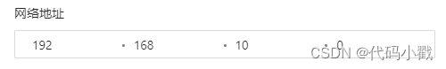
效果
使用方式
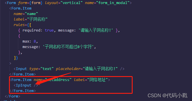
tsx
import { InputNumber, Input } from 'antd';
import React, { useState } from 'react';
import styles from './index.less';

interface PriceInputProps {
  value?: string;
  onChange?: (value: string) => void;
  disabled?: boolean;
}

const PriceInput: React.FC<PriceInputProps> = ({
  value = '0.0.0.0',
  onChange,
  disabled = false,
}) => {
  const [numberArr, setNumberArr] = useState<string[]>(value?.split('.') || []);

  const triggerChange = (changedValue: string) => {
    onChange?.(changedValue);
  };

  const onNumberChange = (evalue: string, type: number) => {
    const copy = [...numberArr];
    copy[type] = evalue;
    setNumberArr(copy);
    triggerChange(copy.join('.'));
  };
  return (
    <Input.Group compact className={!disabled ? styles.inputGroup : styles.inputGroup_disable}>
      <InputNumber
        style={{ width: '24%' }}
        disabled={disabled}
        controls={false}
        value={numberArr[0]}
        className={styles.self_input}
        onChange={(e) => onNumberChange(e, 0)}
        min={'0'}
        max={'255'}
      />
      <span className={styles.dot} />
      <InputNumber
        type={'number'}
        style={{ width: '24%' }}
        disabled={disabled}
        controls={false}
        value={numberArr[1]}
        className={styles.self_input}
        onChange={(e) => onNumberChange(e, 1)}
        min={'0'}
        max={'255'}
      />
      <span className={styles.dot} />
      <InputNumber
        type={'number'}
        style={{ width: '24%' }}
        disabled={disabled}
        controls={false}
        value={numberArr[2]}
        className={styles.self_input}
        onChange={(e) => onNumberChange(e, 2)}
        min={'0'}
        max={'255'}
      />
      <span className={styles.dot} />
      <InputNumber
        type={'number'}
        style={{ width: '24%' }}
        disabled={disabled}
        controls={false}
        value={numberArr[3]}
        className={styles.self_input}
        onChange={(e) => onNumberChange(e, 3)}
        min={'0'}
        max={'255'}
      />
    </Input.Group>
  );
};

export default PriceInput;
css
.inputGroup {
  text-align: center;
  border: 1px solid #d9d9d9;
  border-radius: 2px;
  transition: all 0.3s;
  &:hover {
    border-color: #45bbff;
    border-right-width: 1px !important;
    outline: 0;
    box-shadow: 0 0 0 2px rgba(29, 165, 255, 0.2);
  }
  .dot {
    position: relative;
    top: 15px;
    z-index: 9;
    width: 3px;
    height: 3px;
    background-color: #000;
    border: 1px solid #000;
    border-radius: 3px;
    opacity: 0.5;
  }
}
.inputGroup_disable {
  text-align: center;
  background: #f5f5f5;
  border: 1px solid #d9d9d9;
  border-radius: 2px;
  transition: all 0.3s;
  .dot {
    position: relative;
    top: 15px;
    z-index: 9;
    width: 3px;
    height: 3px;
    background-color: #000;
    border: 1px solid #000;
    border-radius: 3px;
    opacity: 0.5;
  }
}
.self_input {
  border: none;
  outline: 0px;
  box-shadow: none;
  &:hover {
    box-shadow: none;
  }
  &::selection {
    box-shadow: none;
  }
  &:focus {
    box-shadow: none !important;
  }
}


 659
659


 被折叠的 条评论
为什么被折叠?
被折叠的 条评论
为什么被折叠?
 到【灌水乐园】发言


