


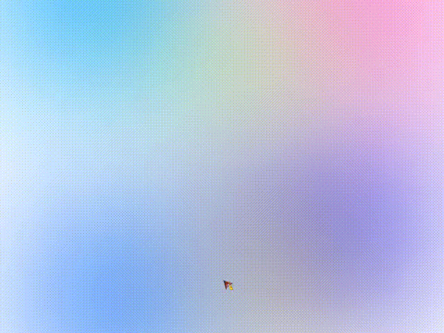
效果展示
代码展示
<!DOCTYPE html>
<html lang="ch">

<head>
    <meta charset="UTF-8">
    <meta http-equiv="X-UA-Compatible" content="IE=edge">
    <meta name="viewport" content="width=device-width, initial-scale=1.0">
    <title>Document</title>
    <style>
        html,
        body {
            height: 100%;
            overflow: hidden;
        }

        .color {
            position: absolute;
            filter: blur(200px);
        }

        .color:nth-child(1) {
            top: -350px;
            width: 600px;
            height: 600px;
            background: rgb(47, 102, 255);
            animation: colorOne 3s ease infinite alternate;
        }

        @keyframes colorOne {
            0% {
                background: rgb(47, 102, 255);
            }
            25% {
                background: rgb(47, 154, 255);
            }
            50% {
                background: rgb(47, 179, 255);
            }
            75% {
                background: rgb(47, 255, 238);
            }
            100% {
                background: rgb(47, 255, 203);
            }
        }

        .color:nth-child(2) {
            bottom: -150px;
            left: 100px;
            width: 500px;
            height: 500px;
            background: rgb(27, 178, 255);
            animation: colorTwo 3s ease infinite alternate;
        }

        @keyframes colorTwo {
            0% {
                background: rgb(27, 178, 255);
            }
            25% {
                background: rgb(47, 137, 255);
            }
            50% {
                background: rgb(47, 130, 255);
            }
            75% {
                background: rgb(47, 144, 255);
            }
            100% {
                background: rgb(47, 85, 255);
            }
        }

        .color:nth-child(3) {
            bottom: 50px;
            right: 100px;
            width: 500px;
            height: 500px;
            background: rgb(130, 225, 253);
            animation: colorThree 3s ease infinite alternate;
        }

        @keyframes colorThree {
            0% {
                background: rgb(130, 225, 253);
            }
            25% {
                background: rgb(130, 148, 253);
            }
            50% {
                background: rgb(50, 47, 255);
            }
            75% {
                background: rgb(78, 47, 255);
            }
            100% {
                background: rgb(137, 47, 255);
            }
        }

        .color:nth-child(4) {
            top: -300px;
            right: -20px;
            width: 600px;
            height: 600px;
            background: rgb(192, 132, 255);
            animation: colorFour 3s ease infinite alternate;
        }

        @keyframes colorFour {
            0% {
                background: rgb(192, 132, 255);
            }
            25% {
                background: rgb(251, 132, 255);
            }
            50% {
                background: rgb(255, 132, 214);
            }
            75% {
                background: rgb(255, 132, 183);
            }
            100% {
                background: rgb(255, 132, 142);
            }
        }

        .color:nth-child(5) {
            top: 20px;
            left: 40%;
            width: 400px;
            height: 300px;
            background-color: rgb(133, 169, 254);
            animation: colorFive 3s ease infinite alternate;
        }

        @keyframes colorFive {
            0% {
                background: rgb(133, 169, 254);
            }
            25% {
                background: rgb(133, 254, 187);
            }
            50% {
                background: rgb(171, 254, 133);
            }
            75% {
                background: rgb(242, 254, 133);
            }
            100% {
                background: rgb(254, 206, 133);
            }
        }

        .color:nth-child(6) {
            bottom: 20px;
            left: 50%;
            width: 300px;
            height: 300px;
            background-color: rgb(50, 230, 243);
            animation: colorSix 3s ease infinite alternate;
        }

        @keyframes colorSix {
            0% {
                background: rgb(50, 230, 243);
            }
            25% {
                background: rgb(50, 243, 98);
            }
            50% {
                background: rgb(243, 230, 50);
            }
            75% {
                background: rgb(243, 153, 50);
            }
            100% {
                background: rgb(243, 89, 50);
            }
        }
    </style>
</head>

<body>
    <!-- 背景色 -->
    <div class="color"></div>
    <div class="color"></div>
    <div class="color"></div>
    <div class="color"></div>
    <div class="color"></div>
    <div class="color"></div>
</body>

</html>
实现思路
animation + filter


 扫一扫
扫一扫


 4224
4224

 被折叠的 条评论
为什么被折叠?
被折叠的 条评论
为什么被折叠?
 到【灌水乐园】发言


