


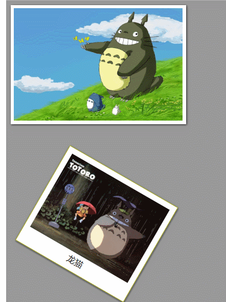
效果如图所示
主要运用了盒子阴影,图片阴影,边框属性三个要点
代码如下:
<!DOCTYPE html>
<html lang="en">
<head>
    <meta charset="UTF-8">
    <title>纯css制作相框效果</title>
    <style>
        body{
            background-color: #999999;
        }
        img.xk{
            position: absolute;
            background-color: black;
            width: 300px;
            height: 200px;
            border: 6px solid white;
            box-shadow: 1px 1px 5px #333333;
        }
        div{
            position: absolute;
            left: 50px;
            top: 300px;
            text-align: center;
            font-size: 15px;
            padding: 10px;
            border: 1px solid #990;
            background-color: white;
            box-shadow: 1px 1px 5px #333333;
            width: 200px;
 最低0.47元/天 解锁文章


 2535
2535


 被折叠的 条评论
为什么被折叠?
被折叠的 条评论
为什么被折叠?
 到【灌水乐园】发言


