


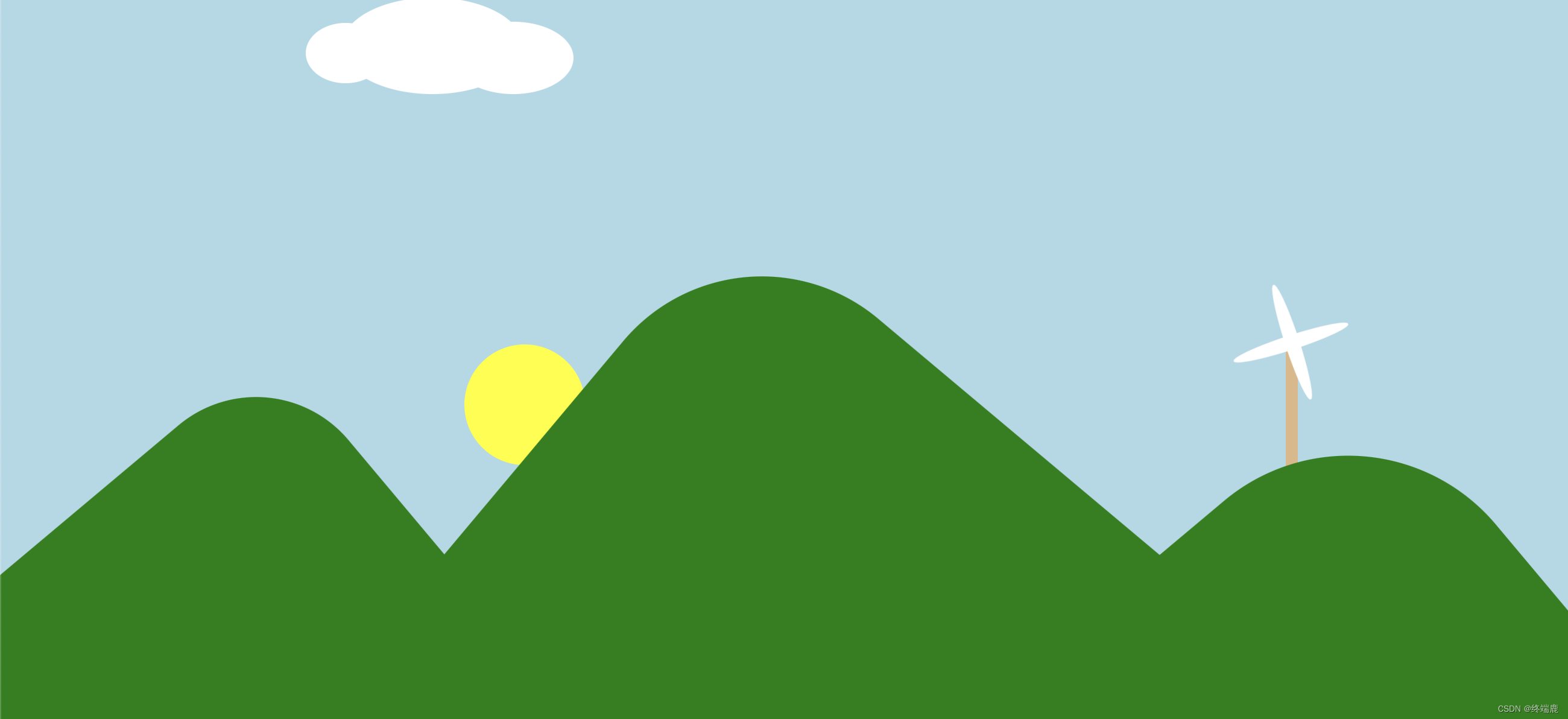
使用html5、css3、javascript画出一副风和日丽的画
<!DOCTYPE html>
<html lang="en">

<head>
	<meta charset="UTF-8">
	<meta name="viewport" content="width=device-width, initial-scale=1.0">
	<meta http-equiv="X-UA-Compatible" content="ie=edge">
	<title>Document</title>
	<style>
		body {
			margin: 0;
		}

		.box {
			width: 1300px;
			height: 600px;
			background-color: #ADD8E6;
			position: relative;
			overflow: hidden;
			/* 让溢出的内容隐藏*/
		}

		.sun {
			width: 100px;
			height: 100px;
			background-color: #FFFF00;
			border-radius: 50%;
			position: absolute;
			bottom: 140px;
			left: -110px;
			animation: sun_move 5s linear forwards;
		}

		.cloud {
			width: 260px;
			height: 100px;
			position: absolute;
			top: 0;
			left: 0;
			animation: cloud_move 3s linear infinite alternate;
		}

		.cloud .c1 {
			width: 66px;
			height: 50px;
			border-radius: 50%;
			background-color: #fff;
			position: absolute;
			top: 21px;
			left: 0;
		}

		.cloud .c2 {
			width: 150px;
			height: 80px;
			border-radius: 50%;
			background-color: #fff;
			position: absolute;
			top: 0;
			left: 30px;
		}

		.cloud .c3 {
			width: 100px;
			height: 60px;
			border-radius: 50%;
			background-color: #fff;
			position: absolute;
			top: 20px;
			right: 38px;
		}

		/*
          描述山
        */
		.mountain1 {
			width: 400px;
			height: 400px;
			background-color: #008000;
			border-radius: 100px 0 0 0;
			transform: rotate(50deg);
			position: absolute;
			bottom: -172px;
		}

		.mountain2 {
			width: 500px;
			height: 500px;
			background-color: #008000;
			border-radius: 150px 0 0 0;
			transform: rotate(40deg);
			position: absolute;
			bottom: -172px;
			left: 394px;
		}

		.mountain3 {
			width: 380px;
			height: 380px;
			background-color: #008000;
			border-radius: 160px 0 0 0;
			transform: rotate(50deg);
			position: absolute;
			bottom: -172px;
			right: -4px;
			z-index: 99;
		}

		/* 风车样式
        */
		.windCar {
			width: 100px;
			height: 200px;
			position: absolute;
			bottom: 160px;
			right: 180px;
		}

		.windYe {
			width: 100px;
			height: 90px;
			position: absolute;
			top: 0;
			left: 0;
			z-index: 999;
			animation: wind_move 2s linear infinite;
		}

		.windYe div {
			width: 100px;
			height: 12px;
			border-radius: 50%;
			position: absolute;
			top: 40px;
			left: 0;
			background-color: #fff;
		}

		.windYe .ye2 {
			left: 1px;
			transform: rotate(90deg);
		}

		.gan {
			width: 10px;
			height: 160px;
			background-color: #DEB887;
			position: absolute;
			bottom: 0;
			left: 46px;
		}


		/*
          定义太阳的动画
        */
		@keyframes sun_move {
			0% {
				top: 400px;
				left: 0px;
			}

			25% {
				left: 260px;
				top: 220px;
			}

			50% {
				left: 500px;
				top: 350px;
			}

			75% {
				left: 900px;
				top: 100px;
			}

			100% {
				left: 1100px;
				top: 0
			}
		}

		/*云朵动画*/
		@keyframes cloud_move {
			0% {
				left: 0;
			}

			100% {
				left: 400px;
			}
		}

		/* 风车动画
        */
		@keyframes wind_move {
			0% {
				transform: rotate(0deg);
			}

			100% {
				transform: rotate(360deg);
			}
		}
	</style>
</head>

<body>
	<div class="box">
		<div class="sun"></div>
		<div class="cloud">
			<div class="c1"></div>
			<div class="c2"></div>
			<div class="c3"></div>
		</div>
		<div class="mountain1"></div>
		<div class="mountain2"></div>
		<div class="mountain3"></div>
		<div class="windCar">
			<div class="windYe">
				<div class="ye1"></div>
				<div class="ye2"></div>
			</div>
			<div class="gan"></div>
		</div>
	</div>
</body>

</html>
效果如下:


 565
565


 被折叠的 条评论
为什么被折叠?
被折叠的 条评论
为什么被折叠?
 到【灌水乐园】发言


