


sns的基本设置
set()函数
sns.set(context=‘notebook’,
            style=‘darkgrid’,
            palette=‘deep’,
            font=‘sans-serif’,
            font_scale=1,
            color_codes=True,
            rc=None)
从这个set()函数,可以看出,通过它我们可以设置背景色、风格、字型、字体等。
这里style可选参数值有:darkgrid,whitegrid,dark,white,ticks
sns.despine() 函数
移除图像的上部和右侧的坐标轴
使用with打开某种风格
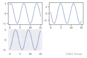
在matplotlib中我们已经学过了,在一个figure对象中,我们可以添加多个子图,那么如果不同的子图使用不同的风格,我们该如何做呢?
很简单,使用with 打开某种风格,然后在with下画的图都使用with打开的分格,我们来看看代码。
x = np.linspace(0, 15, 100)
y1 = np.sin(x + 1) * 1
y2 = np.sin(x + 3) * 3
y3 = np.sin(x + 5) * 5

fig = plt.figure()

with sns.axes_style("ticks"):
    ax1 = fig.add_subplot(221)
    plt.plot(x, y1)
    ax1 = fig.add_subplot(222)
    plt.plot(x, y2)

fig.add_subplot(223)
plt.plot(x, y3)
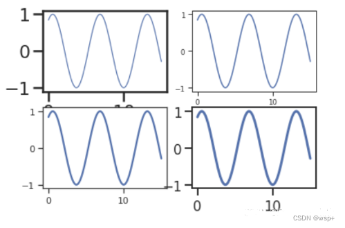
参数 context 指定的4种默认风格
seaborn.set() 的 context 这个参数是用来设置 绘图背景参数的,它主要来影响标签、线条和其他元素的效果,但不会影响整体的风格,跟style有点区别。
x = np.linspace(0, 15, 100)
y = np.sin(x + 1) * 1

fig = plt.figure()

fig.add_subplot(221)
sns.set(context='paper', style='ticks')
plt.plot(x, y)

fig.add_subplot(222)
sns.set(context='notebook', style='ticks')
plt.plot(x, y)

fig.add_subplot(223)
sns.set(context='talk', style='ticks')
plt.plot(x, y)

fig.add_subplot(224)
sns.set(context='poster', style='ticks')
plt.plot(x, y)
绘制热力图
seaborn.heatmap(data, vmin=None, vmax=None, cmap=None, center=None, robust=False, annot=None, fmt='.2g',
annot_kws=None,linewidths=0, linecolor='white', cbar=True, cbar_kws=None, cbar_ax=None, square=False,
xticklabels='auto', yticklabels='auto',mask=None, ax=None, **kwargs)
-
data:矩形数据集
可以强制转换为ndarray格式数据的2维数据集。如果提供了Pandas DataFrame数据,索引/列信息将用于标记列和行。那么如果提供了关系矩阵就可以显示变量之间的相关性。 -
vmin, vmax:浮点型数据,可选参数
用于锚定色彩映射的值,否则它们是从数据和其他关键字参数推断出来的 -
cmap:matplotlib 颜色条名称或者对象,或者是颜色列表,可选参数
从数据值到颜色空间的映射。 如果没有提供,默认值将取决于是否设置了“center” -
center:浮点数,可选参数
绘制有色数据时将色彩映射居中的值。 如果没有指定,则使用此参数将更改默认的cmap -
annot:布尔值或者矩形数据,可选参数
如果为True,则在每个热力图单元格中写入数据值。 如果数组的形状与data相同,则使用它来代替原始数据注释热力图 -
mask:布尔数组或者DataFrame数据,可选参数
如果为空值,数据将不会显示在mask为True的单元格中。 具有缺失值的单元格将自动被屏蔽 -
cbar:布尔值,可选参数
描述是否绘制颜色条 -
square:布尔值,可选参数
如果为True,则将坐标轴方向设置为“equal”,以使每个单元格为方形 -
xticklabels, yticklabels:“auto”,布尔值,类列表值,或者整形数值,可选参数
如果为True,则绘制数据框的列名称。如果为False,则不绘制列名称。如果是列表,则将这些替代标签绘制为xticklabels。如果是整数,则使用列名称,但仅绘制每个n标签。如果是“auto”,将尝试密集绘制不重叠的标签。 -
fmt:字符串,可选参数
添加注释时要使用的字符串格式代码 -
annot_kws:字典或者键值对,可选参数
当annot为True时,ax.text的关键字参数 -
ax:matplotlib Axes,可选参数
绘制图的坐标轴,否则使用当前活动的坐标轴
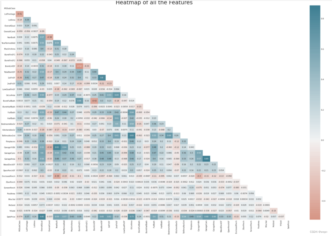
# 设置绘图风格
style.use('ggplot')
sns.set_style('whitegrid')
# 设置画板尺寸
plt.subplots(figsize = (30,20))

# 画热力图
# 为上三角矩阵生成掩码
mask = np.zeros_like(train.corr(), dtype=np.bool)
mask[np.triu_indices_from(mask)] = True

sns.heatmap(train.corr(),
            cmap=sns.diverging_palette(20, 220, n=200),
            mask = mask, # 数据显示在mask为False的单元格中
            annot=True, # 注入数据
            center = 0,  # 绘制有色数据时将色彩映射居中的值
           )
# Give title.
plt.title("Heatmap of all the Features", fontsize = 30)
k  = 11 # 关系矩阵中将显示10个特征
cols = num_corrmat.nlargest(k, 'SalePrice')['SalePrice'].index
cm = np.corrcoef(train_data[cols].values.T)
fig,ax = plt.subplots(figsize=(15,10))
sns.set(font_scale=1.25)
hm = sns.heatmap(cm,
				cbar=True,
				annot=True, # 注入数字
                 square=True, # 单元格为正方形
                 fmt='.2f',   # 字符串格式代码
                  annot_kws={'size': 10}, # 当annot为True时,ax.text的关键字参数,即注入数字的字体大小
                  yticklabels=cols.values,  # 列标签
                  xticklabels=cols.values   # 行标签
                  )
plt.show()
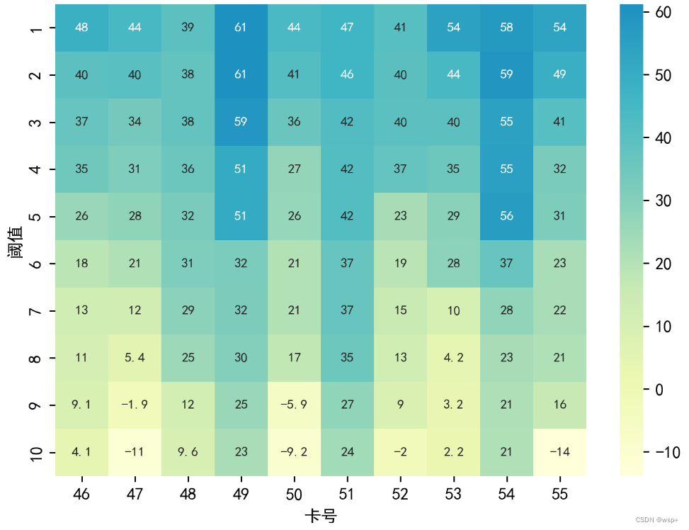
自定义热力图变色
import matplotlib.colors as mcolors

# 定义黄蓝渐变色
colors = ['#ffffd9', '#edf8b1', '#c7e9b4', '#7fcdbb', '#41b6c4', '#1d91c0']
my_cmap = mcolors.LinearSegmentedColormap.from_list('my_colormap', colors)

plt.figure(figsize=(7,5),dpi=256)
sns.heatmap((data1.iloc[:,45:55]*1000).round(3), cmap=my_cmap, annot=True, annot_kws={"size": 8})
plt.savefig('第一问.png')
同样可以使用自带的
sns.heatmap(train_x.astype(float).corr(),linewidths=0.1,vmax=1.0,
            square=True,linecolor='white',annot=True,cmap="RdPu_r")
cmap可以选择:
Accent, Accent_r, Blues, Blues_r, BrBG, BrBG_r, BuGn, BuGn_r, BuPu, BuPu_r, CMRmap, CMRmap_r, Dark2, Dark2_r, GnBu, GnBu_r, Greens, Greens_r, Greys, Greys_r, OrRd, OrRd_r, Oranges, Oranges_r, PRGn, PRGn_r, Paired, Paired_r, Pastel1, Pastel1_r, Pastel2, Pastel2_r, PiYG, PiYG_r, PuBu, PuBuGn, PuBuGn_r, PuBu_r, PuOr, PuOr_r, PuRd, PuRd_r, Purples, Purples_r, RdBu, RdBu_r, RdGy, RdGy_r, RdPu, RdPu_r, RdYlBu, RdYlBu_r, RdYlGn, RdYlGn_r, Reds, Reds_r, Set1, Set1_r, Set2, Set2_r, Set3, Set3_r, Spectral, Spectral_r, Wistia, Wistia_r, YlGn, YlGnBu, YlGnBu_r, YlGn_r, YlOrBr, YlOrBr_r, YlOrRd, YlOrRd_r, afmhot, afmhot_r, autumn, autumn_r, binary, binary_r, bone, bone_r, brg, brg_r, bwr, bwr_r, cividis, cividis_r, cool, cool_r, coolwarm, coolwarm_r, copper, copper_r, cubehelix, cubehelix_r, flag, flag_r, gist_earth, gist_earth_r, gist_gray, gist_gray_r, gist_heat, gist_heat_r, gist_ncar, gist_ncar_r, gist_rainbow, gist_rainbow_r, gist_stern, gist_stern_r, gist_yarg, gist_yarg_r, gnuplot, gnuplot2, gnuplot2_r, gnuplot_r, gray, gray_r, hot, hot_r, hsv, hsv_r, icefire, icefire_r, inferno, inferno_r, jet, jet_r, magma, magma_r, mako, mako_r, nipy_spectral, nipy_spectral_r, ocean, ocean_r, pink, pink_r, plasma, plasma_r, prism, prism_r, rainbow, rainbow_r, rocket, rocket_r, seismic, seismic_r, spring, spring_r, summer, summer_r, tab10, tab10_r, tab20, tab20_r, tab20b, tab20b_r, tab20c, tab20c_r, terrain, terrain_r, twilight, twilight_r, twilight_shifted, twilight_shifted_r, viridis, viridis_r, vlag, vlag_r, winter, winter_r
sns画柱状图改变颜色和添加柱状图标签
def plot_bar(df, c, title):
sns.set(style='whitegrid')
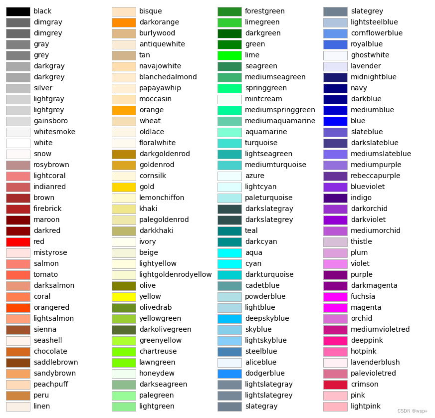
# palette 为设置每个柱子的颜色 传入颜色列表 这个颜色列表可以是十六进制,也可以是上图中的颜色名字
# color 属性智能体设置所有柱子为一种颜色
bar = sns.barplot(df, palette=c)
sns.despine()
# plt.bar_label(bar.containers[0],fmt='%.2f')
# 设置每个柱子的标签 值为自身数值
plt.bar_label(bar.containers[0])
# plt.title(title, fontsize=14)
plt.savefig('bar.png', dpi=400)
plt.show()
一些渐变色列表
blue_palette = ['#f7fbff', '#deebf7', '#c6dbef', '#9ecae1', '#6baed6', '#4292c6', '#2171b5', '#08519c', '#08306b']
red_palette = ['#fff5f0', '#fee0d2', '#fcbba1', '#fc9272', '#fb6a4a', '#ef3b2c', '#cb181d', '#a50f15', '#67000d']
green_palette = ['#edf8e9', '#c7e9c0', '#a1d99b', '#74c476', '#41ab5d', '#238b45', '#006d2c', '#00441b']
orange_palette = ['#fff5eb', '#fee6ce', '#fdd0a2', '#fdae6b', '#fd8d3c', '#f16913', '#d94801', '#a63603', '#7f2704']
柱状图还有一些别的默认好的颜色列表可以试试:
palette='crest'
palette='viridis_r'
palette='vlag'
palette='Spectral'
palette='twilight_r'


 531
531


 被折叠的 条评论
为什么被折叠?
被折叠的 条评论
为什么被折叠?
 到【灌水乐园】发言


